

A well-designed email does more than grab attention—it has the power to convert leads into sales. At the heart of it? The template.
But here’s the big question: how do you go about creating professional, impactful email templates?
Feeling stuck? Struggling with DIY attempts? Unsure where to begin?
This blog post is here to guide you.
With experience designing over 3,000 email templates every month, we know exactly what it takes to create emails that leave a lasting impression. To get you started, we’re sharing 8 creative email template design ideas to inspire your next campaign. Let’s get started!

8 Professional Email Design Examples
1. Magic Mind

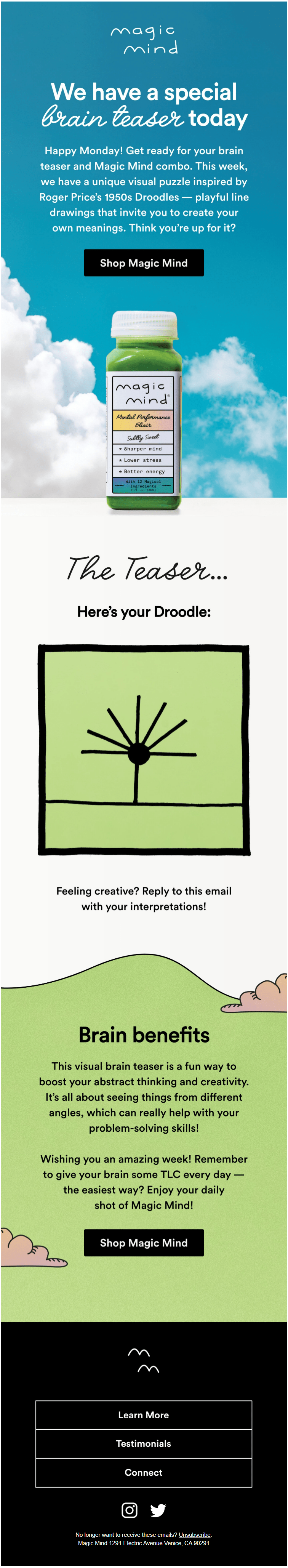
Source: Inbox
Kicking off with a skyward shot, this email plunges you into its lighthearted mood right in its hero block. Blue sky, white clouds — defines chipper!
The product is centered, drawing immediate attention.
The drop shadow effect also adds a realistic touch to the image. The template then shifts to 2D, which brings out the laid-back feel of the email.
Why this email rocks:
- A single CTA: Focused and strategic, it can generate over 300 more clicks compared to multiple or no CTAs. The design ensures the CTA stands out, surrounded by ample white space for emphasis.
- Single-column layout: A clear demonstration of a mobile-first design approach, ensuring a seamless experience across devices.
- Value-driven copy: Engaging, motivational, and brand-aligned.
Design idea: Place elements along the Y-axis in order to guide the user’s eye through the content. Simplify viewability using vertical alignment.
2. FUM

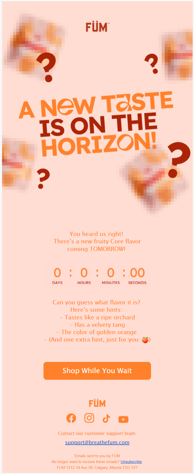
Source: Inbox
Fum’s masterful use of the blur effect compels the viewer to star this message and wait for the next one in the sequence. The countdown timer heightens the intrigue, not to mention the tantalizing hints so crisply set down.
The CTA is spot-on, counterbalancing, as it were, the anticipation.
Why this email rocks:
- Appropriate color scheme: In an email full of suspense and hints, the color, that of peach, equally strongly anticipates the new flavor.
- Well-spaced copy: Text designed with readability in mind, ensuring viewers can easily understand the content without straining their eyes.
Design idea: Leverage the blur effect from time to time, not just to hide and hold, but to achieve stylistic effects as well. Experiment with the Bokeh effect and Gaussian blur. Find more information here.
3. True Grit Texture Supply

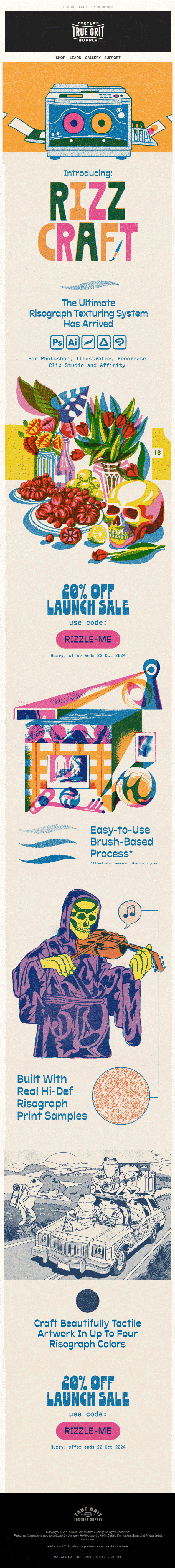
Source: Inbox
Colorful, wacky, and dripping with humor. Not just a dynamic, hard-to-forget viewing experience, True Grit inspires and evokes creativity.
Incidentally, for art lovers out there, this email is itself inspired by fauvism, a 20th century art movement which took off in France.
Why this email rocks:
- Great use of white space: For an email so rich, so vibrant, white space is critically important – something which this email achieves.
- Artistic inspiration: We like how True Grit’s designer has been inspired by an art movement, which expands the creative boundaries.
- Eye-catching discount: Bold typography makes the offer unmissable.
- Animated GIF: Simple yet impactful, the GIFs don’t affect accessibility.
Design idea: Experiment with grainy or gritty textures to create a retro vibe.
4. Raw Juicery

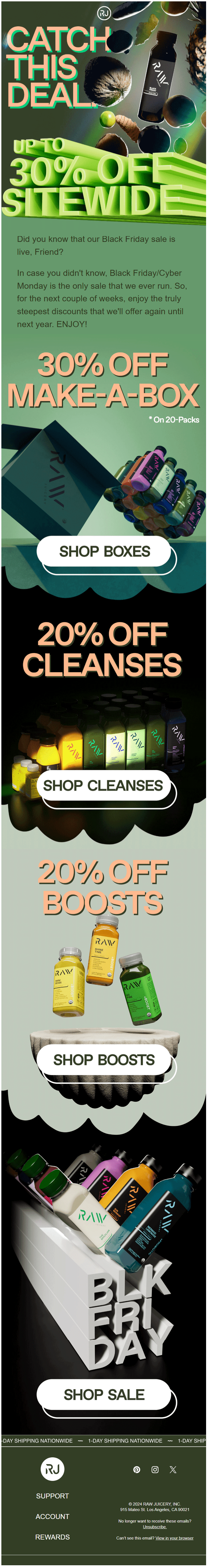
Bold, high-octane — Raw Juicery’s email hits you like a jet of Jack Frost.
Utilizing Word Art effects, bold typography, and striking CTAs, Raw Juicery’s once-a-year sale pulls out all the stops to make it count. One of the highlights of this email is the variety of angles and positions in which the products are showcased. But we also love those unorthodox dividers.
Why this email rocks:
- Bold and beautiful: Email design is typically minimalist. But RJ’s dash at bold typography takes their email to a whole new level.
- Unconventional dividers: The Baroque dividers, accentuated by dark colors, perfectly match the 3D resonance of the design.
- Blend of dark and light: The alternating dark and light palette enriches the viewing experience.
- Top-notch photography: A brilliant use of light and shadow, combined with an artful mix of close-ups, long shots, and floating images.
Design idea: Embrace the maximalist approach to design for one-off emails. Experiment with layouts, dense text, bold colors, layered images, etc.
5. Suri

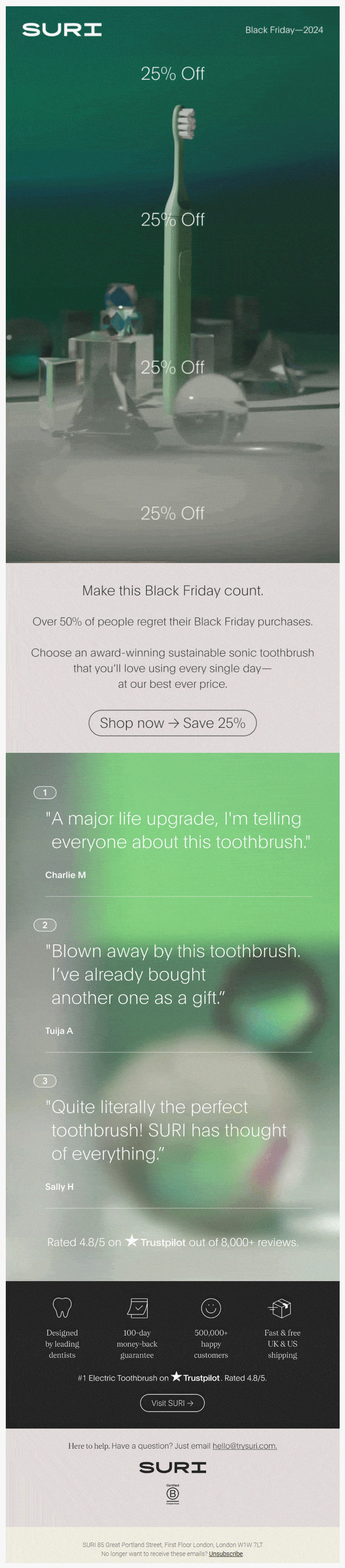
With its futuristic vibe and unique colors, Suri’s email is a nice example of inventive minimalism. We love how the electric toothbrush is made to tower above the rest, signaling its prominence, in a way.
The imminent 360-degree GIF view also establishes this fact.
The repetitive mention of “25% off” doesn’t come off as persistent or annoying because it’s not made to override the aesthetic pull of the template. It’s written simply, in a no-fuss manner, the focus remaining on the product.
Why this email rocks:
- Strategic use of GIF: The 360-degree effect, as we mentioned already, nicely lifts the product to featured status.
- Blur effect: Nice use of the blur effect to add a stylistic touch.
- Well-curated reviews: Choosing the most impactful customer reviews is important. Suri has picked just the right ones.
Design idea: Try cyberpunk, or even dystopian, color schemes, to create a futuristic vibe. Learn more about it here. But be strategic, the vibe should vibe with the product or service you’re promoting.
6. Cat Person

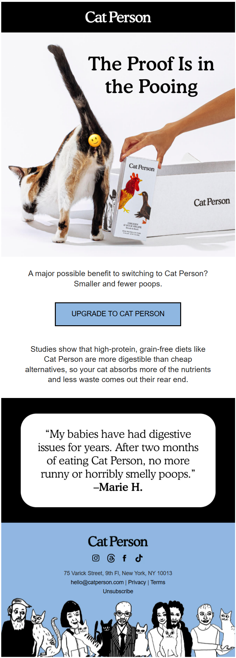
Cat Person’s short email is cute, funny, and very relatable. The hero image says it all, bolstered by creative copy and a well-placed emoji.
The footer is quite interesting, too. Paints quite a picture of the cat people as well as their team.
Why this email rocks:
- Good use of emoji: Cat Person’s use of emoji scores high in relevance or context and humor.
- Innovative copy: The content is spot-on – informative as well as funny.
Design idea: Experiment with toon styles and pop art to lighten up your emails. Try caricatures, where appropriate. Implement color blocking to section off each content block more clearly as well as to enhance the look.
7. Bershka

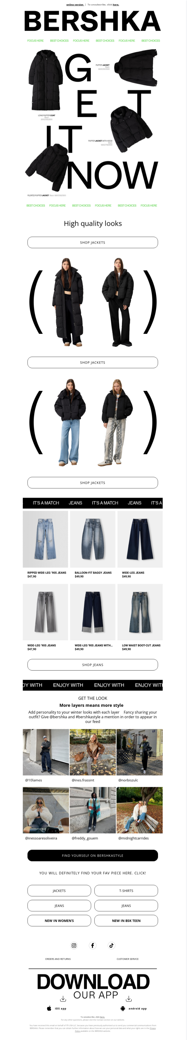
Bershka’s product promotion starts in the hero image itself – quite a unique way of doing it. The entire hero block is a call to action.
The CTA buttons are well-padded, creating a clean and inviting design. We particularly appreciate the inclusion of user-generated content in the pre-footer section. Additionally, the bold typography used for the app download call-to-action is refreshingly unconventional and eye-catching.
Why this email rocks:
- Impressive hero section: That the entire hero section could be a call to action is unprecedented.
- Long CTAs: The long CTA buttons are proof of a mobile-first approach.
- Navigation bars: Prominent top and bottom navbars.
Design idea: Explore unorthodox email layouts, such as storytelling layouts, asymmetrical layouts, angular layouts, and so on. Use these layouts for one-off emails like BFCM, holiday emails, product launch, anniversaries, etc. Check out how far you can go with layouts in this curation.
8. James Perse

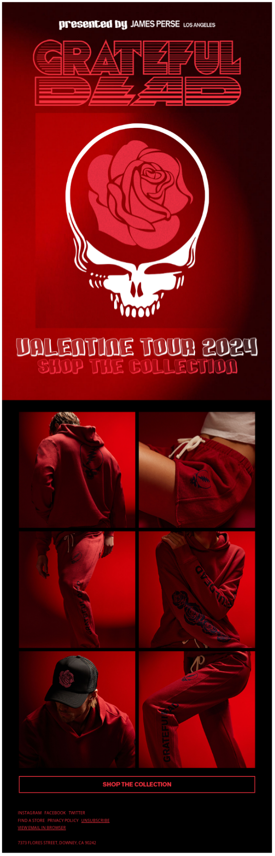
Intense and striking, JP’s all-red Valentine’s Day email has a bite to it. From the skull-and-rose hero image to the two-column product grid to the CTA, this email redefines minimalism with a vengeance.
The color scheme is unforgettably bold, erotic, and “dangerous.”
Why this email rocks:
- Gothic vibe: The Gothic romance theme effectively captures the mood.
- Color gradient: James Perse masterfully uses color gradients to bring out the relatable capricious oomph of the season.
- Classic color combination: The timeless pairing of black and red, bold yet harmonious, completes the mood.
Design idea: Depending on the campaign or season, strive for intense styles with the help of color grading, backlighting, saturation, vignettes, etc.
Speaking of professional email template design ideas, a few expert tips:
- Add a “View in Browser” or “View Online” link: Place it at the top of every email for easy accessibility.
- Ensure the Unsubscribe link is visible: Position it clearly in the footer to comply with email best practices.
- Stick to web-safe fonts: Use fonts that guarantee consistent readability across devices and email clients.
- Maximize the preview text: Treat it as an extension of your subject line to captivate readers.
- Implement defensive design strategies: Optimize your emails to remain readable and functional, even with blocked images.
- Prioritize above-the-fold branding: Feature your CTA prominently and align it with your brand identity.
- Design with online viewing patterns in mind: Structure content to match the natural flow of how users scan digital content.
This Way, Please—for All Things Email Templates
At Email Mavlers, our team of over 150 specialists brings more than 12 years of experience and proficiency across 50+ ESPs. We craft hand-coded email templates designed to integrate smoothly with your platform of choice, ensuring a hassle-free and efficient sending experience. You can bet your bottom dollar. Get in touch with us today.