


Is your browser preview = your subscriber’s inbox?
If you’ve built websites, writing an HTML email feels familiar. It’s the same tags, same CSS, and same idea. So you build an email and send a test. Oops! The layout looks broken in Outlook , the CTA has become square, and the text written in white is merely visible in dark mode on a certain mobile device.
Let’s understand why this happens. Web browsers mostly follow the same rules, so a page looks roughly the same be it on Chrome, Safari, or Firefox. Email clients on the other hand don’t follow the same rules. Before your email is shown, the client does a scrutiny- it may strip out some of your code for security, rewrite parts of the code, or just ignore the CSS it doesn’t support. Email clients like Gmail, Outlook, and Apple Mail each handle this their own way.
And your subscribers are spread across all of them. According to Litmus’s September 2026 data, drawn from more than 1.5 billion email opens, Apple accounted for 76.56% of opens, Gmail 16.10% and desktop Outlook 3.48%. Litmus also reports that more than 25% of its tracked users read email in dark mode. While Outlook may seem like a small part of the clients used, it can still mean thousands of people on a large list. Plus, what if the percentage of Outlook users on your list is higher than this global average?
Hence, the job of an email developer is wider than just making a design look good. The email has to look the same for anyone who opens it on any email client or device and in any mode.
In this blog we will walk through 9 reasons why email CSS differs from website CSS. By the end, you will also learn techniques that keep templates working: table layouts, inline styles, fallbacks, and testing.
9 reasons why email CSS differs from website CSS
1. Email clients don’t support the same CSS
HTML email CSS support is uneven across clients, and that’s what the biggest hurdle is. While modern browsers handle Flexbox, CSS Grid, advanced selectors, transitions, and custom properties without much fuss with email client, support can change by platform and version.
The gap is large. Can I email, a community-run reference that tests 308 HTML and CSS features across inboxes, scores the main clients like this:
| Email client | Features supported (out of ~308) |
| Apple Mail (macOS) | 288 |
| Apple Mail (iOS) | 283 |
| Gmail (desktop webmail) | 154 |
| Gmail (Android app) | 111 |
| Classic Outlook (Windows) | 59 |
Web developers take Flexbox for granted with the support it provides for websites. But when it comes to emails, it gets only 78% full support across tested email clients, and about 5% partial support. While the Gmail apps don’t support it for non-Google accounts, classic Outlook for Windows doesn’t support it at all.
Test these features carefully before you rely on them:
- Flexbox and CSS Grid: It is good for websites, but not dependable enough to be the only layout method in an email
- Background images: many email clients support them, but some Outlook versions need special handling.
- CSS gradients: can render unevenly, especially in older or Word-based Outlook desktop clients.
- Margins and padding: some clients apply spacing differently, which can throw off alignment.
- Positioning and advanced selectors: some properties and selectors are ignored by clients or behave differently from client to client.
HTML email best practice: better to use a widely supported CSS. Make sure to plan the layout for compatibility from the very start, and test the email in the clients your audience uses.
2. Tables still do the layout work
For websites, developers build layouts with <div> elements and Flexbox or CSS Grid because when it comes to modern browsers, it’s flexible and easy to maintain.
Now, let’s talk about email. HTML tables are still the safer choice, because many email clients handle tables more consistently than modern layout systems. Classic Outlook for Windows is the main reason. It renders email with a Microsoft Word-based engine, not a browser engine, so most modern layout CSS simply doesn’t apply.
Classic Outlook isn’t going away soon, either. According to Microsoft, even as the new Outlook for Windows becomes the default, existing installations of classic Outlook will be supported until at least 2029. So anyone emailing business audiences will likely need table-based layouts for a few more years.
Tables give you a dependable base across many email clients. On smaller screens, you can then add responsive styles that stack the columns, in clients that support media queries.
Key takeaway: If broad compatibility is an important criterion, older layout techniques are often more practical than newer CSS features.


3. Inline CSS matters more in email
On websites, CSS generally lives in external stylesheets or shared <style> blocks. This is what keeps styling easy to manage across website pages.
For email, a different approach is preferred – inline CSS. This puts styles directly on each HTML element. So? Now, your email is less dependent on stylesheets that a client might remove or ignore. And this is kind of common. The <style> element has only about 63% full and 15% partial support across email clients. For non-Google accounts, Gmail apps just ignore it. Gmail webmail on the other hand caps it at 16 KB. And Gmail doesn’t read <style> placed inside the <body>.
We go into these Gmail quirks, and how to work around them, in our guide to Gmail CSS support.
Here’s typical website styling:
<style>
  .email-heading {
    color: #222222;
    font-size: 24px;
  }
</style>

<h1 class="email-heading">Welcome to Our Newsletter</h1>
And an email-friendly version of the same heading:
<h1 style="color: #222222; font-size: 24px;">
  Welcome to Our Newsletter
</h1>
Inlining isn’t a cure-all. Plenty of clients read embedded CSS and media queries just fine. What inline styles give you is a safety net: if a client drops or ignores your <style> block, the email keeps its basic formatting.
So inline the styles you can’t afford to lose. That means font size, color and line height on your text, and padding and background color on buttons. It also covers spacing, alignment and background colors on table cells, plus anything you’re unsure a client will support.
Responsive behavior is the exception. Media queries can’t be written inline, so they have to sit in a <style> block.
What usually works best is a bit of both: inline styles for the essentials, and a well-tested <style> block for the rest.
4. Responsive email needs fallbacks
With flexible layouts, breakpoints, and media queries in place, responsive websites adjust to any screen size.
For emails on the other hand, it isn’t that simple. Litmus says, mobile devices are still where most subscribers read email. But not all email clients support the same responsive techniques. Media queries, the backbone of responsive design, have full support in only about 44% of the email clients Can I email tests, with another 41% offering partial support. Some clients apply media queries correctly. Others ignore them, or handle certain properties differently.
A common responsive email layout uses:
- A fluid outer container that fits the available screen width
- A centered content area with a maximum width
- Table-based columns for the desktop layout
- Media queries that stack columns or adjust spacing on mobile
- Fallback styles to keep the email readable if the responsive CSS isn’t applied
Let’s consider an example. Suppose you have created an email design where there;s an image on the left and text on the right for the desktop view. So how will this look on mobile? The image may need to sit above the text.
It’s the responsibility of the developer to ensure the layout still works when the mobile-specific CSS doesn’t kick in.
HTML email best practice: First, build the basic layout. This will ensure it works without relying fully on media queries. Then use responsive email CSS to improve the experience where it’s supported.
5. Classic Outlook plays by its own rules
Ask any email developer which client gives them the most trouble, and Outlook will come up fast.
Classic Outlook for Windows renders email using Microsoft Word’s engine instead of a browser’s. So a lot of everyday CSS either looks off there or does nothing. By Can I email’s count, it handles about 59 of the 307 features tested on it, fewer than any other major client. You’ll usually spot the damage in spacing, background images, rounded corners and columns. The newer Outlook apps work differently, so it helps to know which version your readers are on.
The usual trouble spots:
| Element | What happens in classic Outlook | Common fix |
| Rounded buttons | border-radius may not render, so rounded buttons can show up square | A fallback, or an Outlook-specific version of the button |
| Background images | CSS background images may need special handling | A solid background color as fallback, or VML when the design and project justify it |
| Spacing and alignment | Margins, padding and line-height can behave differently from a browser | Table cells, explicit dimensions and Outlook-specific adjustments |
Browser view vs Classic Outlook view


Remember that a design which looks perfect in a browser preview is not necessarily ready to send. This gap usually shows up when a design moves into code. If your emails start in Figma, our Figma to HTML service turns them into email-ready code that holds up in Outlook too.
6. Dark mode can change your email’s colors
Dark mode adds a problem that rarely comes up in standard website testing. When a reader turns it on, some email clients step in and recolor the email for them, from the background to the text and sometimes more. Each client does this its own way, and your HTML email CSS doesn’t always get the final say.
Litmus sorts clients into three camps. Some leave your colors alone, some flip part of them, and some flip everything. And this isn’t a niche concern. Litmus puts dark mode readers at as many as 40% of subscribers.
Common problems:
- Dark text is almost impossible to read on a dark background
- White background will turn dark gray or black
- CTA font colors get changed
- If logos have a transparent background, they become hard to see
- Background images and live text are not aligned with the intended design
Say your CTA text is red and the CTA background is a light color. The CTA may become unreadable if the client automatically changes the background or text color.
How to improve dark mode compatibility:
- Check your contrast. Text that’s easy to read on white can fade away once a client darkens the background.
- Look at every email in both light and dark mode before it goes out.
- Logos are a common casualty. A dark logo on a transparent background can vanish in a dark inbox, so pick a version that holds up on both.
- If background color is the only thing setting a key section apart, it may blend in once colors shift. Give it something else too, like spacing or a heading.
- Stick with live text where you can, especially for CTAs, since it’s better for accessibility. If the design really calls for an image-based button, make sure it still works with screen readers, scales properly and has a fallback.
Dark mode testing should be part of your email QA process, especially for campaigns with custom backgrounds, complex CTAs or branded color combinations.


7. Custom fonts often don’t load
Websites can load custom fonts with @font-face and expect them to show up. Email clients are far less consistent, so your chosen typeface won’t appear for every reader.
The numbers make this clear. Can I email estimates that only about 22% of tested email clients fully support @font-face. Gmail supports only Roboto and Google Sans; it does not load any custom web fonts. Classic Outlook takes the non-supporting to another level. Text set in an unsupported custom font may ignore your font stack and drop to Times New Roman; Outlook-specific fallback settings are a must.
When a font isn’t available, the client uses a fallback font. Now, the fallback font may have a different width and height and that can change the width of your text, the number of lines you originally had, the height of a section and even the alignment of nearby elements.
For example:
<p style="font-family: 'Montserrat', Arial, sans-serif;
          font-size: 16px;
          line-height: 24px;">
  Your message content goes here.
</p>
Here, the email tries Montserrat first, then falls back to Arial or another available sans-serif font.
Follow these email typography best practices:
- Select a fallback font stack sensibly
- Set clear font sizes and line heights
- Avoid designs that only work if a custom font renders the same everywhere
- Check line wrapping and section height in the major email clients
- Use images for highly stylized text only when necessary, and keep important information as live text wherever you can
8. Email buttons need sturdier code
When you are developing a website, a button can be styled with modern CSS. You can use JavaScript for interaction. But in email, JavaScript doesn’t run, and support for padding, rounded corners, and other button styles varies. So a button may look perfect in one client, but in another, it can look quite different or even distorted.
If you need interactive elements inside the inbox, AMP for email is one route, though it comes with its own rules. We compare the two in CSS for email vs AMP for email.
A simple email button can be an anchor element styled as a CTA:
<a href="https://example.com"
   style="display: inline-block;
          background-color: #d71920;
          color: #ffffff;
          padding: 12px 24px;
          text-decoration: none;
          font-family: Arial, sans-serif;
          font-size: 16px;">
  Learn More
</a>
To ensure maximum compatibility, based on the design, developers can wrap the button in a table or use a “bulletproof button” pattern. Rounded corners and other extras may need fallbacks for classic Outlook.
Test every CTA for:
- Text visibility in light and dark mode.
- Correct size and alignment.
- Enough spacing around the text.
- Working destination links.
- Readability on mobile devices.

9. Testing covers far more environments
Web developers usually test in a few browsers, such as Chrome, Firefox, and Safari. Email developers have a wider field to cover: desktop email apps, webmail and mobile apps.
Gmail, Outlook, Apple Mail, Yahoo Mail and other clients – the same email can look different on each. The reason is again the same – each one renders it in its own way.
There are tools like Email on Acid and Litmus, which let you preview an email across many clients and devices before you send it. Pick your test list based on your audience and the email platform you use. Industry-wide numbers are a starting point, but Litmus itself notes that your own top email clients may look different from its global list, so check your own open data if your email platform provides it.
A simple pre-send checklist:
- Layout holds up in classic Outlook for Windows
- Columns stack correctly on mobile
- Text and CTAs are readable in dark mode
- Fallback fonts don’t break headings or spacing
- All links work
Website CSS vs email template CSS at a glance

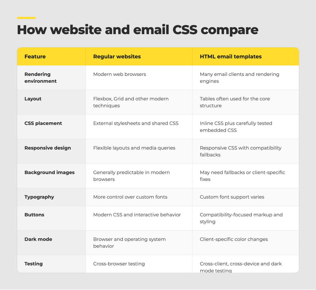
These are general patterns, not fixed rules. Email clients differ, and their support changes over time.
Before you hit send
Email and the web use the same HTML and CSS, but they don’t play by the same rules. Code that looks perfect on a web page can be stripped out, rewritten, or simply ignored by the time it reaches an inbox.
So start with compatibility. Use CSS you know is well supported. Lean on tables where they make sense, inline the styles that matter most, and keep a fallback ready for anything that doesn’t work everywhere.
And don’t trust the browser preview. Test in the email clients, devices and display modes your readers actually use, and look at each one properly. Skip that step and you may hear about the broken layout from your subscribers instead.
Once you know where email and the web part ways, building templates that look good and hold up in every inbox gets a lot easier. If you’d rather hand the work off, our team builds custom email templates that are coded and tested across the major clients.