

Designers chase pixel-perfect emails like a kind of ritual.
Figma shows a flawless hero. The QA inbox looks identical. Then the campaign goes live, and the world proves otherwise.
But what happens next completely catches you off guard.
- Outlook warps the layout.
- Gmail clips your HTML.
- Dark mode inverts your carefully chosen palette.
- Images disappear behind blocked requests.

The result: a painstakingly composed message that arrives bruised.
The truth about HTML email template best practices is that exact visual parity everywhere is impossible.
Email clients are a fragmented front end with their own rules. So stop chasing perfection.
Start building resilience.
This resilience starts with understanding the fundamental differences between web rendering and email rendering.
Let’s cut to the chase and learn what the best practices for HTML email coding are and how you can build pixel-perfect emails.
How are email clients fundamentally different from web browsers?

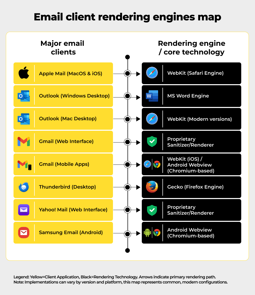
The core problem is fragmentation: every client uses a unique rendering engine.
There’s no single rendering engine to target.
On Windows, Outlook still renders HTML through Microsoft Word. Gmail web scrubs and sanitizes the DOM. Apple Mail uses WebKit. Other clients have their own quirks.
That fragmentation means: a valid CSS property can be honored in one client and stripped in another. And that’s exactly how you build email client compatibility.
An elegant <div> layout can collapse into a stack of 100%-wide blocks. Media queries that save mobile layouts might be ignored on desktop Gmail.
The “write once, render everywhere” web dream doesn’t exist for email. We must design for variance, not perfection.
To build resilience effectively, we first need a clear inventory of the most frequent points of failure.
Now, let’s discuss some HTML email template best practices that are non-negotiables.
What are the most common ways email campaigns break, and why?
To build resilience, we must first understand the most frequent and impactful ways campaigns fail.
1. Outlook (Windows) quirks
Outlook’s Word engine ignores modern CSS features such as flexbox and many media queries. You can expect 1px gaps, divs expanding to 100% width, and VML button oddities. High-DPI screens can stretch layouts unless you apply specific XML fixes. Images blocked by default become broken placeholders if alt text is missing. These Outlook email rendering issues are avoidable, though.
2. Gmail clipping and sanitization
Gmail clips emails that exceed roughly 102 KB of HTML. When it clips, table structures can break mid-render, leading to Gmail rendering issues. Gmail’s sanitizer also removes unsupported styles. Background images in <style> blocks are a common casualty.
3. Dark mode inversions
Clients may invert or override colors. Outlook tends to aggressively flip palettes; Apple Mail is more respectful of color schemes. If your design relies on exact hues, expect surprises.
4. Image loading and blocking
Many clients disable remote images by default. Logo or hero absence can erase brand cues. Alt text is not optional; it’s your fallback identity.
5. Mobile vs desktop differences
Media queries behave inconsistently. Mobile apps often honor breakpoints; some desktop clients do not. Responsive designs that depend solely on CSS can break outside handheld apps.
Once we grasp the pervasive nature of these failures, it becomes clear that obsessing over perfect visual fidelity is a distraction from the real objective.
If pixel-perfection is a myth, what actually matters for email success?
Since perfect visual parity is impossible, the focus must shift from how it looks to what functionality survives.
Pixel parity assumes uniform rendering. That assumption fails.
Big brands know this.
They design intentionally simple, because simplicity survives. If the structure holds, CTA is clear, and the message is readable, the email works. Marginal pixel shifts do not sink campaigns; lost CTAs and broken links do.
So reframe success – not “how identical it looks everywhere,” but “what survives everywhere.”
Adopting a resilient mindset requires a shift in the engineering approach, moving toward proven design and coding strategies that maximize survivability.
What design and coding strategies will reduce breakage and increase survivability?
A few deliberate coding strategies can dramatically increase the survivability of your email across all major clients.

These are battle-tested, engineering-minded practices that turn fragile emails into resilient communications.
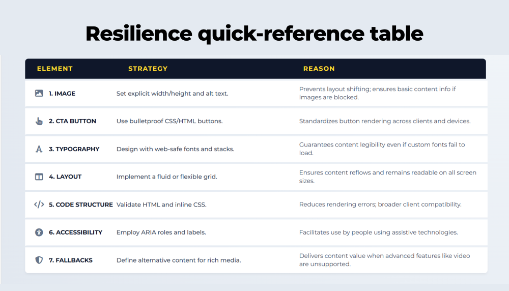
1. Use robust HTML structure
Favor table-based layouts for complex grids. Tables remain the most consistent cross-client approach. Reserve <div> and flexible layouts for extremely simple blocks.
2. Inline critical CSS
Inline width, height, padding, and color for elements that must not break. Outlook ignores some stylesheet rules; inline styles are more reliable. Always set <img width=”…” height=”…”> attributes.
3. Set explicit alt text and dimensions
Every image needs meaningful alt text and fixed dimensions. This prevents layout collapse and preserves brand cues if images are blocked.
4. Design the “first frame”
If you use GIFs or animations, make the first frame carry the core message. Many clients won’t autoplay, but they will show the static frame.
5. Plan for dark mode
Add color-scheme and dark-mode media queries where supported. Avoid pure reliance on color contrasts that dark mode can invert unpredictably. Prefer transparent PNGs and explicit background colors.
6. Keep HTML lean, avoid bloat
Gmail’s clipping limit is real. Strip comments, remove unused markup, compress images, and avoid embedding large data URIs. Lighter code reduces clipping and speeds rendering.
7. Make CTAs resilient
Always include an HTML button (with linked text), not just an image. Ensure CTAs are high-contrast and have generous tap targets for mobile.
Beyond immediate code fixes, true longevity and predictability come from creating a sustainable and scalable design system.
How can we build sustainable resilience using modular templates and graceful fallbacks?
Resilience isn’t just about code fixes; it’s about building a sustainable and predictable design system.
1. Modular systems win.
Create a library of tested components, hero, product card, content block, CTA, and footer. Update a module once; it propagates safely.

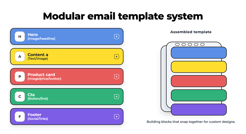
2. Separate layout from content.
Lock the template shell. Let marketers edit fields: headline, preheader, hero URL, and CTA label. Prevent ad-hoc margin edits that break structure.
3. Graceful degradation.
Design a minimal viable email that looks acceptable in the worst clients, then layer enhancements where supported. Think progressive enhancement: base first, polish later.
4. Fallback content.
If you pull web fonts, provide system font fallbacks. If a background image might be stripped, set a background color that communicates brand intent.
When a resilient system is in place, the final priority is to ensure that the message’s foundational elements, the campaign’s goal, remain robust and intact.
Which essential elements must be protected when everything else breaks?
When everything else breaks, ensure these three foundational elements remain intact for maximum impact.
- Brand identity – Embed brand via alt text and inline colors, not fragile CSS classes.
- Accessibility – Large readable font sizes, sufficient color contrast, descriptive alt text, keyboard-navigable links. Consider Outlook’s scaling quirks and test legibility at different render scales.
- Performance – Minimize code, compress assets, and avoid heavy inline images.
Even the most resilient design requires continuous validation, and a robust testing protocol is the non-negotiable final step.
What rigorous testing protocol is necessary to guarantee predictable email results?
Rigorous, multi-faceted testing is the final critical step in guaranteeing your emails deliver predictable results.

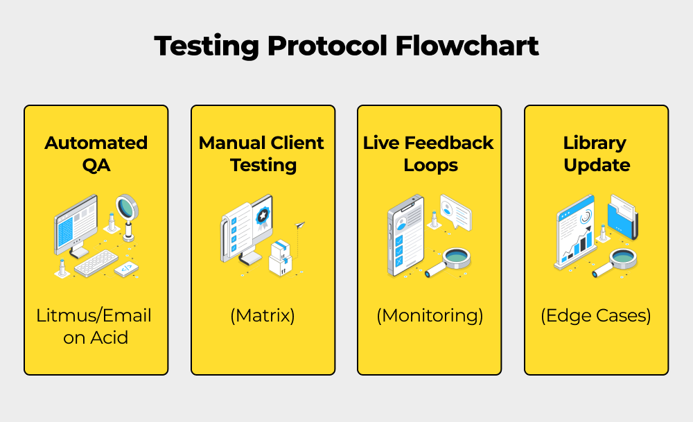
Here are some quick and effective ways to overcome the challenge of email testing across clients.
- Client testing matrix – Preview across Outlook (various Windows versions), Gmail (web & mobile), Apple Mail, and major Android clients. Catch clipping, color shifts, and missing content.
- Automated QA – Use tools such as Litmus or Email on Acid to flag clipping, missing text alternatives, dark mode issues, and more.
- Feedback loops – Monitor live sends for anomalies in engagement. Subscriber reports are frontline diagnostics. Act on them quickly.
- Continuous library of edge cases – Keep a suite of templates that exercise problem areas and revisit them whenever a major client update rolls out.
Having covered the philosophy, failure modes, coding tactics, and necessary testing, we can now concisely summarize the required shift in perspective.
What is the fundamental shift required for reliable email development?
To summarize, success in email development requires a fundamental shift in mindset and process.
That brings us to the business end of this article, where it’s fair to say that you must design for resilience, not perfection.
Pixel-perfect emails are an aspiration, not a reality. But reliable emails are an engineering outcome.
Shift the conversation:
- From identical pixels to predictable outcomes.
- From visual tinkering to modular systems.
- From ad-hoc edits to guarded templates and rigorous QA.
Do the work that saves time. Like, lock down the structure, expose safe content fields, test broadly, and protect your CTAs and brand cues.
When your templates are engineered to survive, you don’t lose beauty; you gain consistency, speed, and trust.
Need email templates that survive every inbox? Request an email rendering audit and let our engineers fortify your campaigns.
Or talk to our email development team about modular template systems and best-practice coding for all clients.