

Your landing page serves as the digital storefront of your business—the first impression many potential customers will have.
But simply packing it with salesly content isn’t going to drive sales.
Not unless you design it with your audience’s needs at the forefront. Ignore viewers, and you’re leaving money on the table.
Remember, the primary goal of a landing page is to guide users toward the answers they need. But if those answers are buried under poor UX, they’ll only frustrate and repel visitors.
People want clarity, not complexity. They’re looking for quick, intuitive paths, not mental gymnastics.
Take Google’s homepage, for example: Minimal, clear, and built entirely around the user.
In this guide, we’ll highlight 9 common UX mistakes hurting conversions on your landing page and show you how to fix them. Let’s roll!
9 Landing Page UX Mistakes
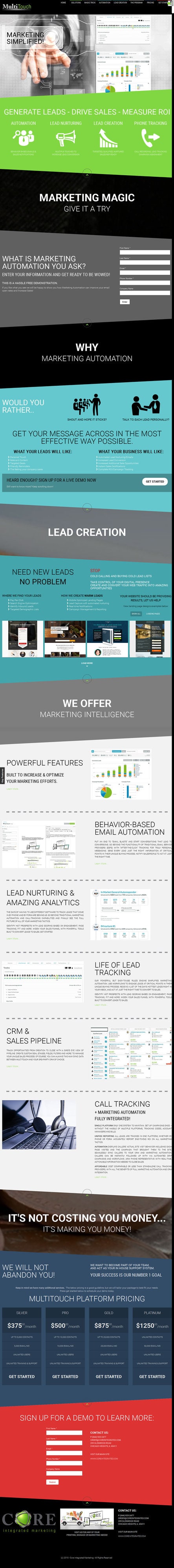
1. Too Many Choices
Landing page UX mistakes like offering too many actions without a focal point can leave visitors paralyzed by choice. When visitors land on your page and see a bunch of buttons, links, offers, or messages competing for their attention, they get confused. As a result, instead of taking action, they freeze or bounce.
It’s kind of like going to a restaurant with a 10-page menu. You just sit there forever trying to decide, and sometimes you leave without ordering anything.
Here’s a landing page that offers too many things at once.

A clean, focused landing page with one clear goal keeps things simple. Less noise = more action. Here are a few best practices to start with:
- Focus on a single goal or action (e.g., one primary CTA like “Sign Up” or “Learn More”).
- Eliminate unnecessary links, menus, or options that might confuse or overwhelm visitors.
- Keep the copy short and to the point—users should instantly know what action to take.
- Provide more information or choices only when necessary, and in manageable amounts. This is known as progressive disclosure.
If you’ve ever asked yourself, “why is my landing page not converting?”, this is one of the top culprits. Avoiding these cluttered layouts is one of the core UX design mistakes to avoid when building pages with clarity and intention.
2. Not Optimized for Mobile
If your landing page isn’t mobile-optimized, you’re basically telling half your visitors, “Good luck figuring this out.”
Most people browse on their phones, and if your page loads slow, text is tiny, buttons are hard to tap, or they have to zoom in and out just to read stuff.
The result? They bounce in seconds.
Poor mobile design is among the biggest landing page UX mistakes that most frequently go unnoticed until conversion data starts dropping.
Mobile-first design is at the heart of optimizing landing page user experience, and it’s a critical component of conversion-focused design today.
Consider these best practices while designing your landing page:
- Compress images, minimize code, and use caching to make the landing page load quickly on mobile.
- Use a simple, thumb-friendly navigation menu; consider a sticky header for quick access.
- Ensure buttons, links, and forms are designed for easy tap interactions (not too small).
- Avoid pop-ups as far as possible. These are harder to close on mobile, so minimize or remove them.
- Prioritize mobile-first testing.
With respect to content, keep text concise and easy to read; avoid clutter. For example, take a look at how Plated does it.


The layout is clean, the CTA button is nicely padded, and the text is easy to read.


3. Slow Load Time
A slow-loading landing page is the fastest way to lose people. If it takes more than a few seconds to load, most visitors are like, “Nope,” and hit the back button. We’re all impatient online, so if your page drags, it feels sketchy or just not worth the wait.
It doesn’t matter how amazing your offer is, if folks never even see it, they’re not converting. Speed = first impression, and if your page shows up late to the party, people are already gone.
Quick-loading pages are non-negotiable when it comes to landing page best practices for higher conversions. If your UX isn’t fast, it won’t last.
Here are a few tips to ensure your pages load quickly:
- Load images and other media only when they’re visible on the screen, not all at once. This is called lazy loading.
- Use a CDN to distribute content across multiple servers to load faster based on the user’s location.
- Store static resources like CSS and JavaScript files in the user’s browser cache for faster repeat visits.
- Ensure the critical content loads first by deferring non-critical elements.
- Pick a hosting provider with solid performance and low server response time.
All of these help support conversion rate optimization (UX) by ensuring that users stick around long enough to take meaningful action.
4. Poor Navigation
If visitors can’t quickly figure out where to click, what to do next, or how to find the info they need, they’ll just leave. Nobody wants to play detective when they’re trying to sign up or buy something.
Messy menus, too many links, or hidden CTAs just cause friction. Take a look at this block of embarrassment.

And the more friction, the fewer conversions. A good landing page should guide people like a smooth slide. One clear path, no detours.
Even a beautifully designed landing page can suffer if the navigation lacks direction—proof of how UX impacts conversion rates more than most people realize. To avoid that, keep the following best practices in mind:
- Use a sticky header or CTA button that follows the user as they scroll, keeping the conversion action visible and accessible at all times.
- Use arrows, icons, or subtle animations to direct attention toward critical actions like form fields or CTA buttons.
- If the landing page has multiple sections or steps, breadcrumbs help users track where they are and navigate back easily without feeling lost.
- If the landing page contains a lot of content, a search bar can help users find what they need quickly, reducing frustration.
- Avoid interstitials or pop-ups. These disrupt the navigation flow, so make sure any pop-up is well-timed, relevant, and yes, easy to close.
One extra tip: For mobile users, use hamburger menus or bottom navigation bars that keep the interface clean and easy to navigate with one hand.
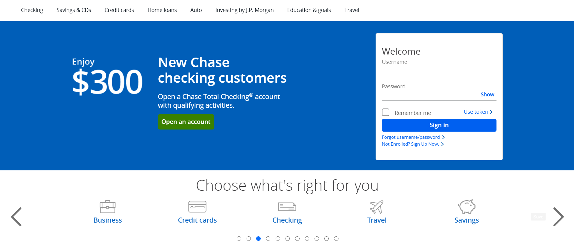
5. No Clear CTAs
When a landing page lacks clear CTAs, users don’t know what action to take next—even if they’re interested. A strong CTA acts like a signal that directs attention and triggers engagement. Without it, there’s no defined path, which creates hesitation and drop-off.
From a technical standpoint, unclear or missing CTAs disrupt the conversion flow. Users may scroll around, get confused, or click away because they don’t see an obvious next step. Even worse, multiple weak CTAs can compete for attention, splitting focus and reducing the chance that any one action gets completed.
Here are a few expert recommendations on CTA buttons:
- Instead of generic CTAs like “Submit” or “Click here,” focus on what the user will gain, such as “Get Your Free Trial” or “Start Your Journey.”
- Ensure your CTA stands out with contrast, size, and white space.
- For longer pages, keep the CTA visible by using sticky buttons or banners that follow the user as they scroll. This reduces the effort needed to navigate back to the CTA.
- Brief text like “No credit card required” or “Instant access” near the button can address concerns and add reassurance, encouraging users to take action.
- Test different phrasing, colors, and placements to determine which ones drive the most conversions. Regular testing can help refine and optimize for the highest engagement.
Finally, place your primary CTA above the fold, and for longer pages, repeat it at the bottom or after critical sections. Always make sure it’s visible without users having to hunt for it. Here is an example.

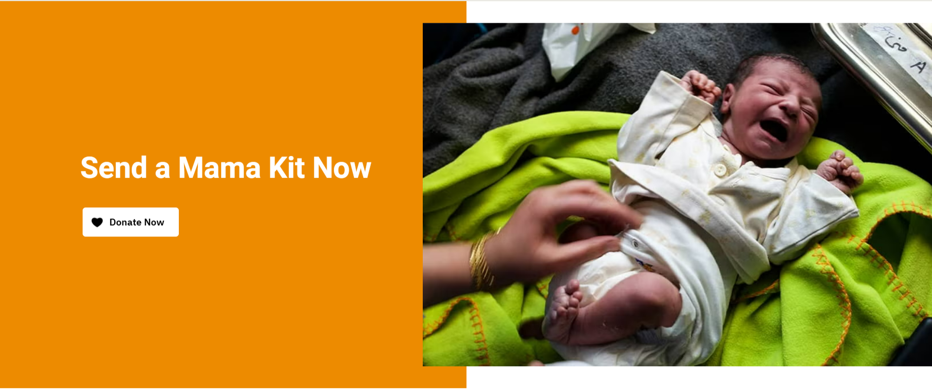
That’s the United Nations Population Fund. As you can see, just one CTA, and the job is as good as done.
Landing page UX is often the difference between a bounce and a conversion. By identifying UX design mistakes to avoid and following proven methods for optimizing landing page user experience, you create smoother paths for users.
6. Zero Micro-interactions
Micro-interactions are subtle but powerful elements of optimizing landing page user experience, reinforcing that users are in control and on the right path.
When a landing page lacks micro-interactions, it misses key moments to guide, reassure, and engage users. Micro-interactions, like button animations, hover effects, form field feedback, or progress indicators, act as subtle cues that confirm a user’s action is working or that they’re on the right track.
Technically, without these cues, the user experience feels flat and unresponsive. Users might click a button and wonder if anything happened, or start filling out a form and get no validation until the end, which increases frustration. These small gaps in feedback add up, causing uncertainty and drop-offs in the conversion funnel.
Well-placed micro-interactions reduce cognitive load, build trust, and create a smoother experience, all critical factors in keeping users engaged and moving forward.
Below are some highly actionable tips with respect to micro-interactions:
- Make buttons or links change subtly when users hover over them, like changing color, size, or even having a slight animation. This signals interactivity without being overwhelming.
- Implement real-time validation with immediate feedback. For example, if someone enters an email, show a “✓” when it’s valid and an error message when it’s not, in a smooth and non-intrusive way.
- Use subtle animations when users scroll down, like images or text appearing gradually or elements sliding in. This keeps the user engaged as they navigate through the page.
- Use small, purposeful animations in icons (like a spinning loading icon) or illustrations (like a character waving or a button pulsing), so it feels interactive without distracting from the main goal.
- For mobile, consider adding small sound cues or vibrations when a user interacts with specific elements (like buttons or form fields), but keep it minimal and optional to avoid annoying them.
Micro-interactions reduce cognitive load and build trust, both essential for conversion rate optimization for UX.
7. No Visual Hierarchy
In the absence of a visual hierarchy, users don’t know where to look first, what’s important, or what action to take. Their eyes just bounce around without any guided flow. That creates confusion, and confused users rarely convert.
Visual hierarchy uses layout, font sizes, colors, spacing, and element positioning to lead attention. If everything looks equally loud—or worse, equally dull—nothing stands out. Key messages, benefits, and CTAs get lost in the noise. Users miss what matters, and that breaks the conversion funnel.
Here’s a landing page with no visual hierarchy. This is a high-definition mess.

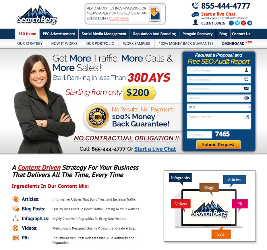
Image source: 99designs
A proper visual hierarchy is possible with these optimization tweaks:
- Make important elements like your headline and primary CTA larger and bolder than secondary content. This guides the eye to the most critical areas first.
- Use color to create visual weight: darker colors for more important elements, lighter tones for secondary ones. This guides users through the page based on the importance of each element.
- Use different font sizes and weights to establish importance. Make headlines and subheadings distinct while ensuring body copy remains legible but secondary.
- Ensure that important elements like CTAs, benefits, and value propositions are aligned in a predictable manner, so users can scan and understand the structure quickly without effort.
You can also use visual elements like badges, banners, or highlighters to draw attention to limited-time offers, key benefits, or value propositions, but only where it makes sense within the hierarchy.
Neglecting this leads to common UX errors in landing pages. Yes, a subtle yet impactful way UX mistakes hurt conversions.

8. Poor Use of Graphics
Poor use of images and videos creates visual clutter, slows down load times, and fails to support the message. If the visuals are low quality, irrelevant, or distracting, they reduce trust and shift attention away from the core offer. That weakens the emotional and informational impact you’re trying to make.
Heavy or unoptimized media files increase page load time, which hurts both user experience and SEO. If the media doesn’t reinforce the CTA or clarify the value proposition, it just adds noise.
Every visual element should serve a clear purpose—building trust, highlighting benefits, or guiding the user toward action.
In practice, here’s how that is going to work:
- If you use video, always set it to autoplay on mute. This grabs attention immediately without forcing the visitor to interact. Make sure the video is short (preferably under 30 seconds) and directly related to the CTA.
- For videos, use a well-designed thumbnail that clearly communicates the video’s value. A compelling thumbnail can increase play rates.
- Images and videos must adapt to various screen sizes (especially for mobile). Use responsive design techniques like srcset for images or implement a flexible video player to avoid cut-off or scaling issues.
- Overlay key points or CTAs directly on the media to ensure the message doesn’t get lost in the visuals. This helps clarify what the user should do after viewing.
When you’re using images, make sure they are original or highly customized. Stock images can feel inauthentic and reduce trust, while custom images or authentic photos build stronger connections with users.
The point is, every visual should serve the message. Otherwise, it’s just clutter adding to your list of landing page UX mistakes.
9. Unoptimized Forms
Overcomplicated forms are one of the most common UX mistakes hurting conversions that brands often overlook until it’s too late.
If a form is too long, asks for too much info, or has fields that aren’t clearly labeled, people are going to abandon it. From a technical perspective, long or complicated forms create friction in the conversion process, increasing the chances that users will drop off before submitting.
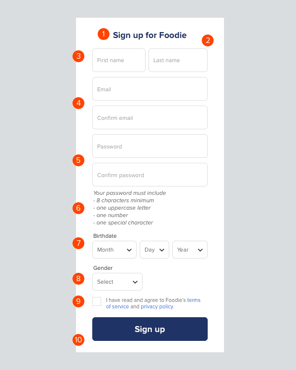
Below is an example of one such landing page sign-up form.

Other issues like slow form validation, error messages that aren’t clear, or a lack of mobile optimization can make the process even worse. If the form isn’t easy to fill out or doesn’t work smoothly on all devices, users will simply give up and leave.
If you’re searching for landing page best practices for higher conversions, this is a great place to start testing and iterating.
Here are a few recommendations that can come in handy:
- Use prefilled fields when possible (e.g., if a user is logged in) or pull in information from a previous form submission to save time and effort.
- Add helpful hints under form fields or next to buttons that guide users without overwhelming them. Short, value-driven explanations (e.g., “Get exclusive offers”) can motivate users to complete the form.
- Make forms easier to complete by allowing browser autofill and using input masks (e.g., automatically formatting phone numbers or credit card numbers).
- Single-column forms are easier to follow and fill out, reducing cognitive load. Avoid multi-column forms unless absolutely necessary.
- Break long forms into manageable steps with clear progress indicators to reduce abandonment.
- Display trust signals like security badges (SSL certificates, privacy policies) near the form to reassure users their data is safe.
Remember to continuously test different form layouts, fields, CTA copy, and button placements to determine which version performs best.
Wrapping Up!
A landing page is more than just a destination, it’s a guided experience crafted to convert curiosity into action. When UX mistakes slip through the cracks, even the strongest offers fall flat. Keeping things simple, intuitive, and user-focused ensures visitors stay engaged, confident, and ready to take the next step.