


Real estate email campaigns often fall flat simply because the templates too often feel undercooked.
At Email Mavlers, we’ve worked with a wide range of real estate clients, and one thing keeps showing up—again and again. There’s this persistent urge among designers to turn entire homepages into emails. It’s like taking a landing page, flipping it vertically, and cramming it into the email viewport.
Flipping the axes does nothing. In fact, it’s a disservice to email marketing. There’s so much more that can be done.
(Interactive real estate emails come to mind, though they’re few and far between!)
In today’s curation, our design team brings together a collection of real estate email examples that break the mold.
You want to make your real estate email campaigns count, right? Then stay put.


5 Brands Nailing their Real-Estate Email Campaign Templates
1. Plum Guide
Photography is the essence of real estate email templates, serving as the visual anchor that captures attention, builds trust, and drives engagement. In an industry where first impressions matter most, high-quality images bring properties to life, allowing potential buyers or renters to emotionally connect with a space before ever stepping foot inside. Well-composed photos not only enhance the aesthetic appeal of an email but elevate the perceived value of the listings, too, turning casual browsers into serious leads.
Which is why Plum Guide, a global vacation rental company, tops the list of our curation. See their real estate email photography.


Here’s why we think this email serves as the go-to template for all creative real estate email ideas:
- High-res close-ups highlight the unique character of each property.
- Diverse home styles and architectural details are vividly portrayed.
- Both interior and exterior views are showcased.
- Supporting elements, such as price, location, and CTAs, remain consistent to maintain focus on the imagery.
Importantly, use image blocks or modules that adapt to screen sizes (mobile-first design). Balance images and white space to avoid clutter and ensure scannability. Stick to optimal formats like JPEG for photos, PNG for logos/icons, and GIF/WebP for simple animations. Keep total email size under 1 MB to prevent clipping (especially in Gmail).
2. Programa
The human brain may process rounded shapes slightly faster and with less cognitive effort than sharp-edged shapes. In fact, some studies suggest that rounded corners can help direct the viewer’s attention inward, toward the content of the element.
Programa, a software platform designed specifically for interior designers and architects, seems to get this.

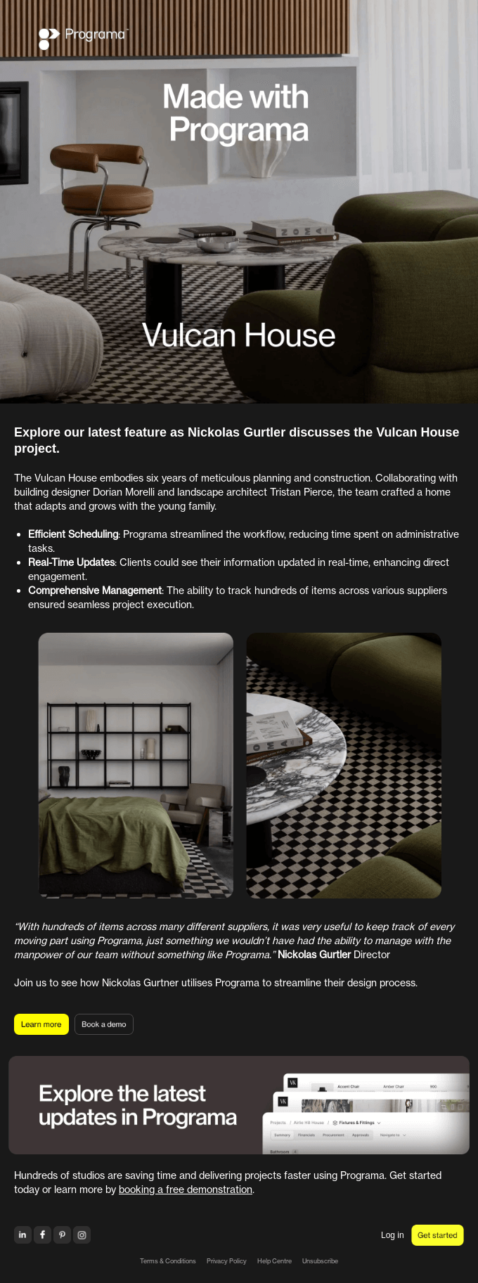
But that’s not the best part. Here’s why this email stands out:
- The dark color scheme offers a muted visual experience. This refined aesthetic creates a sense of sophistication, making the content feel premium while enhancing readability and contrast when paired with bright accents or high-resolution visuals.
- The bright chrome CTA buttons pop vividly against the deep gray background.
- Critically, the color scheme of the featured designs also aligns with that of the email template.
- The minimalist layout supplements the minimalist style of the featured designs as well.
Dark color schemes reduce eye strain in low-light environments, and create a sleek backdrop that makes bright visuals, text, and CTAs stand out with greater intensity.
Relatedly, make sure to optimize real estate email campaigns for Dark Mode.
3. The Expert
The zig-zag layout enriches the viewing experience by creating a dynamic visual flow that guides the reader’s eye naturally through the content. Alternating the alignment of images and text breaks monotony, adds rhythm to the design, and keeps the audience engaged from section to section.
This type of layout is widely used in e-commerce emails. But this one from The Expert elevates the pattern.

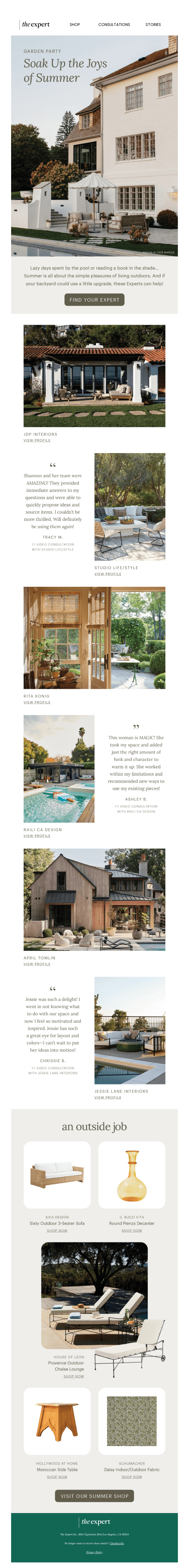
Here’s why we think this real estate email template stands out:
- The beautifully-shot hero banner immediately captures attention and sets the visual tone.
- The hero CTA is color-matched with the featured house, reinforcing design consistency and aesthetic harmony.
- Property listings begin in a distinct new section, creating a clear break in the layout.
- The third block adopts a “quadrant layout,” showcasing outdoor features around a centered image, resulting in a balanced visual storytelling.
- The footer stands out with a visually distinct design.
Overall, the Expert’s email is a nicely-choreographed visual guide, designed to lead the viewer through each section with precision and purpose. Not necessarily one of the best creative real estate email ideas, but it’s smartly done.
4. Dwell
This example points us to a critical aspect of email design, which is often overlooked in the frenzy over creative real estate email ideas, and that is the hook.
Like we said, photography is the essence of real-estate emails. But in a template full of brilliant shots, which one is the hook? Is it the hero banner simply because the email starts from there? The better way is to actually make the hero banner a powerful visual hook, so that it stands out from the rest of the images. So Dwell does exactly that. Take a look at this email.

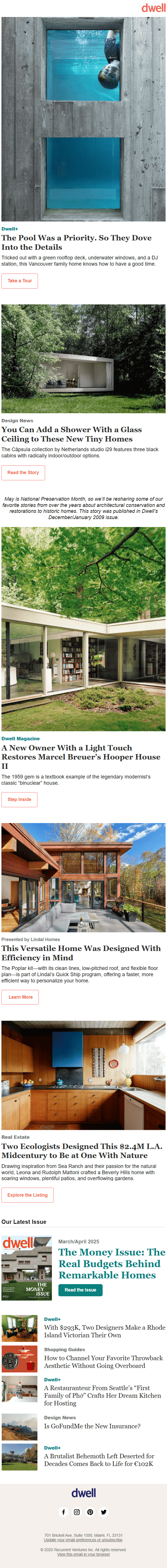
But apart from that, here are a few other reasons why we added Dwell in our curation of real estate email examples:
- The content-optimized CTAs supplement the diversified read.
- The listings are wonderfully shot.
- The single column keeps the design clean and easy to follow. It guides the reader in a top-to-bottom path, ideal for storytelling, unveiling listings in order of priority, or building toward a final action.
- Text and image go together in a graceful quadrille, thanks to the good use of negative space.
In fact, we also love the subtle CTA hierarchy from Take a Tour to Explore the Listing. It captures the experience of buying a property (from demuring to deciding), and unifies the email as a bonus.
5. Samara
We’ve already touched on white space, but it’s worth exploring its dual function. On one hand, it serves a negative function, reducing visual clutter and preventing overwhelm. On the other hand, it plays a positive role by making content pop. Samara’s email exemplifies the latter aspect. Here it is.

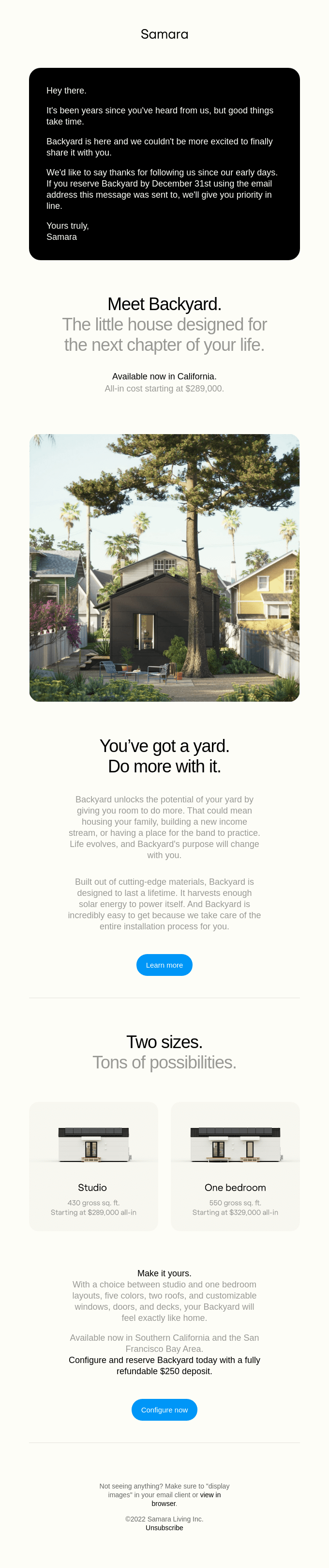
Samara’s is the cleanest email of all. However, there is more to it than meets the eye:
- The dark hero banner stands out both for its urgency and copy. The email proper, if you will, starts just after.
- Different font colors for different aspects of the content make it easy for the reader.
- The content blocks are set along the inverted pyramid, directing attention to the CTA at the apex.
- The amply-spaced text and image makes the backyard, the focus of the email, stand out.
The minimalist vibe of the email creates a sense of calm, clarity, and sophistication. By stripping away unnecessary elements, the design allows each section to stand on its own. The restrained color palette, generous white space, and clean typography work together to focus the reader’s attention on what matters most.
If it were up to us, we’d turn that central image into a carousel. Interactive real estate emails can be minimalist too.


Wrapping Up!
Take your pick from our curation of real estate email examples and make it your own. Unless you’re doing it the way these brands have been, real estate email photography alone can’t make it fly. Every real estate transaction is a one-time decision—and it hinges entirely on trust. That trust doesn’t appear out of thin air; it’s built through a strong, consistent relationship with your audience. And that relationship starts with emails that carry real, unmistakable intent.
Need help designing real real estate emails? Then get in touch with our email designers.