

In the email industry, the word ‘responsive’ is bandied about quite liberally. While people today are way more informed about responsiveness compared to 11 to 12 years ago, the term has also been reduced to a cheap branding tactic. Presumably, ‘responsive’ is next only to ‘gluten-free’ in our keyword-obsessed world.
With every other platform claiming to offer responsive templates, you’re right to be confused.
If you’ve been burned before, you’re more right to be skeptical.
Google, meanwhile, is no help with its ten trillion options, either.
So, we’ll peg it down to just 9 platforms where you’ll get the best responsive email marketing templates— for real! Let’s go.


Your Go-to Tool List for Responsive Email Marketing Templates
1. Mailchimp
Mailchimp’s email templates are fully responsive so that:
- You can use multi-column layouts, which will stack up when viewed on a mobile device.
- Large images in content blocks, instead of being stretched or cut off, scale automatically to fit the screen size.
- You can format text and button size, adjust padding, and edit divider height and width on the mobile version.

However, it is critical to keep in mind that not every device reacts to responsive code in the same manner. While Mailchimp uses media queries to test the capability of a device, and optimizes the templates accordingly, if your email still breaks when viewed on a particular device, you’ll need to consider custom coding.
Because responsive design depends on media queries, your emails will break on apps and devices which don’t support media queries e.g. Android Yahoo Mail App, Blackberry OS 5, Samsung Galaxy S3+, Windows Mobile 6.1, Windows Phone 7 and 8.
2. Selzy
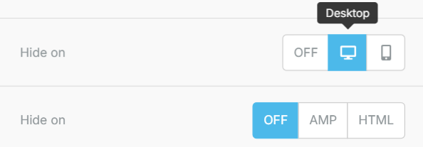
Selzy offers a nice, taut range of responsive email templates, from seasonal to e-commerce to tourism to B2B. You can preview a template before using it in the builder. The tool’s Display Control feature enables you to moderate device-based content visibility.
For example, if you need to hide article covers on mobile devices, you can adjust that with the Display Control feature.
Display Control is available on Selzy’s new builder. But users can still leverage the feature on the old version, as shown below.

You can also resize images for device adaptability in the following three ways:
- Use a slider to change size. The image res will change for the mobile screen as well.
- Select the auto width option which scales the image to max width for both mobile and desktop.
- Select the full width option if you need the image to be fully displayed on mobile, but not on desktop.
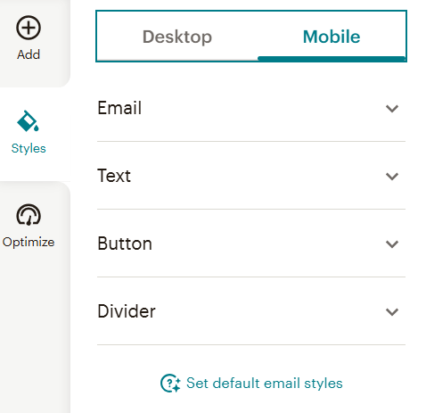
Selzy’s Menu block, too, is adaptable to mobile viewing by virtue of its being made Collapsible.
3. Klaviyo
As a responsive email design platform, Klaviyo offers a template library stocked with over 160 responsive email templates. The templates are easily customizable. You can use reusable content blocks and saved brand assets to fast-track the design process.
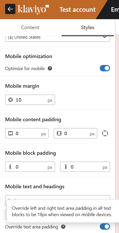
You can optimize emails for mobile viewing in the Styles section. Adjust content padding, block padding, and margin padding. The editor also provides quick tips on how you can automatically or manually optimize design elements for mobile devices.

You can preview emails on mobile devices where Klaviyo ensures that:
- Your email switches to single-column from multi-column
- Interactive elements like buttons and links are automatically enlarged and spaced-out
- Text size is enlarged on the mobile screen
- Images are scaled according to the mobile viewport size
Klaviyo allows you to switch between drag-and-drop and HTML editors. You can view the latter to see the use of media queries.
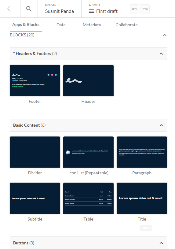
4. Dyspatch
Dyspatch, unlike most modern-day editors, allows you to create emails from the ground up. You can add your own brand assets, and start designing emails from scratch. By ‘scratch’ we mean that you’ll need to assemble the blocks on your own. The blocks are provided, you just drag and drop them where relevant. So, Dyspatch may be characterized as a module-only or module-first email editor. The builder has the following blocks:
- Header
- Hero
- Footer
- Title
- Subtitle
- Table
- Divider
- Buttons
- Images
- Layouts
Dyspatch offers a nice, rich library of responsive templates. Their Neopolitan template is recommended for mobile devices for its essentially lightweight design. Oxygen, Lifestyle, Mantra, Cleave, Cerberus, Airmail, Goldstar, etc. are some of the other templates.
Take a look at the inside of the builder.

Before sending, Dyspatch allows you to pre-select devices based on your email display, so that you can preview the email.
For example, you can preview how an email looks on all Dark Mode-friendly clients, and then generate previews.

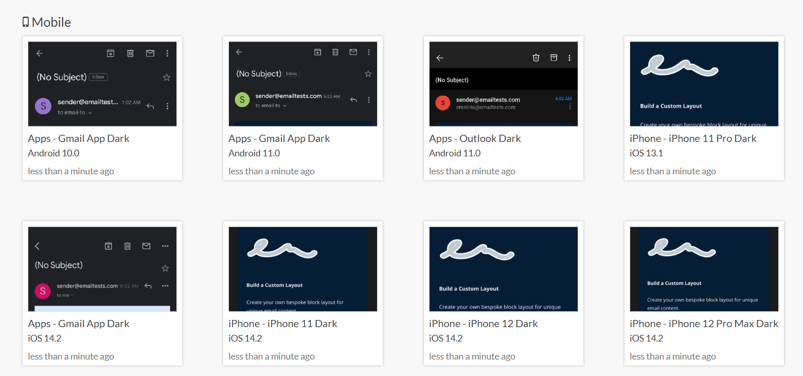
First-time users might find the builder a little challenging to work on. It isn’t your typical email builder interface. In addition, Dyspatch has a different conceptual framework; each template or email is based on a “theme.” If you’ve chosen Dark Mode, as in the example above, you’ll have to customize the code by going to the Theme editor so that Dark Mode renders on all clients.
5. MJML
MJML by Mailjet is a responsive email framework.
You can choose any template you need by selecting the relevant ‘tag.’ For example, if you choose newsletters, MJML gives you 12 responsive templates. Upon choosing your favorite template, you can then preview it on the Email Editor as shown.

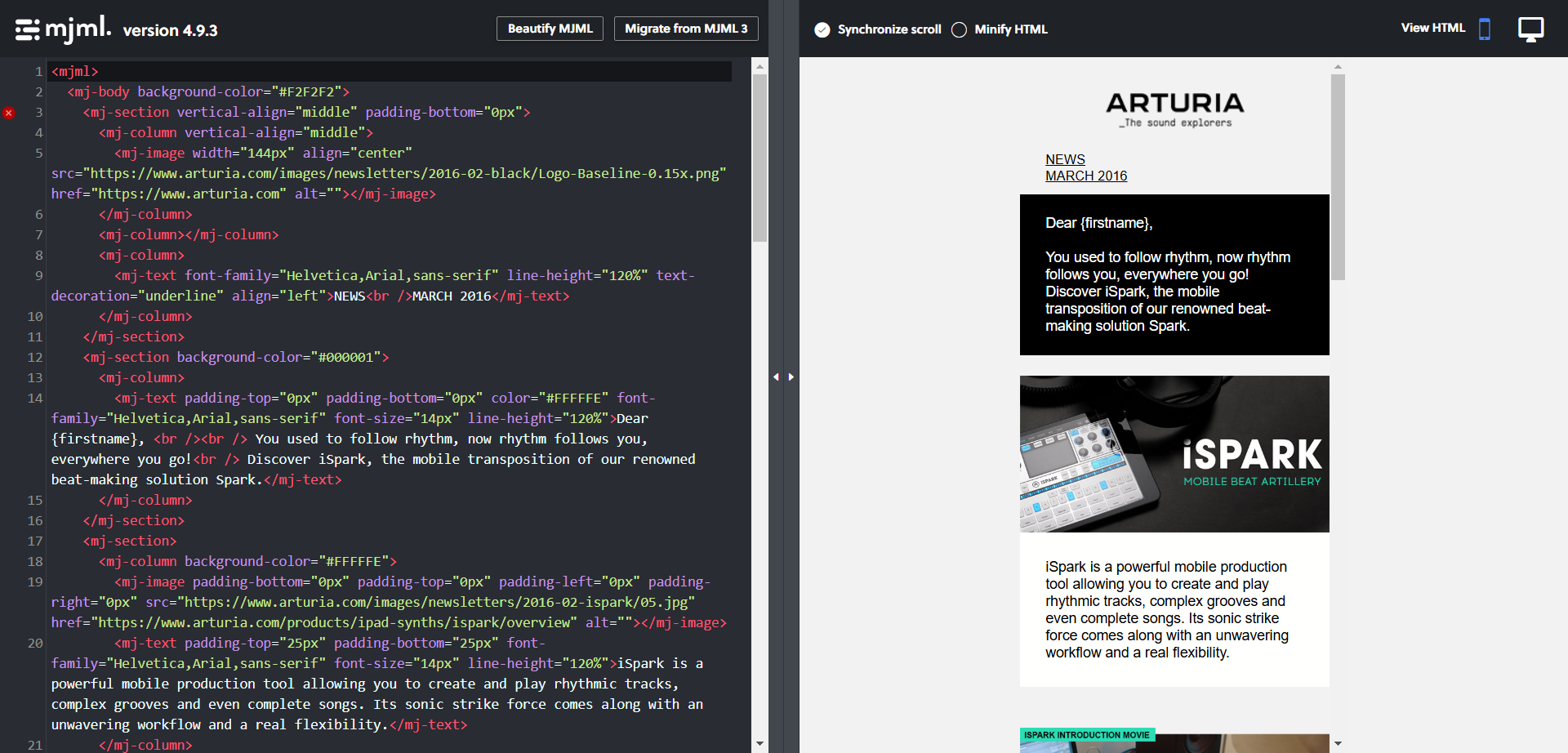
Don’t be alarmed by all that code. You don’t need to code your emails. You can use Mailjet’s Passport email builder to design responsive emails on the go. Passport is based on MJML. Take a look at the builder below.
The builder itself offers multiple pre-made templates to choose from. All templates are responsive. As a recommended best practice, you can do the following adjustments on the editor:
- Use a single-column instead of multiple columns.
- Optimize images for improved scalability.
- Add a device-optimized typeface, and moderate text size.
- Moderate CTA buttons for better clickability.
- Preview your emails, and do a test-send before launching a campaign.
6. Stripo
Stripo has a library of 1500+ responsive email templates. There is a template for nearly all kinds of emails/campaigns, such as:
- Welcome
- Abandoned Cart
- Chinese New Year
- Webinars
- Valentine’s Day
- Nonprofit
- Password Reset
- Survey & Feedback
- Signature
As an email builder, Stripo is intuitive, flexible, and templates are more or less easily exportable. The builder has the following customization options with respect to creating responsive emails:
- The “Mobile Formatting” tab lets you moderate the size of email texts, including header, footer, body, menu tabs, etc.
- In the same tab, you can also moderate the size of your CTA buttons. The Full-Width option fits the button to the mobile screen.
- Using the Alignment option, you can align various elements differently on desktop and mobile devices.
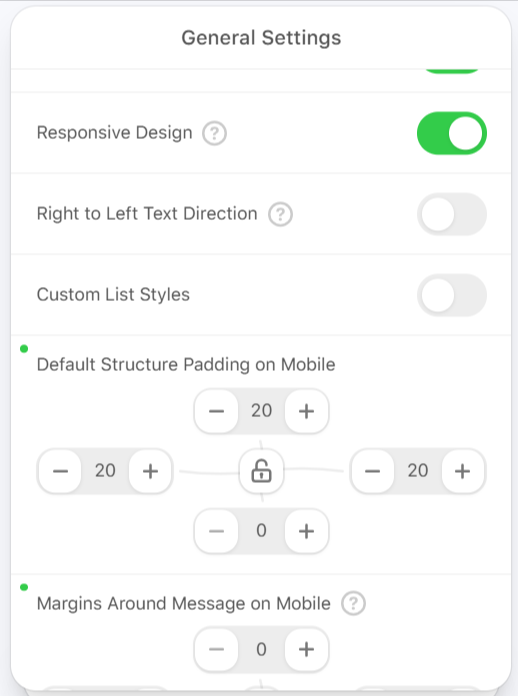
- The Mobile Padding feature lets you adjust the padding. Just click on a particular element, and enable Mobile settings where you can assign the necessary values to activate edits.
- The Containers inversion on mobile toggle lets you re-order the logical structure of product cards on mobile.
- The Responsive image toggle adjusts image size based on device. Enabling or disabling it is all you need to do.
Below is a snapshot of the mobile optimization setting in Stripo’s Demo Editor.

You can also export Stripo’s responsive email templates.
But, templates once uploaded on your preferred ESP may be a bit challenging to work on. Unless your ESP’s builder is equally sophisticated, you might have to do a few tedious workarounds for templates to answer to your needs. Even minor edits can be problematic. For example, the unsubscribe link; post-export, you may need to add the unsubscribe link yourself at the code-level.
7. HubSpot
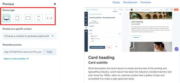
HubSpot’s email marketing templates are responsive by default. The platform’s email builder allows you to show or hide portions of content on mobile devices, and moderate how columns and other design elements appear on smaller screens. (Note that this feature is currently in beta.)
You can also preview the templates on multiple devices as shown in the image below.

HubSpot’s email builder ensures that all emails are responsive in the following ways:
- All templates use media queries in order to make images and tables responsive.
- Any table cell (<td>) that has a CSS class which contains the word “column” is made responsive; the columns are arranged horizontally or vertically on desktop and mobile, respectively.
- It adds a max-width to all images so that they fit the screen the email’s being viewed on at a given time.
- It automatically resizes images for optimized viewing.
- It asks users to make links and CTA buttons taller and wider than 57×57 pixels for the best mobile viewing.
- It offers pre-send client testing for a number of email clients and devices.
8. EngageBay
EngageBay offers 1,000+ free, responsive email templates. Their email builder is easy to use, perfect for beginners with no prior editing experience. Before sending emails, you can preview your templates on mobile, tablet, desktop, and laptop.


With EngageBay’s so-called Mobile Design Mode you can adjust text alignment, font size, and show/hide content.
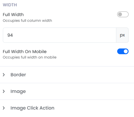
For example, on the right sidebar, you can adjust the dimension of a container based on the device. There is a separate Full Width on Mobile toggle; upon switching it on, the selected container occupies full width on mobile, as shown in the screenshot below.

EngageBay offers 70+ email templates spread across General, E-commerce, Events, and Celebrations. You might find the templates a bit outdated, and you may be right, but they’re more or less okay for starters. You can always import better templates.
9. Email Mavlers
With 12+ years of experience in email marketing template design and development, Email Mavlers is uniquely positioned to offer the best responsive email marketing templates. Till date, we have worked with over 5,000 brands and agencies across 52+ countries. Our team is platform-trained in 50+ ESPs. All templates are duly tested across 40+ email clients before delivery.
As we have been hinting throughout, responsive email templates can break. Of course, this has nothing to do with individual providers as such, but is related entirely to how email operates.
As already stated, the need for expert intervention is highlighted in the documentation of almost all the platforms on the list. Where not explicitly stated, custom-coding has been suggested as an alternative. Either way, the need for expertise is apparent.
This is not a criticism of the platforms. But the thing is, owing to the capricious nature of email clients, emails tend to misbehave post-send. By then, it’s too late, and there’s nothing you can do.
We can help you make your emails totally inbox-ready by:
- Ensuring your emails render seamlessly, regardless of your audience’s email client.
- Guaranteeing a flawless email on every device, from mobile to tablet to desktop.
- Providing clean, compatible code
- Optimizing images for smooth display, ensuring that they load correctly every time.
- Delivering accessible, inclusive emails
We are also experts in interactive emails, custom templates, and modular design. You can design your emails on any of the listed platforms, and, if you want to, get them coded by us.

Responsive Email Design Platform: Talk, Test, Choose
There is no dearth of responsive email design platforms. You’re now in a better position to judge if that’s a positive thing or not. Regardless, the fact remains that email being what it is, and email clients being what they are, responsive email design must be handled responsibly. It’s like putting the final card on the top, any misstep, and the house comes crashing down!
Speaking of being responsible, which platform you settle for is not a decision to be made hurriedly or by just one person.
In fact, having read our post, your next step should NOT be to go for any one of the listed ESPs. Take our recommendations as a starting point, and do your utmost to involve the relevant stakeholders in your decision. You can also get on a no-obligation call with us, and we will answer any and all questions.