

Over the past 12 years, our team at Email Mavlers has conducted countless email template audits. Time and again, accessibility issues have emerged as the most common and overlooked problem.
Despite the growing emphasis on inclusive design, accessibility remains widely misunderstood. As a result, it’s often undervalued. In fact, something as basic as ensuring your CTA—the revenue button—is fully clickable across all email clients and devices is still missed by many marketers. Which is surprising, if not shocking.
The stakes couldn’t be higher. If your subscribers can’t take action when prompted, your email won’t convert. It’s that simple!
In this guide, we’ll walk you through how to design CTA buttons that are reliably clickable and effective. Let’s get started.


What’s A Bulletproof Button?
Bulletproof email buttons are designed to display correctly and be clickable across all email clients and devices.
Why are these buttons “bulletproof?” Let’s break it down:
- Many email clients (especially desktop ones) block images by default for security or privacy reasons. If your CTA button is designed as an image, it won’t show up for these recipients, severely impacting your email’s effectiveness.
- Different email clients render HTML and CSS differently. A “bulletproof” button is coded in a way that ensures its appearance and functionality remain consistent, preventing broken layouts or unclickable areas.
- Image-only buttons are not accessible to users who rely on screen readers. Bullet-proof buttons, built with live text and HTML, are readable by assistive technologies.
- Image CTAs require images to be downloaded, which can slow down email loading times, especially on mobile data. HTML/CSS buttons load much faster.
Below, you can see that Burberry uses bulletproof email buttons. So the first is with images on, the second with images off.

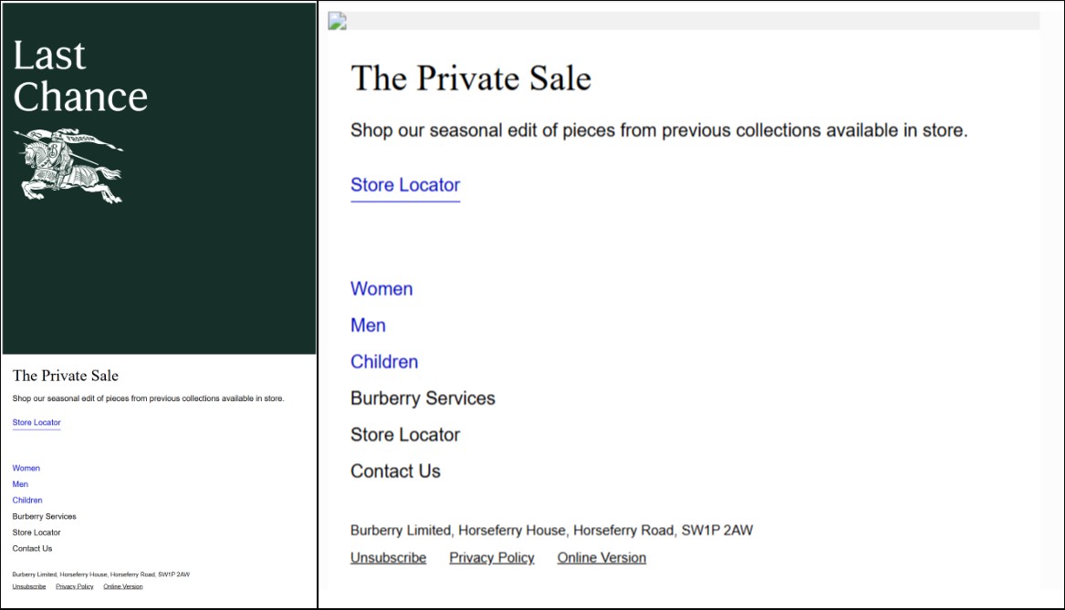
In both cases, the buttons are bulletproof, hence clickable.
But now, check out these variants of Bobbi Brown’s email. The first is with images on, and the second with images disabled.

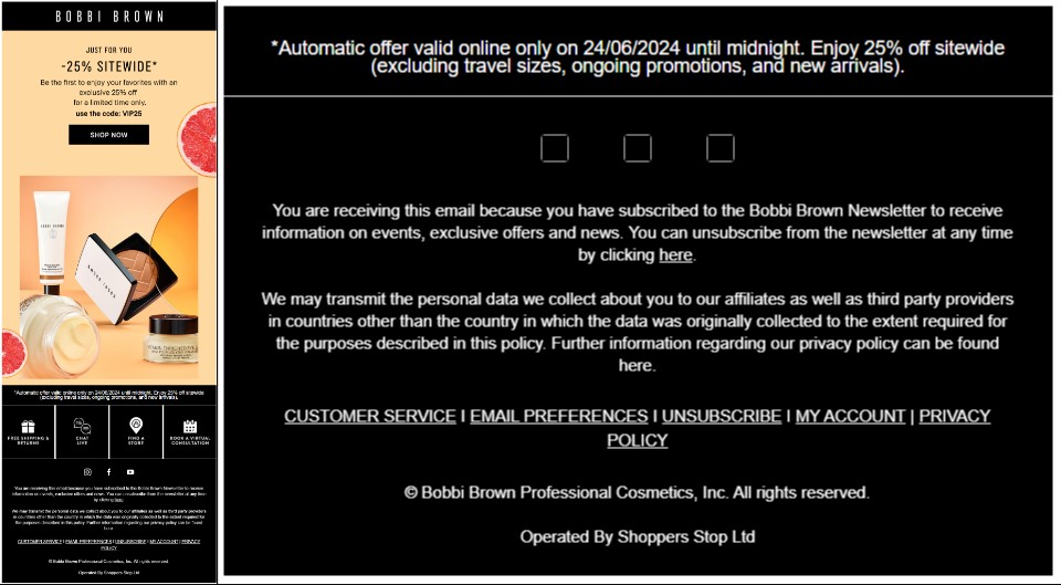
With images off, the entire email, barring the footer, is gone! That’s how serious an issue this is. So here’s why bulletproof email buttons are absolutely necessary:
- Because they always appear and are clickable, more people will see and interact with your CTA.
- Bulletproof CTA buttons make it easier for users to take the desired action.
- Email clients are less likely to flag emails as “spam” if they don’t contain image-only CTAs.
- HTML email buttons are simpler to update (text, color, link) than re-designing and re-uploading images.
Incidentally, live CTA buttons don’t need to be boring or off-brand. With thoughtful design, you can create bulletproof buttons that are visually appealing, fully functional across email clients, and perfectly aligned with your brand’s identity. Need proof? Try this email.
Now, let’s find out how to create bulletproof email buttons.
How to Code HTML Email Buttons?
Suppose we want to create this cart abandonment button for email HTML.

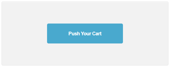
Now, here’s the code to create this HTML email button.
<table width="200" border="0" cellspacing="0" cellpadding="0" align="center" style="width:200px;">
  <tr>
    <td valign="top" align="center" class="em_defaultlink" style="color:#ffffff;">
      <div>
        <!--[if mso]>
          <v:roundrect
            xmlns:v="urn:schemas-microsoft-com:vml"
            xmlns:w="urn:schemas-microsoft-com:office:word"
            href="#"
            style="height:40px;v-text-anchor:middle;width:200px;"
            arcsize="60%"
            stroke="f"
            fillcolor="#49a9ce">
            <w:anchorlock/>
            <center>
        <![endif]-->
        <div style="background-color:#49a9ce; border-radius:20px;">
          <a
            class="em_btn_link"
            href="#"
            title="Push Your Cart"
            target="_blank"
            style="border-radius:20px; color:#ffffff; display:inline-block; font-family:Arial, sans-serif; font-size:16px; font-weight:bold; line-height:40px; text-align:center; text-decoration:none; width:200px; -webkit-text-size-adjust:none;">
            Push Your Cart
          </a>
        </div>
        <!--[if mso]>
            </center>
          </v:roundrect>
        <![endif]-->
      </div>
    </td>
  </tr>
</table>
So what’s happening in the code above?
This HTML code creates a stylized CTA button designed specifically for email compatibility across all major clients, including Microsoft Outlook. It starts with a centered table that acts as the structural container. Tables are used in email development to maintain consistent layout across platforms, and this one sets a fixed width to define the button’s size.
Inside the table is a single <td> element that centers its content and applies a white font color. The actual button is built using two layers—one for Outlook and one for all other email clients. For non-Outlook environments, the code uses a <div> with a light blue background color and rounded corners. Inside that, there is an <a> tag styled to appear like a button, with bold white text, no underline, and padding that makes the link look like a solid clickable area. Its width, height, font, and alignment are all controlled with inline CSS to ensure consistent rendering.
However, since Outlook does not support modern CSS like border-radius, the code includes a conditional VML (Vector Markup Language) block wrapped in <!–[if mso]> tags. This section defines a <v:roundrect> shape with similar styling: rounded corners, the same background color, and embedded centered text. This ensures the button appears correctly even in legacy Outlook versions that rely on Microsoft Word’s rendering engine.
Altogether, the code ensures that users see a consistent, clickable CTA button whether they’re using Gmail, Apple Mail, or Outlook
That’s just one way of creating a bulletproof CTA for emails. You can also do it by creating padded buttons and bordered buttons.
Types of HTML Buttons
1. Padded Button
A padded bulletproof button in email marketing is a bulletproof CTA button that specifically incorporates generous internal spacing (padding) around its text to create a larger, more visually distinct, and easily clickable area.
A padded button relies heavily on HTML tables. Email developers frequently wrap the <a> tag within <td> and <tr> elements of an HTML <table>. This table structure helps ensure consistent rendering of the button’s shape and padding across different email clients, as table layouts are generally well-supported.
Here’s the code for a padded CTA button.
<tr>
  <td valign="top" align="center" style="padding-top:20px;">
    <table align="center" border="0" cellspacing="0" cellpadding="0">
      <tr>
        <td
          bgcolor="#286633"
          style="background-color: #286633; padding: 10px 20px; font-family: Arial, sans-serif; font-size: 14px; font-weight: 700; color: #FFFFFF; text-align: center;"
          valign="middle"
          align="center">
          <a
            href="#"
            target="_blank"
            style="text-decoration: none; display: block; color: #FFFFFF;">
            Push that Cart
          </a>
        </td>
      </tr>
    </table>
  </td>
</tr>
This HTML snippet creates a simple, center-aligned call-to-action button for use in an email. It uses a <table>-based layout, which is a common and reliable approach in email development to maintain consistent rendering across different email clients.
The code starts with a <tr> and a <td> that introduces vertical spacing through padding-top:20px. Within this cell, another centered table is placed, acting as the button container. This inner table has no border, cell spacing, or padding at the table level, ensuring tight, controlled layout.
Inside this inner table is a single cell (<td>) that serves as the visual button. It has a dark green background (#286633), padding on all sides to give the button a comfortable size, and styling that defines the font family (Arial), font size (14px), font weight (bold), and white text color. The text is also horizontally centered.
Nested within this styled table cell is an <a> tag, which functions as the clickable link. The anchor tag is styled to remove the underline (text-decoration: none), match the button’s white text color, and be displayed as a block-level element. Making the link block-level ensures that the entire button area—not just the text—is clickable, improving usability.
2. Border-based Button
A border-based bulletproof button in email marketing is a type of bulletproof CTA button where the visual shape and definition of the button are primarily achieved using CSS border properties, rather than background colors or large amounts of padding.
The following code creates a border-based CTA button.
<tr>
  <td valign="top" align="center" style="padding-top:20px;">
    <table align="center" border="0" cellspacing="0" cellpadding="0">
      <tr>
        <td
          bgcolor="#286633"
          valign="middle"
          align="center"
          style="background-color: #286633; padding: 10px 20px; font-family: Arial, sans-serif; font-size: 14px; font-weight: 700; color: #FFFFFF; text-align: center; border-radius: 10px;">
          <a
            href="#"
            target="_blank"
            style="text-decoration: none; display: block; color: #FFFFFF;">
            Push that Cart
          </a>
        </td>
      </tr>
    </table>
  </td>
</tr>
The outer <tr> and <td> establish spacing above the button using padding-top:20px and center the content horizontally. Inside, there’s another table that contains a single cell styled as the button. This inner <td> has a dark green background (#286633), rounded corners (border-radius:10px), and text styling using Arial, bold, and white font for visual clarity.
Within the styled table cell is an <a> tag, which serves as the clickable link. The link is styled to appear as a block-level element so the entire button area is interactive, not just the text. The text itself is white and has no underline, making it clean and visually consistent with the button background.
It’s important to clarify that “bulletproof backgrounds” in email refer to techniques that ensure a background image, or a specific background color, renders reliably across the vast majority of email clients, even those that traditionally strip out or mishandle standard CSS background properties. This is especially crucial for older versions of Outlook.
HTML Buttons Best Practices
While coding HTML buttons, consider the following best practices:
- Apply styles directly to HTML elements using the style=”” attribute. This offers the highest compatibility across email clients, as many strip out or ignore <style> tags in the header or external stylesheets.
- Wrapping your <a> tag within <td> (table cell) and <tr> (table row) elements of an HTML <table> provides the most consistent rendering across various email clients, as table layouts are well-supported.
- Experiment with display: block; on the <a> tag or a nested <span> within the <a> to control how padding and width behave. inline-block is often preferred for more control over button sizing that adapts to text length.
- For older versions of Microsoft Outlook, you’ll need to include VML within conditional comments (“). This allows you to define a shape (like a rectangle) with a background color, border, and text that Outlook can understand.
- Apply a background-color property to the <body> tag, a <div>, or a <table> cell where the background is intended. This color should complement your brand and design, serving as a graceful fallback.
- Instead of trying to put a background on a top-level div, use a <table> with a width=”100%” and apply your background-color and background-image (and VML for image) to a <td> cell within that table, or to the <table> itself.
- Use background images for aesthetic purposes, texture, subtle branding, or complementary visuals. Ensure all critical information is conveyed through live HTML text, supported by a solid fallback color. Design your email so it still makes sense and is readable even if only the fallback color shows.
- Always, always, always test your bulletproof buttons across a wide range of email clients. Visual variations are alright, but functionality (being clickable) is non-negotiable.

Wrapping Up
Creating bulletproof buttons is a foundational step toward more accessible, reliable, and high-converting email campaigns. As we’ve seen, relying solely on image-based CTAs can result in invisible or unclickable buttons, rendering CTAs useless for many subscribers.
So the next time you design an email, make sure your buttons aren’t just beautiful; they’re bulletproof.
Need help fixing broken emails? Get in touch with us, and let’s get your email templates fixed! (Your first one is on us!)