


Ask any data guy, and they’ll tell you: the real excitement doesn’t lie in crunching numbers or wrangling datasets.
Rather, it’s in the insights that come alive through data visualization.
Take email heatmaps, for example.
At Email Mavlers, where we design and code over 3,000 email templates each month and conduct email audits, heatmaps are part of our everyday workflow. And while our designers might occasionally cringe at how heatmaps dissect their layouts, there’s a thrill in seeing exactly how subscribers interact with the emails.
But beyond the fun, heatmaps are powerful tools. By the end of this blog post, you’ll want to improve email layouts with heatmaps.
If your beautifully crafted emails aren’t delivering results, heatmaps might just hold the answers. Let’s get started then.


What are Email Heatmaps?
Simply put, an email heatmap is a visual tool that shows how your audience interacts with different parts of your email.
Practically all major ESPs offer heatmap tools for emails.
Using color-coded overlays, heatmaps reveal where users click, how far they scroll, and which areas attract the most attention. Warmer colors indicate high engagement, while cooler colors highlight areas of low interaction. For example, take a look at this grab.


Based on the color coding, the heatmap reveals a lot of things:
- The banner product received the highest attention.
- People may have zoomed in to view the product in detail.
- The CTA button could have been more specific.
In this way, based on such insights, you can use heatmaps for email optimization to fine-tune your design and UX strategies.
Unlike traditional analytics, which only provides numbers, heatmaps offer an intuitive, at-a-glance understanding of user behavior. This allows marketers to quickly identify which elements of an email are working and which need improvement.
Types of Email Heatmaps
Understanding the different types of email heatmaps is crucial for leveraging their full potential. Each type provides unique insights into user behavior. Broadly, there are two main types.
1. Email Click Maps
Email click maps are a visual reporting tool that provides a graphical representation of where recipients clicked within an email.
As far as email marketing is concerned, click heatmaps:
- Show exactly where subscribers are clicking within your email.
- Identify which CTAs, links, or images get the most attention.
- Reveal “hot” and “cold” spots, which we’ll explain in detail later.
2. Scroll Heatmaps
Scroll heatmaps show how far down an email recipient scrolls. They use a color gradient to indicate engagement levels, with “hotter” colors (like red or orange) typically signifying areas that receive more attention and are viewed by a higher percentage of recipients, while “cooler” colors (such as blue or green) indicate areas that are viewed less.
In email marketing, scroll maps can be very useful because they:
- Indicate how far down recipients scroll in your email.
- Highlight which sections are most viewed and which are not.
- Provide clues into content placement and email length.
Interpreting Email Heatmaps
Interpreting heatmaps is pretty easy once you understand the color coding and data overlays.
- Hot spots: Areas with the most clicks, scrolls, or attention. So ideally, your CTAs and key links should be here.
- Cold spots: Areas with little to no interaction.
- Scroll depth: If most users don’t scroll past the halfway point, your email may be too long.
So you look for patterns in email attention maps.
Are users clicking images instead of buttons? Is the footer getting more clicks than expected?
Do certain segments interact differently with the same email?
And so on. These insights can inform actionable template changes.
In our next section, you’ll get an idea of how to use heatmaps for email optimization.
Using Heatmaps to Optimize Email Template Design
Alright, so how does this all look in action? Let’s find out.
This is going to be fun as we milk email engagement heatmaps for real, transformative insights.
1. Identify the Hotspots
Use heatmap data to spot the areas of your email that receive the most interaction. Place your most important CTAs, offers, or links in these hotspots to maximize engagement.
For example, take a look at the following email heatmap analysis.


The middle section attracted the most engagement, indicating that users are particularly drawn to how-to content. Interestingly, none of the CTA buttons were clicked. This implies that the email’s performance may have relied on the images within the content tiles being clickable and redirecting to the relevant landing pages.
Now there’s a delicious takeaway nugget for senders right there:
Don’t restrict clickability to CTA buttons alone. Ensure that images also contain relevant embedded links to drive better interaction.
2. Refine Visual Hierarchy
A good visual hierarchy guides readers through your email, ensuring they notice key messages and CTAs.
For example, take a look at the analysis of this email from Doze.

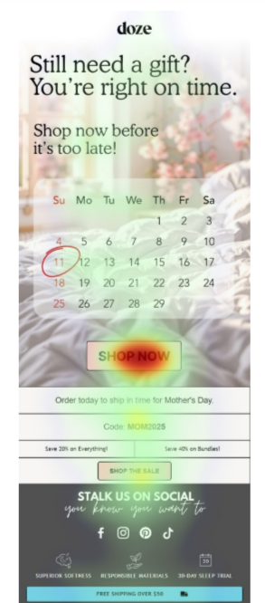
The hero space follows the inverted-pyramid hierarchy in which the visual flow culminates in the apex of the pyramid, which in most cases is the CTA button. Evidently, Doze gets this just right. As you can see, the primary CTA button is the hotspot.
3. Optimize Email Length
Scroll heatmaps reveal how far users typically read. If engagement drops sharply after the first section, consider shortening your emails or moving vital content higher up.
Consider the heatmap overlays on this email from LIV Swiss.

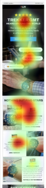
This email is an example of social proof. Now, the heatmap analysis shows that engagement peaked at the top of the email and the first Z-pattern tile, after which it gradually dropped to zero.
With respect to email length, LIV does a couple of things right:
- The thrust of the email is introduced in the hero space, and
- The Z-pattern tiles expand the testimonials.
But for even longer emails, email interaction tracking might suggest the addition of secondary CTAs or anchor links.
4. Reduce Distractions and Clutter
Clutter in email design is unfruitful. It overwhelms the reader, dilutes the core message, and reduces the likelihood of engagement If an email is packed with too many elements, it becomes difficult for the recipient to know where to focus.
And guess what? That’s exactly what the email heatmap analysis on this send from Macy’s reveals. Take a look at the hotspots.

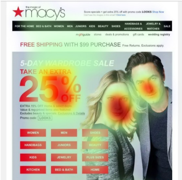
User confusion is literally written on the faces.
But jokes apart, such analyses reveal the mistakes that brands often make. They can be costly. In this case, the CTA block with 12 specific CTA buttons, didn’t register the slightest engagement. The discount offer was welcome, but after that, it’s just chaos.
5. Optimize for Plain-text Emails
Don’t forget heatmaps when it comes to plain-text emails!
Even without visual elements, plain-text messages can benefit from heatmap analysis to understand user engagement patterns. By analyzing click activity within a plain-text format, marketers can gain insights into how well the content structure guides readers and which CTAs resonate best. Most importantly, with the advent of AI summaries, heatmaps can give you highly actionable insights.
Consider the following email heatmap analysis. This email was sent by Robby Hurd, VP of Licensing at Musicbed.

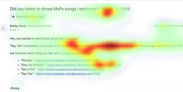
There is no engagement with the AI summary feature. Which shows that people love reading Robby’s emails first-hand, verbatim.
That’s definitely a positive sign. Note also that the part where the writer shares their favorite track saw the highest engagement, highlighting how users tend to connect more with the personal side of the brand. All these insights validate the sender’s approach.
Thus email engagement heatmaps can be an incredibly rich source of insights, whether they validate or disprove assumptions.


Wrapping Up
Before we wrap up, keep these best practices in mind when you do optimize email template design using heatmaps:
- Leverage heatmap insights alongside open rates, CTR, and conversion data for a complete picture.
- Test one change at a time.
- Prioritize heatmap analyses of mobile previews.
- Keep accessibility in mind.
Email heatmaps don’t just show you what’s working, they show you where it’s working. That’s a subtle but powerful distinction. Because in the inbox, every pixel is prime real estate.
Understanding heatmaps is less about fancy tools and more about curiosity. Curiosity about your audience, your message, and how the two collide in those few scrolling seconds of attention. So the next time your CTA gets ghosted, don’t panic!
Just open the heatmap. The truth is glowing right there in red!
Need help with email template design and coding? Get in touch!