

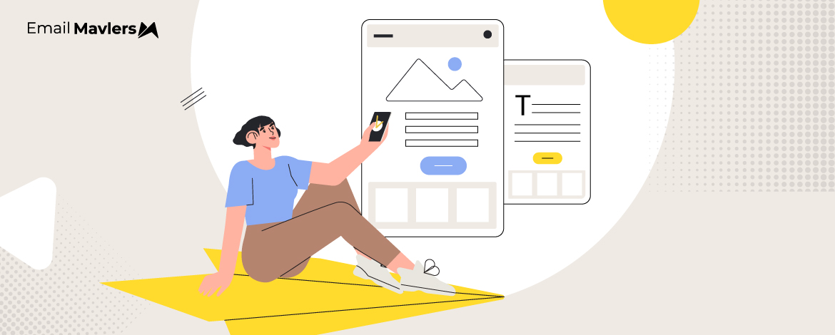
One of the evergreen pleasures of being an email designer? Staring lovingly at a Figma file packed with beautiful templates.
Bold colors, perfect layouts, bursts of color, and so on and on.
But, let’s be real: What looks dreamy in a Figma file doesn’t always survive the wild ride into the inbox. Layouts break, email clients invade your design, while some subscribers don’t even load images, leaving your gem email a sad stack of buttons and alt-text.
But that’s just how email works. And unless you follow certain best practices, your emails may turn out useless, though perfect.
That’s what we’re talking about today. At Email Mavlers, where we design and code 3,000+ emails every month, these dos and don’ts are second nature to us. Curious? Let’s jump right in!


The Dos of Using Images in Email Templates
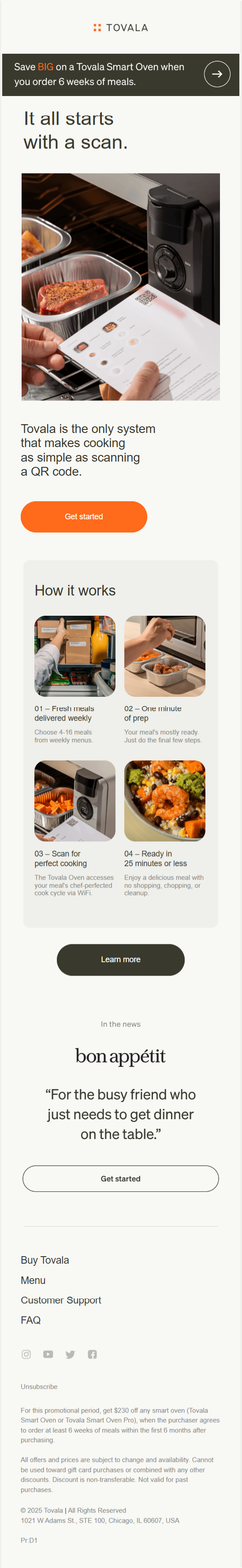
1. Do Use High-quality Images
Use high-quality, relevant images in email templates. Always select crisp, clear images that align with your message and brand. This is one of the most underrated email image best practices. As if image quality should only be the concern of fashion brands.
Below is an example of high-quality images in an email.

Ensure that each image supports the content of your email and resonates with your target audience. Whether you’re showcasing a product, illustrating a concept, or adding visual interest, the imagery should be purposeful, and aligned with your brand image.


Avoid generic or pixelated email template images, since they can reduce credibility and distract from your core message.
In fact, with respect to pixelated design, save these 5 email image best practices:
1. Always use original image files that have a sufficient number of pixels (e.g., at least 2x the display size in your email template, if not more) before any resizing.
2. Export images at the exact pixel dimensions they will appear in the email, and avoid excessively enlarging smaller images within your email builder.
3. Use image optimization tools (like TinyPNG, Compressor.io, or your photo editor’s “Save for Web” function) to reduce file size while maintaining visual quality, being careful not to over-compress JPEGs.
4. Employ JPEGs for photographs and complex images, and PNGs for logos, icons, and graphics with sharp lines or transparency, as PNGs handle these elements without compression artifacts.
5. Send test emails to various email clients (Gmail, Outlook, Apple Mail) and devices (desktop, tablet, mobile) to visually confirm images render clearly and aren’t pixelated.
Email image placement also plays a big role in improving UX. (There is a reason why hero banners come at the top.) The point is to create visual pathways that guide the reader’s eye through the most important information.
2. Do Add Descriptive Alt-text
Include alt text for every image to ensure accessibility for visually impaired users. It’s also useful if the image doesn’t load for some reason, as the alt text will still give context. Keep it simple and clear. Describe the image in a few words so readers don’t miss out on important info. For example, check this out.


This is the same email from Supply you saw in the last section.
As you can see, there is no alt-text for the CTAs, although clicking on the free-shipping link redirects you to the product page.
The thing to note is the “descriptive brevity” of the alt-text. You want to make the copy clear and fully informative. Focus on what’s important about the image in the context of the email.
So instead of saying “image,” write something like “Red sneakers on white background” or “50% off summer sale banner.”
3. Do Optimize Size & Format
Try to keep your image file sizes between 100KB and 200KB to make sure your emails load quickly and smoothly. Big, heavy images can introduce email image loading issues, especially on mobile devices or slower connections, which can frustrate your readers, or worse, cause them to close the email mid-load.
Stick with standard formats like JPEG for photos and complex visuals, and PNG for images with transparency or simple graphics like logos and icons. These formats are widely supported and usually strike a good balance between quality and file size.

If you’re using GIFs, do it sparingly. They can be fun, but they also tend to be much larger in size. If you do include one, keep it short, compressed, and relevant, ideally under 1MB, if possible.
With respect to GIFs, save these two email image best practices.
- Ensure the first frame of your GIF conveys the core message or CTA, as some email clients (like Outlook) only display the static first frame.
- Use fewer frames and simpler animations to reduce file size and avoid distracting, overly busy visuals.
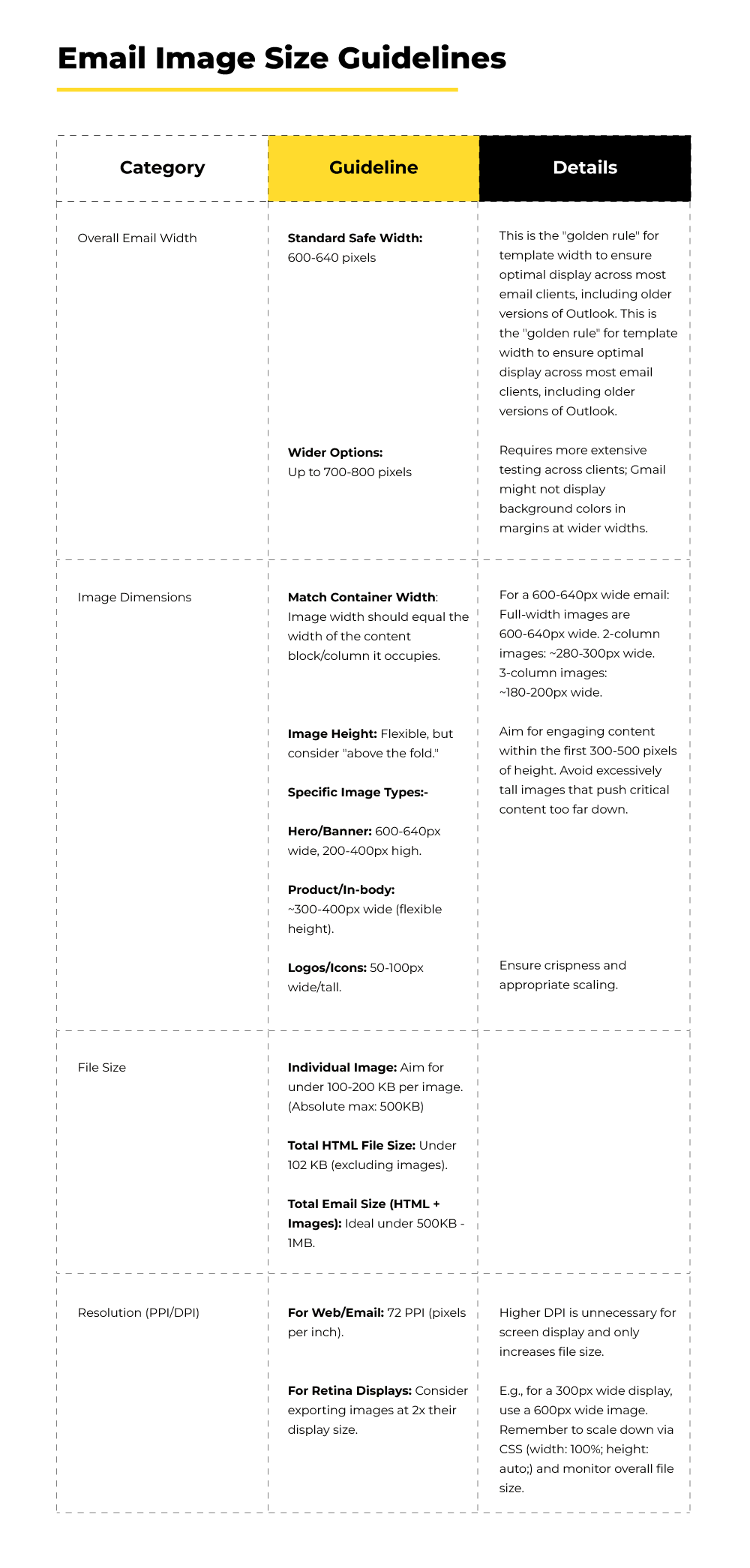
You may want to check out these email image size guidelines.

4. Do Stick to A Text-to-Image Ratio
If you rely too heavily on images, important information might get missed, especially if the images don’t load properly or if the email gets flagged by spam filters.
On the other hand, if all your emails are just a big block of text with no visuals, they can look dull and uninviting. The key is to mix both elements in a way that supports your message. Use images to catch attention or visually explain something, and use text to clearly communicate your core message.
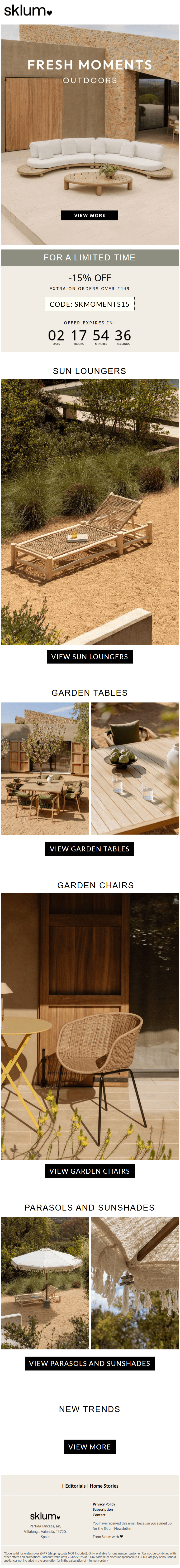
As an example, check out this Mother’s Day email from Grüns. It’s a nicely balanced use of text and images in email templates.

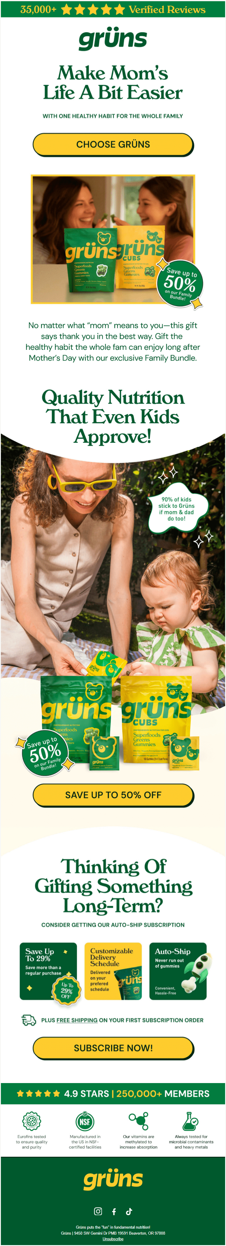
A text-to-image ratio not only keeps your email visually appealing but improves deliverability and accessibility, as well.
But what’s a healthy image-to-text ratio in emails, you might ask.
We recommend you aim for a 60:40 or 70:30 text-to-image ratio if you’re using images in emails, as well as text.
5. Do Design for Mobile First
Always design your emails with mobile in mind first. Most people check their emails on their phones these days, so it makes sense to prioritize how your message looks and functions on smaller screens. That means using a single-column layout, keeping text short and readable, making buttons big enough to tap easily, and ensuring images scale properly.
For example, here is what a mobile-first email looks like.

If an email looks great on desktop but breaks or becomes hard to read on mobile, there’s a good chance your audience will lose interest or skip it entirely. A mobile-first approach helps you focus on what really matters: clear content, fast loading, and easy navigation, so your message gets across no matter where your emails are getting opened.
This way, you’re covering all bases, but starting where it counts the most.
The Don’ts of Using Images in Email Templates
1. Don’t Use Images Only
Avoid sending emails that consist solely of images.
Why? Because clients block images by default and your message could be lost or flagged as spam. But that’s just one reason. Image-only emails are also inaccessible to users who rely on screen readers which cannot “read” text embedded within an image.
So for example, take a look at this email from Supply.

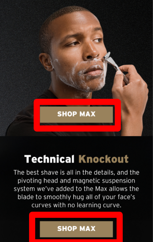
The text is fully embedded within the template. The screen reader can’t read the text; worse, it won’t parse the CTAs either.
Because the CTA text is also embedded in the template.
The best practice is to use live text, so that the CTAs at least can make it to the viewer. Because if CTAs fail, what’s left?

So avoid designing CTA images in email templates.
In fact, live text also improves load times and user experience, which reduces drop-offs. From a promotional standpoint, HTML text allows for better personalization, A/B testing, and dynamic content insertion, making campaigns more relevant and persuasive. And moreover, live text is searchable and indexable, providing better insight into campaign performance.
2. Don’t Clutter Your Emails
De-cluttering doesn’t necessarily mean de-imaging. So it isn’t the number of images that clutter, but how they’re set up.
Clutter is the consequence of the absence of white space. Take a look at the mess of email template images below.

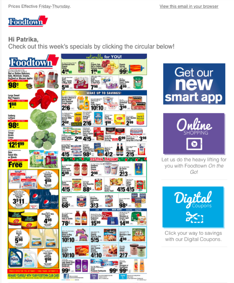
When everything in your email is crammed together, from text to images to buttons to headers, it becomes overwhelming.
On the flip side, a clean layout with well-placed spacing is what feels inviting and engaging. It has 5 key components:
- Generous white space
- Clear visual hierarchy
- Consistent alignment
- Defined sections
- Balanced content-to-space ratio.
Always keep in mind, white space isn’t wasted space. So don’t be afraid of using it in your emails.
3. Don’t Forget Dark Mode!
Missing brand logos, invisible text, inverted colors — these are just some of the issues in emails not optimized for Dark Mode. You might as well be sending out “email negatives,” so to speak.
For instance, check out this email from Neiman Marcus.

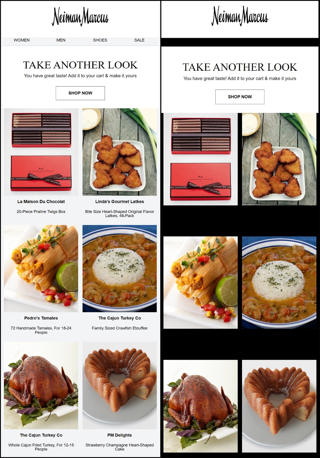
Since the email wasn’t optimized, in dark mode, the email ends up dropping the main navbar and product descriptions.
This usually happens when text or image colors don’t adjust well to dark backgrounds, causing content to either blend in or vanish entirely. As more users view emails in dark mode—especially on mobile devices—it’s crucial to design with that in mind. Otherwise, important sections of your email might not display as intended, leading to a confusing or broken user experience.
Trust us, dark mode optimization is one of the most touted email image best practices, but few know how to ace it.
Check out our blog post on Dark Mode emails where we show a lot of messed-up emails and also tell you how to reverse it.


Wrapping Up
Designing emails is a bit like designing a paper airplane in a wind tunnel. You can sketch the sleekest design, fold it perfectly, and still watch it nosedive the second it leaves your hand. Figma files are your dream. The inbox is reality.
So while images can absolutely make an email, they can just as easily break it if you’re not careful. Use them smartly. Respect the limitations. Work with the chaos, not against it. And above all—test on real devices, in real clients, and yes, in Dark Mode.
Because truly great email design isn’t just pretty. It’s bulletproof.
If you’re using images in emails, the stakes are higher. And email image optimization isn’t always DIY-friendly. Especially if you want to make custom emails, it’s a lot of coding to make it work.
Need help bullet-proofing your email design? Get in touch with our coding team, and soup up those mockups!