

Your landing page is often the first interaction a visitor has with your brand.
A clear, professional SaaS landing page design instantly builds credibility and trust. SaaS buyers want to understand what your product does and why it matters within seconds. SaaS is a crowded market. A good SaaS product landing page positions your offer uniquely, highlighting features, benefits, and use cases that set you apart from competitors.
The importance of this cannot be overstated when you look at the numbers:
- The average SaaS landing page conversion rate is about 9.5%.
- The median SaaS landing page conversion rate is 3.0%.
- Top 10% of SaaS pages convert at 15–25%, far outperforming others.
Keeping these in mind, investing in a thoughtful SaaS landing page design is not optional, it’s essential for turning visitors into trial users, subscribers, and long-term customers.
If you’re wondering why your landing pages for SaaS are not converting, don’t worry. Backed by UX best practices and persuasion psychology, our landing page design and development experts have helped 400+ businesses create pages that turn clicks into conversions.
We’ve put together essential insights, best practices, and examples to guide you in designing effective SaaS landing pages. Let’s find out what these are.

How to design a SaaS landing page that converts?
The building blocks of a good landing page for SaaS are UX and copywriting. With that in mind, let’s understand how these come together to create a page.
1. SaaS landing page copywriting tips
Effective copywriting can make the difference between a visitor bouncing and a prospect converting. Your words should clearly convey value, address user needs, and guide visitors toward taking action. Here are some essential tips:
- Anchor your value proposition with contrast: Don’t just describe what your product does, frame it against the alternatives. Contrast highlights where you stand out and prevents your message from sounding interchangeable with every other SaaS tool.
- Leverage specificity over general claims: Vague promises like “boost efficiency” are forgettable. Concrete outcomes and precise language make your product more credible and tangible in the reader’s mind.
- Adopt customer language, not corporate speak: SaaS buyers tune out jargon. Use words and phrases that come directly from customer feedback, reviews, or support tickets. When prospects see their own language reflected, it creates instant relatability.
- Show transformation, not just features: Features are the “what,” but users buy the “after state.” Frame your copy around the problems solved and the improvement customers experience once your product is in place.
- Use layered CTAs for different intent levels: Not every visitor is ready to start a free trial. Offer alternative actions to capture leads at various stages of readiness.
- Integrate objection-handling into copy: Every SaaS buyer has hesitations: complexity, time to implement, hidden costs. Address these proactively in your copy so prospects feel their concerns are anticipated and answered.
- Highlight persuasive micro-moments: Big headlines get attention, but small details often close the deal. Add reassuring microcopy to pricing tables, sign-up buttons, or forms to remove friction and reinforce trust.

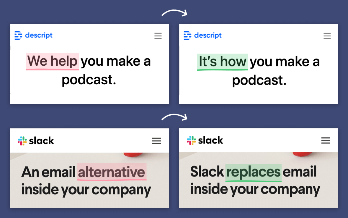
Source: Marketing Examples
2. SaaS landing page best practices for UX
In SaaS, UX shapes how quickly visitors understand value and how confidently they move toward conversion. Beyond the surface-level design of a basic SaaS landing page, the focus should be on guiding attention, reducing friction, and creating momentum.
- Engineer the first 5 seconds: Structure the top section of the page to immediately establish product relevance, value, and the next action without requiring scroll or interpretation.
- Collapse complexity into progressive disclosure: Break down detailed product information into layers, presenting essential value upfront and revealing depth only when the visitor signals interest.
- Design for the moment of commitment: Anticipate where a user is most likely to convert and remove friction at that exact point through seamless interactions.
- Prioritize hierarchy around intent: Organize visual and content weight based on user decision stages rather than aesthetic preference, ensuring the most conversion-critical elements dominate attention.
- Embed urgency and reassurance in micro-interactions: Subtle interface cues should reduce anxiety and nudge action by confirming safety, minimizing doubt, and signaling immediacy at decisive moments.
- Personalize pathways dynamically: Adapt messaging, layout, or calls-to-action to match the visitor’s context, intent, or profile, ensuring relevance without overwhelming viewers.
- Use trust signals as design anchors: Position social proof and credibility markers precisely where users encounter friction, letting them function as decision enablers rather than decorative add-ons.
- Design for testing velocity: Structure the landing page in modular sections that can be rapidly re-ordered, swapped, or tested, ensuring continuous optimization rather than static perfection.
SaaS UX isn’t about visual polish alone, it’s about designing an environment where visitors feel clarity, safety, and momentum, making conversion the natural next step.
Importance of CTAs in landing pages for SaaS
In SaaS, CTAs carry unique weight because the “product” is intangible and often complex. Unlike e-commerce, where the value exchange is immediate and obvious, SaaS requires a leap of faith: a trial, a demo, or a subscription to something unseen.

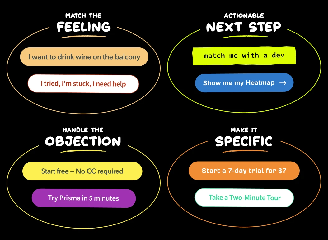
Source: Marketing Examples
CTAs therefore serve as trust contracts. They do not merely invite action; they must reassure the user that the action is low-risk, high-value, and reversible.
Below are a few tips for designing CTAs for SaaS landing pages:
- Design CTAs as conversion endpoints, not afterthoughts: Treat them as the focal point around which all messaging, design, and proof signals converge.
- Frame CTAs as trust contracts: Reduce friction by making the perceived action low-risk, high-value, and reversible.
- Architect layered CTAs for intent segmentation: Offer multiple, stage-appropriate entry points (trial, demo, resource access) to capture different buyer mindsets.
- Align CTAs with psychological triggers: Use placement, copy, and sequencing to directly address user hesitations and reinforce motivation.
- Reduce friction in form-related CTAs: Minimize fields and streamline steps to prevent drop-offs at the point of action.
- Repeat CTAs strategically: Include primary and secondary CTAs throughout the page to capture intent at multiple stages.
- Instrument CTAs for continuous optimization: Treat the CTAs as experimentation hubs, running high-velocity tests to uncover behavioral insights.
5 SaaS landing page examples
Seeing theory in action is the fastest way to understand what works. In this section, we showcase real-world SaaS landing page examples that excel in copy, UX, and conversion-focused design. These examples highlight best practices, innovative approaches, and subtle techniques that turn visitors into trial users and paying customers.
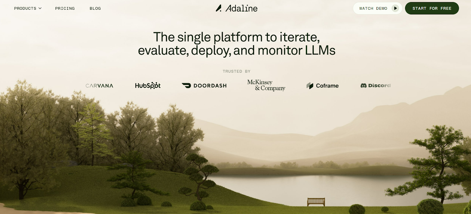
1. Adaline
Adaline is an AI technology platform that provides end-to-end capabilities for product and engineering teams to build, deploy, and scale AI-powered applications. It focuses on simplifying and accelerating the AI development process with tools designed for seamless integration and efficient management of AI models and data workflows.

Source: Adaline
Below are some of the reasons why Adaline tops the list.
- Immersive Experience: It uses a dynamic, nature-inspired theme with detailed parallax scrolling. This approach turns a simple act of scrolling into a captivating journey, making the user want to explore the site’s content.
- Narrative Flow: As you scroll, the environment and animations transition, guiding the user through the product’s features in a cinematic way.
- Branding and Innovation: The creative design aligns with Adaline’s product, which is a platform for building AI applications. This visual metaphor of a “digital garden” or evolving landscape suggests growth, innovation, and complexity handled with elegance.
- Strategic Layout: The use of a “card-type scroll” presents information in a linear, digestible format, preventing information overload. Each section is a self-contained unit that builds on the last, creating a cohesive and easy-to-follow narrative.
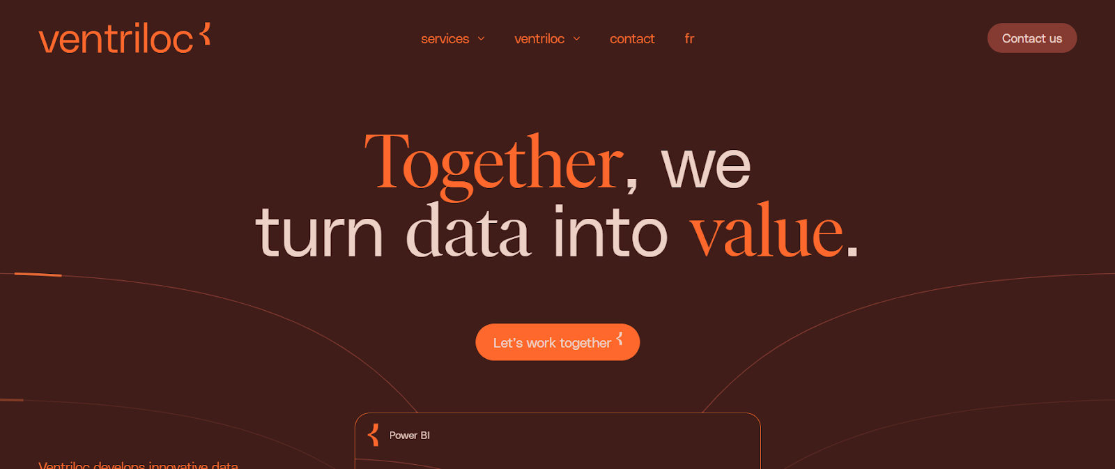
2. Ventriloc
Ventriloc is a company specializing in innovative data solutions to help decision-makers make informed choices. The landing page uses a rich, earthy color palette of deep browns and oranges with elegant serif typography, giving it a warm, professional, and reliable feel.

Source: Ventriloc
Core UX features contributing to Ventriloc’s landing page success include:
- Distinct Color Palette: The use of rich, earthy tones like deep browns and vibrant oranges is a significant departure from the typical blues and grays found in the tech industry. This palette makes the brand feel approachable and trustworthy.
- Elevated Typography: It uses a mix of elegant serif fonts and modern sans-serifs. The bold serif type in the hero section gives the site a high-end, editorial feel, repositioning data consulting from a purely technical service to a sophisticated, strategic one.
- Interactive Data Visuals: Instead of static images of charts, the site uses animated and dynamic visuals that feel like live dashboards. This “show, don’t tell” approach effectively demonstrates their expertise in data visualization.
- Structured, Non-Grid Layout: The layout avoids a rigid grid, opting for a more flowing, organic composition. This makes the site feel less like a traditional corporate page and more like a premium publication or an interactive experience
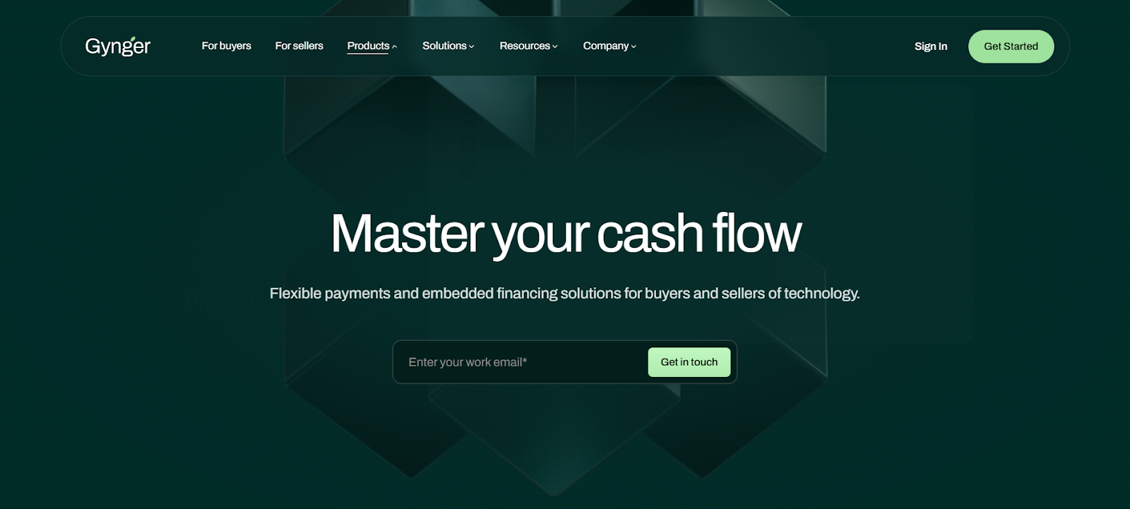
3. Gynger
Gynger is an embedded financing platform that provides flexible payment and AI-powered financing solutions specifically for technology purchases by businesses, enabling companies to buy software, infrastructure, and services.

Source: Gynger
Here are the core UX strengths that make Gynger’s landing page effective:
- The headline immediately communicates the core benefit, while sub-value propositions address specific pain points. Industry-focused messaging ensures the target audience understands the product is designed for them.
- Content emphasizes actionable benefits rather than features. Every section answers the user’s question, “What’s in it for me?” using language that resonates with executives and finance teams.
- Integration logos are prominently displayed to showcase compatibility, reliability, and enterprise readiness. Repeated placement reinforces trust throughout the page.
- The main products are presented with distinct, memorable taglines. Visual flows illustrate processes, making complex offerings easy to understand at a glance.
- Messaging is tailored to specific roles, guiding each persona toward relevant actions. “Learn more” links allow users to self-select their journey.
- Multiple clear CTAs guide users without creating pressure. Progressive disclosure offers sufficient information to spark interest without overwhelming.
This page balances being informative without being overwhelming, uses business-focused language, and provides multiple pathways for different types of users to engage.
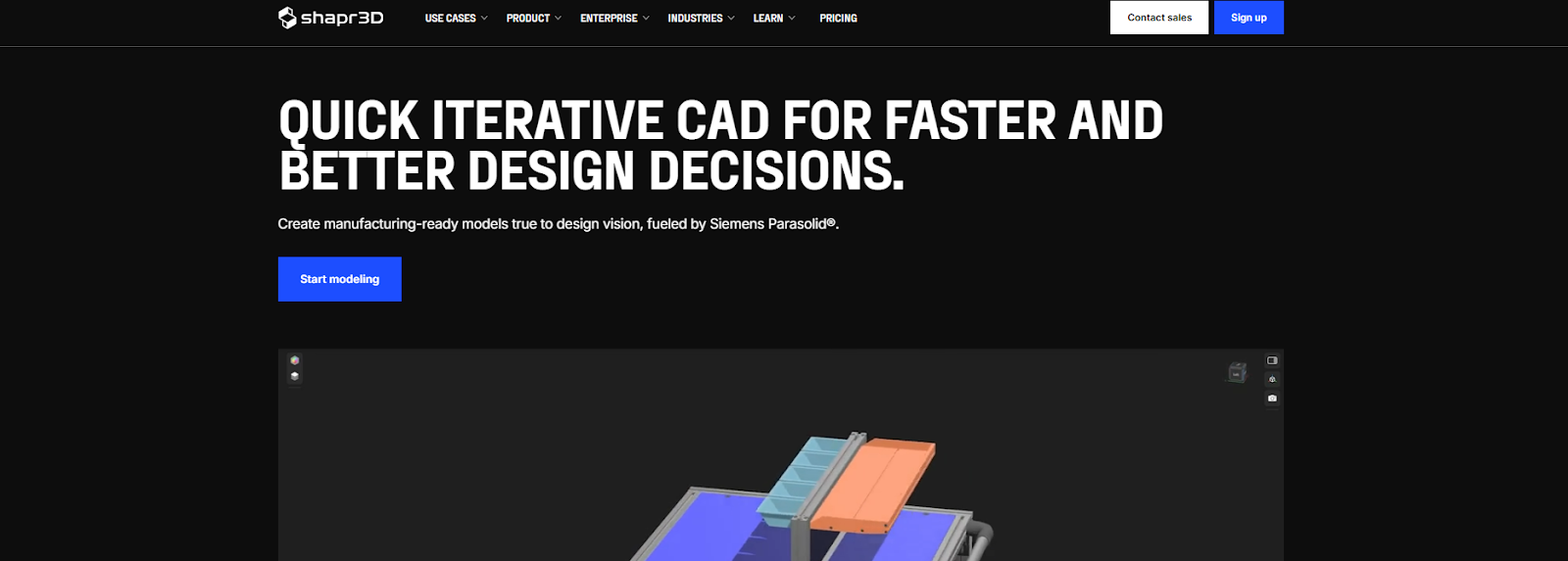
4. Shapr3D
Shapr3D is a Hungary-based software company that develops intuitive, professional-grade 3D CAD modeling tools, originally for iPad and now available on macOS, Windows, and Apple Vision Pro. The primary UX strengths behind Shapr3D’s landing page include:

Source: Shapr3D
- Sophisticated Dark Mode interface: White text on black enhances readability and makes content easy to scan. Primary CTA is prominently positioned upfront.
- Engaging live product animation: Provides an interactive preview of the product without requiring immediate action, capturing user attention.
- Focused feature presentation: Card-type scroll spotlights one feature at a time, reducing cognitive load and improving comprehension.
- Sectional contrast for storytelling: Later sections toward the bottom switch to a white background to highlight product success, benefits, and detailed information.
- Supportive content placement: The rest of the page is dedicated to social media pages, lead-generation CTAs, FAQs, and navigational links.
- Visual impact: Life-size product images in each feature section reinforce clarity.
- Minimalist color palette: Only three colors—black, blue, and white—create a cohesive and visually appealing design.
5. Adalo
Adalo is a no-code platform designed to help businesses build both web and mobile applications without writing code, using a drag-and-drop interface that simplifies app development.

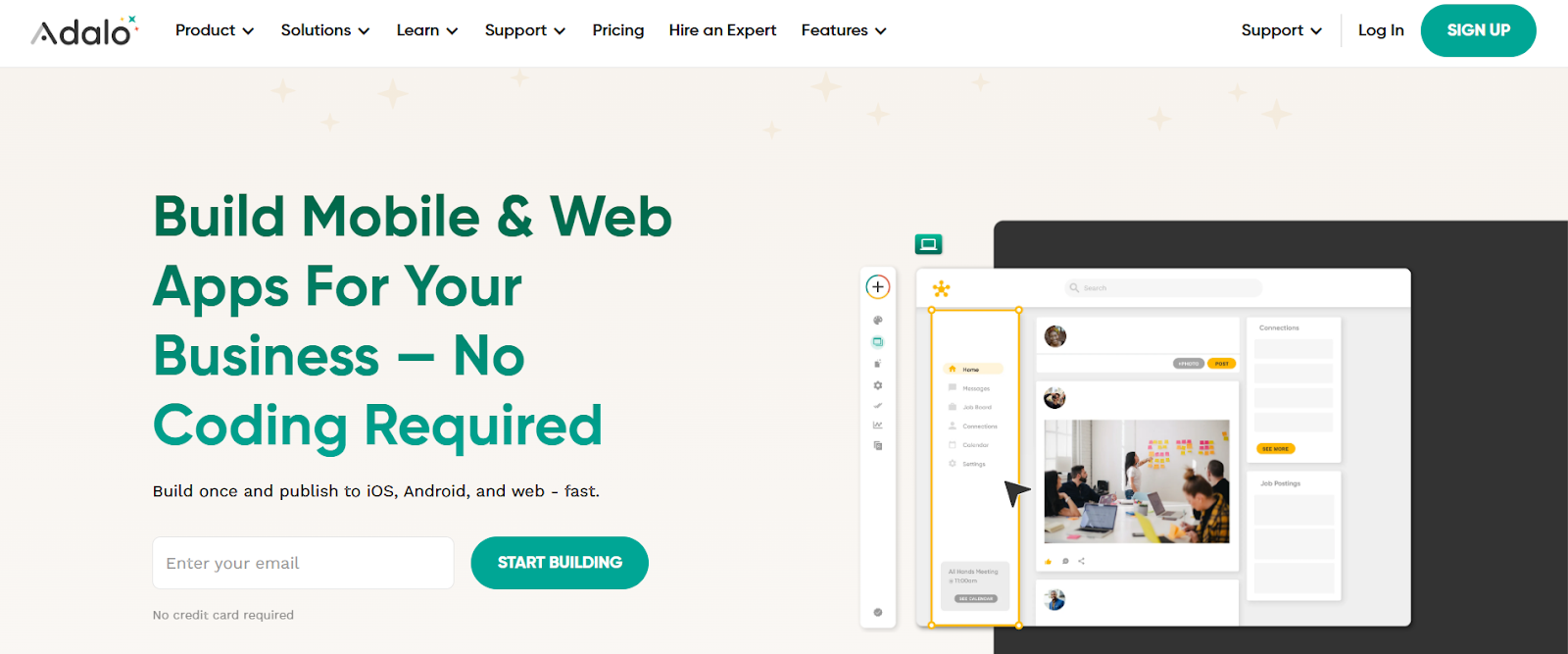
Source: Adalo
What makes Adalo’s landing page UX so effective? Let’s find out:
- Strong Visuals: The use of high-quality visuals, like mockups of apps being built and screenshots of the platform, helps users understand the product’s value and functionality at a glance.
- Clarity and Simplicity: The page’s main message is immediately clear. It states what Adalo is and who it’s for, and the user’s main goal is obvious with a prominent CTA. The design is clean, with ample white space.
- Social Proof and Credibility: The page builds trust by featuring testimonials, customer success stories, and logos of well-known companies that use Adalo.
- Clear Call to Action (CTA): The primary CTA is highly visible, uses a contrasting color, and is repeated at strategic points on the page.
- Animated product cards: Multi-colored cards highlight different platform aspects through motion, creating a dynamic and engaging experience.
For more SaaS landing page templates, visit SaaS Landing Page and Landingfolio.
A/B testing landing pages for SaaS
A/B testing landing pages for SaaS is less about button colors and more about systematically interrogating your value narrative, funnel mechanics, and user intent signals. At scale, it becomes a discipline of precision—validating hypotheses around copy, messaging hierarchy, and page architecture that directly influence perceived differentiation and willingness to convert.
With that in mind here’s a set of tips for A/B testing SaaS landing page templates:
- Test narrative hierarchy, not just UI elements: Focus on validating whether messaging order and framing resonate with executive versus practitioner audiences.
- Segment by acquisition channel: Run variants separately for paid, organic, ABM-driven, and referral traffic to uncover channel-specific response patterns.
- Design persona-aware experiments: Tailor tests for decision-makers, influencers, and end-users rather than assuming uniform response.
- Experiment with CTA framing by journey stage: Validate how “Get a Demo” vs. “Explore the Platform” performs across top-, mid-, and bottom-funnel traffic.
- Vary qualification friction: Test form length and required fields differently for inbound versus targeted accounts to balance lead quality with conversion.
- Run iterative, not one-off, experiments: Structure testing as a continuous discipline that evolves positioning and informs go-to-market.
Common mistakes in SaaS landing pages
Even the strongest SaaS products can lose credibility and conversions if the landing page fails at a design, development, or UX level. Many teams invest in campaigns and product messaging, but overlook execution details that shape the user’s first impression and decision-making journey. Frequent pitfalls include:
- Cluttered visual hierarchy: Poor spacing, weak contrast, or competing elements that prevent the value proposition from standing out.
- Inconsistent typography and sizing: Lack of clear rhythm across headings, subheads, and body text, making scanning harder.
- Generic or irrelevant imagery: Stock visuals that don’t reflect the product experience or customer context.
- Slow load times: Heavy assets, unoptimized images, and bloated code that frustrate users and inflate bounce rates.
- Weak mobile execution: Layouts that break, crowd, or lose functionality when viewed on smaller screens.
- Overly complex navigation: Multiple links, dropdowns, or external redirects that pull users away from the core funnel.
- Buried or repetitive CTAs: Buttons lost in design noise or clustered together without clear intent hierarchy.
- Lack of interactivity: Static pages that fail to demonstrate product dynamics or engage users with micro-interactions.
- Inaccessible design choices: Low contrast, missing alt text, or non-semantic code that limit usability for a portion of the audience.
- No progressive disclosure: Dumping information all at once instead of pacing it logically through sections and scroll.
These mistakes are not limited to B2B SaaS landing pages, but extend to all niches.
Final thoughts on SaaS landing pages
The best landing pages evolve continuously, fueled by data, experimentation, and a deep understanding of buyer psychology. They aren’t static artifacts; they are living assets that tell your product’s story, handle objections in real-time, and align every element to drive measurable outcomes.
If your current landing pages aren’t delivering the conversions you expect, it’s a signal to rebuild smarter. That’s where we come in.
Our landing page design and development experts blend UX strategy, persuasive copy, and scalable code to craft SaaS pages that turn curiosity into commitment.
Ready to build or optimize SaaS landing pages? Let’s build yours today.