

Getting people to show up for webinars on the day of the event is never easy. Live attendance falls short of total registrations. In fact, only 35-40% of registrants show up for webinars.
No matter how many follow-up webinar emails you send.
One effective way to bridge this gap is by sending more compelling webinar invitation emails.
And by “better,” we mean well-designed and well-written.
At Email Mavlers, where we design and develop over 3,000 email templates each month, our team has extensive experience with all kinds of emails, including webinar email templates.
For today’s roundup, our team curated some of the most impactful webinar email examples to inspire you. Let’s get started.


7 Webinar Email Templates That Get Registrations Rolling In
1. Neil Patel
Webinar email subject line: Zero traffic from Google?
Neil Patel’s webinar invitation emails, all written in plain text, follow a consistent pattern. Each of his emails has:
- An opening hook: A compelling insight, stat, or question to grab attention and set context for the topic.
- Problem/trend statement: Explains a current challenge, shift in marketing, or opportunity to make the webinar relevant.
- Webinar invitation: Direct link or text urging the recipient to register or save their seat.
Take a look at one of Patel’s latest webinar invitations.

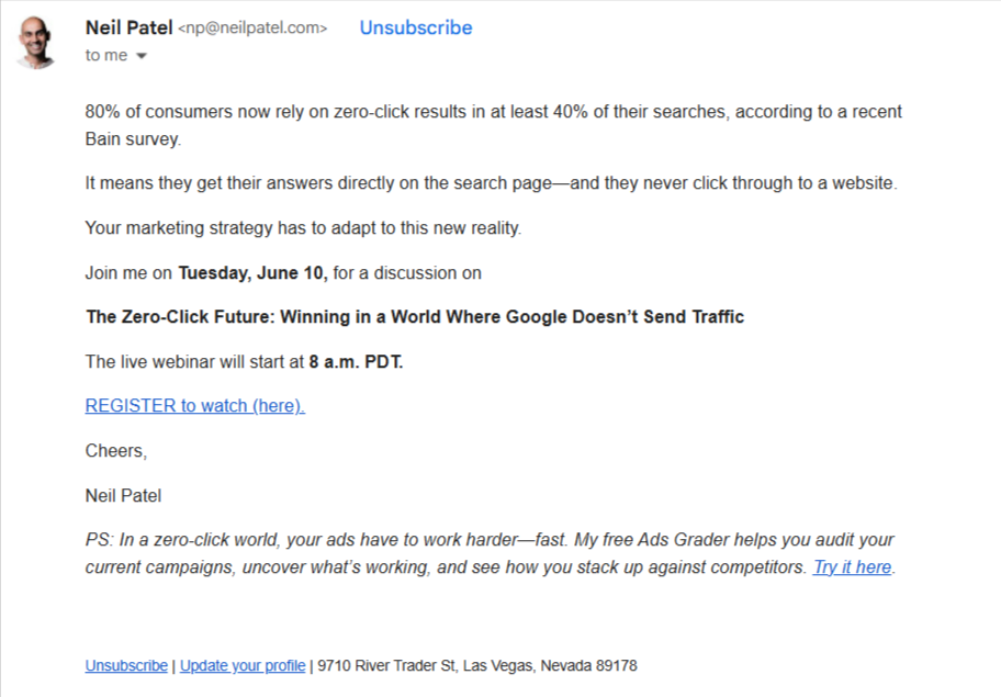
Source: Inbox
It’s quite an effective way to compose a webinar invitation email; a time-tested copywriting template. But make sure you are a good writer. If not, you can get such emails written by an expert. Where possible, you can use gen AI to brush it up.
So if you want to send out plain-text emails, remember to:
- Highlight relevant details and links. Leverage formatting to the max to grade priority content.
- Verify whether or not the links are working.
- Keep your sentences short. Limit paragraphs to no more than three lines. Make it skimmable.
You should use P.S. plugs where needed. Avoid faking urgency. And make the time zones clear. Change the subject line in the webinar follow-up email while keeping the preheader and body as is. Just in case the recipient missed it the first time.
The follow-up to the above email has this subject line: Is traffic still king? Only the body and preheader are intact.
Importantly, follow up on your webinar email without deviating from the format of the first email.
2. Zapier
Webinar email subject line: [Webinar] How Zapier’s GTM leaders are using AI – Don’t miss out!
If you want to send HTML or text-based emails, the hero space is where you give it away, followed by a CTA button.
Zapier’s webinar invitation emails stick to this pattern.

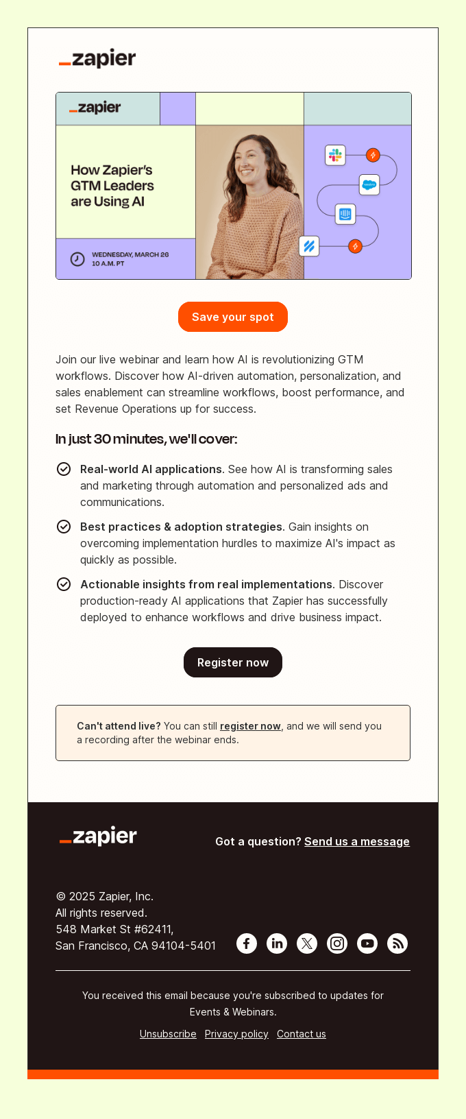
Zapier’s webinar email stands out for the following reasons:
- The invitation consists of an information hierarchy. First, the top-level details which the hero image reveals. Next, the details of the webinar encapsulated in the bullets. Lastly, it has a message for those who can’t attend live.
- Along with information hierarchy, the invitation has a CTA hierarchy for two levels or kinds of action.
- The email is brand-optimized. (Now that’s something you’re going to miss in the case of text-only emails.)
The key takeaway from Zapier’s email is: Use the hero space for the most important information. The recipient shouldn’t have to scroll for date, time, webinar subject, and the primary CTA.
3. Turbo Tax
Webinar subject line: Need help with Child Tax Credits?
How many experts are lined up for your webinar? If one, make sure to headline the invitation with their headshot.
Check out how Turbo Tax has done it in one of their webinar email templates.

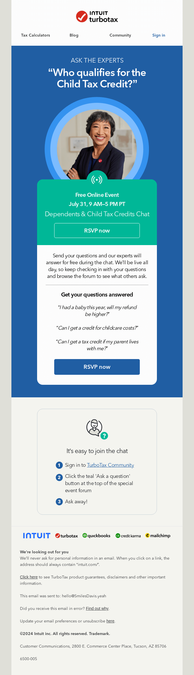
Just from the design perspective, TT’s email is quite interesting. And here’s why we think so:
- The banner overlays “dimensionalize” the content, creating a fractal-like viewing experience that draws your eyes toward the smallest visual module. In the present case, the smallest module contains date, time, and RSVP — the most relevant details related to the webinar.
- The layered approach works both ways. After the first CTA, the module expands to the next CTA.
- Both the CTAs are the same, but they don’t feel redundant.
The key takeaway? Use the layered design approach if you feel like you want to repeat something without seeming repetitive. And you may feel that way since you crave a large audience for your webinars. So overdoing it is natural. But you should do it smartly.
It’s also best practice to design a webinar follow-up email to keep it handy. You can tweak the copy a bit.
You can also tweak the hero space. Maybe another headshot of the expert, or a simple animated GIF just to salt it up.
4. Vimeo
Webinar subject line: Join us for a webinar with Asana.
If you have multiple experts, the same rule applies. Headline your invitation with their professional headshots.
Here’s how Vimeo does it. (You can optimize the image frames as per your brand palette. Similarly, you can add effects to the headshots; but make sure not to render the faces unidentifiable.)

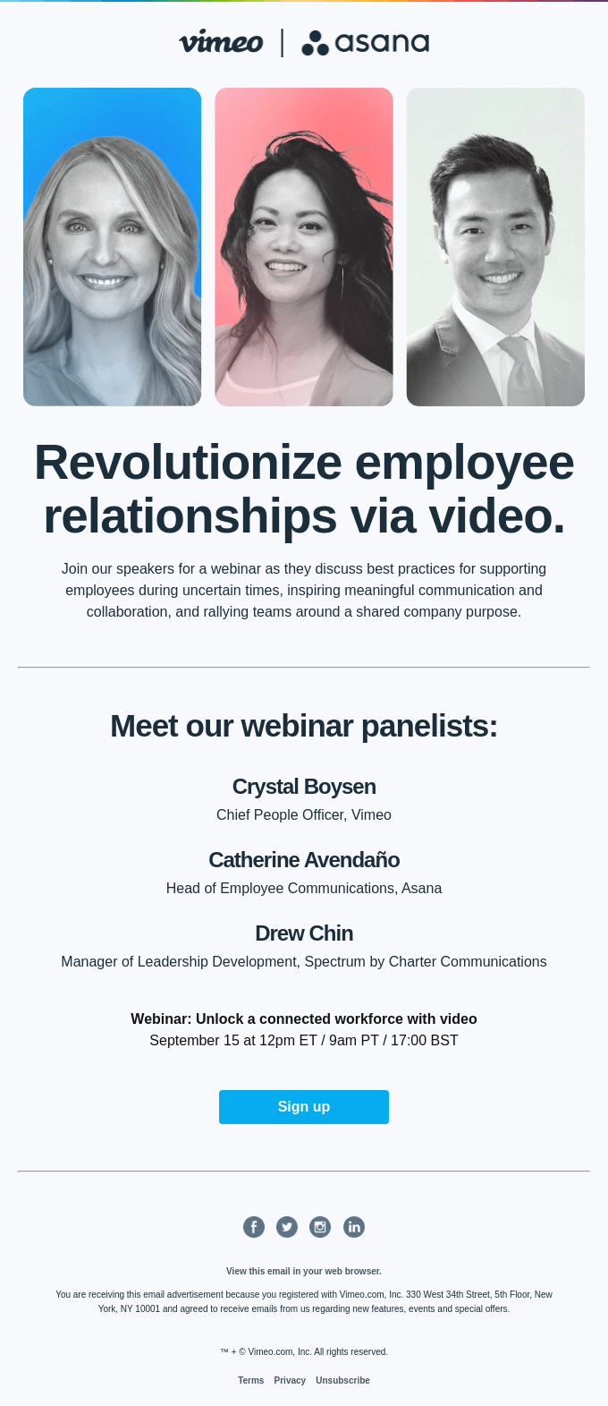
There isn’t too much going on in this email. However, there is one very important design strategy used here.
And that’s the popular inverted pyramid technique.
You’ll notice a pyramid structure in the email: it starts broad with the headshots and gradually narrows down to the CTA. The goal? To lead the recipient to the CTA button. A proven hack. Run with it.
5. Play App
Webinar subject line: Join our live webinar tomorrow
Quite distinct from the examples so far, Play App sends a branded webinar invitation. Have a look.

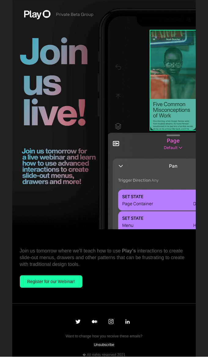
The dark color scheme is beneficial for a number of reasons:
- Improves readability in low-light environments.
- Especially helpful for users who check emails at night or for extended periods.
- A dark color scheme is modern and sleek.
- It makes links and buttons pop, which is a major advantage in the case of webinar emails.
The key takeaway is that if you’re sending HTML invitations, Dark Mode optimization is absolutely critical. Unless it’s a text-only email, your follow-up webinar email should also be optimized for Dark.
6. Pineapple Collaborative
Webinar subject line: Food Styling 101 ✨
Generally, concise copy, use of bullets, etc. are recommended for most webinar email templates.
You don’t want to hold up the recipient for long. Skimmable is the rule of thumb. And the webinar email examples we’ve seen so far stick to that. Even Neil Patel’s text-only invites are short and sharp.
But then, here’s a webinar invitation from Pineapple Collaborative. At first glance, it breaks all the rules, doesn’t it?

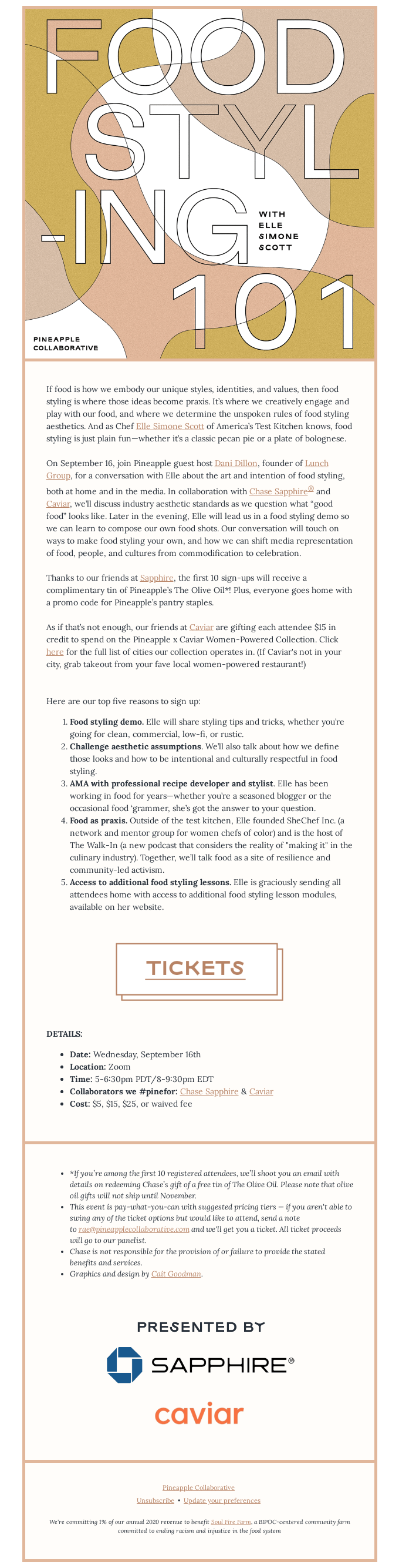
This is a long, if not long-winded, email. How do we explain this? It’s clearly a departure from established best practices.
Here’s what. Food copywriting follows its own unique set of rules and techniques, distinct from general copywriting.
It centers on evoking the senses through rich, descriptive language, crafting a mouthwatering narrative that draws readers in. Storytelling and emotional resonance also play a key role in making the message more enticing and memorable. Consequently, the copy tends to be long. And subscribers and readers are trained for it. So that’s what makes the Collaborative’s email what it is.
It’s a text-based email. From the design perspective, the hero image and the Word Art-style CTA button are the highlights.
So the key takeaway from all this? Be consistent with your niche as well as your brand. Even when inviting people for webinars.
7. A Kids Book About
Webinar subject line: Introducing… A Kid Asks About!
Here is a Q&A invitation which you can draw inspiration from. This isn’t a B2B webinar invite, but just take a look!

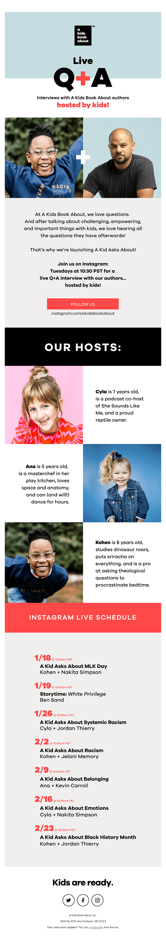
The highlight? It’s the S-curve which introduces the “hosts.” We love it because it’s cute, nicely written, and visually appealing. Now this is the traditional product grid, if you will. And it’s refreshing to see it used in an invitation email. Once again, run with it!
It’s an effective use of space. Plus, if you’ve got multiple speakers, you can leverage the product grid in this way. You can also add more details about the experts beyond their name and designation.
Note also the use of bold typography, which earns extra credit for enhancing the visual appeal.
7 Webinar Email Best Practices
1. Write a compelling subject line
This is your first impression. Make it clear, concise, and engaging. Include keywords relevant to the webinar topic and, if possible, personalize it with the recipient’s name.
Consider using emojis or creating a sense of urgency (e.g., “Last Chance!” or “Spots Filling Fast!”).
2. Highlight the benefits
Don’t just list what the webinar is about; explain what attendees will gain. Focus on the value proposition – new skills, solutions to pain points, insights, networking opportunities, or exclusive information.
3. Provide all details clearly
Your email should answer the “who, what, when, where, and why” immediately. This includes:
- What: Webinar title and a brief description of the topic.
- Who: Speaker(s) names, titles, and a short bio.
- When: Date, time, and crucially, the time zone.
- How long: The estimated duration of the webinar.
- How to join: A clear and prominent call to action.
Wrap it all up within the hero space. Revisit the curation to find out how it can be done.
4. Strong, clear CTA
Use action-oriented language like “Register Now,” “Save Your Seat,” or “Join Us.” Make the CTA button visually prominent and place it strategically. For example, the primary CTA is kept above the fold.
5. Optimize for mobile
A significant portion of emails are opened on mobile. Ensure your email design is responsive, easy to read on smaller screens, and that the registration process is seamless on mobile.
6. Create a sense of urgency
Subtle urgency can encourage immediate action. This could be through limited spots, an early-bird discount (for paid webinars), or countdown timers in the email.
7. Add to calendar links
Make it easy for recipients to save the date. Include direct links to add the event to Google Calendar, Outlook, Apple Calendar, etc.

Wrapping Up
Whether you lean toward plain-text or go all in with brand-forward HTML designs, the best webinar invitation emails are intentional. They don’t just inform; they guide, persuade, and excite. As we’ve seen across these examples, the most successful invites are those that align with the brand’s voice and prioritize clarity.
So the next time you’re drafting a webinar invite, start with your audience, stay true to your brand, and don’t shy away from experimenting with layout, tone, or structure. The goal isn’t just to get signups; it’s to get the right people to show up.
Need help designing compelling invitation emails? Contact us and let’s get this moving.