

Quite irrespective of your brand, the 4th of July presents a great marketing opportunity. It’s your chance to tap into national pride, summer excitement, and a collective spirit of celebration that your brand can be part of.
Incidentally, in 2024, Americans were estimated to have spent a staggering $15.5 billion on the Fourth.
Naturally, you want to make the most of it this year too.
And to help you get started, our team at Email Mavlers has curated a selection of 4th July email templates.
These brands have re-imagined email design in ways that we think is inspiring and highly effective. Scroll away!
5 Inspiring 4th of July Email Designs That Light Up the Inbox
1. Kenneth Cole
In 2019, Kenneth Cole, the founder of the eponymous apparel brand, wrote these words on Milwaukee Independent, against the background of the year’s annual 4th of July celebrations:
“America is ours to save and this Independence Day, please consider what it means to you and what you wish to leave for your children. It will take more than “oohs” and “aahs,” and should instead inspire you to act when the crowds have dispersed.”
This statement reflects the belief system of the man behind the brand. Subsequently, it cements the identity of the brand itself. From the marketing perspective, this is highly relevant. And it’s refreshing to see how Kenneth Cole stays true to its identity in one of their 4th of July promotional emails, too.
Here is a sample from their 4th of July email campaign.
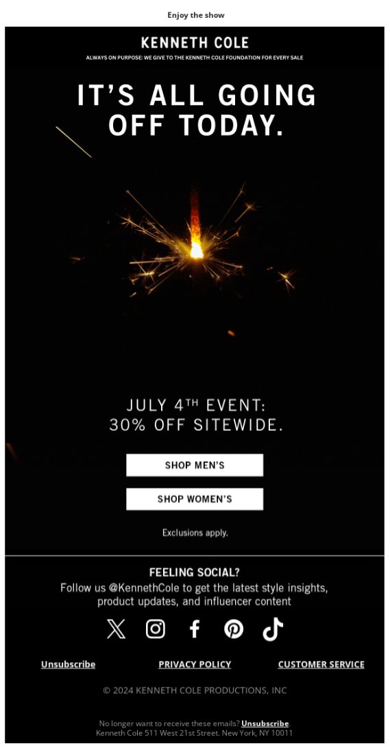
This email reflects the identity of Kenneth Cole the brand in the following ways:
- Instead of the blue-and-red staple, this email keeps it real by capturing the 4th of July night sky.
- There are no exciting fireworks, no crowds; rather, it’s a solitary wick, evoking the idea of the individual American. The whole thing ties beautifully to the words of Kenneth Cole the man.
- The minimalist dynamic of the email also reinforces the underside of the celebrations.
Coming to the technical aspects, the minimalist design combined with the strategic use of white space brings out the promotional intent of the email. The dominating mood is that of quiet reflection and non-virile patriotism.
The visual hierarchy turns on the inverted pyramid which starts at the heading and ends at the CTA buttons.
There are no needless distractions. The copy is sharp and focused thanks to its command-style language.
Pro tip: You don’t have to have a political belief system to justify Independence Day marketing. The point is that in a day dominated by the concept of identity, make sure that your emails reflect your brand identity.
2. Linjer
Linjer’s Fourth of July email stands out with its stunning photography and a refreshing departure from the traditional red, white, and blue palette. Instead of leaning into the expected patriotic theme, the brand delivers a visually elegant and thoughtfully curated message that captures attention through simplicity and style.
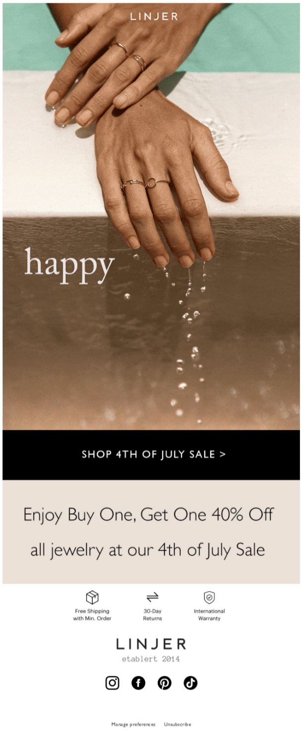
Linjer’s email kicks off with a stunning hero banner, right from the edge of the template. We’re impressed by how the triple layering of water, pool ledge, and the outer edge of the ledge creates a natural visual structure for the subscriber.
This is excellent photography. It captures the movement of a swimmer just out of the pool and flaunting a pair of hands adored with Linjer’s jewelry.
The dripping water droplets are beautifully shot. Plus, the simple, non-invasive GIF captures the blink-and-gone moment of the 4th of July sale. You can see the GIF in action right here.
Pro tip: Find ways to illustrate your products uniquely.
Instead of relying solely on straightforward, studio-lit images, consider showcasing your products in real-life scenarios, unexpected environments, or through artistic compositions. Just like Linjer does.
3. Pet Releaf
It isn’t celebrations everywhere for everyone on Independence Day as Pet Releaf informs us through an interesting 4th of July email design.
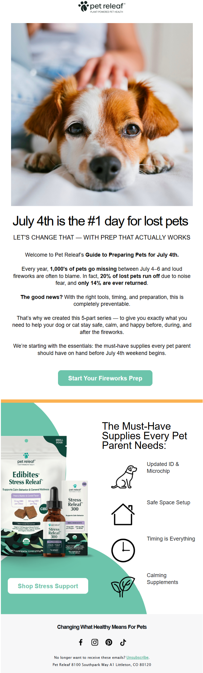
This informational campaign effectively addresses a common concern for many pet owners during celebrations, particularly those involving loud noises.
Unlike other 4th of July emails, this email opens on a sad note as reflected in the hero banner.
The best part of the email is not its information, but its use of live text to convey the information. This shows intent. We love the urgency and seriousness of the heading: The problem of lost pets doesn’t get over the day after the 4th.
Interestingly, the product is presented alongside the safety bullet points, rather than being given a separate, dedicated section as most brands typically do. This choice likely reflects the brand’s commitment, blending promotional and educational content to emphasize that safety is just as important as the product.
Pro tip: Even if you’re not a pet-focused brand, you can still share a message of solidarity with those—pet owners and others—who find loud celebrations like the Fourth of July challenging.
To start, consider adding supportive message stickies within your email. Alternatively, if you’d prefer not to shift focus from your promotional content, a thoughtful note in the footer can be a meaningful gesture.
4. Todd Snyder
Todd Snyder is known for its high-quality menswear, which tends to be on the more premium side. However, throughout the year, they have frequent sales and promotions where one can find significant markdowns.
In fact, just this January, Todd Snyder was offering 40% off their “already-discounted” items.
Similarly, their 4th of July email campaign from last year embraced a minimalist design approach to spotlight another major sale. Check it out.
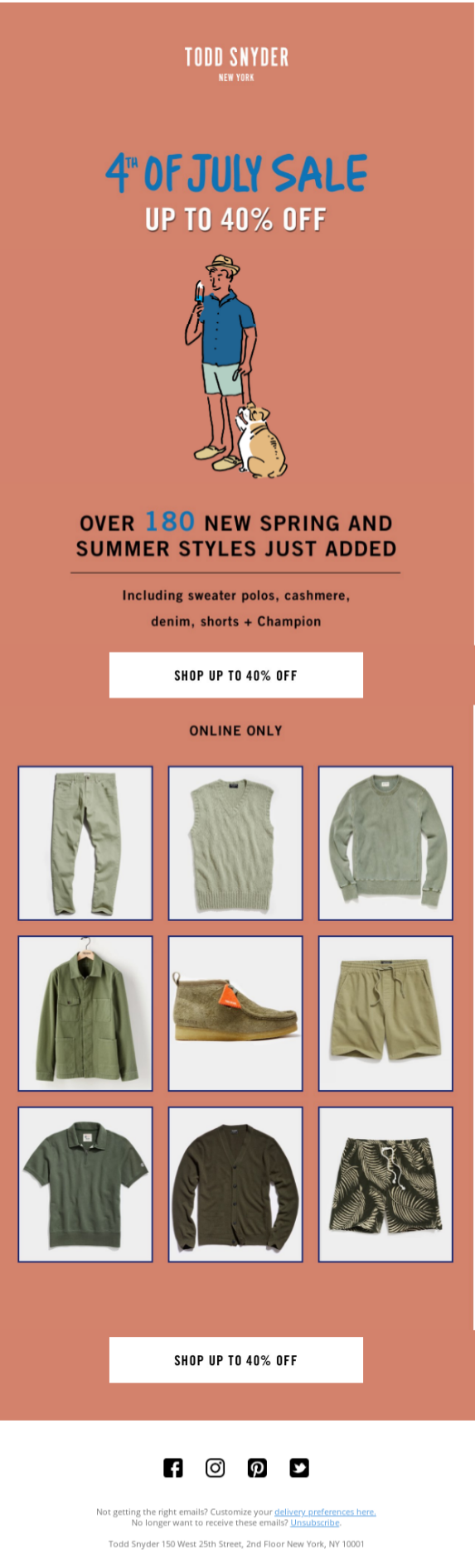
The simple cartoon, which captures a quiet moment of celebration, is the centerpiece of attraction.
The strategic use of white space effectively amplifies the impact of the sale announcement, drawing immediate attention without overwhelming the viewer. The ‘X’-shaped visual structure—originating from the bold discount header, converging at the central cartoon illustration, and then extending outward toward the detailed discount information—guides the reader’s gaze with intention and precision.
In the lower half, a well-balanced three-column grid layout is employed to present the discounted products. This format allows for a clear, organized display, making it easy to scan and compare items at a glance.
Pro tip: Leverage white space to bring attention to your sale. This is super-basic, but curiously ignored. For example, check out this email and this one where the simple yet effective design strategy is overlooked. The result? An email full of noise and stripped of focus.
5. LOLI
LOLI kicks off their 4th of July email with a cute GIF and a nice, relevant primary heading. Here it is.
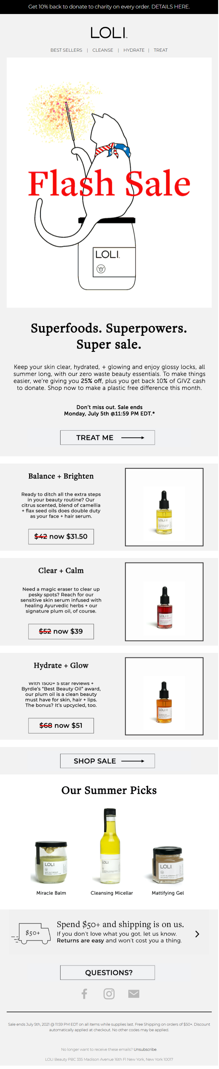
That being said, the GIF does flash rapidly which may be challenging for certain viewers. We would have significantly reduced the animation rate. That’s the only major flaw in this otherwise well-designed email.
But the GIF fits nicely into the overall design scheme of the email. The template keeps a light touch. No overdesigned sections which seem to be the staple of most brands sending 4th of July campaigns. The motive is to mirror or re-create the American night sky in the hero space, leading it to become a dumping ground for aesthetic excesses (think glitters, stars, neon ads…)
The use of live text, the stairstep layout for the featured items, and the CTAs are well-executed.
Pro tip: Mind accessibility when using GIFs. Design in a way that the GIF doesn’t stand out to the point of seeming alienated from the rest of the template. Make sure the sections don’t compete with each other.
Looking for more 4th of July email examples? Check out Brevo’s curation for added inspiration.
Key Takeaways
Here are the overall design takeaways from our curation of 4th July email templates:
- Brand identity first: Ensure your visuals and copy reflect your core identity.
- Minimalism wins: Clean, focused layouts with ample white space draw more attention.
- Imagery: Whether emotional or aesthetic, good photography and illustration elevate engagement.
- Accessibility Matters: Use live text and moderate animations for inclusivity.
- Contextual Relevance: Tying email content to real-life concerns or subtle cultural observations builds trust and relatability.
4th of July email design doesn’t need to rely on clichéd fireworks, flag motifs, or loud promotions to be effective. As these campaigns from Kenneth Cole, Linjer, Pet Releaf, Todd Snyder, and LOLI show, the most impactful designs are those that stay true to a brand’s identity, respect the emotional context, and communicate with intention.
Need help designing custom 4th July email templates? Get in touch with our team!