Author Archives: Susmit Panda - Content writer

Avatar photo

About Susmit Panda - Content writer

A realist at heart and an idealist at head, Susmit is a content writer at Email Mavlers. He has been in the digital marketing industry for half a decade. When not writing, he can be seen squinting at his Kindle, awestruck.

high-performing Mother’s Day email template

9 Best Mother’s Day Email Templates (2025)

With Mother’s Day just around the corner, the pressure to create something meaningful and effective can feel overwhelming. The last thing you want is to run out of creative steam this close to the big day.

But here’s the good news: it’s not too late to make an impact.

Our team of email designers, who craft over 3,000 templates each month, have pulled together a curated selection of standout Mother’s Day email templates. These designs are not just beautiful, they’re built with strategy, emotion, and performance in mind.

Whether you’re aiming to drive last-minute sales, send a heartfelt message, or inspire gift-giving, you’ll find the best Mother’s Day email ideas right here. 

Let’s jump in, and create something special for your audience this Mother’s Day. Here we go!

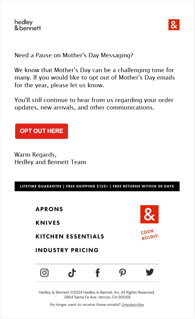
1. Send an Opt-out Email 

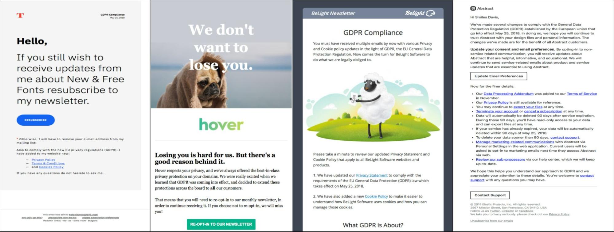
Start your Mother’s Day campaign with an opt-out email in which you let the subscribers choose to pause all event-related communications from your brand. Below is a list of design best practices for a Mother’s Day opt-out email: 

  • Keep your email template on-brand and minimal in order to draw attention to the central message.
  • Keep the navigation bars and the footer intact.
  • Use a focused CTA, such as “Opt Out”, “Skip it”, etc.
  • Stick to a formal tone. Assure the subscriber that they’ll still continue to receive other brand communications. 

Hedley & Bennett checks all those boxes and the result is an email that is on-brand, minimal, and empathetic. 

opt-out email sample

Source: Inbox

Avoid sending emails in which the opt-out choice comes after a catalogue of Mother’s Day images and UGC. 

Only send Mother’s Day-related emails to subscribers who have explicitly indicated they wish to receive them; otherwise, avoid sending messages that could potentially cause distress. 

In a word, let your opt-out email stand on its own.

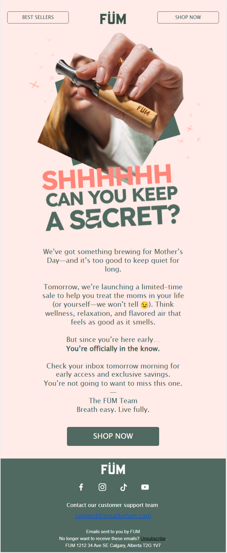
2. Tease, Don’t Tell

If you’ve got something special coming up for Mother’s Day, tease, don’t tell. There are lots of ways of doing this. Here’s a few:

  • Use concise copy and visuals that hint at what’s coming, or a blurred-out product image, to build curiosity without giving it all away. Build intrigue right from the subject line.
  • Keep it short and quick. This email acts as a prologue.
  • Stick to a single-column layout with ample white space to guide the reader’s attention to the teaser.
  • Ask the recipient to do something. It can be a request to save the email, or to keep an eye on the inbox. 

Here’s how FUM does it in their first email from the Mother’s Day sequence. 

tease, don’t tell email sample

Source: Inbox

Clean, focused, and brilliantly-written, FUM’s Mother’s Day kickoff is just the inspo you need for a teaser.

Lap it up as a never-gone-wrong Mother’s Day email inspiration! 😉

3. Nail the Copy

Not many brands spend a lot of time on copywriting. Which makes this one of the least popular Mother’s Day email ideas.

The result? Watered-down emails, non-contextual images, and a bit of soppy bells and whistles to go with it. 

No! If you want to stand out, grab these hot tips: 

  • Spend enough time on Mother’s Day subject lines. Do NOT use ESP-recommended AI inputs.
  • Start with a hook. Disturb the reader so that they read it all through to find a resolution. Finish it off in a few.
  • Come up with a pre-gifting and post-gifting scenario. Allow your subscribers to imagine and narrate their own individual stories in connection with their mother.
  • Use bite-sized text for quick reading. Make it skimmable.
  • Place the CTA buttons strategically, exactly where the copy before and after make sense.
  • Keep your brand voice intact throughout.
  • Hire a seasoned email copywriter to do all this. 

Take a look at this Mother’s Day email from Carnivore Snax to see how it all looks in action. Indeed, when paired with compelling copy, responsive Mother’s Day email templates like these create an experience that feels polished, personal, and conversion-driven.
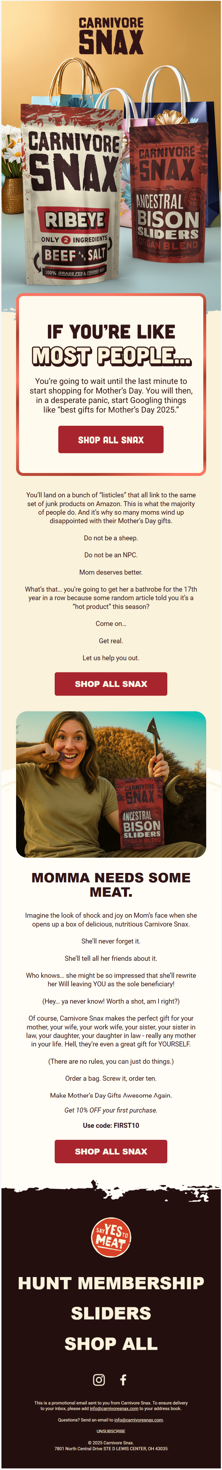
email from Carnivore Snax

Source: Inbox

Snax’s copy is bold, insistent without being crude, and authoritative. 

(Generally, Mother’s Day emails tend to be mushy at the cost of brand voice. Snax doesn’t go there. Their brand voice—aggressive, frank, and politically-incorrect—never goes silent.)

The single-column layout, complemented by a tone-setting overlay and well-interposed CTAs, makes this just the Mother’s Day email inspiration you need.

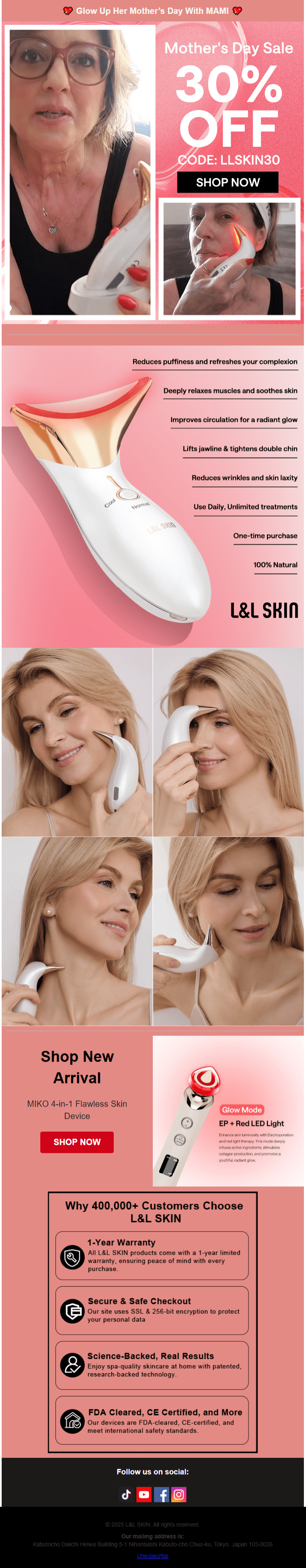
4. Use High-res Images

Use high-res images in your Mother’s Day email to capture attention and set an emotional tone. Whether it’s close-up shots of gifts, lifestyle imagery of mothers and families, or styled flat-lays, high-quality images make your email feel polished and trustworthy. 

They should support your message, reflect your brand’s style, and inspire the viewer to take action.

L&L Skin shows us how all that looks and feels right here. 

email template form L&L Skin

Source: Milled

Keep the following recommendations in mind:

  • Stick to a cohesive color palette and style that aligns with your brand and the Mother’s Day theme.
  • Compress images smartly to reduce file size without losing quality, ensuring fast loading and preventing subscriber drop-off.
  • Make sure images scale well on smaller screens. Avoid overly wide formats, and test to ensure they remain clear and impactful on mobile devices.
  • Add descriptive alt text to all images.
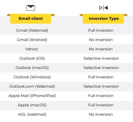
  • Lastly, optimize your emails for Dark Mode

The point of high-res images is to create a potentially immersive experience and to highlight product details. L&L does both.

5. Use Bold Typography

Pair high-res images with bold typography

Bold typography ensures your key message stands out clearly and immediately. Whether it’s a heartfelt headline, a special offer, or a call to action, strong type helps guide the reader’s eye. 

Use bold fonts to contrast with softer imagery, or choose elegant typefaces that complement the emotional tone of the visuals. Keep the message short and impactful, and ensure there’s enough white space around the text so it doesn’t compete with the imagery.

A few best practices related to typography:

  • Place text over areas of the image with sufficient contrast—or use overlays, gradients, or color blocks—to make sure your message is easy to read on all devices.
  • Use short, punchy phrases or headlines that support the visual story without overcrowding the design.
  • Choose typography that matches both your brand identity and the tone of Mother’s Day, whether that’s elegant and sentimental or bold and celebratory. 

Need Mother’s Day email inspiration for this? Well, catch this bold Mother’s Day email newsletter from Highr Collective. 

Mother’s Day email newsletter from Highr Collective

Source: Milled

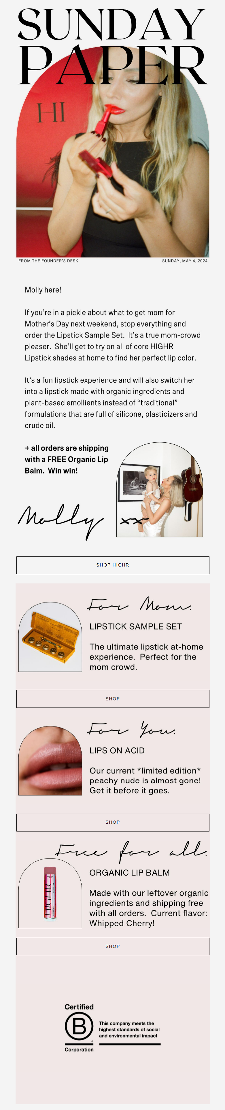
The highlights of this email? Obviously the bold type, then the handwritten grid headers, and the “arched” containers. (Apart from a Mother’s Day email idea, the arch is quite trendy in general.)

The long, amply-padded CTAs are equally prominent.

6. Curate a Gift Guide

A Mother’s Day gift guide is a must-have. People want gift guides and these emails generally clock a high open rate. 

Your audience is likely accustomed to seeing gift-guide emails in a product-grid format, so it’s best to stick with that. 

However, you can introduce fresh visual themes in your Mother’s Day email templates just to mix it up a bit. 

On that front, here are a few Mother’s Day email ideas to start with: 

  • Use handwritten fonts for headings and short descriptive text within the grid.
  • While maintaining the grid, you can create mini-stories by how you present a few key products.
  • Connect a few related items within the grid to suggest a ready-made gift set.
  • A small “Quick View” button within the grid could offer a brief product description without leaving the email.
  • When a subscriber hovers over a product image, it could subtly zoom in or show a different angle. 

Here are two Mother’s Day gift-guide emails. The first is from Roots Canada, and the second is from InBloom

Mother’s Day gift-guide email samples

Source: Email Love

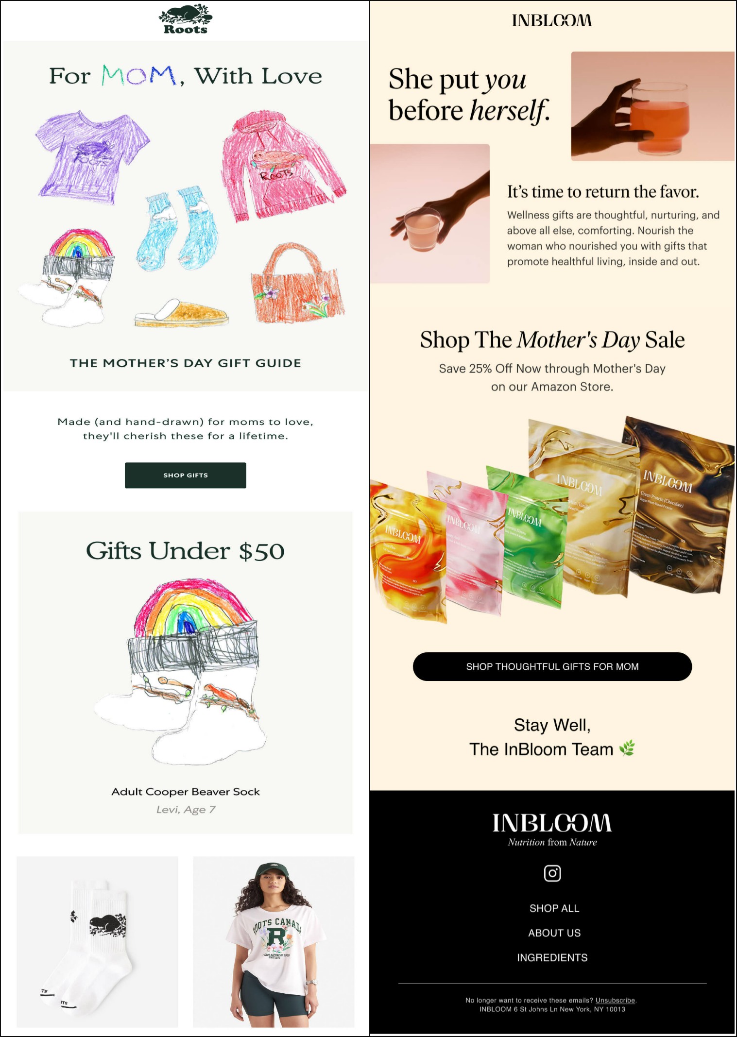
The highlight in Roots Canada’s email is the hand-drawn illustrations that headline every new product grid. How nostalgic! 

InBloom’s email opens with something that resembles a product grid, but isn’t one. It’s also not your typical hero banner. The result? A perfect visual hook. 

The header is spot-on: it’s heartfelt, reflective, and puts the essence of motherhood front and center.

7. Use Animated GIFs

Now, here’s a cool Mother’s Day email inspiration with many takers.

Animated GIFs can inject a bit of real fun and personality into your emails, making your brand feel more approachable and engaging. A well-placed, relevant GIF can create a more memorable experience for the subscriber. Here are a few recommendations:

  • Keep GIF file sizes under 1MB—smaller is even better.
  • To optimize, cut down on frames, limit colors, and trim any extra whitespace.
  • Use animation to support your message, not steal the spotlight.
  • Since many email clients don’t autoplay GIFs—or only show the first frame—make sure that first frame clearly delivers your key message or call to action.
  • Avoid fast flashes that could harm viewers with visual sensitivities, and consider how screen readers might interpret your email.
  • Test your email across major platforms to ensure the GIF plays well or falls back smoothly when needed.

Adornmonde’s Mother’s Day animated hero banner is cute, simple, and most charmingly, tells a story. Check it out. 
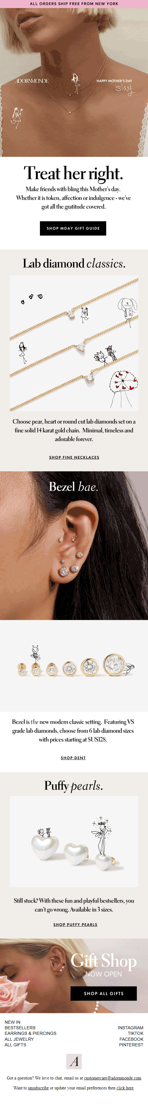
Adornmonde’s Mother’s Day animated hero banner

Source: Inbox

We love how the animated GIF is conceptually present throughout the email template. A lot of white space, chunked-out text in between the images, clearly defined primary and secondary CTAs, and a breezy, relaxed tone all come together to make this email a memorable Mother’s Day message.

8. Hit Pause on Stock

Let’s face it, you can’t ditch stock photography altogether. They’re handy and arguably villainized beyond their fair share. 

That said, to keep things feeling genuine, try incorporating real, authentic photography into at least one or two of your Mother’s Day email templates. Here are a few tips to get you started:

  • Avoid overly posed or staged shots that look unnatural. Aim for candid moments and real interactions.
  • Use clear, high-resolution images that look professional. However, always optimize them for email to reduce file size and improve loading times.
  • Ensure your subjects are well-lit and in focus. Poorly lit or blurry photos are a strict no-no.
  • Pay attention to framing, rule of thirds, and leading lines to create visually appealing images.

Stock photos often feel generic and impersonal. Some stock photos become overused and can make your email look dated.

So, do consider “de-stocking” for a couple of your emails. Loeffler Randall, for example, does it this way here. 

Loeffler Randall email template

Source: MailCharts

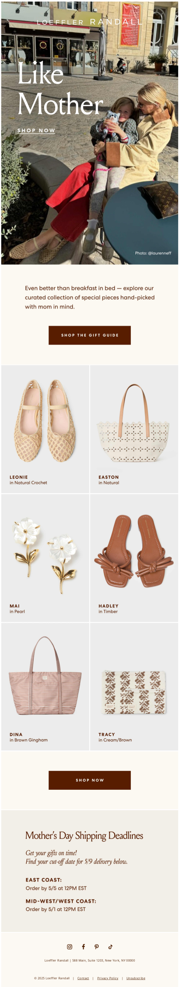
The hero banner is the perfect spot to add a real photo. 

(You may want to use such photography in a special Mother’s Day email newsletter, if your brand has a newsletter, that is.)

The email is also consistent with LR’s brand palette (sepia). The CTAs are well-padded and the content blocks neatly sectioned. 

9. Tweak with Time 

Tweak your design strategy closer to Mother’s Day for subscribers who’re yet to make a purchase. 

You want to create a sense of urgency, but without being too pushy. Consider these tips: 

  • Make your subject line pop. Put your best copywriter on this.
  • Send a heartfelt owner-signed plain-text email. Highlight the sales offers and add relevant links.
  • You can use a countdown timer; however, timers are best for flash sales. Use a calendar rather. (See example below)
  • Keep the email brief so readers can reach the footer, where they’ll likely find answers to purchase questions and helpful links, with minimum scrolling.
  • Make the CTA button prominent. Reassure the subscriber. 

Doze’s Mother’s Day email template covers all the bases. We love the calendar as the hero image. 

Doze’s Mother’s Day email template

Source: Milled

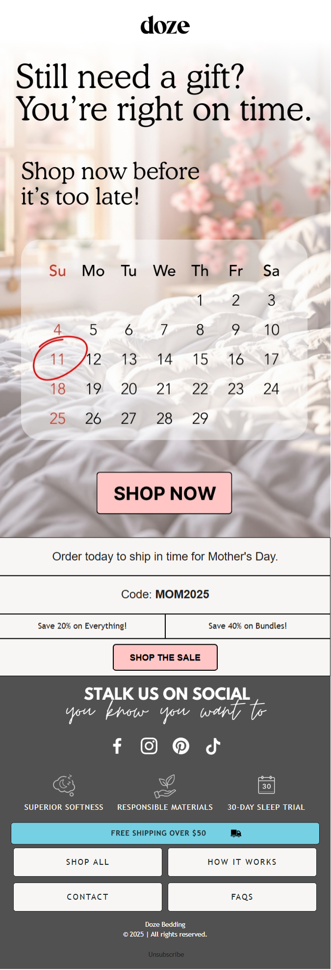
Make sure any Mother’s Day discounts, bundles, or free shipping are visually prominent and easy to understand. 

You may also want to reinforce your value proposition. Remind them why they should choose you for their Mother’s Day gift. This could be your unique product selection, high-quality materials, thoughtful packaging, or reliable delivery.

Wrapping Up!

Now’s the perfect time to take those Mother’s Day email ideas and turn them into high-impact campaigns.

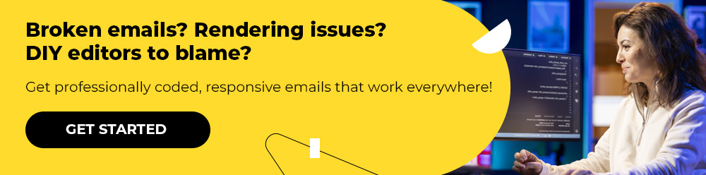
Whether you’re short on time or want to elevate your campaign with minimal effort, our team is here to deliver responsive Mother’s Day email templates that do the job beautifully. Schedule a call with us today

At Email Mavlers, each template we deliver is meticulously hand-coded with clean, well-documented markup to make future customization effortless. We rigorously test every template across major email clients—implementing fallbacks for limited-support environments—to ensure broad compatibility. Fully responsive by design, our emails adapt smoothly across devices and browsers, from desktop to mobile. Every template is custom-built to be editable, reusable, and perfectly integrated with your marketing platform for a seamless workflow.

As of now, we offer design and development across these ESPs:

We’re expanding to more ESPs, such as Zoho, Active Campaign, Braze, and Eloqua, to name a few. 

And yes, your first order is on us. Get in touch today!

landing page design mistakes

9 UX Mistakes Hurting Conversions from Your Landing Page

Your landing page serves as the digital storefront of your business—the first impression many potential customers will have.

But simply packing it with salesly content isn’t going to drive sales.

Not unless you design it with your audience’s needs at the forefront. Ignore viewers, and you’re leaving money on the table.

Remember, the primary goal of a landing page is to guide users toward the answers they need. But if those answers are buried under poor UX, they’ll only frustrate and repel visitors.

People want clarity, not complexity. They’re looking for quick, intuitive paths, not mental gymnastics.

Take Google’s homepage, for example: Minimal, clear, and built entirely around the user.

In this guide, we’ll highlight 9 common UX mistakes hurting conversions on your landing page and show you how to fix them. Let’s roll!

1. Too Many Choices

Landing page UX mistakes like offering too many actions without a focal point can leave visitors paralyzed by choice. When visitors land on your page and see a bunch of buttons, links, offers, or messages competing for their attention, they get confused. As a result, instead of taking action, they freeze or bounce. 

It’s kind of like going to a restaurant with a 10-page menu. You just sit there forever trying to decide, and sometimes you leave without ordering anything. 

Here’s a landing page that offers too many things at once. 

landing page sample

A clean, focused landing page with one clear goal keeps things simple. Less noise = more action. Here are a few best practices to start with:

  • Focus on a single goal or action (e.g., one primary CTA like “Sign Up” or “Learn More”).
  • Eliminate unnecessary links, menus, or options that might confuse or overwhelm visitors.
  • Keep the copy short and to the point—users should instantly know what action to take.
  • Provide more information or choices only when necessary, and in manageable amounts. This is known as progressive disclosure. 

If you’ve ever asked yourself, “why is my landing page not converting?”, this is one of the top culprits. Avoiding these cluttered layouts is one of the core UX design mistakes to avoid when building pages with clarity and intention.

2. Not Optimized for Mobile

If your landing page isn’t mobile-optimized, you’re basically telling half your visitors, “Good luck figuring this out.” 

Most people browse on their phones, and if your page loads slow, text is tiny, buttons are hard to tap, or they have to zoom in and out just to read stuff. 

The result? They bounce in seconds.

Poor mobile design is among the biggest landing page UX mistakes that most frequently go unnoticed until conversion data starts dropping. 

Mobile-first design is at the heart of optimizing landing page user experience, and it’s a critical component of conversion-focused design today.

Consider these best practices while designing your landing page:

  • Compress images, minimize code, and use caching to make the landing page load quickly on mobile.
  • Use a simple, thumb-friendly navigation menu; consider a sticky header for quick access.
  • Ensure buttons, links, and forms are designed for easy tap interactions (not too small).
  • Avoid pop-ups as far as possible. These are harder to close on mobile, so minimize or remove them.
  • Prioritize mobile-first testing. 

With respect to content, keep text concise and easy to read; avoid clutter. For example, take a look at how Plated does it.

landing page design by 
plated

The layout is clean, the CTA button is nicely padded, and the text is easy to read. 

3. Slow Load Time

A slow-loading landing page is the fastest way to lose people. If it takes more than a few seconds to load, most visitors are like, “Nope,” and hit the back button. We’re all impatient online, so if your page drags, it feels sketchy or just not worth the wait. 

It doesn’t matter how amazing your offer is, if folks never even see it, they’re not converting. Speed = first impression, and if your page shows up late to the party, people are already gone. 

Quick-loading pages are non-negotiable when it comes to landing page best practices for higher conversions. If your UX isn’t fast, it won’t last.

Here are a few tips to ensure your pages load quickly: 

  • Load images and other media only when they’re visible on the screen, not all at once. This is called lazy loading.
  • Use a CDN to distribute content across multiple servers to load faster based on the user’s location.
  • Store static resources like CSS and JavaScript files in the user’s browser cache for faster repeat visits.
  • Ensure the critical content loads first by deferring non-critical elements.
  • Pick a hosting provider with solid performance and low server response time.

All of these help support conversion rate optimization (UX) by ensuring that users stick around long enough to take meaningful action.

4. Poor Navigation

If visitors can’t quickly figure out where to click, what to do next, or how to find the info they need, they’ll just leave. Nobody wants to play detective when they’re trying to sign up or buy something.

Messy menus, too many links, or hidden CTAs just cause friction. Take a look at this block of embarrassment. 

poor navigation example

Source: Unbounce

And the more friction, the fewer conversions. A good landing page should guide people like a smooth slide. One clear path, no detours.

Even a beautifully designed landing page can suffer if the navigation lacks direction—proof of how UX impacts conversion rates more than most people realize. To avoid that, keep the following best practices in mind: 

  • Use a sticky header or CTA button that follows the user as they scroll, keeping the conversion action visible and accessible at all times.
  • Use arrows, icons, or subtle animations to direct attention toward critical actions like form fields or CTA buttons.
  • If the landing page has multiple sections or steps, breadcrumbs help users track where they are and navigate back easily without feeling lost.
  • If the landing page contains a lot of content, a search bar can help users find what they need quickly, reducing frustration.
  • Avoid interstitials or pop-ups. These disrupt the navigation flow, so make sure any pop-up is well-timed, relevant, and yes, easy to close.

One extra tip: For mobile users, use hamburger menus or bottom navigation bars that keep the interface clean and easy to navigate with one hand.

5. No Clear CTAs

When a landing page lacks clear CTAs, users don’t know what action to take next—even if they’re interested. A strong CTA acts like a signal that directs attention and triggers engagement. Without it, there’s no defined path, which creates hesitation and drop-off.

From a technical standpoint, unclear or missing CTAs disrupt the conversion flow. Users may scroll around, get confused, or click away because they don’t see an obvious next step. Even worse, multiple weak CTAs can compete for attention, splitting focus and reducing the chance that any one action gets completed.

Here are a few expert recommendations on CTA buttons: 

  • Instead of generic CTAs like “Submit” or “Click here,” focus on what the user will gain, such as “Get Your Free Trial” or “Start Your Journey.”
  • Ensure your CTA stands out with contrast, size, and white space.
  • For longer pages, keep the CTA visible by using sticky buttons or banners that follow the user as they scroll. This reduces the effort needed to navigate back to the CTA.
  • Brief text like “No credit card required” or “Instant access” near the button can address concerns and add reassurance, encouraging users to take action.
  • Test different phrasing, colors, and placements to determine which ones drive the most conversions. Regular testing can help refine and optimize for the highest engagement.

Finally, place your primary CTA above the fold, and for longer pages, repeat it at the bottom or after critical sections. Always make sure it’s visible without users having to hunt for it. Here is an example. 

CTA placement in landing page

That’s the United Nations Population Fund. As you can see, just one CTA, and the job is as good as done. 

Landing page UX is often the difference between a bounce and a conversion. By identifying UX design mistakes to avoid and following proven methods for optimizing landing page user experience, you create smoother paths for users.

6. Zero Micro-interactions

Micro-interactions are subtle but powerful elements of optimizing landing page user experience, reinforcing that users are in control and on the right path.

When a landing page lacks micro-interactions, it misses key moments to guide, reassure, and engage users. Micro-interactions, like button animations, hover effects, form field feedback, or progress indicators, act as subtle cues that confirm a user’s action is working or that they’re on the right track.

Technically, without these cues, the user experience feels flat and unresponsive. Users might click a button and wonder if anything happened, or start filling out a form and get no validation until the end, which increases frustration. These small gaps in feedback add up, causing uncertainty and drop-offs in the conversion funnel.

Well-placed micro-interactions reduce cognitive load, build trust, and create a smoother experience, all critical factors in keeping users engaged and moving forward. 

Below are some highly actionable tips with respect to micro-interactions:

  • Make buttons or links change subtly when users hover over them, like changing color, size, or even having a slight animation. This signals interactivity without being overwhelming.
  • Implement real-time validation with immediate feedback. For example, if someone enters an email, show a “✓” when it’s valid and an error message when it’s not, in a smooth and non-intrusive way.
  • Use subtle animations when users scroll down, like images or text appearing gradually or elements sliding in. This keeps the user engaged as they navigate through the page.
  • Use small, purposeful animations in icons (like a spinning loading icon) or illustrations (like a character waving or a button pulsing), so it feels interactive without distracting from the main goal.
  • For mobile, consider adding small sound cues or vibrations when a user interacts with specific elements (like buttons or form fields), but keep it minimal and optional to avoid annoying them.

Micro-interactions reduce cognitive load and build trust, both essential for conversion rate optimization for UX.

7. No Visual Hierarchy

In the absence of a visual hierarchy, users don’t know where to look first, what’s important, or what action to take. Their eyes just bounce around without any guided flow. That creates confusion, and confused users rarely convert.

Visual hierarchy uses layout, font sizes, colors, spacing, and element positioning to lead attention. If everything looks equally loud—or worse, equally dull—nothing stands out. Key messages, benefits, and CTAs get lost in the noise. Users miss what matters, and that breaks the conversion funnel.

Here’s a landing page with no visual hierarchy. This is a high-definition mess. 

 landing page with no visual hierarchy

Image source: 99designs

A proper visual hierarchy is possible with these optimization tweaks:

  • Make important elements like your headline and primary CTA larger and bolder than secondary content. This guides the eye to the most critical areas first.
  • Use color to create visual weight: darker colors for more important elements, lighter tones for secondary ones. This guides users through the page based on the importance of each element.
  •  Use different font sizes and weights to establish importance. Make headlines and subheadings distinct while ensuring body copy remains legible but secondary.
  • Ensure that important elements like CTAs, benefits, and value propositions are aligned in a predictable manner, so users can scan and understand the structure quickly without effort.

You can also use visual elements like badges, banners, or highlighters to draw attention to limited-time offers, key benefits, or value propositions, but only where it makes sense within the hierarchy.

Neglecting this leads to common UX errors in landing pages. Yes, a subtle yet impactful way UX mistakes hurt conversions. 

8. Poor Use of Graphics

Poor use of images and videos creates visual clutter, slows down load times, and fails to support the message. If the visuals are low quality, irrelevant, or distracting, they reduce trust and shift attention away from the core offer. That weakens the emotional and informational impact you’re trying to make.

Heavy or unoptimized media files increase page load time, which hurts both user experience and SEO. If the media doesn’t reinforce the CTA or clarify the value proposition, it just adds noise. 

Every visual element should serve a clear purpose—building trust, highlighting benefits, or guiding the user toward action. 

In practice, here’s how that is going to work:

  • If you use video, always set it to autoplay on mute. This grabs attention immediately without forcing the visitor to interact. Make sure the video is short (preferably under 30 seconds) and directly related to the CTA.
  • For videos, use a well-designed thumbnail that clearly communicates the video’s value. A compelling thumbnail can increase play rates.
  • Images and videos must adapt to various screen sizes (especially for mobile). Use responsive design techniques like srcset for images or implement a flexible video player to avoid cut-off or scaling issues.
  • Overlay key points or CTAs directly on the media to ensure the message doesn’t get lost in the visuals. This helps clarify what the user should do after viewing.

When you’re using images, make sure they are original or highly customized. Stock images can feel inauthentic and reduce trust, while custom images or authentic photos build stronger connections with users.

The point is, every visual should serve the message. Otherwise, it’s just clutter adding to your list of landing page UX mistakes.

9. Unoptimized Forms

Overcomplicated forms are one of the most common UX mistakes hurting conversions that brands often overlook until it’s too late.

If a form is too long, asks for too much info, or has fields that aren’t clearly labeled, people are going to abandon it. From a technical perspective, long or complicated forms create friction in the conversion process, increasing the chances that users will drop off before submitting. 

Below is an example of one such landing page sign-up form. 

landing page signup form

Other issues like slow form validation, error messages that aren’t clear, or a lack of mobile optimization can make the process even worse. If the form isn’t easy to fill out or doesn’t work smoothly on all devices, users will simply give up and leave.

If you’re searching for landing page best practices for higher conversions, this is a great place to start testing and iterating.

Here are a few recommendations that can come in handy: 

  • Use prefilled fields when possible (e.g., if a user is logged in) or pull in information from a previous form submission to save time and effort.
  • Add helpful hints under form fields or next to buttons that guide users without overwhelming them. Short, value-driven explanations (e.g., “Get exclusive offers”) can motivate users to complete the form.
  • Make forms easier to complete by allowing browser autofill and using input masks (e.g., automatically formatting phone numbers or credit card numbers).
  • Single-column forms are easier to follow and fill out, reducing cognitive load. Avoid multi-column forms unless absolutely necessary.
  • Break long forms into manageable steps with clear progress indicators to reduce abandonment.
  • Display trust signals like security badges (SSL certificates, privacy policies) near the form to reassure users their data is safe.

Remember to continuously test different form layouts, fields, CTA copy, and button placements to determine which version performs best.

Wrapping Up!

A landing page is more than just a destination, it’s a guided experience crafted to convert curiosity into action. When UX mistakes slip through the cracks, even the strongest offers fall flat. Keeping things simple, intuitive, and user-focused ensures visitors stay engaged, confident, and ready to take the next step.  

Beehiiv vs Substack newsletter platform comparison

Beehiiv vs Substack: Which Newsletter Platform Is Right for You?

You’re going to need a dedicated platform, like an ESP, that will bring your ideas from the microwave to the table—unspoiled.

The tricky part? There are literally dozens of these ESPs to choose from. 

Worse, most of these ESPs offer nearly similar features. 

So how do you pick the right one? Or does it even matter if they’re all cut from the same cloth?

Short answer: Yep, it totally matters. Because similarities start and stop at the level of features. What distinguishes one from the other is the flexibility a tool offers with respect to your peculiar business needs. 

As to how to pick the right one—well, that’s what this post is all about. 

We have been in this space for over 12 years now, and we have designed and coded newsletters for brands across 52+ countries. 

Right now, Beehiiv and Substack are two of the biggest names in the newsletter world. You’ll see them popping up all over Reddit threads and community chats. Looking for the best platform for newsletters? Substack and Beehiiv are the top contenders. 

In today’s guide, we offer expert insights into these two platforms so you can figure out which one is the right tool for you.

So then, Beehiiv vs Substack—on to the showdown!

Which Is Better: Beehiiv or Substack?

It depends. But here’s a measuring stick—just a list of questions—that may offer some clues later. We’ll get into a detailed review just after. 

  • Is your newsletter an independent program or part of a website? 
  • Are you comfortable having to pay to send your newsletter emails?
  • Do you want to monetize your newsletter?
  • If yes, what kind of a business model are you building on?
  • Are you okay with basic, minimalist newsletter design? 

Sit through the above questions before diving into the next part—a detailed Beehiiv vs Substack comparison. Let’s kick off with Beehiiv.

Beehiiv 

Launched only in 2021, Beehiiv has quickly made its mark in the newsletter space, with a star-studded clientele (featuring the likes of TIME and Boston Globe Media) using the platform to create newsletters.

Beehiiv may be just the tool you need for your newsletter IF: 

  • You’re looking for a zero-fuss, one-click publishing option
  • You want to track referral-based engagement with your newsletter
  • You want to build a referral program into Beehiiv
  • You want to run polls and surveys from within the newsletter 

Here are some of the features in Beehiive which stand out: 

1. A Simple Email Builder

Beehiiv’s email builder is simple, easy to use, and intuitive. If your design needs are modest, their ready-made templates are a great starting point. These templates are fully customizable—whether it’s adjusting fonts or swapping out content tiles, you have plenty of flexibility to align with your brand. Our favorite feature is the pre-styled canvas, which comes equipped with heading tags, buttons, banners, tables, etc. so you can just pop your content into the tiles, including videos and tweets, and send it out to your readers. No format-fretting anymore! 

The best part? Beehiiv lets you know beforehand whether your newsletter risks being clipped by Gmail. 

Newsletters designed on Beehiiv

2. Multilingual Support

You can now reach out to a global audience thanks to Beehiiv’s multilingual support—a feature that sets them apart from all other ESPs. 

Including English, Beehiiv supports French, Spanish, Portuguese, German, and Italian.

3. Advanced Analytics 

From routine tracking to engagement deep-dives, you get granular visibility into how your audience is responding to your newsletter. 

In fact, you can also look into the engagement level of specific segments. 

“For instance, if you’re running a Facebook ad to grow your list, you can use Beehiiv’s dashboard to see if the users who signed up via that ad end up engaging with your newsletter. That should help you identify which growth tactics are worth investing more in, and which you might want to stop doing,” reveals Dan Oshinsky, who is the founder of Inbox Collective. 

4. Migration for Free

Is your newsletter on another platform? If yes, Beehiiv helps you move the entire setup, along with your email list, over to theirs—for free. 

In addition, for up to 2,500 subscribers, Beehiiv is absolutely free. 

Below, you can take a look at an exhaustive analysis of Beehiiv. 

(The tables are based on insights from Dan Oshinsky’s ESP reviews.)

On the face of it, Beehiiv seems like the best platform for newsletters. 

But, let’s see next how Substack stacks up against Beehiiv. Keep reading! 

Substack

To begin with, Substack is wildly popular. In fact, Margaret Atwood, George Saunders, Salman Rushdie, and Mehdi Hasan are on Substack. 

“…As novelists embrace Substack, they’re leveraging their brands not just into a new platform, but a new distribution model: consistent points of contact, delivered into readers’ inboxes at a regular frequency, with the added intimacy of a discursive, freewheeling comments section,” points out Adrienne Westenfeld, Books & Fiction Editor at Esquire.

You might not be a novelist, nor have a personal halo behind your hair. So then, is Substack right for you? It could be IF: 

  • You want to sell a paid subscription to your readers
  • You’re looking for a no-sweat publishing experience
  • You want to run a podcast alongside the newsletter
  • You don’t want to monetize the newsletter, but need a space to write freely, hit Publish—and yes, keep on doing that 

If that sounds like you, Substack may just be your thing. Let’s take a look at some of the standout features of Substack. 

1. Easy-to-use Editor

Substack’s editor is as straightforward as Beehiiv, if not more so. It’s totally, almost movingly, writer-oriented. You can also add audio content, like a snippet, from your latest podcast episode. Additionally, if you want to divide content availability for free and paid subscribers, you can decide the exact cut-off point, and Substack will take care of the rest.

Once again, as in Beehiive so in Substack, the template library isn’t vast. If your design requirements are minimal, Substack fills the bill. 

2. No Monthly or Annual Fees

You can send as many newsletters as you like to as many readers. There are no monthly or annual subscription fees to use the platform.

3. No Website Needed

Don’t have a website of your own? No problem. You can still establish your presence online through Substack. 

You can buy a custom domain for a one-time $50. 

This is crucial for cementing your online identity. So whenever someone visits the domain, they’ll see your publication as a standalone website. And whenever you write and post something, it will be published on the custom domain, and at the same time get sent as an email to your newsletter subscribers. Readers can comment on your stories, and if you know your SEO, you can also optimize the content for greater visibility. 

4. Publisher-friendly Features

Substack is increasingly seeking to be perceived as a publishing platform, not just a newsletter tool.

As a result, they’ve been rolling out a string of publisher-focused features: 

  • You can set up more than one newsletter under a single publication.
  • You can embed lead magnets into your newsletter
  • Through their chat feature, readers can directly engage with you
  • You can create free trials for new subscribers 
  • You can sell group subscriptions. This enables orgs and companies to buy multiple subscriptions for their members all at once.

Two years ago, Substack also launched Notes for writers to post short-form content and share ideas among themselves and their readers.

Below, you can take a look at an exhaustive analysis of Substack. 

Substack features

Finally, in terms of pricing, here’s how the Beehiiv vs Substack comparison stacks up against each other. 

Substack vs beehiiv

Newsletter Design: Beehiiv vs Substack

As already stated with respect to design, Beehiiv and Substack are suitable only if your design requirements are modest. Neither of the tools offer a lot of design flexibility. Beehiiv’s template library is pretty basic. And Substack doesn’t offer templates. 

Obviously, since both platforms focus on the written word. 

And writers shouldn’t have to worry about design and coding if they get to make just enough visual tweaks and get away with it. 

So both Beehiiv and Substack prioritize simplicity. For writers and for their readers. 

However, if you’re not a content creator per se, and your requirements are pretty sophisticated, neither of these tools are fit for you. 

For example, consider the following newsletter from Outside Local Run

newsletter from Outside Local Run

Source: Email Love

The newsletter is exclusively for marketing and sales purposes. The focus is on persuading the subscribers to make a purchase. 

In fact, the local temperature listing also indicates geo-localization. 

So, the designer has had to create multiple such templates to cater to the different regions where the business is or its products are available. 

Similarly, have a look at Arsenal’s newsletter below. Here is email design at its best. Brand-optimized. With powerful CTA buttons. 


Arsenal’s newsletter

Source: Email Love

In light of all this, consider the following questions:

  • Are you a B2B or B2C business that wants to leverage newsletters?
  • Do you want templates designed as per automated flows? 
  • Are you looking for multi-column design to showcase products?
  • Might you want interactive elements in your newsletter?
  • Do your brand assets call for highly-customized newsletter templates?
  • Would you like to experiment with animated GIFs? 

If your answer to these questions is a yes, you may have to look beyond Substack and Beehiiv. 

For Beehiiv and Substack alternatives for newsletters, you can explore platforms like HubSpot, Mailchimp, Curated, and Omnisend. 

But, keep in mind that those who are platform-trained have an edge over those who want to use any platform as an adjunct. So even if you have the best platform for newsletters, you need to learn to milk it, too. 

Enter Email Mavlers!

Need a newsletter designed and coded to spec? Let’s talk about it!

At Email Mavlers, each template we deliver is meticulously hand-coded with clean, well-documented markup to make future customization effortless. We rigorously test every template across major email clients—implementing fallbacks for limited-support environments—to ensure broad compatibility. Fully responsive by design, our emails adapt smoothly across devices and browsers, from desktop to mobile. Every template is custom-built to be editable, reusable, and perfectly integrated with your marketing platform for a seamless workflow.

As of now, we offer design and development across these ESPs:

We’re already expanding to more ESPs. Your first order is on us. Get in touch today!

AI Email Templates

AI-generated Email Templates: Customizing for Consistency

Independent AI tools—that is, tools that can be used outside of ESPs—for generating email templates are few and far between. Our research shows that when it comes to AI-generated email design, the choice is between template libraries within ESPs and AI image generators which may not have anything to do with email as such. 

The numbers bear it out, too. In 2024, only 9% of email marketing teams used AI for email design. It’s written content where the market is flooded with AI tools, which is also why 34% of teams used these copywriting tools to create plain-text emails. 

So, if you want to generate brand-consistent email templates, you’ll either have to learn to use AI image tools or sign up to an ESP, choose a pre-made template, and customize it yourself. Which is the usual way. 

If you need brand-consistent email templates, our recommendation would be to get in touch with design and development professionals. But if you’re a one-soul team, or if your team is mostly made up of strategy, analytics, and non-UX brains, we get it if you don’t want to stretch your resources, and get the UX part taken care of by itself, as far as possible. 

In today’s blog post, we’re sharing a few AI tools that many budget-conscious agencies out there may find useful. Let’s begin with text emails. 

How to Maintain Brand Identity in AI Emails

1. ChatGPT, Copy.ai, Writesonic

If you’re not a copywriter and need branded emails, there are several AI tools to help you achieve brand consistency in email marketing. 

ChatGPT is the most popular gen AI tool out there. But you may also explore Copy.ai, Writesonic, and even Grammarly. For example, below is a welcome email generated on Copy.ai. No piece of copy genius, but it works. 

Welcome email generated on copy.ai

Now, one can make a strong case that prompt enginceering is one of the most overhyped jobs/skills of the last 4-5 years. This may be true, at least in the case of written content. Most of you know how to write, it’s no rocket science to get AI to talk. But at the same time, it is no less true that AI tools respond better to certain prompts than others. Take these phrases:

  • Your task is/You MUST/Ensure that
  • You will be penalized
  • Think step by step
  • Use the same language as… 
  • Explain it to me like I’m 11-years old

You can incorporate these phrases to churn out better outputs. Here is an example prompt to generate a brand-optimized welcome email. 

Write a warm and engaging welcome email for new users who are experts [in this field] and have just signed up for our [product/service/platform name]. Your tone MUST be friendly and professional. Highlight the key benefits of using our platform, provide a quick overview of what they can do next (like setting up their profile, exploring features, or getting started with a tutorial), and include a clear CTA. Your task is to follow the style of this example email, or you will be penalized. 

In this way, you can ask ChatGPT to write emails for you. The more you feed unique, brand-related information into it, the better the outputs. 

It’s going to be a bit time-consuming initially, but once the model is sufficiently trained on your brand, it gets quicker from there on. 

2. Mailmodo AI

Mailmodo AI may be closer to what you’re looking for.

Mailmodo’s AI email template generator takes your brand kit, auto-integrates products and coupons, and generates branded emails in no time:

  • Select Create with AI in the Mailmodo dashboard
  • Select the type of campaign for your template
  • Grab the products you want to showcase from your catalog
  • Add the discount coupon, if you’re offering one
  • Add any other relevant details you wish the buyer to know
  • Hit Generate templates, and your email’s ready

The tool offers 3 template options. Pick one, save it, and if you want to tweak the edges, you can edit the template in the Editor

Keep in mind that the AI feature isn’t available in the trial version. The tool is essentially an in-ESP feature. 

But when it comes to brand identity, Mailmodo’s Brand Kit is a cool feature. If you have your brand assets on you, you can add them to different sections of a template and set up a modular architecture. 

Mailmodo’s Brand Kit

Speaking of modular architecture, keep these things in mind:

  • Begin by identifying the design components you’re likely to rely on most frequently and sketch out wireframes for each module type.
  • Assess which elements should be built as reusable modules.
  • You can structure these modules based on specific campaign types, or alternatively, develop a comprehensive master template per campaign and extract tailored modules from it.
  • Thoroughly test each module to ensure they adhere to email design and development best practices.

You can upload your assets directly to Mailmodo. Please remember to review the modular architecture at least once every quarter. 

3. Sarbacane

Sarbacane is the closest to what you want. All you have to do is enter your website’s URL in the search bar, and you’re done. For example, on entering our own website URL, the tool generated 18 branded templates!

Take a look at this email which we generated on Sarbacane—30 seconds ago. You can edit this Easter email to optimize it for your brand.

easter email created on Sarbacane

Here’s how we would optimize this email to achieve maximum brand control in automated email marketing: 

  • Re-color the hero space by replacing blue with yellow
  • Stick to the CTA button shape, but reduce the number to just two
  • Add our social media handles (X, LinkedIn, Instagram, FB)
  • Shorten the View on Browser text 
  • Trim the footer section, replace stock images with vectors
  • Shorten email length to just 3 content blocks at most 
  • Rewrite the copy in order to suit an exclusively B2B audience

Not just seasonal emails, but Sarbacane generates order confirmation emails, re-engagement emails, welcome emails, promotionals, and a lot more.

In fact, it also generates one-to-one emails such as this one. 

one-to-one email generated with Sarbacane

Just tweak the content, replace the headshot and other details, and it’s good to go. As a best practice, remember to add your signature to such emails. 

On that note, here are a few recommendations vis-a-vis email signatures: 

  • Optimize the weight of your signature. A signature that is 150px-220px long, 300px-600px wide, and below-100kb in weight should be just fine.
  • Provide the link to your brand website.
  • Add your social media handles. Use icons, not text links.
  • If there’s any relevant upcoming event, include it below the signature.
  • Use alt-text for headshot, brand logo, or any other image.

You may also consider animating your email signature, if you want yourself to be more visible.

4. Email Service Providers 

Now this is where it’s at. Not necessarily AI to generate templates per se. But pre-made templates, which all ESPs offer.

Before you go ESP-hunting, a few considerations to start with:  

  • Begin by defining exactly what you’re looking for. With so much jargon floating around in the industry, it’s easy to get lost. Pin down your specific requirements and talk them through with a dedicated expert.
  • There’s a key distinction between tweaking a pre-designed HTML template and building from scratch using a WYSIWYG editor. The former typically uses drag-and-drop functionality, while the latter offers a blank canvas with full creative control.
  • If a template claims to be mobile-friendly but doesn’t mention “responsive,” consider it a red flag. While all responsive emails are mobile-friendly, not all mobile-friendly ones are truly responsive.
  • You can repurpose templates across platforms, but it’s not always straightforward. Each ESP has unique quirks and limitations, and troubleshooting often requires platform-specific knowledge and thorough documentation research.
  • Take the time to read through feedback on neutral review sites like Capterra, G2, or TrustRadius. Real user experiences can offer insight beyond marketing claims.
  • Email development has its own set of rules and client inconsistencies. Minor code adjustments are often needed, even with “ready-to-go” templates.
  • If your brand assets are all set, a modular design system could streamline your workflow. But if you’re still shaping your design vision, pre-built templates are the fastest and easiest way to get started.

You could theoretically use AI image generators to churn out images for your hero spaces and other content tiles. 

Some of the most popular tools would be Deep Dream Generator, Leonardo, and Midjourney. But, you may not get the desired outputs from these tools unless you’re a designer yourself or have at least some level of expertise in design. Whereas the right prompts can get ChatGPT to generate the desired text for you, design prompts need to be extra-precise. 

Most non-UX people aren’t able to attain such levels of precision. The result is stock AI images which are easily, disastrously detectable. 

Pre-made templates on ESPs are a safer, smarter alternative. 

But if you insist on AI email template customization, Sarbacane is your thing.

Wrapping Up! 

Automated email design with AI is only right for you IF:

  • Your customization needs are basic or you mostly rely on textual emails
  • You don’t need enterprise-level ESP support
  • You’re a small team and stretched for resources 
  • You’re not an e-comm brand with high visual dependencies 
  • You sell primarily on other channels
  • Your campaigns are confined to transactional emails

But if you need custom emails, interactive support, gamified experiences, and other high-octane campaigns, AI isn’t even close. 

And this is where we come in—a premier email marketing agency with over 12 years of experience in design and development. 

Need help designing vibey emails for your brand? Let’s get started!

Customize WooCommerce Emails

How to Customize WooCommerce Email Templates for Your Brand

In regions where email marketing hasn’t yet become mainstream, brands continue to rely heavily on transactional emails—and for good reason. These emails are crucial touchpoints. They get noticed and opened more often than standard marketing emails, simply because they’re “transactional”.

Whenever money changes hands, one naturally pays more attention. 

In fact, according to the Klaviyo benchmarks report (2025), the open rate of transactional emails, across all industries, is more than 60%. 

But if email marketing is a core part of your business strategy, sending out default, generic emails just won’t cut it. You understand the impact of a well-crafted email experience. That’s why, in this guide, we’ll walk you through how to customize WooCommerce email templates for your brand.

Design and development are where we shine, and we bring over 12 years of experience to help you elevate your email marketing game. 

If that’s what you’re after, you’re in the right place. Let’s jump right in!

How to Customize WooCommerce Emails

1. Use WooCommerce’s Editor 

To kick off with the basic design part, you can use WooCommerce’s built-in drag-and-drop functionality to customize templates. 

Go to WooCommerce, click Settings, then select Emails. Next, select Email Customizer in the dropdown, and click Customize

You’re ready to customize emails with your brand assets.

woocommerce email template editor

Image source

From header to CTA buttons to social media icons, you can customize your transactional emails so that they all reflect your brand identity. 

Incidentally, you can utilize plugins to enhance email designs. 

Some of the most popular plugins include the Email Template Customizer for WooCommerce, MailPoet, and Metorik. 

2. Add Custom Content 

A custom placeholder is where you can add a specific type of content for your customer. It will be unique for each customer. 

WooCommerce offers a wide range of custom placeholders such as:

  • {order_number}
  • {order_date}
  • {customer_first_name}
  • {_payment_method}
  • {customer_last_name}
  • {customer_note}

The below image shows how a customer’s first name is added to the subject field. This is simple personalization. 

adding first name in subject field

Image source

Follow the steps outlined in the previous section. Select your template, and as shown above, enter your instructions in the subject field. 

Related: How to Use Dynamic Content in Emails

3. Customizing Product-related Emails

You can leverage product descriptions to customize the WooCommerce email templates. Click Products, find the product item, and hit Edit

In the product data section, select Advanced.

From here on, you can add product descriptions to include almost anything to promote customer loyalty. 

Below, you can see how a Thank You note can be added. 

Adding thank you note in woocommerce emails

A post-order Thank You note goes a long way in building customer loyalty.

4. Use Code to Customize Emails

To achieve maximum customization, you can edit WooCommerce templates with coding. For example, you can choose to edit specific sections within your template through PHP as shown below:

  • email-header.php: for editing email headers
  • email-footer.php: for editing email footers 
  • customer-note.php: for an email when a note is added to the order
  • customer-invoice.php: for editing invoice content

But unless you’re a developer, you can’t utilize this method. As a result, you’ll have to make do with the features available in the editor. 

You could also customize emails with WooCommerce hooks. WooCommerce has two kinds of hooks, action hooks and filter hooks. For instance, the following PHP code is used to fetch order-related data for dynamic content. 

<?php
add_action( 'woocommerce_email_before_order_table', 'mm_add_greeting_below_header', 10, 2 );
function mm_add_greeting_below_header( $order, $sent_to_admin ) {
    if ( ! $sent_to_admin ) { // Only show to customers
        $user = $order->get_user();
        $greeting = $user ? sprintf( 'Hello %s,', $user->first_name ) : 'Hello Customer,';
        echo '<p style="margin-bottom: 20px;">' . esc_html( $greeting ) . ' Thank you for your recent order!</p>';
    }
}
?>

The action hook ‘woocommerce_email_before_order_table’ places the content just before the list of ordered items. 

But once again, you’ll need developer help for all this. 

Related: Design to HTML: Email Coding Best Practices

WooCommerce Email Design Best Practices

To create a seamless transactional experience, follow these WooCommerce email design best practices:

  • Keep all transactional emails short and to the point. As a rule of thumb, the recipient shouldn’t have to scroll more than once.
  • Resist the temptation of neglecting the subject line and pre-header just because such emails get opened. Instead, make it unique to stand out from similar notifications from other brands.
  • You may or may not use images. But if you do, avoid all-images like the plague. Incorporate real text in between images.
     
  • Stick to your brand identity. In the case of transactional messages, you’d chiefly focus on brand logo and brand-optimized CTA button.
  • Enable tracking within the email. Place the tracking CTA above-the-fold.
  • If you wish to add animated GIFs, add just one and keep it simple.
  • Remember to optimize the emails for Dark Mode.
  • Whether or not you want to add hero images is up to you. Many lifestyle brands use rich hero banners. But it’s nothing etched in stone.
  • Make sure the links are working and redirecting to the right pages. Test the CTA buttons in particular. 

So far, so good. But where can you customize WooCommerce emails? Turns out there are many tools for WooCommerce email customization. 

Here are some of the most popular WooCommerce customization tools:

  • WP HTML Mail 
  • Metorik
  • MailPoet
  • YayMail
  • Decorator 
  • WooCommerce Email Template Customizer by Villa Theme
  • Kadence WooCommerce Email Designer
  • WooMail
  • Email Customizer for WooCommerce by ThemeHigh
  • FlyCart

Need help with designing custom or modular email templates? Let’s shake on it! 

Ensure your emails render seamlessly, with Email Mavlers — flawless on every device, from mobile to desktop to tablets. We’ll get around CSS complexities to deliver pixel-perfect templates across clients. Also enjoy optimized images for smooth display, fast-loading clean code for reliability, and accessible, inclusive designs. 

Designing Beehiiv branded email

Beehiiv Email Template Design: How to Create Branded Emails?

You’re ready with your newsletter text. Except that it’s just that–a big wall of text. 

But you’re not a designer, and the idea of hiring one makes you throw up. 

If you’re looking for a tool that brings designer dependency to zero, beehiive is just the name you need to hear. 

Launched only in 2021, beehiiv has quickly made its mark in the newsletter space, with a star-studded clientele (featuring the likes of TIME and Boston Globe Media) using the platform to create newsletters. 

In today’s guide, you’ll learn how to create a branded email in beehiiv.

We’ve just tested the platform, and it has created a buzz in our design team.  

No, you don’t have to be a designer par excellence. Just follow a few simple steps, and you’re golden. Save that wall of text. Let’s roll! 

1. Log in, Navigate to Posts

If you don’t have an account in beehiiv, create one. You can get started with the no-commitment Launch tier. 
Now log in to your beehiiv account. Navigate to Posts.

beehiiv dashboard post section

(For some reason, maybe brand differentiation, beehiiv has picked a distinctly social-sounding name, but that’s par for the course with ESPs.)

Related: How to Create an Email Newsletter: A Step-by-step Guide

2. Click ‘Start Writing’

In the Posts section, click the Start Writing button on the right-hand side of the screen. From the dropdown menu, select Use template

Start writing tab beehiiv dashboard

The Launch tier offers only a limited number of pre-made templates. 

But they’re nicely pre-styled so that you can start writing right away. 

The Default templates, for instance, are organized with heading tags, buttons, tables, banners, and a footer; you’ll just have to flesh it out. 

But you can also create a new template from scratch, if you need. 

3. Preview Your Template 

Next, select the Preview option to see how the template will look in desktop and mobile. 

template preview option beehiiv


4. Save Your Template

Hit Save, once you’re satisfied with the design. Remember, you’re not done yet. If you think the email isn’t send-ready, you can edit it. 

Select Use this template, and get down to fine-tuning the email. 

Saving template beehiiv dashboard

Beehiiv Newsletter Customization

The modern newsletter isn’t just a block of well-written text. With editors like beehiiv, you can spice up your newsletter in more ways than one. 

You can ask readers to comment, feature an audio snippet of your podcast, add an audio-guided FAQ section, and so on. 

And you want to do it while staying on-brand. 

With respect to all these, beehiiv works a treat.

You can customize a beehiive newsletter in the Post Builder in one or more of the following ways:

  • Add backlinks to your posts
  • Enable comments
  • Include audio files in a post
  • Use your Gmail profile pic
  • Add and customize columns
  • Customize the footer
  • Add post bylines

Keep in mind that the above features do NOT make your newsletter on-brand.

Instead, the features help you do some real brand-building. 

For example, consider the email footer. Depending on your brand assets, you can customize the background color of the footer, choose a custom font, adjust padding, etc. You can tweak how the legal fine print is written as well.

In fact, on Max and Enterprise plans, you can get the beehiiv tag removed so that your brand identity isn’t affected at the least.

For more information on each of the customization features, you can view the beehiiv email template tutorials here.

Related: 9 Platforms for the Best Responsive Email Marketing Templates

Designing A Newsletter: Best Practices

If you’re concerned that beehiiv’s pre-made and default templates won’t help you cement your brand identity, you can build from scratch. 

The builder does offer that option. But before you get started, consider these best practices on designing a newsletter:

  • Your newsletter is for readers, not subscribers; bear this mind, as it will keep you tethered to simple, clean, minimal design.
  • Be consistent with your brand identity. You may tweak a few things here and there for one-off campaigns, but otherwise stick to the mold.
  • Avoid long-winded blocks of text. Keep it short and scroll-worthy.
  • Use bullet lists, banners, CTAs, columns, etc. to keep the reader hooked till the end. Use more than one font color to determine attention.
  • Optimize for Dark Mode. Unlike promotional emails, your readers won’t just be skimming your newsletter, so make it read-friendly.
  • Add live text, not just images. Pay attention to color contrast. Add alt text to all images. In short, design with accessibility in mind.
  • Include real, not stock images, as far as possible. Resist adding images to merely “aestheticize” the newsletter. Bells and whistles don’t work.
  • Stick to the inverted pyramid flow in every content block of your email. 

Now, if all that just felt like an informational cloudburst on your head, there’s a better way. 

You’re not ready to hire a design team, then so be it. How about getting your first newsletter template designed by us for FREE? 

Our team of certified experts specializes in ESPs like SFMC, Braze, Klaviyo, and more. We build mobile-friendly, error-free email templates, integrate them into your ESP, and help you get the most out of every platform.

No spoon-bending, just pure expertise. Get in touch to find out more! 

7 GDPR-compliant Email Templates You Can Lift & Lock

In the Spring of 2018, when the GDPR came into effect, a number of brands lost a major portion of their subscribers. 

In fact, according to a Litmus poll from that time:

  • 16% of the brands surveyed lost 10-25% of subscribers
  • 24% of brands lost over 25%, and 
  • Just 19% of brands escaped the GDPR axe

As it turned out, those brands that were not affected had initiated GDPR campaigns 1-2 months prior to the deadline. 

Send-preparedness can’t be underestimated. 

And when it comes to legal aspects, you can’t afford to wait until the last minute. Conceptualizing, designing, and developing templates takes time. In today’s guide, our design team curates 7 send-ready GDPR-compliant email templates. Let’s get started!

GDP key points

1. GDPR Consent Request Email 

Subject: Important! ⚠ Consent Required

Dear [Recipient’s Name],

We hope you’re doing well. In line with our commitment to transparency and compliance with GDPR regulations, we’re reaching out to ask for GDPR consent in emails so that our valued subscribers, like you, can continue receiving our communications.

Your privacy is important to us, and we want you to feel confident about how we handle your information. We use your details to share updates, exclusive offers, and content that we believe will be relevant to you. Rest assured, your data will always be managed responsibly and will never be shared with third parties without your clear permission.

If you’d like to stay connected, please confirm your consent by clicking the link below:

[Consent Link]

If you choose not to provide your consent, we’ll respect your decision and stop sending you communications. Additionally, you may withdraw your consent at any time using the unsubscribe link in our emails.

We value your time and trust. Thank you for your attention, and we look forward to keeping in touch.

Best regards,
[Your Name]
[Your Position]
[Your Company]
[Contact Information]

2. Data Breach Alert Email

Subject: Urgent: Breach Alert! ❌ 

Dear [Recipient’s Name],

We want to inform you about a recent security issue that may have impacted your personal information. At [Your Company], safeguarding your data is our top priority, and we’re truly sorry for any inconvenience this may cause.

Upon discovering the breach, we acted swiftly to secure our systems and launched a detailed investigation to assess the situation. We’ve also engaged with cybersecurity specialists and law enforcement to ensure this doesn’t happen again.

To help protect your information, we strongly recommend the following actions:

  • Keep a close eye on your financial and online accounts for unusual activity.
  • Update your passwords, ensuring they are strong and unique across your accounts.
  • Remain cautious of unexpected messages requesting personal details.

If you have any concerns or would like further guidance, our support team is available at [Contact Information] to assist you.

We understand the concern this may cause and are committed to supporting you through this situation. Thank you for your patience and cooperation as we work to strengthen our security measures.

Sincerely,
[Your Name]
[Your Position]
[Your Company]
[Contact Information]

3. Privacy Policy Update Email 

Subject: We’ve Updated Our Privacy Policy!

Dear [Recipient’s Name],

We’re reaching out to inform you that we’ve recently updated our Privacy Policy at [Your Company]. These updates are part of our ongoing commitment to being transparent about how we manage your data and to ensure you stay informed about your rights.

Here are some key updates you should be aware of:

  • Expanded details on the information we collect and how it’s used.
  • Clearer explanations of your rights regarding your personal data.
  • New information about how we share data with trusted partners and the security steps we’ve taken to protect it.
  • Improved descriptions of how we store your data and the measures in place to prevent unauthorized access.
  • Updates on how long we retain your information and the criteria we use to determine data retention periods.
  • Clarifications about the third-party tools and services we use to enhance your experience.
  • More detailed guidance on how you can access, modify, or delete your personal data.

We encourage you to review the updated Privacy Policy to fully understand these changes. You can access the revised policy here:

[Privacy Policy Link]

By continuing to use our services after [Effective Date], you are confirming your acceptance of the updated terms. If you have any questions or concerns, please don’t hesitate to contact us at [Contact Information].

Thank you for your attention to this important update. We truly value your trust and remain committed to protecting your personal information.

Best regards,
[Your Name]
[Your Position]
[Your Company]
[Contact Information]

4. Data Access Request Email 

Subject: Important ❗ Request for Access to My Personal Data

Dear [Recipient’s Name],

I hope this message finds you well. I am reaching out to formally request access to the personal information that [Your Company] may have on record about me, in accordance with GDPR regulations.

I would be grateful if you could provide the following details:

  • A summary of the personal information you currently hold about me.
  • The reasons why my data is being processed.
  • Information on any parties or categories of parties with whom my data has been shared or may be shared.
  • The timeframe for which my data will be retained, or if that’s unavailable, the criteria used to establish that period.
  • Details regarding the source of my data, if it was obtained from a third party rather than directly from me.
  • Information on any automated decision-making processes that involve my data, along with the logic behind those decisions and their potential impact on me.
  • A record of any instances where my data has been transferred internationally, including the safeguards in place to protect it.
  • Details about the security measures applied to ensure my personal data is protected.
  • Confirmation of my right to request correction, deletion, or restriction of my personal data.

I kindly ask that this information be shared with me in a widely accessible electronic format. If you require any additional details from me to fulfill this request, please inform me at your earliest convenience.

I appreciate your prompt attention to this matter and look forward to your response.

Best regards,
[Your Name]
[Your Position]
[Your Company]
[Contact Information]

5. Loyalty Program Consent Renewal Email

Subject: Confirm Your Consent to Stay in Our Loyalty Program

Dear [Recipient’s Name],

We’re reaching out to ensure you remain part of our exclusive [Loyalty Program Name], where you enjoy special rewards, personalized offers, and early access to exciting promotions.

In line with our commitment to data privacy and compliance with GDPR, we kindly ask you to confirm your consent to continue receiving communications related to our loyalty program.

By confirming your consent, you’ll continue to enjoy:

  • Exclusive discounts and offers
  • Early access to new products and events
  • Personalized recommendations tailored to your preferences

If you’d like to stay connected and keep enjoying these benefits, please click the link below to confirm your consent:

[Confirm My Consent]

If we don’t hear from you by [Deadline Date], we’ll assume you no longer wish to participate, and your information will be securely removed from our loyalty program database.

We’d love for you to remain part of our community! If you have any questions, please feel free to reach out at [Contact Information].

Thank you for your time and continued support.

Best regards,
[Your Name]
[Your Position]
[Your Company]
[Contact Information]

6. Welcome Email with Privacy Guidelines

Subject: Welcome, from the Founder

Dear [Recipient’s Name],

Welcome to [Company Name]! We’re excited to have you with us and look forward to providing you with the best experience possible.

We take your privacy seriously, and we want you to feel confident about how we manage your personal information. Here’s a quick overview of our privacy practices:

  • Your Data is Safe: We follow strict security measures to keep your information protected.
  • Transparent Data Usage: We only collect data necessary to enhance your experience, provide personalized content, and improve our services.
  • Your Control Matters: You have the right to access, modify, or delete your data whenever you choose.
  • Communication Preferences: You can manage your subscription settings or opt out of emails at any time by clicking the unsubscribe link in our messages.

For full details on how we handle your data, please review our Privacy Policy here:

[Privacy Policy Link]

If you have any questions or concerns, feel free to contact us at [Contact Information].

Once again, welcome aboard! We’re excited to connect with you and provide value through our updates, offers, and insights.

Best regards,
[Your Name]
[Your Position]
[Your Company]
[Contact Information]

7. Unsubscribe Confirmation Email

Subject: Your Unsubscribe Request Has Been Confirmed

Dear [Recipient’s Name],

This is to confirm that your request to unsubscribe from our mailing list has been successfully processed. We understand that your communication preferences may change, and we fully respect your decision.

From now on, you will no longer receive emails from [Your Company]. Please keep in mind that it may take a few days for this change to reflect across all our systems.

If you unsubscribed accidentally or decide you’d like to hear from us again, you can always rejoin our mailing list by visiting our website or reaching out to us at [Contact Information].

We’re grateful for the time you spent with us, and we’d be delighted to connect with you again in the future.

Warm regards,
[Your Name]
[Your Position]
[Your Company]
[Contact Information]

Email Template GDPR Rules: 5 Tips

Bear these tips in mind before sending out GDPR-compliant emails to your list:

  1. Nail the subject line: Always differentiate urgent emails with a great subject line, so that no one misses these notifications.
  2. Transparency is key: We recommend you get your legal team and copywriter together to craft the email.
  3. Responsible data collection is a must: Make sure you’re only collecting data that you absolutely need.
  4. Include proof of consent: Emails following the GDPR series should include a proof of consent in the footer.
  5. Maintain brand identity: We recommend using the templates we shared as HTML, brand-optimized emails.

On that last tip, consider the following examples. Since most of the emails will be similar in content, brand differentiation is key.  

GDPR compliant emails


You may send plain-text emails as well, except that in the case of non-HTML emails, you don’t get these advantages: 

  • A well-designed email has a visual hierarchy, which ensures that the viewer doesn’t miss important details.
  • Use of prominent CTA buttons and colored links also drives the reader’s attention to the fine print.
  • Images, combined with humor, also hooks the viewer.
  • Typographical accents also act as a useful visual aid. Hover’s email above is a nice example. 

But if you want to stick to plain-text, consider the tips shared here.

Related post: Image-only vs. Image-also Emails

Need help with email template design and dev? Let’s shake on it!

Ensure your emails render seamlessly with Email Mavlers — flawless on every device, from mobile to desktop to tablets. We surpass CSS complexities to deliver pixel-perfect templates across clients. Enjoy optimized images for smooth display, fast-loading clean code for reliability, and accessible, inclusive designs. 

optimize emails for dark mode

Dark Mode Email Design: Challenges & How to Overcome Them

Ignoring Dark Mode? You’re not just restricting, but may be messing with inbox experience, as well. Missing brand logos, invisible text, inverted colors — these are just some of the issues in emails not optimized for Dark Mode. You might as well be sending out “email negatives,” so to speak. 

In the midst of an attention recession, brand opacity is the last thing you need. 

Just a simple toggle can cock up your designs. Take stock of your send-preparedness before it’s too late. 

Let’s size up some typical Dark Mode challenges, and learn how to overcome them.

1. Color Inversion 

Color inversion is a sore thumb, a predominant Dark Mode email issue. The switch from dark to light or light to dark can ruin your email in these ways:

  • Inversion can completely change your original color scheme, affecting your brand identity.
  • Important text, navbars, and CTA buttons can disappear.
  • Aesthetic elements, such as drop-shadows, can also be wiped out in Dark Mode. 

For example, consider the Light and Dark versions of this email from no less than Neiman Marcus. 

light and dark version of email template

Nav bar gone! Product names and descriptions gone! 

For Neiman Marcus to be ignorant about Dark Mode is quite an illumination. But the question is, how to prevent color inversion in emails? 

Our email design team recommends these email color inversion fixes:

  • Create sufficient contrast between text and background color to ensure legibility in Dark Mode.
  • Avoid pure white as it can come off as being too lurid.
  • Be careful about using effects like drop-shadows. If you insist on keeping shadows, using a lighter shade of the background color might do the trick. But generally, avoid shadows.
  • Add outlines around icons so they’re visible in Dark Mode.
  • Be careful about using color gradients. Dark Mode tends to obscure visual depth and shade distinctions. 

2. Missing Logo

The logo is the chief design element of your brand identity. 

But if your emails are not optimized for Dark Mode viewing, the logo can disappear, leaving subscribers confused. Imagine sending a logo-less welcome email to a new subscriber who views emails in Dark Mode; or even in the case of a double opt-in, where the subscriber is giving their consent a second time, the absence of a logo can raise suspicions in what is practically a trust zone! 

Take a look at this email from Macy’s for some perspective. The stakes are high, as you can understand. 

dark mode email from Macy’s

So, what’s the solution? Here are a few core recommendations: 

  • Use transparent PNGs to ensure that no white box appears around the logo.
  • When your logo or logo text color doesn’t go well with dark backgrounds, they’ll become indistinguishable. To prevent that, consider adding strokes, white/glow lines to the logo so that it’s visible and readable. Drop shadows work too.
  • Use a header graphic for your logo so that, light or dark, it’ll remain unaffected by the different environments.
  • Add a gradient behind the logo.
  • Use a dark color scheme. It’s quite the trend these days, and such templates work in light as well dark environments. 

You can also create a separate Dark Mode version of your logo so that it is displayed according to the mode in operation. 

For that, you’ll need to use the following code snippet. 

/* Default styles */
.dark-mode-hide {
    display: block; /* Default to block */
}
.dark-mode-show {
    display: none; /* Default to none */
}
/* Media query for Dark Mode */
@media (prefers-color-scheme: dark) {
    .dark-mode-hide {
        display: none !important; /* Hide in dark mode */
    }
    .dark-mode-show {
        display: block !important; /* Show in dark mode */
    }
}

Related post: 16 Overlooked Email Development Challenges That Marketers Must Address

3. Accessibility Issues 

All the previous challenges were related to accessibility alright. In this section though, you’ll learn how Dark Mode can disrupt the viewing experience for differently-abled subscribers. 

Dark Mode can affect such viewers in the following ways: 

  • Low contrasts require viewers to strain their eyes in order to make out a piece of content.
  • Poor font weight can make text hard to scan.
  • Use of stark white can hurt people with visual impairments. 

Speaking of low contrasts, check out the footer of this email from HURS. The color combination is wide of the mark.

Footer of email template from HURS

Interestingly, improved accessibility is one of the leading reasons why users prefer Dark Mode. As Tanner Kohler and Amy Zang at Nielsen Norman Group point out, “Aesthetic appeal and improved accessibility are the strongest arguments for supporting dark mode.” So, here’s how you can optimize for accessibility:

  • Be careful about the contrast ratio. You want to make sure it meets the WCAG recommendations.
  • Use cleaner, larger fonts to maximize readability.
  • Test to make sure that Dark Mode versions don’t hinder the functionality of screen readers. 

Related post: Image-only vs Image-also: Email’s Image Issues In Focus

4. Client Compatibility

No points for guessing that email rendering in Dark Mode has its peculiar challenges. 

As Justin Khoo, founder of ProofJump, explains, “Although the Gmail client for iOS does a “full invert” in colors, clients, such as Gmail for Android as well as Outlook and the native iOS Mail clients, only do selective color inversion. Generally, clients that do selective color inversion will only make light background colors darker while making dark text lighter and not vice versa. With selective color inversion, you may sometimes end up with the client converting a light background to a dark color while not converting the text within, to a light color, rendering the email unreadable.”

You can find out how different email clients treat Dark Mode in the following table. 

How different clients handle dark mode email templates

You can view the comprehensive list on Can I email. But how to ensure Dark Mode compatibility in emails?

The first step is to make sure that your email works in both Light Mode and Dark Mode. The code snippet below does that. 

<meta name="color-scheme" content="dark light">
<meta name="supported-color-schemes" content="dark light">

Now, the following snippet of code uses media queries to ensure that the design adapts to light and dark as and when needed. 

@media (prefers-color-scheme: dark) {
      body {
          background-color: #000000; /* Dark background */
          color: #ffffff; /* Light text */
      }
  }

Now, here are some general recommendations:

  • Start with Dark Mode in mind, instead of waiting for emails to look messed-up and only then looking for fixes.
  • Prioritize Dark Mode optimization for as many clients that support it as possible. Gradually, via previews, test where you can leverage advanced techniques.
  • Don’t forget to add fallback versions.
  • Test all emails thoroughly. Email on Acid and Litmus have been our go-to tools for email testing. 

The stand-out best-practice would be testing all your templates in Light and Dark Mode. Test extensively. Test again and again. Use tools like Litmus and Email on Acid to fast-track tests. Whether to fix Dark Mode email colors or to resolve compatibility issues,  testing alone can help you to send out emails with confidence. 

Get a peek into how we at Email Mavlers audit email templates. We evaluate critical elements such as design consistency, mobile responsiveness, pre-header text, and ESP integration. Our insights help boost email performance, enhancing open rates, click-through rates, and overall engagement. Share your email address, and get our FREE audit report

Gmail template troubleshooting

Templates Not Loading in Gmail? Here’s the Fix!

Templates not loading in Gmail? Been there! This has been one of the major bugs that causes a lot of timesink. 

Some of the most frequently reported challenges include:

  • The white wall issue. Upon clicking on Templates in Gmail, templates don’t load, showing a white pop-up instead.
  • Browser incompatibility, with Edge being notably difficult.
  • Templates imported from your CRM are not insertable into a new email. 

If you are facing any of the above, or other issues while trying to load templates in Gmail, this post is for you. 

1. The White Box Issue

The white wall issue, where instead of templates a white pop-up is displayed, can be due to a number of reasons: 

white wall issue in gmail template
  • Lapsed extension: Remove and re-install your CRM extension. Having the most up-to-date extension is crucial.
  • Check for updates: In many cases, the issue has been traced to vendor-side snags. Raise it to the support team, and request them to verify your suspicion. Back-end software updates can cause such troubles.
  • Browser cache: Clear browser cache, and check if the problem persists. 
  • Multiple extensions: Other extensions might be the culprit. So, try opening the Templates option incognito. 

If multiple extensions are trying to modify a single interface, their codes can clash, triggering a functionality hitch. 

2. Browser Incompatibility

Many users have reported successful loading in Chrome, but not in Microsoft Edge. Two potential reasons stand out:

  • Chrome continues to enjoy a bigger market share than Edge, leading to extension developers prioritizing development and testing for Chrome, not Edge. Your ESP may just have done the same thing, which you’ll want to verify.
  • While both Chrome and Edge are based on Chromium, there can be differences in how they apply browser APIs.

Verify with your ESP if they have a dedicated Edge extension yet. If not, you should consider switching to Chrome. 

Keep checking with your platform’s day-to-day service updates. If you prefer Edge, submit feedback on the platform’s community forum or support channels. There have been instances where user requests have led companies to introduce new features. 

3. Templates Not Insertable 

Another frequent challenge is where you cannot insert templates from a contact record into Gmail. The templates are at least accessible, though, the problem arises when you’re composing an email directly from the contact record. 

Possible reasons for this may include the following: 

  • Integration issues: The integration between your CRM, email composition tools, and templates might have glitches.
  • Permission issues: User permission may be limited. You might have general access to templates, but you’re not allowed to use them inside a specific contact record in the CRM.
  • Data discrepancy: Incorrect data might cause hindrance to the template insertion process.
  • Code issues: As templates are accessible from the library, there could be coding errors within the template. 

First and foremost, check if you have the necessary permissions. 

Second, verify if the issue persists with all the contacts or is limited to just one contact. If it’s the latter, there must be some data issues. But if the problem recurs across all contacts, you may have a larger integration issue on your hand. 

You may also want to test the functionality in a different browser. Review the template code as well. One other possible fix could be trying to do the insertion using a simple template. This may reveal whether the issue is caused by the complexity of the template itself. 

If none of these leads you to the source of the problem, do flag it to your ESP’s support team. 

Related post: Pre-made Email Templates: Tools, Examples, & Tips

4. Missing Personalization Tokens

Sometimes, templates won’t load if you haven’t imported contacts in the first place. Your ESP then may interpret the tokens as code, and not load the template. 

So, if there’s no data to reference, the templates may not load with just the relevant placeholders in order. Make sure you have imported all the contact records so that your ESP can populate the personalization tokens. This is basic, but users often miss this.

5. Broken Images

Even when templates did load successfully, users have encountered broken images inside templates. 

In fact, sometimes the images appear as separate file attachments. 

The problem typically occurs during the sending process. Consider the following recommendations: 

  • Verify if the image links are correct and working properly. 
  • You may want to simplify your templates. 
  • Explore alternative image hosting solutions. 
  • Go through email client settings before sending the email. 

If none of the above works, consult your ESP’s support team.

Related post: Image-only vs Image-also: Email’s Image Issues In Focus

Key Takeaways

Whenever you face template loading issues in Gmail, consider the following best practices before raising a ticket:

  • Update your browser to the latest version. 
  • Sign out and clear your browser cache, and sign in again. 
  • Disable all browser extensions and restart the browser.
  • Test on another ESP-supported browser.
  • Antivirus applications can disrupt Gmail functionality. Test by disabling virus checkers if the issue persists.
  • Consider loading templates from a proxy Gmail account. 
  • Try loading templates on another device. 
  • Consider resetting Chrome settings, and check again. 
  • Run a malware scan to check if other programs are interfering with Chrome.
  • Try loading templates in Guest mode or Incognito mode. 

Speaking of templates, with our design, coding, and testing, all pre-send and post-send client snags are taken care of from the get-go. With expertise in over 50+ ESPs, and all templates tried and tested across 40+ email clients, we ensure a fail-proof post-delivery experience for your subscribers. For all design and coding needs, get in touch with our design and dev team

How to Use AMP in Email

AMP for Email: How to Implement, Issues, & Examples

AMP, however fascinating, is no piece of cake, at least as far as email marketing is concerned. While there are a number of ESPs that support AMP, you need strong development expertise at your disposal. But if done correctly, it can double your sales, and, equally importantly, turbo-charge customer experience (CX). 

We have implemented AMP emails for brands, but requirements have traditionally been sparse. 

Nonetheless, the potential for AMP is colossal, to say the least. In this guide, you’ll get a peek into AMP implementation and a few use cases where email campaigns can benefit from this. 

So, let’s get started with how to implement the technology. 

Implementing AMP in Email

Implementation can be tricky. You must go through the following steps:

  1. Choose an ESP that supports AMP
  2. Get your domain whitelisted
  3. Create the AMP email and its HTML fallback 

Let’s consider each of these steps in detail. 

1. Choose the Right ESP

Currently, support for AMP is limited. It’s still a new technology, and marketers as well as customers aren’t keen. 

“Among those ESPs who don’t support the standard, 71% said the biggest reason is a lack of interest in AMP for email by their customers. The ESPC members whose platforms support AMP for email said that less than 5% of their customers routinely send messages that use AMP for email, which certainly supports the claims by the non-supporters that interest from marketers is low,” reveals Chad S. White, noted email marketing expert. 

Still, quite a number of platforms do support AMP. These include:

  • Adobe Campaign Classic
  • Amazon Pinpoint
  • Amazon Simple Email Service (SES)
  • AWeber
  • Blueshift
  • Braze
  • Cheetah Digital
  • Clang
  • Copernica
  • Customer.io
  • dotdigital
  • Elastic Email
  • eSputnik
  • ExpertSender
  • ExpressPigeon
  • Iterable
  • Klaviyo
  • MagNews
  • Mailmodo
  • Mailrelay
  • Mapp Cloud
  • Maileon
  • Mailgun
  • Mailkit
  • MessageGears
  • MindBox
  • MoonMail
  • Netcore Cloud
  • Salesforce Marketing Cloud
  • SendPulse
  • SocketLabs
  • SparkPost
  • Stripo
  • Tripolis
  • Twilio Send

However, when it comes to email clients, only these support AMP technology:

  • AOL Mail
  • FairEmail
  • Gmail
  • Mail.ru
  • Yahoo Mail

The absence of Apple Mail is conspicuous. As Chad also points out, “Support for AMP for email by inbox providers in the US is low. Microsoft piloted AMP for email after its launch, but shortly thereafter halted it. But the more important holdout is Apple, whose Mail app is used to open the majority of emails in the US.”

Related post: 9 Platforms for the Best Responsive Email Marketing Templates

2. Get Your Domain Whitelisted

You need to make sure that your domain name and email address comply with the criteria set by your ESP. Additionally, your domain name should be SPF, DMARC, and DKIM-configured. 

Below are a couple of reasons why whitelisting is crucial: 

  • Security and trust: Whitelisting verifies sender authenticity, and ensures the recipient that the email is safe. 
  • Deliverability: In the absence of whitelisting, email clients may treat your emails suspiciously, routing them to spam. 

AMP emails are especially high-risk. From phishing attacks to URL obfuscation to Google Analytics abuse, the concerns are varied.

“Often embedded in phishing emails that impersonate well-known brands, threat actors aim to undermine the ‘hover’ technique taught in most security awareness training programs. By displaying a legitimate AMP link from trusted organizations like TikTok, Google, or Instagram, they reduce recipients’ suspicion about the true destination of the link,” reports James Dyer at Egress. 

In fact, check out the following AMP email attack trend in 2024. 

3. Create Two Email Versions

Since support is limited, you’ll need to create two versions of your AMP email: the AMP version and the HTML fallback. 

This is where things get fairly complicated. Coding AMP emails is tricky, requiring advanced-level development expertise. You’ll have to use specific AMP components and libraries. AMP has its own syntax and coding rules, which are markedly different from your traditional HTML script. Not to mention the persistent challenge of ensuring client compatibility, and passing validation checks. 

Our recommendation would be to hire a strong developer, or get in touch with a development team. A solid understanding of HTML, CSS, and JavaScript is non-negotiable. 

AMP in Email: 5 Examples

Let’s take a look at 1o common examples of AMP in email. 

1. Interactive Carousels

One of the most popular uses of AMP in email is carousels. You can use it for any piece of content, though it’s typically used for interactive product cards, such as this email from KFC. 

There are different ways of implementing it. Here are three:

  • You can display a list of product images as a continuous strip by using type=“carousel”
  • Show the products in the form of slides by using type=“slides”
  • Set the carousel to autoplay, needing no user interaction. The images will change every 5 seconds. 

2. Interactive Polls

You can create interactive polls to gather feedback from subscribers without requiring them to quit the inbox. 

Consider the following dynamic module in a Huggies email. 

huggies email interactive poll

Related post: 7 Creative Ideas for Interactive Email Templates

The lightbox component is used to expand an element or section across the viewport of an email in response to user action. 

The expanded state will not end unless the user wants it to. Take a look at the following code snippet. 

<amp-lightbox id="my-lightbox" layout="nodisplay">
  <div class="lightbox" on="tap:my-lightbox.close" role="button" tabindex="0">
    <h1>Hello World!</h1>
  </div>
</amp-lightbox>
<button on="tap:my-lightbox">
  Open lightbox
</button>

The lightbox is displayed when the user clicks on an element in the email that has an “on” attribute. This targets the id of the lightbox element, resulting in the expanded view. 

4. Mustache Component

Mustache is a component within AMP that is chiefly used to insert personalized content dynamically. For example, order confirmation or transactional emails update as per user behavior. 

Consider the following piece of code for one such email. 

<p>Hi {{ user.name }},</p>

<p>Your recent order of {{ order.items }} is ready for pickup!</p>

Those placeholders will dynamically populate with the customer’s name and their order details. Keep in mind that amp-mustache works in tandem with other amp components which furnish the data. 

5. Event Reminders, Countdowns

You can create event-reminder emails by using amp-timeago. This is an AMP component for displaying timestamps. Jeffrey Jose, Product Manager at Google, has identified the below use cases for amp-timeago:

  • Future dates
  • Cutoff times
  • Localized modules 
  • Past dates 

For example, take cutoff times. 

An e-commerce brand sends a flash sale email for a limited number of days, after which the timer stops or displays zeroes. In the following code snippet, if the time at which email is opened is more than 24 hours (the cut off is set to 86400 seconds), the phrase “Sale Ended” will be shown. Else, the remaining time is displayed.

<!DOCTYPE html>
<html amp4email>
<head>
  <meta charset="utf-8">
  <style amp4email-boilerplate>body{visibility:hidden}</style>
  <script async src="https://cdn.ampproject.org/v0.js"></script>
  <script async custom-element="amp-timeago" src="https://cdn.ampproject.org/v0/amp-timeago-0.1.js"></script>
</head>
<body>
  <p>Flash Sale Ending Soon!</p>
  <p>Time Remaining: 
    <amp-timeago
      width="160"
      height="20"
      datetime="2024-10-27T18:00:00Z"  locale="en"
      cutoff="86400"  >
      Sale Ended
    </amp-timeago>
  </p>
  <p>Don't miss out on these amazing deals!</p>
</body>
</html>


The use of seconds is important because second-level granularity ensures precision and accurate calculation. 

Wrapping Up!

Clearly, AMP for email is tricky. If you can leverage it from time to time in one-off campaigns, though, it does boost engagement.

Adoption is tardy, marketers are indifferent, and customers are still ignorant of this technology in the context of email. Still, you can experiment with AMP emails and enrich subscriber experience. The good news is that we can help you with AMP emails. At Email Mavlers, our flawless interactive email templates have helped clients capture attention, boost engagement, and deliver the punch your messaging needs. So feel free to get in touch with our design and dev team!