This Email Design Trends infographic features 13 design trends, some new, some already existing.
But the infographic doesn’t cover how to use the latest email design trends in 2025. Needless to say, unless you know how to apply the design trends, there’s no point. Whether it’s games, layouts, or color blocking, you want to see it all in action.
So if you’re struggling with the application part, this how-to guide is for you, straight from the experts of a 12-year-young email marketing team. Let’s kick off!
Email Design Trends 2025
We’ll be studying just four email design trends today, namely:
- Interactivity
- 360°-Rotate
- Unique/custom layouts
- Bold typography
The reason for choosing those four is that they are particularly hard to implement. Code complexity, inbox support, accessibility, etc. are just some of the challenges. Besides, since these four generate the greatest excitement in brands and customers alike, it’s critical to address the realities surrounding their execution.
So let’s learn how to use the latest email design trends, starting with everyone’s favorite, interactivity.
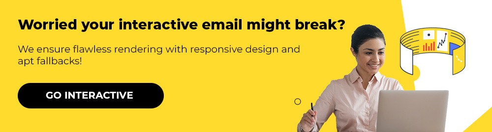
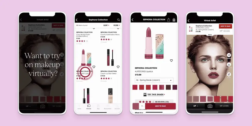
1. Interactivity
Interactivity is an evergreen trend. It’s not likely to peter out. But it can be challenging to code interactive emails.
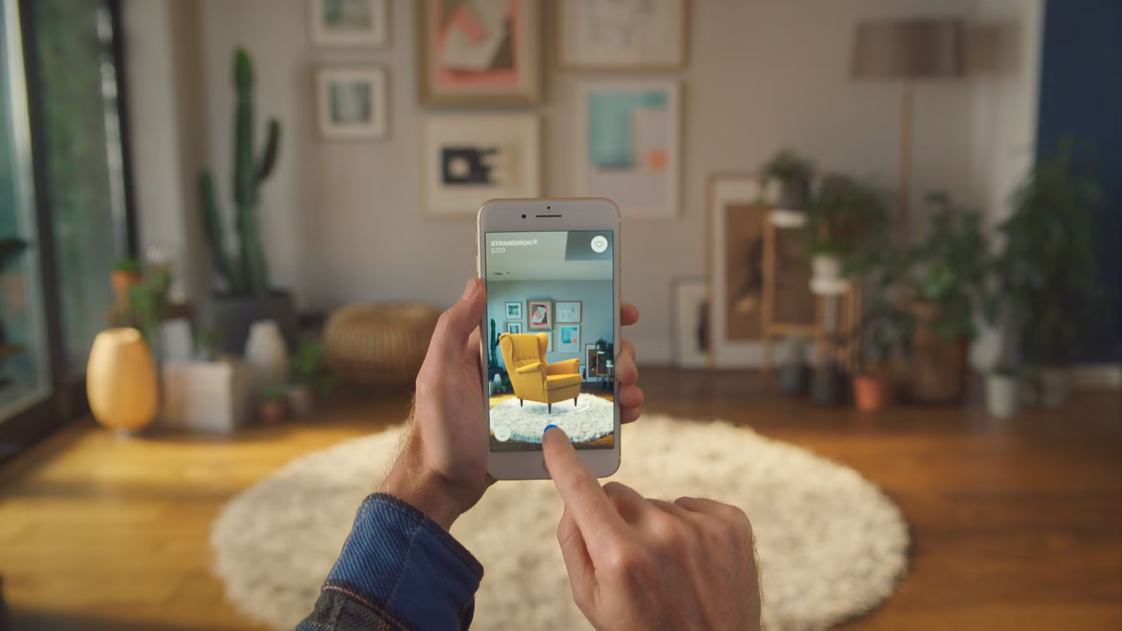
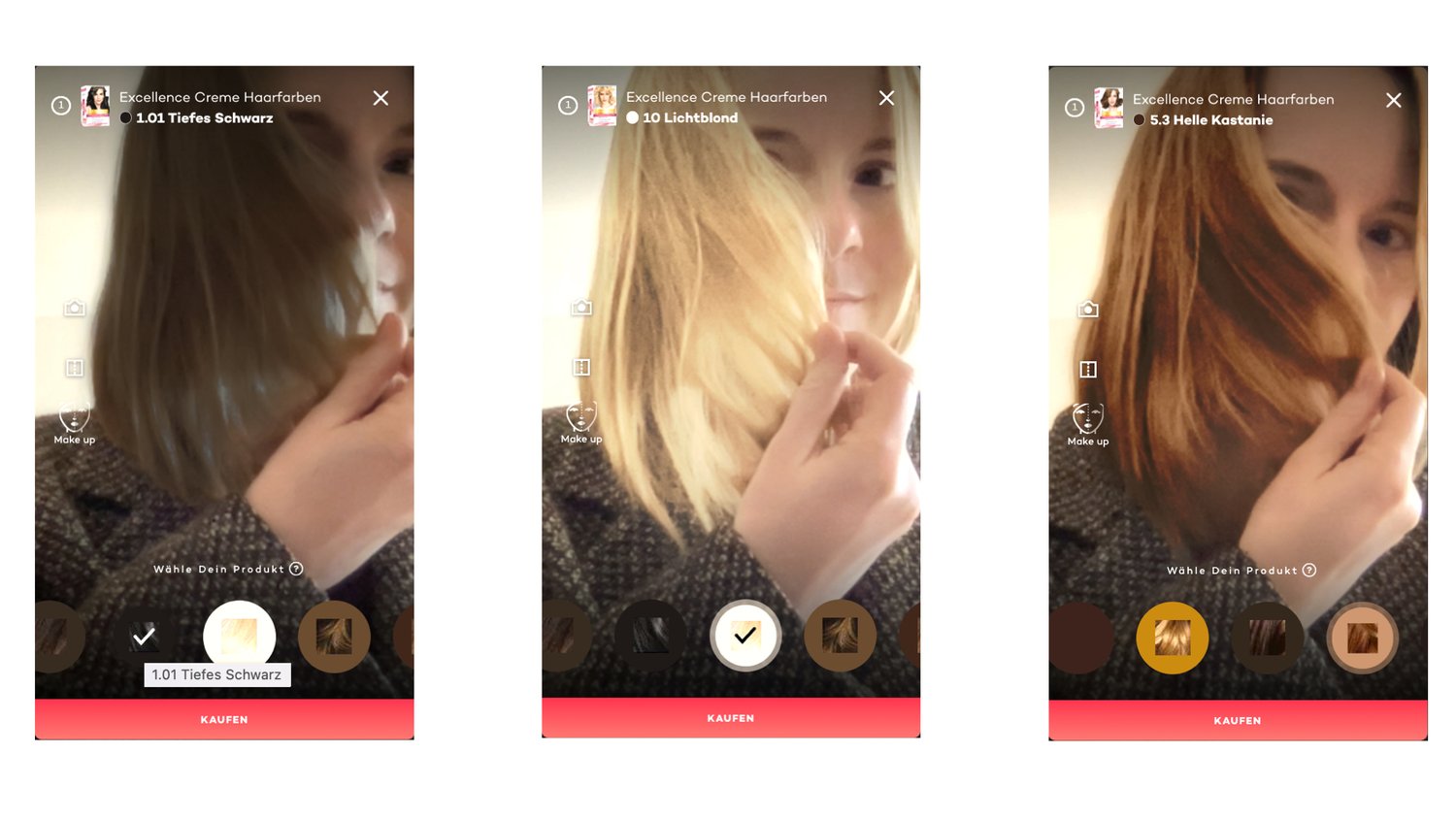
Consider this interactive Volkswagen email below.
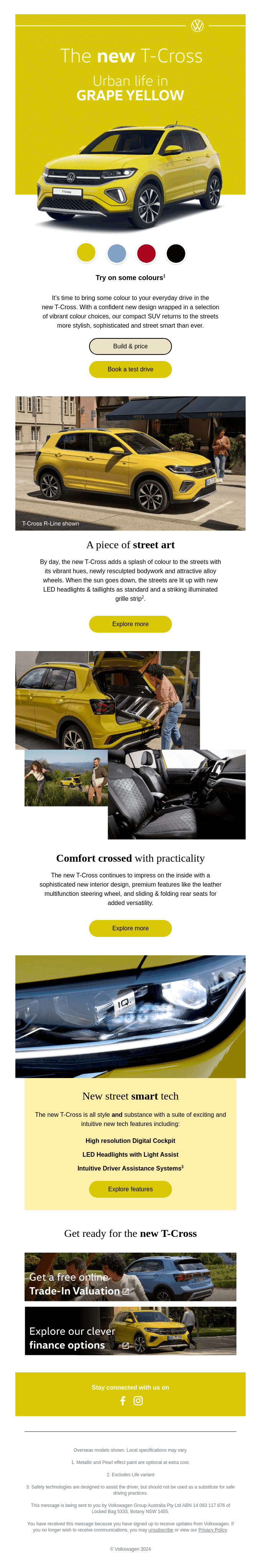
The email allows the user to view the model in four colors. Own a car or no, car color is a huge deal for car buyers. And if one can view a car in different colors inside an email, it doesn’t get any better than that. But how did Volkswagen manage to pull it off? Let’s try to understand that.
Interactivity is based on the dynamics between states and events in programming. The “state” refers to the current position of a system at a given time, whereas “event” describes the change of the state of the system. In the VW email above, the checkbox of a particular color is a state, and the changed color, an event. Now, here’s the code snippet which makes this possible:
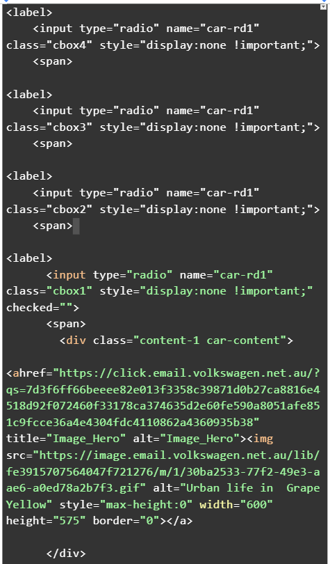
So, which elements define the interactivity of the email? Let’s look at each of them below:
- style=”display:none !important;” hides the color boxes 4, 3, and 2 from view. !important precludes any other CSS rule from displaying the radio button. It’s being used as an emphasis. Keep in mind that the hidden button is still functional, it stores the current/selected “state” of the button image. When you click on a color, the state will be changed to an event.
- <input type=”radio” specifies the radio buttons or the color choices in the email.
- name=”car-rd1″ signifies that only one radio button can be selected at a given time within the email.
- checked=”” indicates that the first radio button i.e. Grape Yellow is pre-selected when the email loads.
Now, speaking of interactivity, you need to consider a few things with respect to inbox support. For interactive emails to work, the inbox must support the following at the least:
- :checked, display:none, <style>
- for: pseudo-class/appearance:none
Apart from Windows Outlook Apps, Gmail, and obscure email clients from different countries, all inboxes support interactivity. Lack of support necessitates the use of fallbacks.
2. 360°-Rotate
The 360°-rotate debuted toward the end of 2023, and is being used by a number of e-commerce brands. The immediate benefit is that it gives you the entire view of the product. Not very different from checking out a product with your bare hands, now is it?
For example, consider the following email template from Joggy.
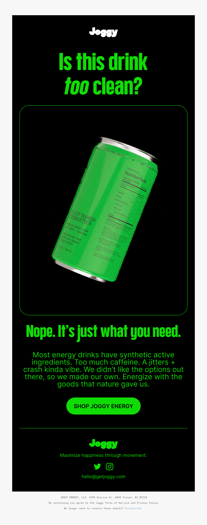
Joggy nails the 360° effect. How did Joggy do it? The following is the relevant code snippet for the effect:
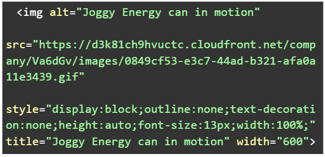
The key attribute in the above snippet is the src attribute which specifies the URL of the image file i.e. the Joggy Energy can.
The value is the URL, pointing to the image hosted on a cloud service. The .gif tells you that the file is an animated GIF.
<img alt=”Joggy Energy can in motion” is the alt-text for screen readers.
Incidentally, it is not the only way to implement animation; you could use keyframes to achieve the effect. However, in the given email, the animation is particularly complex, so recreating it with keyframes might not be tenable. Plus, GIFs enjoy greater rapport with email clients than keyframe animations.
The question may arise, What about the file size of the GIF? In Joggy’s email, the Energy can image is not a small file; and keyframe animations pose no size issues since the animation is achieved using code, not through a sequence of frames.
But Joggy tactfully sidesteps the potential file size challenge by hosting the GIF on a Content Distribution Network or CDN.
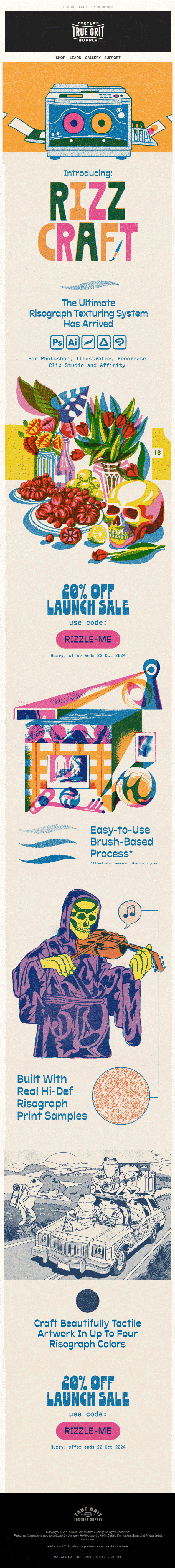
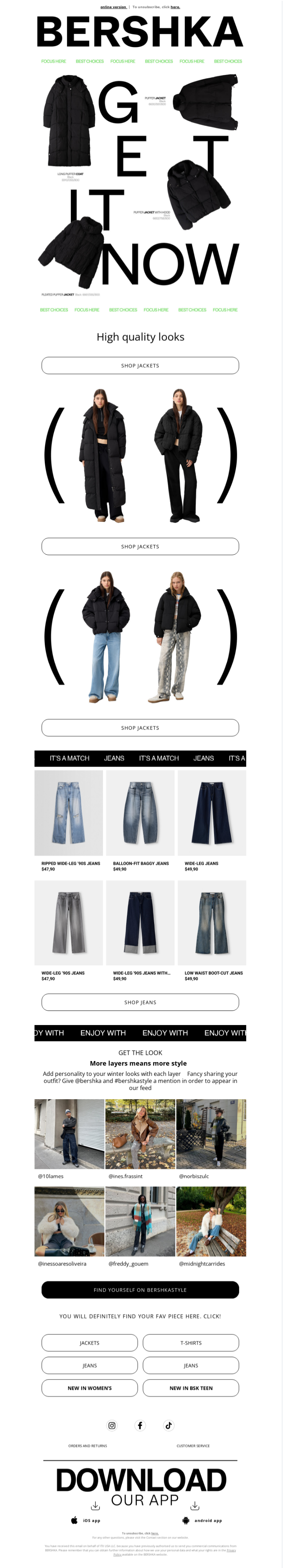
3. Unique Layouts
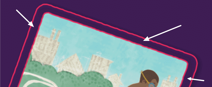
Custom or unique layouts were among the email design trends our infographic featured. Below is an example.
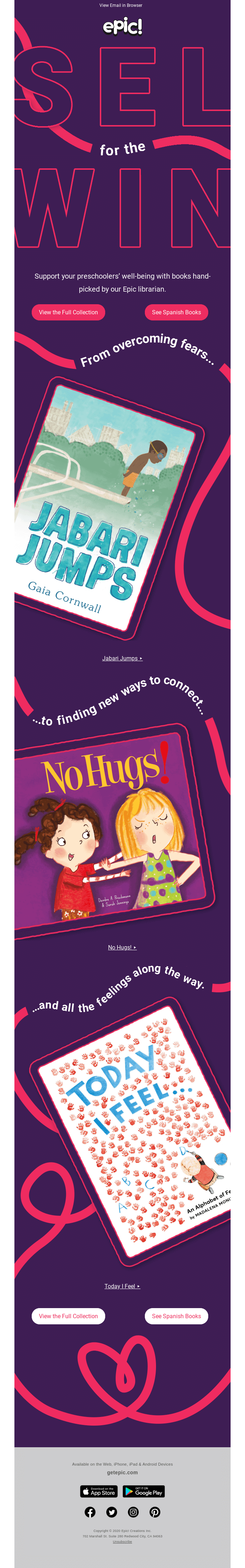
Epic for Kids doesn’t stick to a traditional layout. Alright. But if you know anything about ESPs and like platforms, one can’t design such unique layouts on their builders. So, in order to pull this off, Epic for Kids probably relied on a design tool.
Design tools such as Figma, Adobe XD, and Sketch allow you to create custom layouts.
Now, Epic’s unique layout seems to be driven by the concept of asymmetrical design. Here’s how it does it:
- Balance: Epic’s email maintains visual weight and balance. One instance would be the Jabari Jumps frame complimenting the Today I Feel image. See it for yourself.
- Negative space: The highly economical CTAs and the spaces between and around the typographic trails indicate the good use of white space. Spacing is critical in itself, but when you come to asymmetrical design, it’s more so.
So much about the design. How could one code this monster of an email? Let’s take the first hero image. Here’s the code:
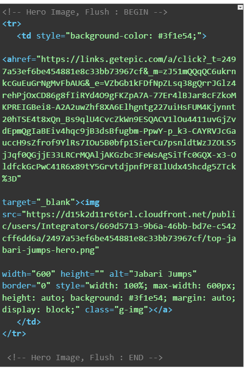
As before, let’s explore the key attributes of the above snippet:
- <tr> defines a row within the table, and <td> defines a cell within the table row.
- style=”background-color: #3f1e54;” this is what sets the background to a very dark violet. This is applied one more time as a fallback because the image has transparent areas (see below), or in case it fails to load. The background color of the image is the same as that of the table cell. Both the <td> tag and <image> tag are dark violet.
- rc=“…” specifies the URL of the image file.
- width: 100%; ensures that the image occupies the entire width of its parent container (<td>).
- max-width: 600px sets the maximum width of the image at 600 pixels.
- height: auto; automatically adjusts the height to fit the width.
Now this is only the code for the first hero image. But the pattern is the same for the images following it.
4. Custom Typography
Also among email design trends, custom typography is making its appearance in the emails of FMCG brands. Usually, and sensibly, confined to the hero text, custom typography doesn’t just help with branding, but it makes your designs pop, and is next only to immersive experience. Take this example below.
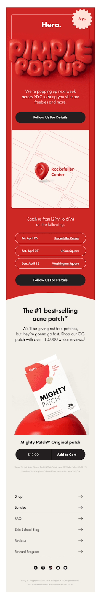
Once again, you can’t create 3D typography in ESPs. It is likely that Hero Cosmetics used design tools like Adobe Express, Adobe Illustrator, and Sculpteo to create that amazing hero text.
The hero text is visually rich, immersive, and scroll-prompting.
Similar to the examples we saw before, the relevant attributes are these:
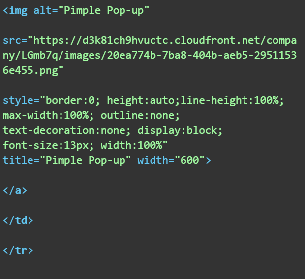
The src attribute points to the URL of the image file. Indeed, as regards bold typography, you must rely on image files. But this brings us to the ever-controversial territory of all-image emails.
Kath Pay, author of Holistic Email Marketing, has argued, “I love a gorgeous email image as much as anyone, but you must balance aesthetics with functionality. That’s why I have advised my clients against sending all-image emails for years and why my design training course focuses on designing for emails using HTML, images and live text.” Keeping her sage words in mind, it is critical you design emails keeping accessibility at the forefront.
Now, is Hero’s email above accessible? Yes!
Because the image tag has an alt attribute; so if images are turned off, the text will be still visible.
In addition, thanks to the display:block; style, the text will be rendered as a block-level element, taking up the full width of the available space, leading to better visibility than if it had been an inline element. Finally, the font size, set to 13 pixels, makes the text legible for email readers.
Toward Leveraging the Latest Email Design Trends: Are You Ready?
If you need help with leveraging the email design trends in 2025, get in touch with our email marketing experts.