
")
Back-to-school is a sprint. And every brand, big or small, is already at the starting line.
If email marketing is part of your playbook, this is your cue to move early. While most of the action kicks off in late July, the smartest brands are already laying the groundwork—warming up their audience with stories, sneak peeks, and well-timed product drops.
To help you get ahead, our team at Email Mavlers has collected X standout back-to-school email examples.
Let these serve as creative fuel for your next winning campaign.
7 Back-to-School Email Templates That Make the Grade
1. Aloha Collection
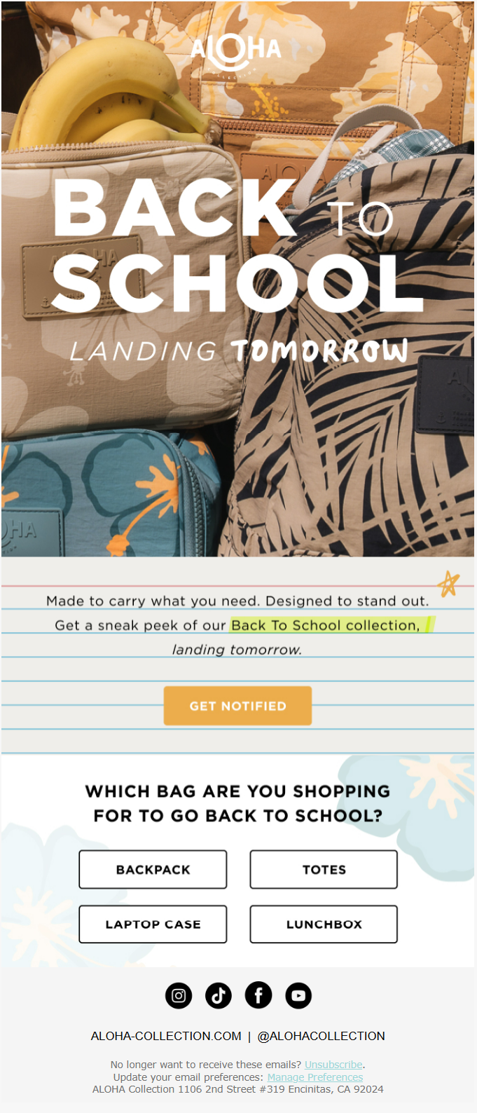
Aloha’s email exhibits several strong design and marketing principles that make it effective for a back-to-school campaign.
The visual hierarchy is expertly crafted, with the bold “BACK TO SCHOOL” headline immediately capturing attention.
The imagery works particularly well by showcasing actual products in a lifestyle context rather than sterile product shots.
The layered backpacks with visible details like bananas and palm leaf patterns give customers a realistic sense of the bags’ size, functionality, and aesthetic appeal. What we loved most? The ruled notebook design that frames the core message.
2. Pink Chicken
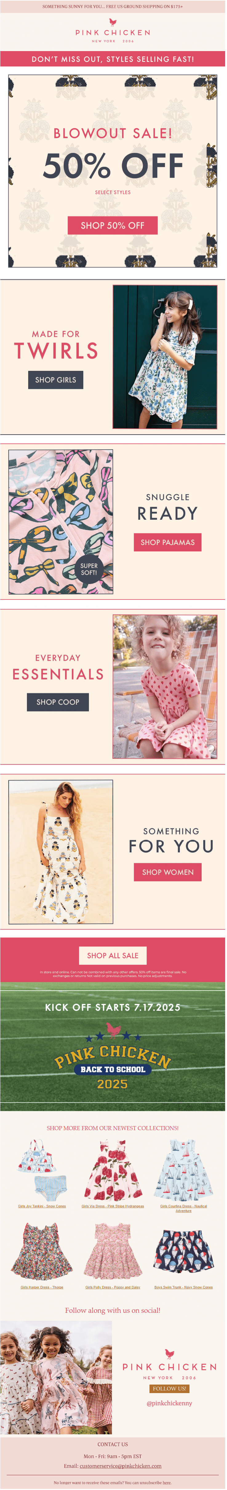
The segmented approach to product presentation is particularly smart for a family-focused brand. By creating distinct sections for “TWIRLS” (girls), “SNUGGLE READY” (pajamas), “EVERYDAY ESSENTIALS” (co-op basics), and “SOMETHING FOR YOU” (women’s), the email acknowledges that the brand’s customer base includes both children and adults, making it feel inclusive rather than narrowly focused.
The images capture authentic moments of play and comfort, which resonates with parents who want to see how clothing will look and function in real life. The diverse representation across age groups and settings also broadens the brand’s appeal.
The visual rhythm created by alternating full-width promotional blocks with split-screen lifestyle sections keeps the email dynamic and prevents the monotony that often plagues long promotional emails.
3. Kickers
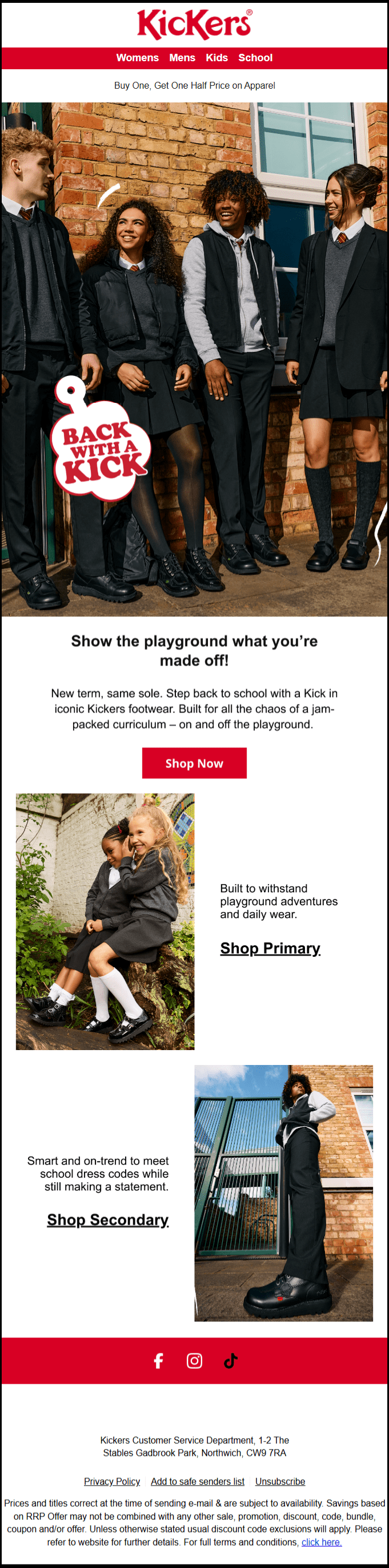
The Kickers email demonstrates masterful use of hero imagery and live text that creates a compelling back-to-school campaign.
Evidently, this isn’t a sterile studio shot but rather captures the genuine energy and camaraderie of actual school life, making the footwear feel integrated into real student experiences.
The email’s sophisticated use of white space and S-curve layout principles in its product grid creates visual flow and prevents cognitive overload. This layout approach transforms what could have been a simple product catalog into an engaging visual narrative that guides readers through different school age cohorts while maintaining commercial effectiveness. The white space surrounding each product image creates framing effects that make the photography appear more premium and focused.
We also love the minimalist use of the color scheme. The palette is deliberately limited to the brand’s signature red, clean white, and black text, creating a cohesive visual identity.
4. Mine4Sure
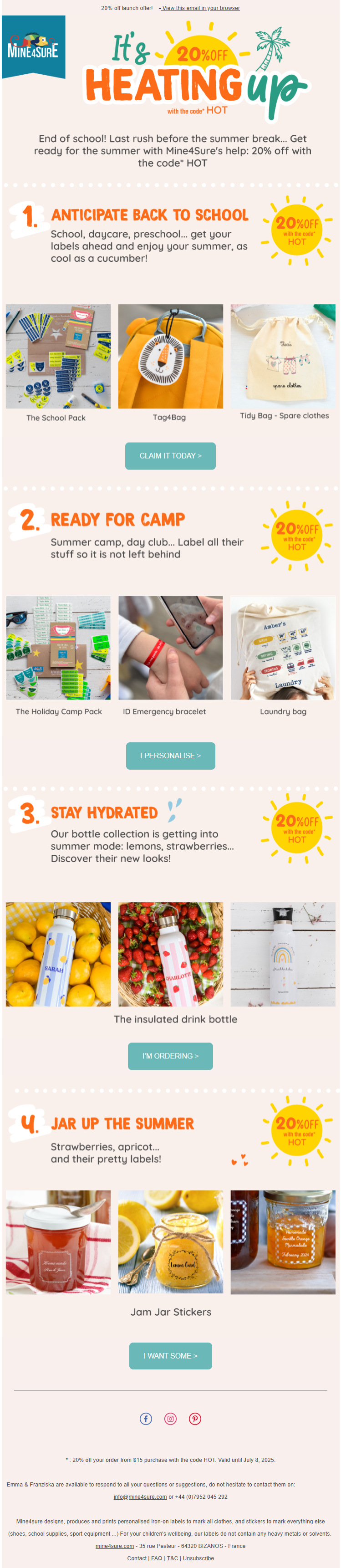
This MineSure email is absolutely nailing the summer vibes with a design that feels like sunshine in your inbox.
The whole layout has this brilliant numbered journey thing going on that totally works. Instead of just throwing products at you, they’re creating these little summer scenarios that parents can actually relate to.
The color palette is doing serious work here. Those warm oranges and sunny yellows paired with that cool teal create this perfect summer energy that doesn’t feel overwhelming or chaotic. The consistent sun icons showing the discount percentage are such a nice touch – it reinforces the heating up theme without being heavy-handed about it.
The progression from back-to-school prep through camp readiness to summer fun activities creates this natural flow that follows how families actually think about summer planning.
Finally, the email’s CTAs are absolutely brilliant because they ditch the boring “Shop Now” nonsense and actually speak like real humans having conversations. Instead of generic button text that could work for literally any brand selling anything, these CTAs feel like they’re coming from someone who actually gets what parents are going through during summer prep.
5. Deux par Deux
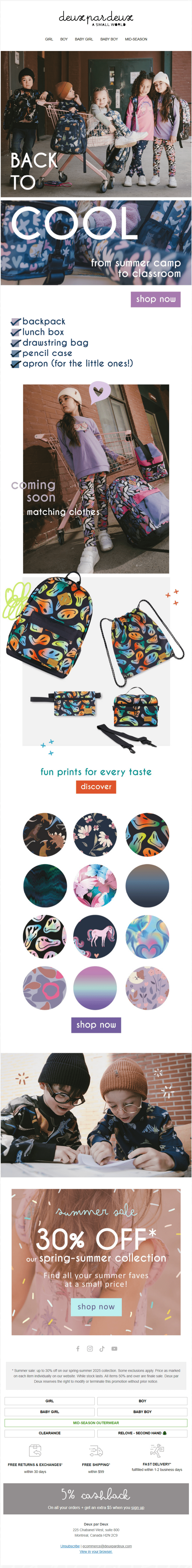
This Deux Par Deux email is crushing it with a design that feels like flipping through a cool kids’ fashion magazine rather than your typical promotional email. The whole aesthetic screams “effortlessly stylish” in a way that makes parents feel like they’re discovering some insider brand rather than being sold to.
The “BACK TO COOL” messaging is a smart play on words that feels fresh and actually captures what parents want for their kids – not just going back to school, but going back with confidence.
The lifestyle photography throughout feels authentic and unforced, showing kids actually being kids rather than posed mannequins. The final sale section maintains the premium aesthetic even while pushing discounts, which is tricky to pull off but they’ve managed it perfectly.
We’re fans of the bleeding effect—where images and text break past the boundaries. In this email, it adds a lively, fluid energy that makes it feel vibrant and quite refreshingly off-template.
6. Elodie Details
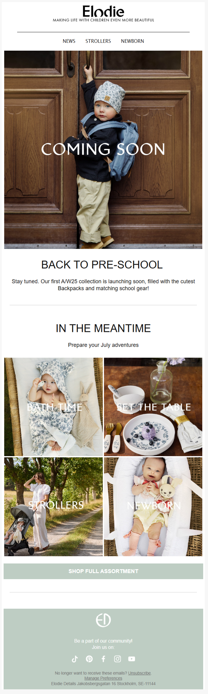
That hero image is stunning storytelling. The little kid reaching up toward those wooden doors creates this perfect metaphor for growth and aspiration, while the “COMING SOON” overlay builds anticipation without feeling pushy.
The grid layout in the “IN THE MEANTIME” section is genius because it creates these little lifestyle vignettes that feel more like Instagram posts than product shots.
Everything looks like it belongs in a Kinfolk magazine spread – natural lighting, beautiful textures, that Nordic minimalism that feels both cozy and sophisticated. The color palette of soft sage greens and warm neutrals creates a calming, premium feeling.
7. Adornmonde
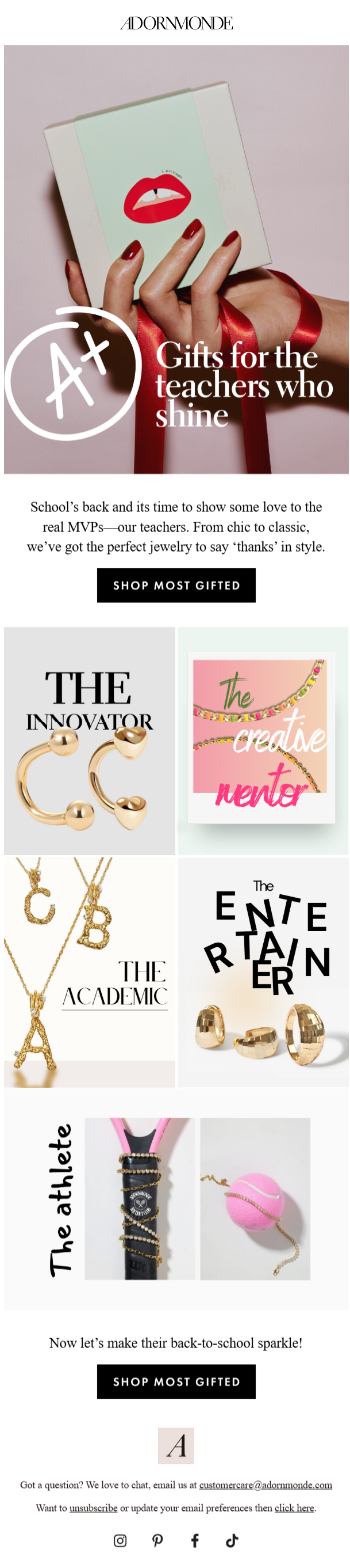
Source: Inbox
This Adornmonde email is serving pure creative genius with how it has positioned teacher appreciation as this chic, editorial moment rather than just another back-to-school shopping push.
That hero image is absolutely perfect – the red lips on the mint green card with those perfectly manicured red nails creates this instant visual pop that screams sophistication.
What’s brilliant is how they’ve created these personality-driven categories that feel like they’re describing actual people rather than just product types. These aren’t just jewelry styles, they’re recognizing that teachers are complex, interesting humans with different personalities and styles. It makes the gift-giving feel so much more thoughtful and personal.
The typography treatments for each category are gorgeous too – mixing different fonts and layouts keeps each section feeling fresh and prevents that boring catalog look.
Wrapping Up
From segmentation and lifestyle storytelling to creative layouts and unexpected design details, each of these examples proves that great email marketing is equal parts strategy and style.
As inboxes get busier, your ability to connect hinges on how well you can stand out while staying true to your brand voice. Whether it’s through thoughtful CTAs, fluid design, or playful messaging, now’s the time to experiment, inspire, and engage.
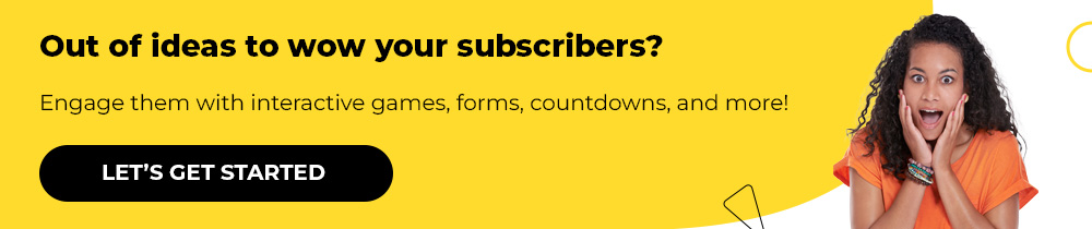
Need help designing your back-to-school campaign? Get in touch with our designers, and let’s get started!