

Crafting HTML emails is unlike building regular web pages. Email clients come with inconsistent and often limited rendering capabilities, particularly when it comes to CSS and responsive design. Popular platforms such as Outlook, Gmail’s mobile apps, and Yahoo Mail either lack support for media queries or only handle them inconsistently—even though media queries are the go-to solution for mobile-friendly layouts. In fact:
- According to Litmus, on average, a single email can have over 15,000 potential renderings due to combinations of providers, operating systems, clients, screen sizes, image display states, and code alterations by ESPs.
- As per Sinch Mailjet’s Inbox Insights study, email teams rank inconsistent rendering as one of their top challenges, second only to making emails responsive.
To tackle this challenge, email developers use an approach called fluid or hybrid responsive design. This method, also called spongy email template coding, eliminates the need for media queries, allowing emails to adapt naturally to different screen sizes.
In this blog post, our email developer explores how an HTML email without media query can still be responsive and mobile-friendly, working across all major clients.

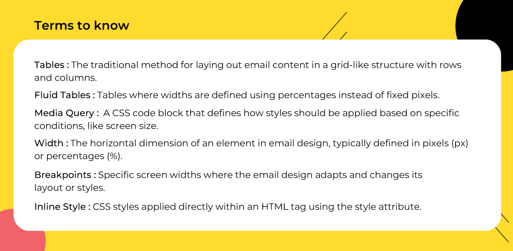
Key principles of responsive email templates without media queries
Designing a responsive email template without media queries requires a balance of reliability and adaptability. The following principles form the foundation of this approach:
- Structure with tables: Unlike web development where CSS grids and flexbox dominate, tables remain the most reliable method for creating layouts that render consistently across even the most stubborn email clients.
- Use percentage-based widths: Instead of fixed pixel dimensions, setting container widths in percentages ensures that columns and content automatically resize to fit different screen sizes, from mobile to desktop. This technique is core to fluid email design. (Interestingly, the variety of viewport sizes spans hundreds of unique display dimensions.)
- Set max-widths for desktops: To prevent content from stretching too wide on larger monitors, apply a max-width property. This creates a comfortable reading experience for desktop users while maintaining flexibility on smaller screens.
- Rely on inline CSS: Many email clients strip out or ignore external and embedded stylesheets. Inline CSS guarantees that your styling is preserved and displayed consistently across platforms.
- Avoid unsupported CSS: Shorthand properties, floats, or advanced CSS often fail in email clients. Sticking to safe, widely supported CSS rules ensures your design won’t break in Outlook, Gmail, or Yahoo.
- Make visuals block-level: Applying display: block to images and buttons prevents awkward gaps, unwanted padding, and alignment issues.
- Adopt fluid layouts for fluid email design: By defining widths in percentages and allowing elements to “flow” naturally, your design becomes adaptable. This fluid approach makes the template adjust smoothly without the need for media queries.
“The fluid part refers to the fact that we use lots of percentages and elements that can move and expand to fit the space they are given. The hybrid part is because we also use max-width to constrain these free-flowing elements, and restrict the overall size of our email on larger screen sizes,” explains Nicole Merlin, expert email developer.
These techniques empower you to build a responsive email template that looks polished, loads correctly, and adapts gracefully—no media queries required. In other words, they form the foundation of coding a modern email template for responsive design.
Responsive HTML email template: The deep dive
Now, let’s get into the details of coding a scalable HTML email template without media queries.
Table-based layout
Nesting tables is still the most reliable way to structure content in email clients, as they offer consistent rendering across various platforms that may not fully support modern CSS.
For example, take a look at the following snippet:
<table width="100%" border="0" cellspacing="0" cellpadding="0">
<tr>
<td>
<table width="100%" border="0" cellspacing="0" cellpadding="0">
<tr>
<td style="padding: 10px;">
<!-- Inner content -->
</td>
</tr>
</table>
</td>
</tr>
</table>
Now, here’s a breakdown of the code and why, as an HTML email without media query, it still works reliably:
- <table width=”100%”>: The outer table is set to 100% width, meaning it automatically stretches to fill the available screen space.
- No fixed widths: Since no rigid pixel values are set for the main container, the layout naturally adapts to different screen sizes without requiring breakpoints or media queries.
- Nested table: The inner table is also set to width=”100%”, ensuring that content within scales proportionally with the parent container.
- cellpadding, cellspacing, and border set to 0: These attributes prevent unwanted gaps and borders, ensuring consistent rendering across various email clients.
- Inline padding (style=”padding:10px;”): Styling is applied inline, which is the most reliable way to ensure email clients like Outlook or Gmail preserve the design.
- Simple, universally supported HTML: Using basic table-based structure avoids modern CSS properties that are often unsupported in email clients.
Instead of relying on conditional CSS rules, the layout scales on its own, helping you fix email responsiveness without media queries. Since table-based HTML is universally supported across email clients, and inline styles ensure consistent rendering, the template remains dependable whether opened in Outlook, Gmail, Yahoo, or Apple Mail.
Fluid widths with max:width
Use percentage-based widths for fluid layouts, but combine them with max-width on parent elements (often <td> or <table>) to prevent content from expanding too wide on large screens. This creates a “spongy” effect where content expands to a certain point and then stops.
For example, consider the following code snippet:
<table width="100%" border="0" cellspacing="0" cellpadding="0">
<tr>
<td width="50%" style="width: 50%; padding: 10px;">
<!-- Content goes here -->
</td>
<td width="50%" style="width: 50%; padding: 10px;">
<!-- Content goes here -->
</td>
</tr>
</table>
In this example, the table is set to width=”100%”, meaning it will always stretch across the available screen space. Inside the table, each <td> is given width=”50%” (both as an attribute and inline CSS), which ensures that the two columns split the space evenly, no matter the device size. The style=”padding: 10px;” adds breathing room inside each cell, preventing the content from feeling cramped.
This setup is reliable because it uses percentage-based widths instead of fixed pixels, allowing you to avoid media queries in HTML email.
display:block for images
In HTML and CSS, display:block is a property that tells the email client to treat an element as a block-level element instead of an inline element. This adjustment is essential in hybrid coding for responsive email.
When you apply display:block to images or buttons in an email:
- The element won’t leave mysterious gaps underneath (common in Outlook, Gmail, and Yahoo).
- Images and buttons will align properly with surrounding table cells.
- You can center or control spacing around them more consistently.
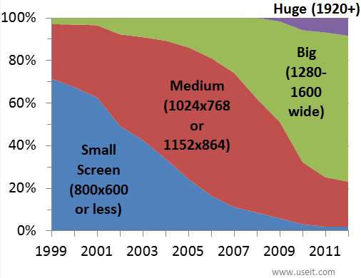
Screen resolution over the years. Source: NN Group
In email design, inline elements such as <img> or <a> are naturally placed within a line of text, which often results in unwanted gaps or white space around them. By contrast, block-level elements like <div> or <p> expand to take up the full available width and automatically begin on a new line. This distinction is important because applying display:block to elements like images or buttons forces them to behave like block elements, eliminating spacing issues and ensuring a cleaner, more consistent layout.
Inline CSS
All styling in emails should be applied directly to individual HTML elements using the style attribute. Many, including Gmail and Outlook, strip out these styles altogether, leaving your email unformatted or broken. By using inline styles, you ensure that your design choices—such as fonts, colors, padding, or alignment—are preserved across every client.
Here are some common examples of inline styling used in HTML emails:
- Text styling: Inline text styles guarantee consistent font, size, and color across clients. Without them, text can default to generic or mismatched styles, hurting readability and brand identity.
<td style="font-family: Arial, sans-serif; font-size: 16px; color: #333333; line-height: 24px;">
  Welcome to our newsletter!
</td>- Image formatting: display:block removes unwanted gaps around images, and setting width and removing borders ensures logos and visuals align cleanly in all clients.
<img src="logo.png" alt="Company Logo" width="200" style="display: block; border: 0; margin: 0 auto;" />- Button design: Since many clients don’t support CSS classes, inline styles are essential for creating buttons that look clickable and visually consistent.
<a href="https://example.com" style="display: inline-block; padding: 12px 24px; background-color: #007BFF; color: #ffffff; text-decoration: none; font-size: 16px; border-radius: 4px;">
  Click Here
</a>
These inline styles make sure your email looks as intended across clients, regardless of whether they respect <style> tags or external CSS files.
mso-table-lspace and mso-table-rspace
These are Microsoft Office-specific CSS properties designed to manage how Outlook handles spacing around tables in emails:
- mso-table-lspace: Controls the left spacing around a table.
- mso-table-rspace: Controls the right spacing around a table.
They are primarily used to override Outlook’s default behavior, which often adds unwanted space around tables, an issue common in Outlook versions 2007-2019 and Outlook for Windows.
Why they matter
Unlike most email clients that rely on web browsers for rendering, Outlook for Windows uses Microsoft Word’s engine. This approach frequently introduces quirks that break otherwise clean designs. A common problem is that tables may display extra left or right margins, even when margin or padding is explicitly set to 0. This can throw off alignment, particularly in fixed-width layouts, and make columns or entire sections appear shifted.
Fixing the Outlook issue is critical, not least because:
- Outlook accounts for roughly 5–11% of the overall email client market, although its dominance in B2B and corporate environments means its rendering issues affect a large share of business communications, not just edge cases.
- On a global scale, desktop Outlook clients make up about 2% of all email opens, while Outlook’s mobile apps contribute around 9%. Small, but not insignificant.
So Outlook remains a persistent obstacle for modern email development, with users forced to employ legacy coding while wading through these common issues in responsive email coding.
The fix
To prevent these issues, you can reset the properties in your CSS, as shown below:
table {
  mso-table-lspace: 0pt;
  mso-table-rspace: 0pt;
}
That CSS reset tells Outlook not to add extra left or right space around tables.
If you don’t apply mso-table-lspace and mso-table-rspace, tables in Outlook may:
- Appear misaligned within the email body
- Shift slightly left or right, breaking visual balance
- Cause columns not to line up properly with other content
By including these properties, you ensure that table-based layouts remain consistent and aligned in Outlook, just as they appear in other major email clients.
Avoid floats and complex CSS
Another way to avoid media queries in HTML email is to avoid floats.
Since many clients use outdated or limited rendering engines, elements may not appear as intended: floated items can stack instead of sitting side by side, positioned elements may overlap or shift, and advanced selectors may be ignored entirely.
Therefore, for reliable email design, it’s safer to use simple, widely supported CSS combined with table-based layouts to ensure consistent rendering on email platforms.
Responsive HTML email template: Sample code
Creating responsive emails without relying on media queries is possible by using fluid layouts, table-based structures, and inline styles. The following sample code demonstrates a fully functional responsive email template that adapts smoothly across devices while remaining compatible with major email clients.
<!DOCTYPE html>
<html>
<head>
    <meta charset="UTF-8" />
    <title>Responsive Email Without Media Queries</title>
</head>
<body style="margin:0; padding:0; background:#f4f4f4;">

    <!-- Outer Wrapper -->
    <table width="100%" cellpadding="0" cellspacing="0" border="0" bgcolor="#f4f4f4">
        <tr>
            <td align="center">

                <!-- Main Container -->
                <table width="100%" cellpadding="0" cellspacing="0" border="0" style="max-width:600px; width:100%; background:#ffffff;">

                    <!-- Header -->
                    <tr>
                        <td align="center" style="padding:20px;">
                            <img src="logo.png" width="100%" style="max-width:200px; height:auto; display:block;" alt="Logo">
                        </td>
                    </tr>

                    <!-- Hero Section -->
                    <tr>
                        <td align="center" style="padding:20px;">
                            <h1 style="font-size:24px; margin:0; font-family:Arial, sans-serif;">Welcome!</h1>
                            <p style="font-size:16px; font-family:Arial, sans-serif;">
                                This email adjusts smoothly without media queries.
                            </p>
                        </td>
                    </tr>

                    <!-- Two-Column Section -->
                    <tr>
                        <td>
                            <table width="100%" cellpadding="0" cellspacing="0" border="0">
                                <tr>
                                    <td width="50%" style="padding:10px;">
                                        <img src="image1.jpg" width="100%" style="display:block;" alt="Image 1" />
                                    </td>
                                    <td width="50%" style="padding:10px;">
                                        <img src="image2.jpg" width="100%" style="display:block;" alt="Image 2" />
                                    </td>
                                </tr>
                            </table>
                        </td>
                    </tr>

                    <!-- Footer -->
                    <tr>
                        <td align="center" style="padding:20px; font-size:12px; font-family:Arial, sans-serif; color:#999;">
                            © 2025 Your Company. All rights reserved.
                        </td>
                    </tr>

                </table>

            </td>
        </tr>
    </table>

</body>
</html>
This sample demonstrates hybrid coding responsive email structure: table-based layouts, fluid widths, inline CSS, and block-level elements working together to achieve an HTML email without media query that adapts across devices. This method simplifies coding an email template for responsive design while ensuring broad compatibility.
Let’s quickly understand the key aspects of the code:
- Outer wrapper table: The outermost table is set to width=”100%”, which ensures the email stretches across the entire screen regardless of device. This full-width approach creates a flexible container that adapts naturally to both desktop monitors and mobile devices.
- Main container table: Inside the wrapper, the main content table uses max-width:600px with width:100%. This combination keeps the email readable on large screens while still allowing it to shrink proportionally on smaller screens, maintaining a balanced layout without breaking.
- Header section: The header includes a logo image with width=”100%” and max-width:200px, allowing it to scale fluidly. Inline styles like display:block and height:auto prevent gaps or distortion, ensuring the logo aligns correctly across all email clients.
- Hero section: This section contains a heading and paragraph styled with inline CSS for font family, size, and spacing. Inline styling guarantees that text appears consistent in all clients, while proper padding and line-height maintain readability on both mobile and desktop screens.
- Two-column section: A nested table creates two <td> cells, each set to width=”50%”, containing images with display:block and width=”100%”. This approach ensures the columns scale proportionally, creating a “spongy” effect that adapts smoothly on smaller devices without requiring media queries.
- Footer: The footer uses inline styles for fonts, colors, padding, and alignment. These styles ensure the footer text is legible, centered, and visually separated from the main content, maintaining a professional look across all clients.
This approach combines table-based layouts, percentage widths, inline CSS, and block-level elements to deliver a responsive email template that renders consistently across devices, achieving mobile-friendly design without the complexity of media queries.
Limitations of coding minus media queries
- Multi-column sections: 2 or more sections don’t render consistently across Outlook and other devices, and on mobile, they will automatically stack.
- Poor control on mobile layouts: Without reliable media query support, the template can’t precisely adjust spacing, font sizes, or column behaviour on different phones.
- Multi-column stacking on small screens: Two-or-more column sections frequently stack vertically on mobile, which can break intended layouts and spacing.
- Inconsistent Outlook (Windows) rendering: Outlook for Windows often ignores modern CSS (flex, floats, some paddings/margins), causing broken alignment, clipped content, or misplaced images.
- Different behavior on Outlook for Mac / macOS mail clients: Outlook for Mac and Apple Mail use different rendering rules, so something that looks correct in one macOS client can appear wrong in another.
- Limited support for advanced CSS: Properties like position, float, background-size, and many modern CSS selectors may not work consistently across clients.
- Images and spacing can shift: Images without explicit width/height or inconsistent line-height/vertical-align settings may move or resize unexpectedly across clients.
- Interactive/animated elements are unreliable: Animations, complex hover effects, or interactive components often fail or degrade differently per client (often removed entirely).
- ESP limitations: Some ESPs strip or alter CSS and HTML (e.g., removing <style> blocks), so the template must be defensive and use inlined, simple CSS.
Wrap-up: Simplifying coding email template for responsive design
Creating responsive HTML emails without media queries is not only possible but highly reliable when you use table-based layouts, fluid widths, inline CSS, and block-level elements. Please understand that inconsistent rendering can seriously undermine campaign performance, which directly affects your business as a whole. After all, nearly 24% of businesses report recurring inbox delivery issues, directly affecting revenue and customer retention.
No-media-query email development isn’t just a technical choice, it’s a strategic advantage that drives measurable business results through lightweight responsive email design.
And our developers at Email Mavlers see it first-hand.
So stop letting email client limitations dictate your design. Take charge, experiment boldly, and build email templates that actually perform.
If you want mobile-friendly emails that render perfectly across every client, get started with our email development team today!
Nikunj Butani
Chandni Rola
Susmit Panda - Content writer