

Email digests remain one of the most dependable formats for keeping audiences informed and engaged without overwhelming them.
A well-designed digest can summarize a week’s worth of activity, highlight key stories, or deliver personalized insights that strengthen brand connection. Yet, many brands still treat digests as an afterthought—sending cluttered layouts, inconsistent visual styles, or non-scannable content.
This guide from our design team breaks down everything you need to to learn how to design digest emails that are effective, attractive, and user-friendly.
Before we begin, note that an email digest is NOT the same as a newsletter.
The latter is a single announcement sent to your audience, whereas a digest refers to a curated collection of multiple announcements sent together in one email.

Why Email Digests Matter
Even as automation and real-time updates dominate marketing, the email digest fulfills a unique need: it saves time for readers and centralizes your best content.
- Saves attention: Instead of a flood of daily emails, users get concise, curated updates.
- Builds trust: A consistent, useful summary reinforces your brand as a helpful resource.
- Drives repeat engagement: Readers who click from digest summaries often become your most active subscribers.
- Supports personalization: Digests can easily showcase user-relevant content based on behavior or preferences.
A good email digest acts as your brand’s editorial voice—selective, insightful, and easy on the eyes. To begin with, consider the following email digest template from Zapier.

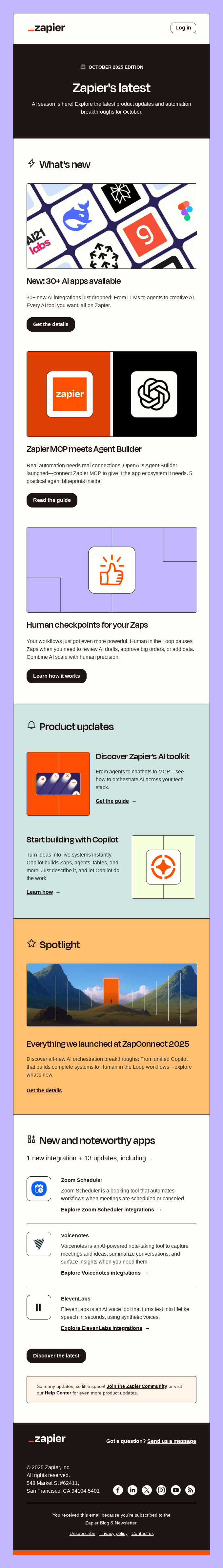
Zapier’s digest email example excels in visual hierarchy and modular design, making it easy to scan and engaging to read. Each section is clearly defined with distinct background colors and iconography, guiding the reader seamlessly through the content. Plus, the use of clean typography, generous white space, and consistent CTA buttons creates a balanced aesthetic.
Stay with us as we show you how to design digest emails for your subscribers.
How to Create Email Digest Templates
1. Start with A Clear Objective
Before designing, decide what purpose the digest serves. This shapes your layout, tone, and content hierarchy.
Common types include:
- News/content roundups: Summarizing new blog posts, videos, or community updates.
- Product or feature updates: Highlighting what’s new in your platform or service.
- Performance/activity reports: Sharing user stats, insights, or personalized summaries.
- Event or learning recaps: Compiling takeaways or recommended next steps.
Once the purpose is defined, keep every design and copy choice aligned with that primary goal. A digest without focus quickly becomes noise.
2. Keep the Layout Simple & Scannable
A weekly digest email template should not overwhelm readers. Scannability should be your top priority. Take a look at this email digest template by Nieman Lab.

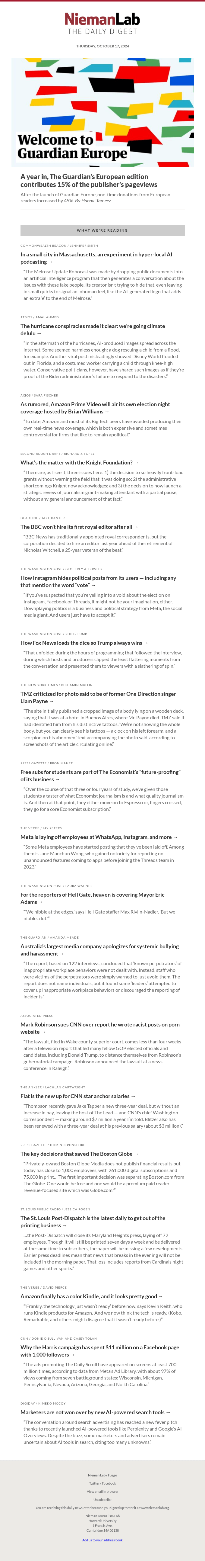
This NiemanLab Daily Digest email shines through its clean, editorial-style layout that perfectly complements its journalistic purpose. The minimalist design, dominated by black text on a white background, ensures maximum readability and focus on content.
Based on the above digest email example, consider these best practices for layout:
- Stick to a single-column structure. It improves readability across mobile and desktop.
- Create clear visual sections. Separate each story or content block with white space, borders, or color bands.
- Include consistent heading styles. Use size, color, or typographic hierarchy.
- Limit the scroll length. Keep the email under 8-10 key items. Offer “View More” or “See All” links instead.
A digest should feel easy to skim yet informative enough to encourage clicks. These layout rules also support responsive digest email design, ensuring consistency across all devices.
3. Choose A Readable Type & Color System
Typography and color quietly guide the reader’s journey through your digest. Keep the following best practices in mind:
- Use clean, system fonts. Options like Arial, Helvetica, or Georgia maintain legibility across email clients.
- Stick to 1–2 typefaces. One for headers and another for body copy should be enough.
- Maintain high contrast. Dark text on a light background remains the most accessible choice.
- Establish a color hierarchy. Use brand colors for headings or buttons but keep the body content neutral.
- Respect accessibility. Ensure color contrast ratios meet WCAG standards for all users.
Your design should never compete with the information being delivered. Simplicity equals clarity. See it all in action in the below weekly digest template from Awesome Coffee.


The bold color palette—anchored in rich purples, yellows, and oranges—creates strong visual contrast and keeps readers engaged throughout the scroll. Well-structured content blocks, paired with high-quality imagery and consistent rounded buttons, make the layout feel both inviting and cohesive. Typography is clean and friendly, supporting a conversational brand voice.
Indeed, these choices also reflect best email design tips for digest newsletters—balancing brand tone with functionality.
4. Determine the Right Structure
Think of your digest as a mini magazine issue. Each section should feel intentional and easy to navigate. A strong structure usually includes:
- Header: Logo or brand identifier with optional tagline.
- Hero or top story: A featured item with an image or lead content.
- Section summaries: Grouped items such as “Latest Articles,” “Top Reads,” or “Team Picks.”
- Personalization block: Optional section showing user data, saved preferences, or recommended content.
- Footer: Links to social profiles, unsubscribe, or profile management.
Not limited to weekly digest templates, but even in general, establishing a visual and structural rhythm helps regular readers instantly know where to look. A solid email layout for digest emails keeps readers oriented and encourages repeat engagement.
5. Write Copy that’s Short & Informative
Text is often what makes or breaks an email digest. Readers decide in seconds whether to stay or scroll. Consider this weekly digest email template from The Cut.

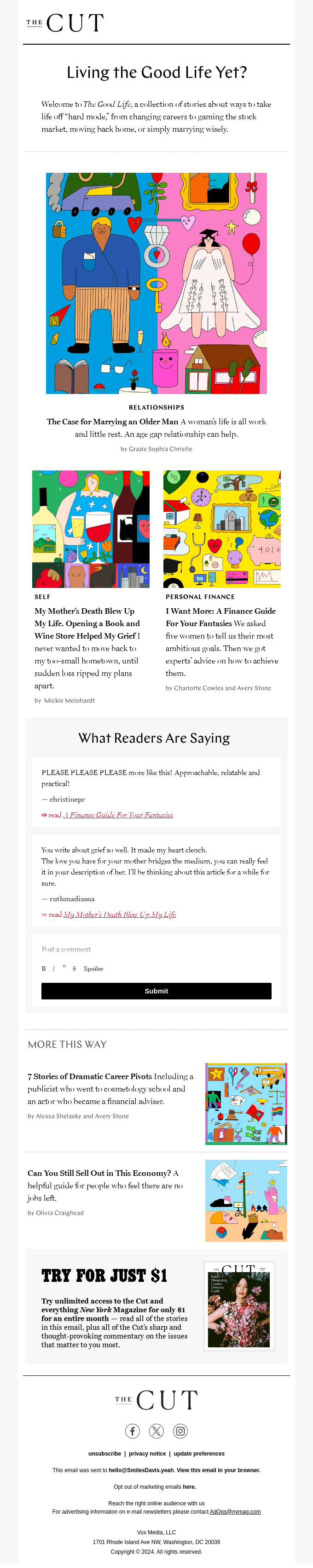
Each section is concise and purposeful. Headlines are short, punchy, and immediately capture interest, while subheads and blurbs provide just enough context to invite clicks. The minimalist layout, generous white space, and single-column structure make it easy to skim.
Vibrant, editorial-style illustrations break up the text and draw attention to feature stories.
For this kind of short, high-impact copy, keep the following best practices in mind:
- Use short headlines—under 6–8 words whenever possible.
- Follow with one-sentence summaries focused on value.
- Use action verbs—“Explore,” “Download,” “Learn,” “See How.”
- Avoid duplication; if content titles are self-explanatory, skip redundant text.
- Lead with benefits, not details—why the reader should click.
Always write for the skimmer first, then for the reader who wants to dive deeper. Incorporating these email design tips for digest newsletters early in your process ensures that design and copy reinforce each other seamlessly.
6. Balance Visuals & White Space
Images in a digest must serve clarity, not decoration. Too many visuals slow loading and distract from CTAs. Here are some of the guidelines to follow:
- Use thumbnails or small preview images for stories.
- Ensure all images are optimized for fast loading (under 150 KB each).
- Always include alt text for accessibility.
- Keep margins generous—white space boosts focus.
- Use visual separators to group similar items rather than heavy dividers.
A visually light digest with space to breathe feels modern and easy to digest. For example, this weekly digest email template from Forerunner is right on the money.

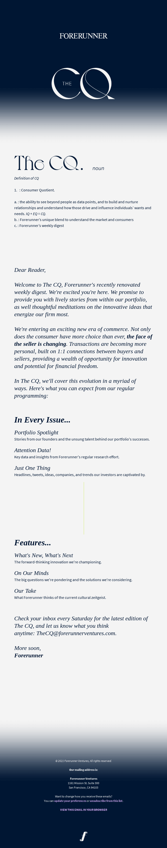
The spacious layout gives every element room to breathe, creating an elegant sense of calm and focus. The soft gradient header transitions smoothly into a clean, text-forward body that feels light and airy. Typography is sophisticated yet readable, with subtle hierarchy guiding the eye through definitions, introductions, and section highlights. The restrained color palette—deep navy on white—adds to the premium, editorial tone while ensuring clarity. These are principles that also enhance responsive digest email design for better usability.
7. Add Clear CTAs
Now, this must have been evident from our digest email examples. Design CTAs to stand out but not overpower the layout. To that end, here are a few things to consider:
- Use one primary CTA per content block.
- Keep labels brief: “Read More,” “Watch Now,” “Get Report.”
- Design with color contrast and ample padding.
- Avoid multiple similar CTAs bunched together—they cancel each other out.
A great digest drives readers from summary to full content with minimal friction. In fact, adding subtle motion or hover effects can even introduce interactive digest email design elements without overwhelming the layout.
8. Test Across Devices & Clients
Even the best design fails if it breaks on mobile or dark mode. Testing every major platform ensures your digest stays professional and accessible. Checklist for testing:
- Review rendering on popular clients (Gmail, Outlook, Apple Mail).
- Check mobile vs. desktop spacing and font scalability.
- Test linked images and alt text visibility.
- Validate color contrast in dark mode. This one point can’t be overstated.
- Ensure all CTAs are touch-friendly with adequate spacing.
Always preview in live mode before final send. Small design breaks can quickly erode trust. And testing is especially vital in the case of interactive digest email design.

Design Digest Emails with Email Mavlers
A well-crafted email digest isn’t just a recap, it’s a rhythm your audience grows to expect and rely on. When design, structure, and storytelling align, your digest becomes more than an information bundle; it becomes a branded experience that informs, delights, and engages.
Whether you’re refining your weekly digest email design or experimenting with a new email layout for digest emails, we’re here to help you build something extraordinary.
If you’re ready to transform your routine updates into beautifully designed digests that keep your audience coming back, let’s design your next email digest together. Get started!