

Typography plays a key role in marketing, directly impacting readability, engagement, and even conversion rates. In fact, Click Laboratory boosted form conversions by 133% by enlarging the font from 10pt to 13pt and adding extra line spacing!
Regular or advanced typography in email design is so impactful and important that:
- Using the same font style consistently can boost brand recognition by nearly 80%.
- By the end of this year, the worldwide font market is expected to surpass $4 billion.
- On average, small businesses allocate about $300 per year to font licensing.
Likewise, email typography choices strongly influence the impact of your campaigns on subscribers. You see, reading emails is hard work. So if you’re wondering why no one seems to read your emails, maybe it’s time to face the type for real.
Our email design experts break down exactly how to choose typography that elevates your email campaigns and directly impacts the bottom line. Ready, set, type!

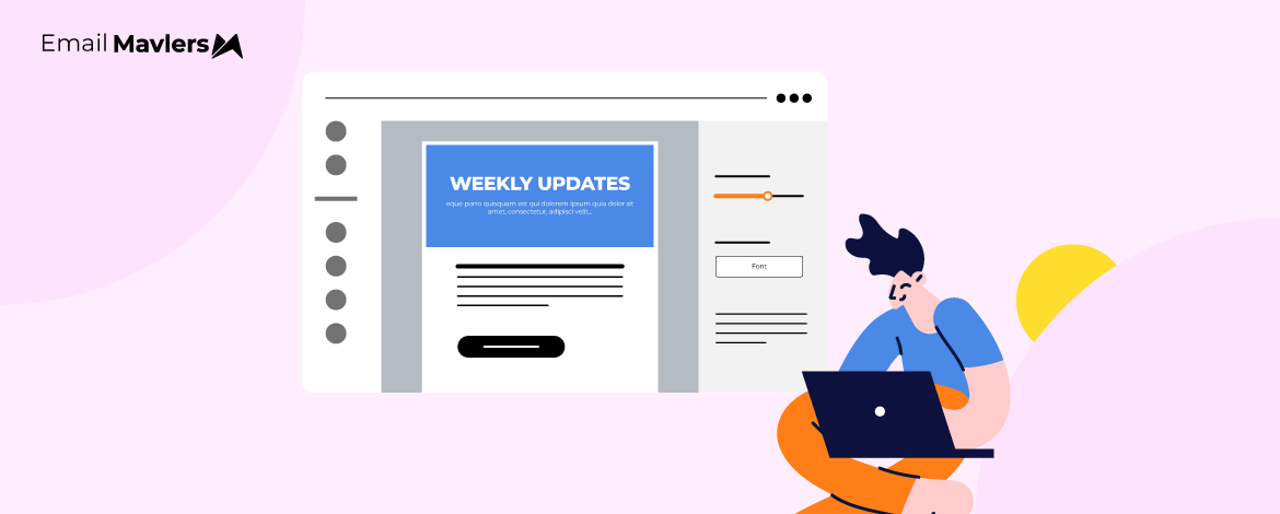
Why typography matters in email design
In campaigns, email typography is a critical design element that influences how your brand is perceived, how well your message is understood, and whether a recipient takes action:
- Readability and user experience: The primary function of typography is to make text legible. Choosing the right font, size, line height, and letter spacing ensures your email is easy to read on any device, especially mobile phones. (We’ll talk more about typography for mobile-friendly emails as well as responsive HTML email typography.)
- Brand identity and consistency: Your font choices reflect your brand’s personality. Using consistent typography across all your emails reinforces brand recognition and builds trust with your audience.
- Visual hierarchy and scannability: People tend to skim emails rather than read them word for word. Typography hierarchy in email templates helps you create a clear structure, using different font sizes, weights, and styles to guide the reader’s eye. Larger, bold headings and subheadings draw attention to key points, making the content easy to scan and digest quickly.
- Emotional impact: Fonts have a psychological effect. The typeface you choose can set the tone and mood of your message before the reader even processes the word.
- Accessibility: Proper typography is essential for making emails accessible to all users, including those with visual impairments. Using sufficient font size and ensuring high contrast between the text and background color prevents eye strain and ensures the content is readable for everyone.
A thoughtful approach to responsive HTML email typography is essential for effective email communication. For that, it’s important to understand font selection.
How to pick the right fonts for (advanced) typography in email design?
The right typography can increase engagement and conversions, while the wrong one can make even the best email design ineffective.
Here’s what to consider when selecting the typography for mobile-friendly emails:
- Rendering consistency across clients: Unlike web design, email design faces heavy rendering restrictions. Gmail, Outlook, Apple Mail, and others handle fonts differently. Prioritize web-safe fonts (Arial, Helvetica, Georgia, Verdana, Tahoma) and always specify fallback options in your CSS stack. HTML email font optimization is key here. Custom fonts like Google Fonts can work in some clients but should never be your only choice.
- Readability across devices and densities: Responsive email font sizing is critical. A font that looks crisp on a desktop can become cramped on mobile or blurred on high-DPI screens. Test typefaces at different resolutions and zoom levels to ensure clarity. Stick to 14–16px for body text and avoid going below 13px.
- Personality and brand alignment: Fonts carry psychological weight. Sans-serif fonts suggest modernity, openness, and clarity; serif fonts signal authority, tradition, and formality; display fonts can add character but risk looking unprofessional if overused. Map your choice to your brand’s tone of voice and customer expectations if you’re using advanced typography in email design techniques.
- Cultural considerations: When working with multilingual campaigns, character coverage becomes critical. A font that renders beautifully in English may lack glyph support for Chinese, Arabic, or Cyrillic, leading to fallback mismatches and broken brand consistency. Even within a script, letterform style can shift perception.
- Legibility under constraints: Emails are skimmed in seconds. Fonts with wide apertures (like Verdana or Open Sans) remain legible even at smaller sizes or when line spacing is compressed. Avoid fonts with overly decorative strokes or narrow letter spacing, which reduce scanning efficiency. Using scalable typography in email design ensures readability across device sizes.
- Accessibility and inclusivity: Typography must accommodate readers with visual impairments or dyslexia. Stick to high contrast between text and background, avoid justified text, and choose fonts with clear distinctions between characters (e.g., lowercase “l” vs. numeral “1”).

Source: Neuroscience Marketing
Choosing the right font for your emails is both an art and a science. Let’s find out more about the strategies involved.
Web-safe vs Custom fonts
One of the first decisions in email typography is whether to stick with web-safe fonts or explore custom fonts.
- Web-safe fonts (Arial, Helvetica, Verdana, Times New Roman, Georgia, Trebuchet MS) are universally supported and render consistently across nearly all email clients. They’re lightweight, load instantly, and minimize rendering risks.
- Custom fonts (such as Google Fonts or brand-specific typefaces) allow richer brand expression. However, they’re only supported in a limited set of email clients (Apple Mail, iOS Mail, some Android clients). If you use them, always set a CSS fallback stack — e.g., font-family: ‘Open Sans’, Arial, sans-serif; — so your message remains legible if the primary font fails. This is part of HTML email font optimization, and modern email typography techniques must consider these distinctions first.
As a rule of thumb, if branding demands a custom font, use it sparingly for headings, and rely on web-safe fonts for body copy.
Font pairing strategies
Font pairing determines visual rhythm and hierarchy. A mismatch can create confusion, but a thoughtful combination can make your emails more scannable and engaging:
- Single-family approach: Use one versatile font family (like Arial) in different weights (regular, bold, italic) to keep the design cohesive.
- Dual-font pairing: Combine a strong sans-serif heading (e.g., Helvetica Bold) with a serif body text (e.g., Georgia) to balance contrast and readability. Typography hierarchy in email templates ensures each font plays a clear role.
Stick to a maximum of 2-3 font families to avoid clutter as in the example below.

Overusing different styles feels chaotic in the limited real estate of an email.
Sizing and line spacing
Advanced typography in email design isn’t just about font choice; how you size and space it determines readability:
- Body text: 14–16px is the sweet spot. Anything smaller than 13px risks being unreadable on mobile.
- Headlines: 20–24px ensures visibility and scannability.
- CTAs: Minimum 16px for both legibility and tap-target accessibility.
- Line height: 1.4–1.6x the font size improves readability and prevents crowding.
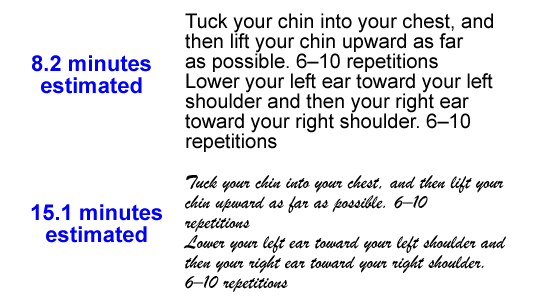
Too tight feels cramped; too loose disrupts flow. As part of responsive HTML email typography best practices, always test with real content, not lorem ipsum. A subject line with long words, a bulleted list, or a multi-line CTA will behave differently in real-world scenarios than dummy text would suggest.
Accessibility considerations
Good, responsive email font sizing in typography is inclusive. Here’s how typography choices and coding practices intersect to support accessibility:
- Contrast: Maintain a minimum 4.5:1 contrast ratio between text and background (per WCAG standards).
- Readable fonts: Stick to fonts with clear character distinction (e.g., distinguish between “I,” “l,” and “1”). Fonts like Verdana or Open Sans are excellent for this.
- Avoid justified text: Uneven spacing creates rivers of white that are difficult for dyslexic readers. Left-align for easier scanning.
- Minimum sizes: Keep text no smaller than 14px for body copy and 16px for interactive elements.
Consider screen reader behavior carefully. Maintain a clear semantic hierarchy using typography hierarchy in email templates and scalable typography in email design.
Employ <h1> for the email title, <h2> for section headers, and <p> for body text, allowing users to navigate efficiently between sections. Use ARIA labels or role=”presentation” strategically. Mark decorative text-as-images as presentation to prevent clutter, and add context to interactive links with aria-label.
Importantly, how you use typography in images can affect a screen reader’s interpretation. For example, take a look at the following pricing section.


Source: Stanford University
The reader might announce “$90” followed by “$30,” without clarifying which figure is the actual cost. Since strikethrough formatting is generally not conveyed effectively in most assistive technologies, it’s best to steer clear of it in critical contexts like pricing. A clearer approach is to rephrase the content so that the correct amount is unambiguous.
For HTML email typography best practices, save Paul Airy’s expert tips.
Responsive scaling: Decoding email typography for mobile-friendly emails
Emails are read on a wide range of devices, from large desktop monitors to small smartphone screens. If your text isn’t responsive, it can become too small to read, wrap awkwardly, or even break your layout. To ensure readability across devices, modern email typography techniques lead with the concept of fluid typography in HTML emails.
To begin with, consider these techniques for basic or advanced typography in email design:
1. Inline font size fallbacks
Many email clients, especially older versions of Outlook, ignore CSS in <style> blocks.
To ensure your text remains legible everywhere, define inline font sizes on your HTML elements as a fallback.
<td class="em_f18" style="font-size:16px; line-height:24px;">This is body text</td>The font-size property sets the base size of text for most email clients, while line-height ensures proper spacing, improving overall readability.
Using inline styles is important because they override unsupported CSS and provide a reliable baseline when media queries are not applied.
2. Media queries for scaling
Modern mobile clients (iOS Mail, Gmail app, Apple Mail) support media queries, which allow you to adjust font sizes specifically for smaller screens:
<style>
  @media only screen and (max-width: 600px) {
    .em_f18 {
      font-size:18px !important;
      line-height:28px !important;
    }
    .em_h1 {
      font-size:24px !important;
    }
  }
</style>
The max-width: 600px media query targets typical mobile screens, ensuring styles are applied specifically to smaller devices. Adding !important makes sure these mobile-specific styles override any inline styles when supported. With this approach, you can adjust headings, body text, and even buttons to maintain legibility and ensure touch-friendly interactions across devices.
3. Hybrid approach
Combine inline fallbacks + media queries for maximum compatibility:
<td class="em_f18" style="font-size:16px; line-height:24px;">This is body text</td>

<style>
  @media only screen and (max-width: 600px) {
    .em_f18 {
      font-size:18px !important;
      line-height:28px !important;
    }
  }
</style>
Desktop clients display the inline 16px font size, while mobile clients override it with 18px to ensure optimal readability on smaller screens.
When making text responsive, avoid fixed-width containers and allow paragraphs to expand naturally, ensuring content adapts smoothly to different screen sizes. Keep line lengths between 45–75 characters to maintain readability and scanning efficiency, and test extensively on both Android and iOS devices, as some email clients, like Gmail on Android, may ignore certain media query rules.
Modern email typography techniques & best practices
Refined typographic strategies can elevate email readability, engagement, and brand perception. Consider the following email typography best practices and techniques:
- Differentiate by email type: Assign distinct typographic styles to different categories of emails, such as promotional versus transactional. This helps recipients instantly recognize the type of message and sets clear expectations before they even start reading.
- Nuanced hierarchy through weight and style: Instead of relying solely on size differences, use subtle variations in font weight, italics, or small caps to guide the reader’s eye naturally through your content without creating visual clutter.
- Dark mode considerations: Typography can shift dramatically under dark mode. Test fonts and colors to ensure contrast, legibility, and brand consistency remain strong in both light and dark environments.
- Use grayscale for hierarchy: Employ shades of gray to indicate hierarchy and emphasis, rather than harsh color contrasts that can feel jarring or compromise accessibility.
- Optimize for real-world viewing conditions: Small details like stroke contrast, x-height, and letterform clarity can affect readability in bright sunlight or on glossy mobile screens. Choose fonts and sizes that perform well across diverse viewing conditions.
- Be mindful of cultural and historical connotations: Some fonts carry unintended historical or cultural associations. Review your type choices carefully to avoid undermining brand perception.
- Purposeful use of non-letter characters: Integrate symbols, patterns, or typographic cues thoughtfully to enhance mood, guide attention, or add subtle visual interest.

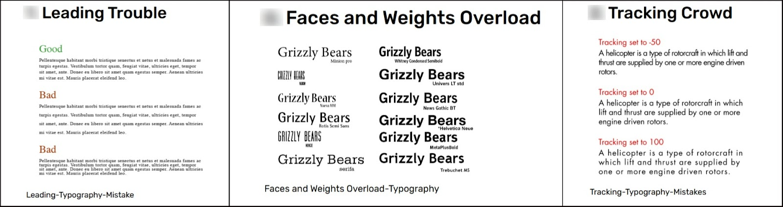

Common typography mistakes. Source: Think 360 Studio
Taken together, these strategies remind us that typography is more than a cosmetic choice, it’s a functional design language that shapes how subscribers experience your message.
Which reminds us of the importance of testing fluid typography in HTML emails.
Test the type: Responsive HTML email typography testing
To optimize readability, engagement, and conversions, follow these structured guidelines for A/B testing advanced typography in email design:
- Identify the specific aspect of typography that you want to improve, such as readability, click-through rates, visual hierarchy, or emotional tone. Make your objective measurable, for example by aiming to boost CTA clicks or reduce unsubscribe rates.
- Modify only a single typographic variable in each test, for example font family, size, line height, letter spacing, or weight. Avoid changing multiple elements at once so you can clearly attribute any impact.
- Concentrate on the parts of your email where typography matters most, such as headlines, body text, call-to-action buttons, or other key information blocks. These are the areas that drive engagement and influence readability.
- Create test variations that produce noticeable differences, for example serif versus sans-serif, 14px versus 16px font size, tighter versus looser line spacing, or regular versus semi-bold weight. Variations should be significant enough to reveal actionable insights.
- Randomly divide your audience into test and control groups, making sure each segment is large enough to achieve statistically reliable results.
- Send both versions at the same time to eliminate timing-related biases, such as holidays or peak activity hours, which could skew results.
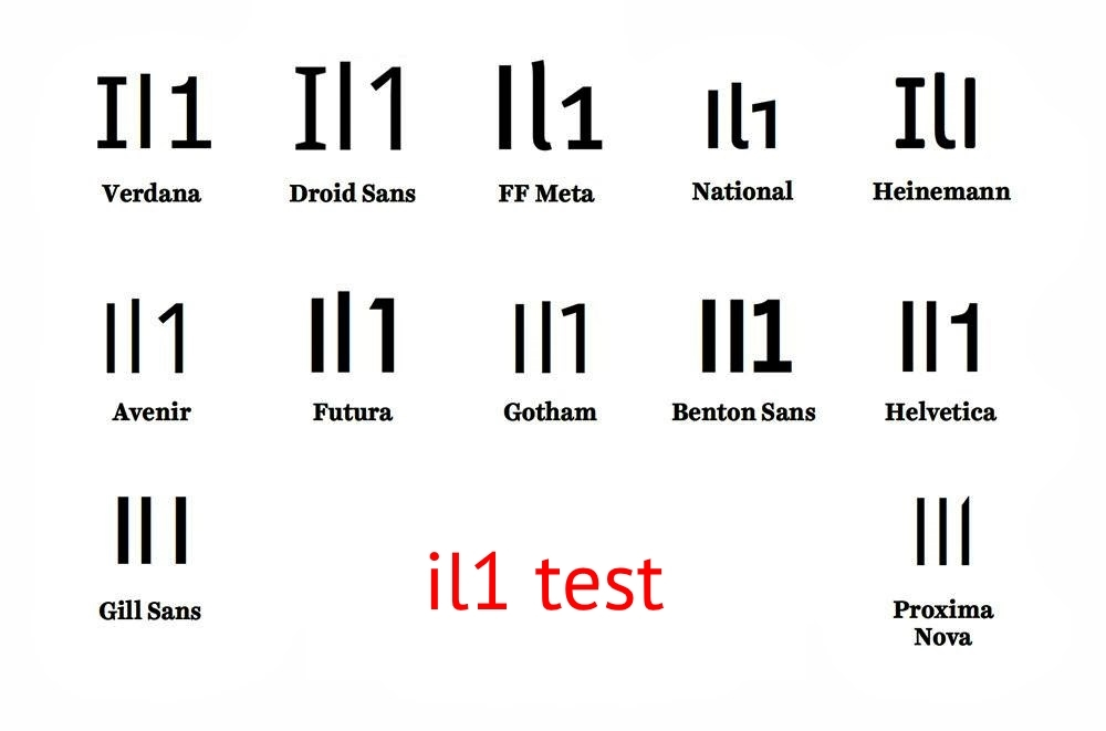
- Run the “Il1 test”. Verify that your chosen font clearly distinguishes between the uppercase “I,” the lowercase “l,” and the numeral “1.” This simple check ensures each character is easily recognizable and prevents confusion in your text.

Source: Virtual Inclusion
When you test typography with care, the results often reveal more than just which font or size “looks better.” Subtle adjustments can shift how readers perceive trust, urgency, or clarity—and those shifts show up in clicks, scroll depth, and even conversions. By treating typography as an element you can experiment with, rather than a fixed design choice, you give yourself the chance to uncover surprising insights about how people actually engage with your emails.
Wrap-up: Set your type with Email Mavlers!
The fonts you choose, how you space them, and how they adapt across devices all influence whether your message is read, skimmed, or ignored. Thoughtful typographic decisions turn text into a guide, leading readers through your content effortlessly.
Incorporating responsive HTML email typography into your campaigns is a business strategy as well as a technical item.
Take control of your email typography today and see the difference it makes. Get started with our email design and development team to bring your next campaign to life!