

The European Accessibility Act (EAA) has officially taken effect, signaling more than a legal mandate. It is a defining opportunity for brands to lead with inclusivity and rethink how they engage every individual.
So far, much of the EAA spotlight has been on websites, apps, and digital interfaces. But email, often the first and most frequent customer touchpoint, deserves equal attention. From promotions and onboarding flows to service alerts and support updates, emails shape brand interactions in more ways than one. In fact:
- The global email marketing industry stood at $11.5B in 2023 and is projected to surge to $46.1B by 2033.
- In a Mailmondo survey of 250 B2B and B2C marketers, email emerged as the top-performing channel (25%), ahead of organic search (19.7%), social media ads (11.4%), organic social media (11.3%), and paid search (10.4%).
At Email Mavlers, we see the EAA as more than a rulebook. It is an invitation to design email experiences that are not only compliant but empathetic and accessible.
So then, how to make emails accessible?
In this blog post, we walk you through the principles of designing and developing emails that truly include everyone, including accessible email best practices, and more. Let’s roll!
What is EAA compliance and why it matters for email marketers
The European Accessibility Act (EAA) is a directive by the European Union (EU) that mandates a wide range of products and services to be accessible to people with disabilities. It aims to remove barriers created by different rules in EU member states, making it easier for companies to operate across the EU and fostering a more inclusive society.
While the EAA covers a broad scope of products and services, including hardware like computers and ATMs, it is particularly significant for digital services, which include email marketing.
For email marketers, EAA compliance is a critical legal requirement, not just a “nice-to-have” best practice. The act applies to businesses that provide digital services or sell products to consumers within the EU, regardless of where the business is based. This means that if you send emails to people in the EU, your email campaigns must be accessible.

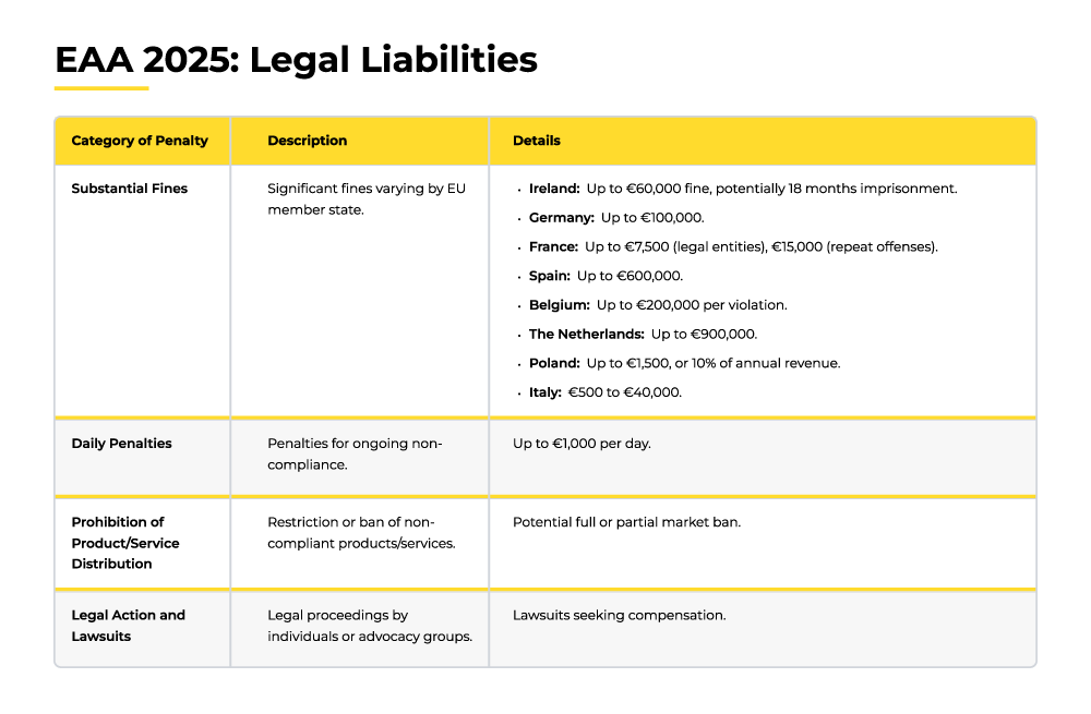
The EAA is binding law. So, failure to comply can bring hefty fines, lawsuits, and reputational harm, with penalties differing across EU member states. (See table further down).
But EAA compliance is not just about avoiding legal trouble; it’s a strategic move with significant business benefits as well:
- Broader Audience Access: Accessible emails extend your reach to 1.3 billion people with disabilities worldwide, while also supporting older users and those with temporary or situational barriers, like glare on a mobile screen.
- Stronger Experience and Engagement: Features such as clearer copy, higher contrast, and structured layouts make emails easier to use for everyone, boosting opens, clicks, and overall satisfaction.
- Positive Brand Perception: Embracing accessibility signals inclusivity and responsibility, building trust and loyalty by showing all customers they matter.
- Strategic Edge: With accessibility set to become the norm, adopters of EAA compliance will gain a clear advantage and position themselves as industry leaders.
In fact, Campaign Monitor reports an 18% boost in engagement for accessible emails, while the Click-Able Email Accessibility Benchmark Report shows accessible campaigns driving twice the conversion rates of non-accessible ones.
Together, these benefits show that accessibility is a powerful way to strengthen customer relationships, expand reach, and future-proof your email marketing in an increasingly inclusive digital landscape.
Now, let’s find out how to make emails accessible for real.
Email accessibility guidelines: Key principles
At its foundation, EAA email design guidelines draw from WCAG 2.2 Level AA, which is structured around four core principles:
- Perceivable
- Operable
- Understandable
- Robust
Based on these, here are the core guidelines for accessible email design. (You can save this as a robust email accessibility compliance checklist too!)
1. Perceivable
Content should be presented in ways that users can recognize and process, regardless of their abilities:
- Alt Text for Images: Add descriptive alternative text so screen readers can convey meaning to visually impaired users.
- Strong Contrast: Maintain at least a 4.5:1 ratio for normal text and 3:1 for large text to support users with low vision or color blindness.
- Readable Text: Use a clean sans-serif font, minimum 14px body size, and left-aligned formatting for easier reading.
- Beyond Color: Combine color with text or symbols to highlight important messages or errors, never rely on color alone.
2. Operable
Users should be able to navigate and interact with the content effectively.
- Logical Structure: Use semantic HTML tags (e.g., <h1>, <h2>, <p>) for clear hierarchy and screen reader navigation.
- Keyboard-Friendly: Ensure all links and buttons work via keyboard only, with a visible focus indicator.
- Clear Links: Write descriptive link text (e.g., “Download our email accessibility guide” instead of “Click here”).
- Safe Motion: Avoid flashing or rapid animations; never exceed three flashes per second to reduce seizure risk. (More on this just in a while.)
3. Understandable
Information and design should be easy for users to follow and interpret.
- Plain Language: Keep text simple, concise, and free from jargon.
- Predictable Layout: Use consistent layouts to aid comprehension for users with cognitive challenges.
- Avoid All-Caps: Steer clear of all-uppercase text, which hinders readability and screen reader interpretation.
4. Robust
Emails should remain accessible across different devices, clients, and assistive technologies.
- Clean Code: Write valid, semantic HTML for compatibility across email clients, browsers, and assistive tech.
- Plain Text Backup: Always include a text-only version so your content remains accessible when HTML fails.
A word on using animated GIFs in email
Email GIF-triggered seizures can occur when flickering or rapidly changing images, patterns, or lights within an email—such as flashing GIFs, animated banners, or embedded videos—reach certain frequencies (typically between 3 and 60 hertz) and levels of intensity. These visual effects can overstimulate the brain’s neurons, particularly in individuals with photosensitive epilepsy, leading to seizures or other adverse neurological responses.

Source: Association for Computing Machinery
Even for recipients without diagnosed conditions, such content can cause discomfort, dizziness, or eye strain, making it not only a health risk but a barrier to accessibility and UX.
So here’s a list of best practices for using GIFs in email design that balance creativity with accessibility and performance:
- Keep file sizes small: Aim for under 1MB (ideally 500KB) to ensure fast loading across devices and networks.
- Optimize the first frame: Some email clients (like Outlook) only display the first frame of a GIF, so make sure it conveys the main message or CTA.
- Limit animation speed: Avoid flashing, strobing, or rapid transitions (especially 3–60Hz) to prevent triggering seizures or discomfort.
- Use subtle motion: Smooth, looping animations work better than aggressive effects; they draw attention without overwhelming.
- Focus on purpose: Use GIFs strategically to highlight a product, feature, or CTA—not as decoration.
- Consider fallback options: Provide static image alternatives in case the GIF doesn’t load or isn’t supported.
- Don’t overuse: One or two purposeful GIFs per email are effective; too many reduce impact and risk slowing load times.
Best practices to meet email accessibility standards
Accessibility begins with intent, not obligation—and the EAA marks a meaningful step in that direction. More than compliance, accessibility is a strategic choice, a reflection of brand values, and a true market differentiator.
Sarah Gallardo, Associate Principal Technical Producer at Stitch, shares these best practices for accessible email design:
- Use live text, not image text: This ensures compatibility with dyslexia-friendly fonts, zoom tools, contrast plugins, and screen readers that may miss alt text.
- Rethink kinetic content: Only keep interactive elements if they remain fully accessible and provide clear value; otherwise, remove them.
- Avoid VML: Choose flexible, responsive design patterns that display consistently across email clients.
- Code for both formats: Make HTML emails accessible, and ensure plain text versions are equally clear and functional.
- Treat accessibility as ongoing: It requires continuous collaboration, training, and QA as client support evolves.
- Test in real environments: Email clients don’t always follow web standards, so prioritize hands-on testing for accuracy.
Accessibility is a continuous practice, not a one-time fix. Every choice, from text to layout, shapes whether your emails reach all users or leave some behind.
Email accessibility testing tools
To ensure your emails really follow EAA email design guidelines, you can test them using these online tools:
- WebAIM Contrast Checker: Verifies that your text and background colors meet WCAG contrast ratio standards.
- VoiceOver: Apple’s built-in screen reader for macOS, iOS, iPadOS, and watchOS, which audibly describes on-screen content.
- Coblis: A free simulator that shows how your designs appear to people with various types of color blindness.
- Accessible-email.org: Offers detailed guidance and best practices for creating accessible emails.
Let’s take a quick look at each of these email testing tools.
WebAIM Contrast Checker
The WebAIM Contrast Checker is a free, browser-based tool designed to help designers and developers evaluate the color contrast between foreground (text) and background colors for web and digital content accessibility. It instantly calculates the contrast ratio based on color values entered (hex codes or by using its color picker), showing whether the combination meets WCAG 2.0 and 2.1 accessibility requirements for text, links, and graphical components.
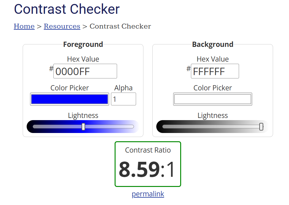
Source: WebAIM Contrast Checker
For testing accessible email design, consider these best practices:
- Incorporate contrast checks at both template design and final QA stages to preempt inbox display issues.
- Use the Contrast Checker alongside real device/client rendering previews for more realistic accessibility assurance.
- Pair with other accessibility tools (like WAVE or browser extensions) for comprehensive evaluations beyond color.
VoiceOver
Apple’s VoiceOver is a built-in screen reader technology available on macOS, iOS, and other Apple devices that converts on-screen text and interface elements into spoken words for users who are blind or have low vision. It reads aloud descriptions of text, buttons, links, images (via alt text), and other UI elements, allowing users to navigate and interact with digital content without needing to see the screen.
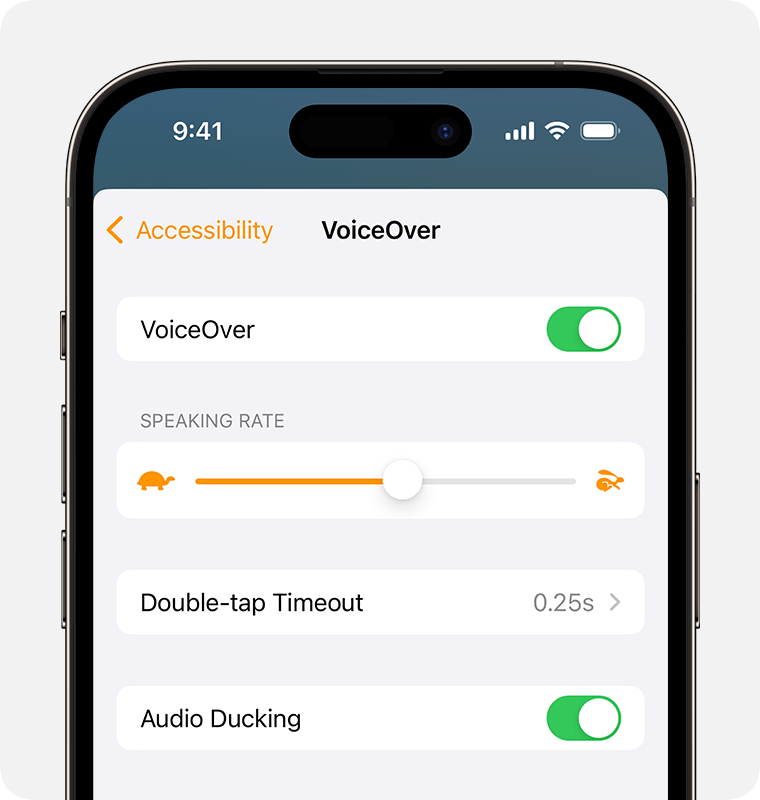
For testing your emails on VoiceOver, keep these testing approaches in mind:
- Familiarize yourself with VoiceOver commands: On a Mac, toggle VoiceOver with Cmd + F5. Navigate using Ctrl + Option + arrow keys and the rotor to efficiently check email structure.
- Check all key email elements: Ensure headings, images (with alt text), links, buttons, forms, and dynamic states like checkboxes or expandable sections work correctly.
- Use semantic HTML: Favor native HTML elements over excessive ARIA, maintain proper heading hierarchy, and provide meaningful alt text and labels.
- Verify hidden content behavior: Ensure that collapsible sections, expandable content, and hidden menus are not read aloud by screen readers before they are revealed.
- Combine with visual and code checks: VoiceOver testing complements color contrast and markup validation, giving a real user perspective of the screen reader experience.
- Stay updated: Test on the latest macOS and iOS versions, as VoiceOver behavior and bugs can change across updates.
Coblis
Coblis (Color BLIndness Simulator) is an online color blindness simulator tool that helps visualize how images, designs, and color schemes appear to people with different types of color vision deficiencies. Users upload images (such as email screenshots), and Coblis simulates how those visuals look to users with red-green blindness (protanopia, deuteranopia), blue-yellow blindness (tritanopia), and other forms of color blindness.

These are some practical ways to test your email templates on Coblis:
- Test complete email visuals: Upload full email screenshots or key visual assets to evaluate overall color impact, rather than just isolated swatches.
- Combine with contrast tools: Pair Coblis simulations with WCAG contrast checkers like WebAIM to conduct a thorough color accessibility review.
- Iterate and retest: Adjust colors as needed and rerun simulations to ensure improved accessibility without compromising your brand identity.
- Integrate with screen reader checks: Visual accessibility is just one layer. Combine color testing with tools like VoiceOver and semantic HTML checks.
Accessible-email.org
Accessible-email.org is an initiative focused on promoting accessibility and usability in email marketing. It offers an accessibility evaluation tool specifically designed for email marketing professionals and developers to assess the current accessibility level of their emails and identify improvements needed to make emails more inclusive. Here’s how to use it:
- Go to the Accessible-email.org website and find their email accessibility evaluation tool or tester.
- Paste the raw HTML or upload the email file.
- The tool generates a detailed report outlining issues, if any.
- After making changes, resubmit your email to ensure issues are resolved.

Designing for accessibility in email: The takeaway
Accessibility is a continuous process, but the payoff is substantial: accessible content fosters stronger engagement by making every user feel valued and included, broadens your reach by removing barriers that might prevent people from interacting with your brand, and establishes your organization as one that genuinely cares about inclusivity.
Now that you know how EAA impacts email design, you’re on the threshold. Let us help you cross it with intent. If you want to make your email campaigns fully accessible and EAA-compliant, contact our team at Email Mavlers to get started!