

They say true marketing is H2H, or human to human. The same principle applies to email marketing.
After all, you’re not designing your emails for inboxes, ISPs, or algorithms. You’re designing for people. And one of the most powerful ways to connect with people is through empathy.
In fact, empathy should be more than just a soft skill—it should be one of your core marketing KPIs.
When done right, every email you send can stand out, not just for its design or content, but for how deeply it resonates with the reader on a human level.
So how do you design empathetic emails?
That’s exactly what we will explore in today’s guide, where the design team at Email Mavlers has handpicked 10 outstanding examples of empathetic email design.
7 Brands Leading the Way in Empathetic Email Design
1. City Boots
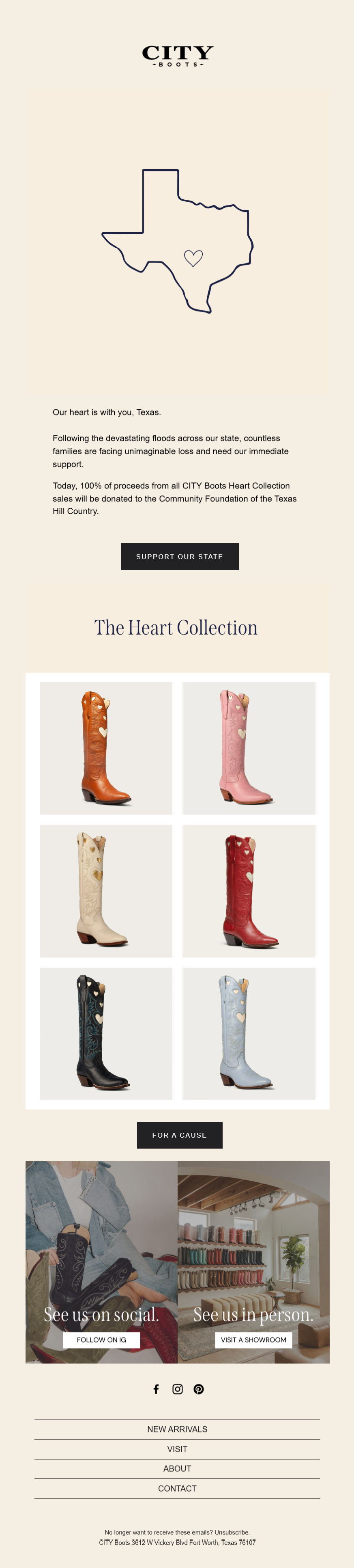
Source: Inbox
Looking at City Boots’s empathy email example, several strategic design and messaging elements stand out:
- The headline “Our heart is with you, Texas” immediately establishes emotional solidarity and care
- The heart icon placed over Texas visually reinforces this compassionate message
- The simple, minimal design doesn’t feel exploitative or overly commercial given the context
- Muted color palette feels respectful and appropriate
- Finally, the heart symbol creates an emotional focal point without being overly sentimental.
Here’s an email design that builds trust by effectively balancing commercial goals with authentic community support.
2. Paire
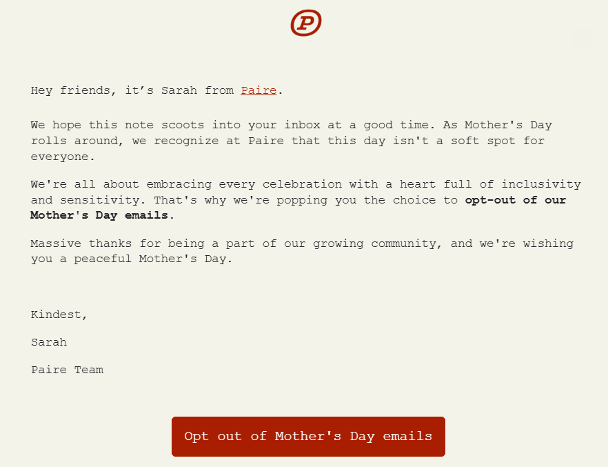
This Paire email has several thoughtful empathetic elements:
- Opens with recognition that the timing might not be ideal.
- Directly acknowledges that “this day isn’t a soft spot for everyone” – validating that Mother’s Day can be painful or complicated for many people
- Makes opting out easy and prominent with a clear button
- Frames the opt-out as a choice they’re “popping” to the recipient.
- Personal signature from Sarah adds human touch
- “Peaceful Mother’s Day” wishes rather than “Happy” – more thoughtful and less assumptive
This empathy email shows emotional intelligence by recognizing that their standard Mother’s Day marketing could cause pain and proactively offering a compassionate alternative.
3. Astley Clarke

Source: Inbox
If empathy is about sharing another’s feelings, that can include positive emotions too.
Wimbledon isn’t just a sporting event, it’s a cultural and fashion highlight in the UK calendar. In that spirit, this Astley Clarke email smartly taps into the excitement surrounding Wimbledon, and is a clear example of empathetic email design:
- Creates relevance by positioning their pieces for the social season surrounding Wimbledon.
- The jewelry pieces echo Wimbledon’s signature green and purple color scheme.
- Green stones and accents feel perfectly aligned with the grass courts and traditional Wimbledon aesthetic.
- Instead of being overly tennis-themed, the email maintains sophisticated restraint – perfect for the refined audience at Wimbledon.
This email successfully captures Wimbledon’s blend of sporting excitement and social prestige without being heavy-handed about the tennis connection. A great showcase of email design that builds trust through elegant storytelling and subtle design cues.
4. Hard Jewelry
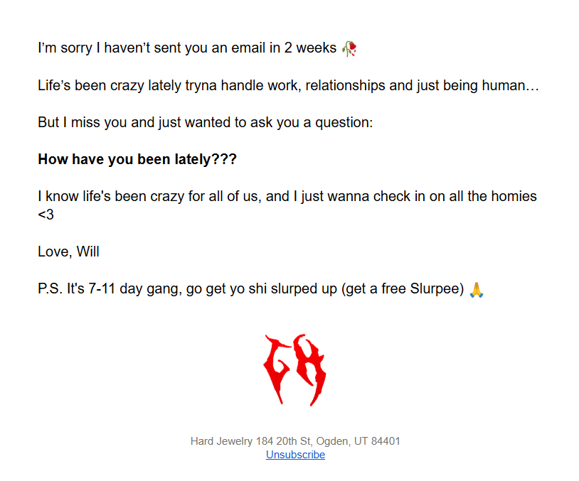
Source: Inbox
Hard Jewelry’s email design showcases empathy and real human connection through several authentic elements:
- The email is written in Will’s natural speaking voice with casual language (“tryna,” “yo shi,” “homies”)
- Feels like a text from a friend rather than a marketing email
- The informality creates intimacy and relatability rather than corporate distance
- The tone suggests he actually cares about his subscribers as people
As this email shows, designing emails for user trust often begins with showing up as a real person and genuinely caring about your audience’s well-being beyond sales.
5. Allie Stark Wellness
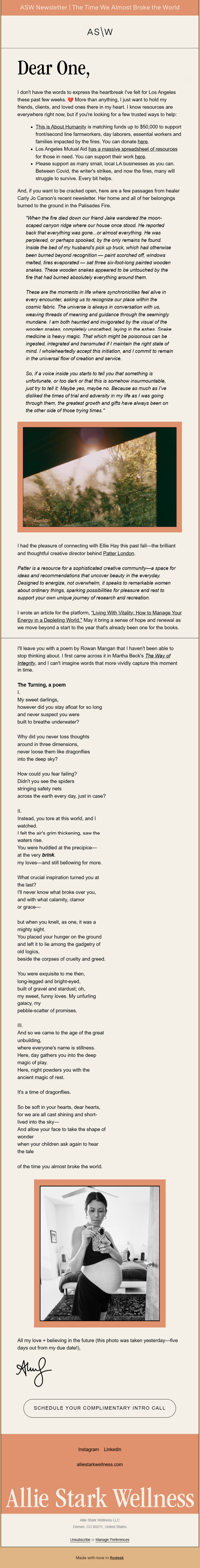
Source: Inbox
The ASW newsletter is a classic instance of human-centric email design. Here’s why:
- Earthy tones and gentle contrasts create a calming, non-threatening visual environment that feels safe and approachable
- Prevents visual overwhelm and gives breathing room, mirroring the mental space the content aims to provide
- Guides the eye naturally through the content without creating cognitive load or decision fatigue
- Offers various ways to engage based on where someone is in their wellness journey, meeting people where they are
- Prioritizes accessibility and ease of consumption, showing respect for reader’s time and mental energy
Above all, the storytelling creates a safe emotional container. This is empathy email at its finest, grounded in the psychology of email design that values calm, clarity, and care.
6. Artfinder
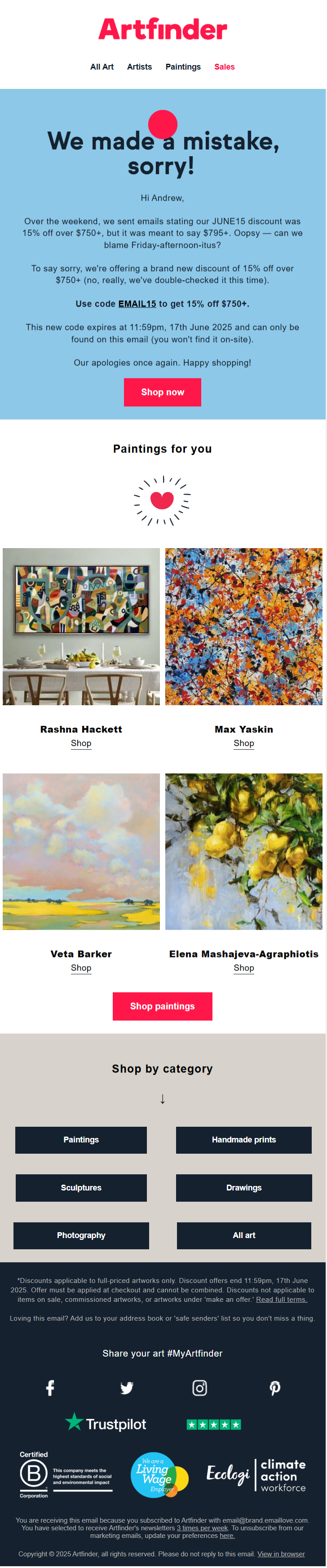
Rather than minimizing their error or offering a casual fix, Artfinder uses the mistake as an opportunity to demonstrate their values and commitment to customer care.
- Uses straightforward language that feels genuine rather than overly formal legal-speak or marketing fluff
- Positions the mistake acknowledgment prominently in the visual hierarchy, not burying it in fine print
- Avoids overwhelming the already frustrated customer with too much visual information or competing elements
- Places the mistake acknowledgment in the most valuable visual space typically reserved for promotional content
- Uses actual text rather than image-based typography, ensuring screen readers can properly interpret the apology and all content for visually impaired users. This in particular is a great hallmark of empathetic email design.
7. FatFace
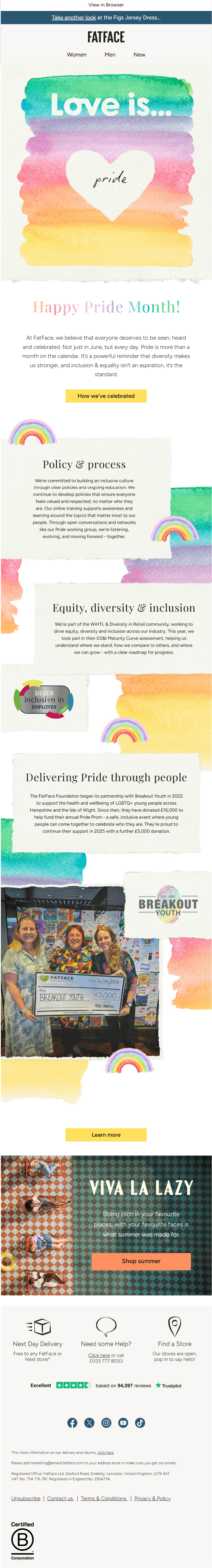
Our final example of empathetic email design is this email from FatFace. Here’s why it stood out to our team:
- Uses soft, artistic rainbow gradients that feel organic and celebratory
- Maintains rainbow motifs throughout sections, creating cohesive experience that reinforces the celebratory theme
- Demonstrates ongoing dedication to LGBTQ+ causes
beyond just Pride Month, suggesting authentic rather than seasonal support - Openly discusses company policies related to diversity and inclusion, building trust through accountability
This is a wonderful reminder that emotional connection in email design often comes from actions, not aesthetics alone.
(Note that the hero section of this email is a GIF. To view the GIF in action, please refer to the source.)
Wrapping Up
Empathy isn’t about sentimentality or soft visuals; it’s about meeting people where they are, recognizing their context, and designing with care, clarity, and compassion.
The examples we’ve explored prove that empathy can take many forms. Whether it’s thoughtful language, accessible design, or simply acknowledging your reader’s reality, these choices help build lasting trust and deeper engagement.
Ask yourself: Does this email truly see the person on the other side? That one question can turn a campaign into a conversation and a subscriber into a loyal advocate.
Need help creating empathetic email design for your brand? Get in touch with our team, and let’s get started!