

When it comes to email heavyweights, Gmail’s holding its ground with about 30.57% of the global market. It’s sitting comfortably in second place, right behind Apple Mail, which dominates with a whopping 55%. Microsoft Outlook trails way behind, clutching just around 4%.
Yet, for all the popularity of Gmail, it presents a host of challenges for email developers, particularly with respect to CSS in Gmail.
You can’t use modern layout techniques like Flexbox or Grid.
Responsive Gmail email design is tricky, and even basic things like consistent spacing can be a headache.
But the good news is, it doesn’t have to be this way, if our work with Fortune 500 brands over the last 12+years is any proof.
In today’s guide, two of our best email developers share proven techniques to get the best out of Gmail CSS support. Let’s get started.

Gmail CSS Support: The Limitations
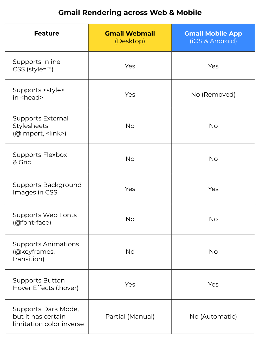
So, what exactly is the challenge with Gmail email design? To start with, it’s the rendering engine. A rendering engine is essentially the software component within an email client that takes the HTML and CSS code of an email and interprets it to display the email content visually to you.
The rendering engine of Gmail dictates the presentation of emails across Gmail Webmail (Desktop), Gmail Mobile Applications (iOS and Android), and Google Workspace (previously known as G Suite). In contrast to contemporary web browsers, Gmail does not completely adhere to HTML and CSS standards, imposing stringent regulations that influence the design of emails. The table below lists Gmail’s rendering differences.
Upon receiving an email, Gmail alters and sanitizes the HTML and CSS before it is displayed. To begin with:
- Gmail removes <link> tags and @import stylesheets to mitigate security vulnerabilities.
- Gmail introduces additional classes and IDs to ensure that email layouts do not interfere with its own user interface.
- All <script> tags and form elements (<input>, <select>, and <textarea>) are entirely eliminated for security purposes.
Let’s take a look at these in some detail, and also explore additional limitations in CSS in Gmail.
1. You can’t link to external stylesheets
You cannot link to external CSS using the <link> tag or @import in Gmail. These will be completely ignored.
Since you cannot maintain a separate stylesheet to control the visual presentation of your emails, you lose the benefits of modularity, reusability, and easier maintenance that come with external stylesheets—a significant limitation when working on scalable Gmail email design projects.
2. You can’t utilize Flexbox or Grid
Advanced CSS like flexbox, grid, and certain animations don’t work in Gmail.
You see, Gmail’s rendering engine largely ignores the @keyframes rule and the animation property. Any animations defined using these standard CSS techniques will likely not play in Gmail. As a result, you cannot use CSS to create smooth transitions on hover, animated entrances, looping effects, or any other dynamic visual changes that are common on websites.
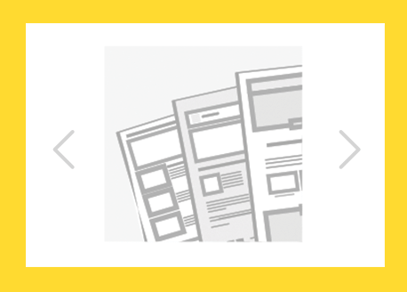
Gmail also doesn’t support JavaScript.
Which is why automatic sliders (see below image) are not supported in CSS in Gmail environments. For sliders, turn to Thunderbird and Apple Mail.
3. You can’t use custom fonts
Gmail’s not a fan of custom fonts. Whether you try to sneak them in with @import, <link>, or @font-face, Gmail’s just gonna pretend they don’t exist. This includes Gmail on Chrome, Firefox, Android, and iOS. So, if you toss in a custom font hoping it’ll show up, Gmail’s going to ghost it.
This severely limits branding and visual customization within your emails, and it’s one of the prime concerns developers need to address during Gmail email design planning.
4. Problematic dark mode rendering
Gmail (both iOS and Android) can automatically apply a dark theme to your email even if you didn’t design it that way.
Light backgrounds (like #ffffff) may be inverted to dark (like #000000). Dark text colors might be changed to lighter ones (e.g., #000000 to #ffffff).
Gmail apps do not support the CSS media query:
@media (prefers-color-scheme: dark) { ... }This means you can’t selectively style your email for dark mode using media queries in Gmail apps.
You can’t use <meta name=”color-scheme” content=”light dark”> to control Gmail app behavior—it’s ignored. PNGs or SVGs with transparent backgrounds may look odd if not optimized for both dark and light themes.
Logos with dark colors may disappear in Gmail dark mode unless you use a background or version swap strategy.
5. Gmail clips emails larger than 102kb
When an email surpasses 102KB in size, Gmail will automatically clip it.
Only some part of the email is displayed, and the rest is hidden behind a “View entire message” link. Tracking pixels and analytics scripts may fail to load correctly, which can influence open rates and engagement metrics. Content, calls to action, or branding elements may be overlooked, diminishing the overall effectiveness of your emails.
In fact, in certain scenarios, it can get worse than a merely ineffective email. Take a look at this email from Shop Bazaar.
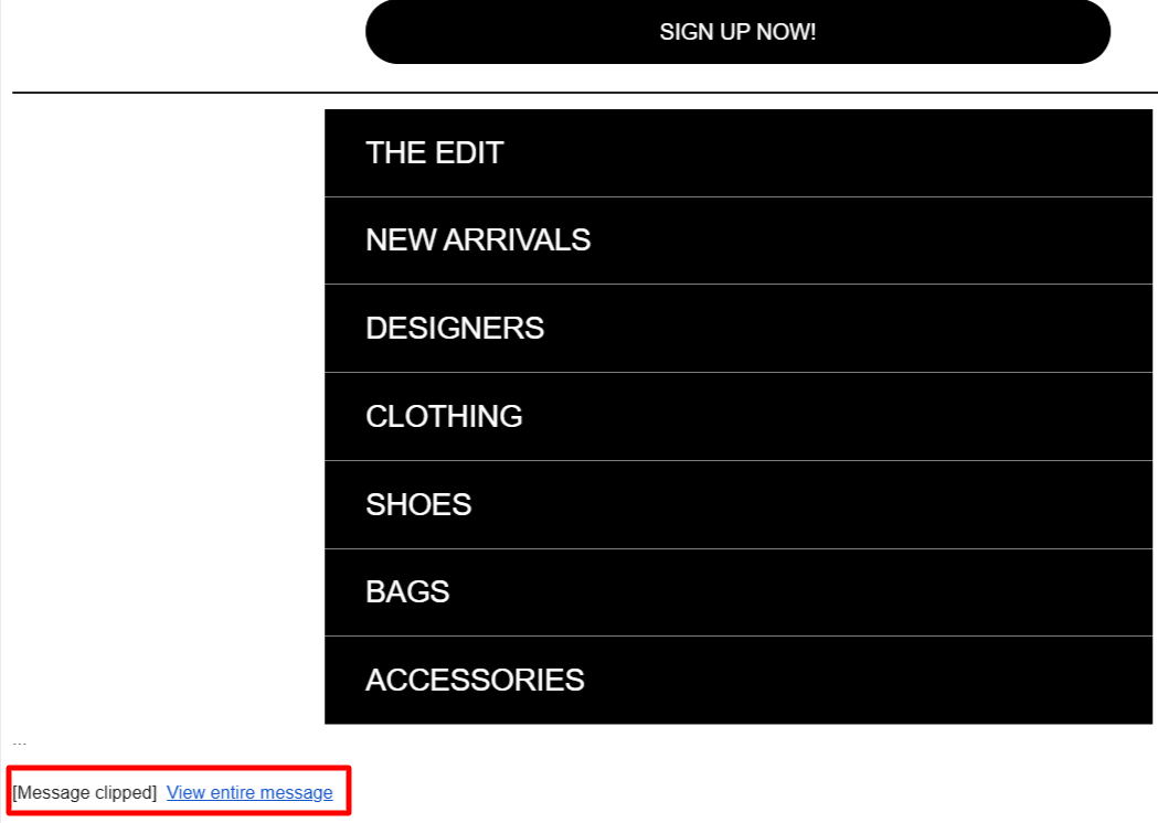
The cut-off hides the all-important email footer, rendering the unsubscribe link, social media handles, and proof of constant invisible.
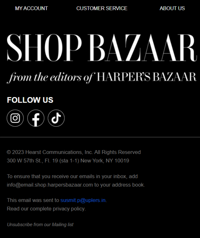
Here is the online-viewable portion of the above email, the footer.
Gmail CSS Support: The Workarounds
Now, let’s explore some reliable email (CSS) best practices for Gmail. (Note that the Gmail CSS workarounds listed here aren’t exhaustive)
1. Utilize inline CSS
Like we said, Gmail tends to strip out any external stylesheets, so it is difficult to inline your CSS. By placing your styles directly within the HTML tags, you can be confident that your email will be displayed as intended.
For example, consider the following line of code.
<p style="color: navy; font-weight: bold;">Hello there!</p>The style attribute is used to directly embed CSS properties within the HTML tag.
2. Use hybrid coding
Hybrid email coding is the typical way of achieving cross-client compatibility.
Hybrid coding in email is a method that merges responsive design strategies with aspects of fixed and fluid layouts, ensuring emails display consistently across diverse devices and email clients, even those with limited support for modern CSS standards. It’s a practical solution, crafted to deliver an optimal user experience without depending entirely on newer technologies that many outdated email platforms still struggle to handle.
3. Optimize for custom fonts
Since Gmail doesn’t support custom fonts, always provide fallback fonts in your CSS like this:
<td style="font-family: 'Roboto', Arial, sans-serif;">
  Your Email Text
</td>
So even if ‘Roboto’ is ignored by Gmail, it will use Arial instead.
Gmail only supports system fonts (also called “web-safe fonts”), such as Arial, Georgia, Helvetica, Tahoma, Trebuchet MS, Verdana, Courier, etc.
Another common workaround is to embed custom fonts within the template.
For instance, Mount Sapo embeds their brand fonts in all their emails.
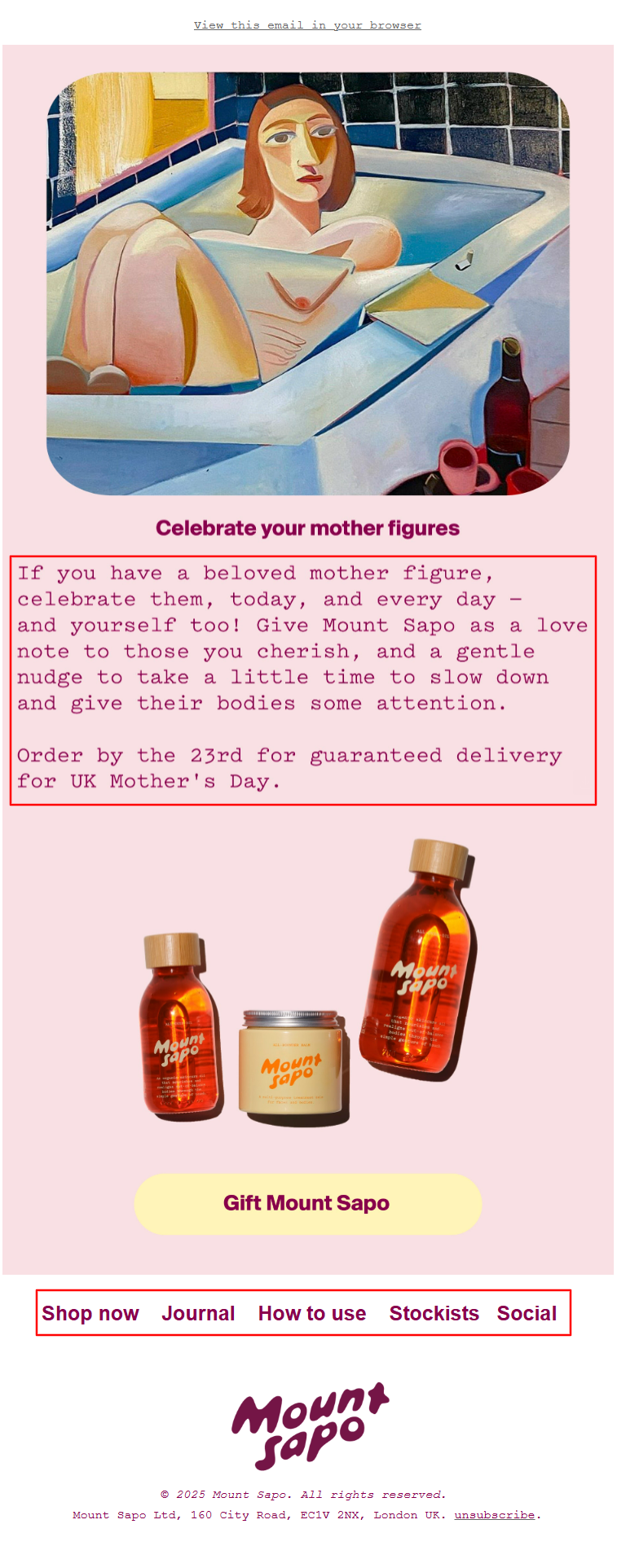
Source: Inbox
This takes care of brand consistency, right?
However, it comes with a cost.
First, screen readers cannot interpret text embedded in images, making your content inaccessible to visually impaired users.
Second, while you can add alt text to images, it provides a textual description, not the actual text content. This isn’t the same as having readable text.
Now, sticking text inside images isn’t off-limits, but don’t go overboard like Mount Sapo did by cramming entire essays into fancy brand fonts (Pitch and Swisse International in this case)
Play it smart: for key sales messages and buttons, always back your emails up with fallback fonts.
4. Optimize for dark mode
Use Transparent PNGs with white outlines or background containers for logos and icons. Avoid pure white backgrounds (#ffffff).
Try using off-whites like #f4f4f4 which Gmail may skip inverting. Also, when planning dark mode design strategies, remember that media queries in Gmail apps aren’t reliable, so fallback-friendly design remains crucial.
5. Optimize for Gmail clipping
First off, Gmail strips out <style> tags on mobile apps, which leaves you with messy inline CSS — so don’t go overboard styling every little thing.
Big images are another killer. They bloat your email size fast, so always run them through tools like TinyPNG, ImageOptim, or Squoosh before you even think about hitting send. (Even better? Host your images externally if you can.)
Also, don’t lose sight of the fact that Gmail loads everything in your HTML, and it all counts toward that dreaded 102KB limit. So ditch any unnecessary hidden sections before you send.
Skip the heavy nesting of tables, kill off extra white spaces and comments, and run your HTML through a minifier like HTMLMinifier to tighten it up.
Lastly, if you’ve loaded your email with tracking pixels, maybe dial it back a bit.
Too many tracking links and UTM tags can seriously bulk up your file size.
6. Test before sending
Are your Gmail CSS workarounds working? You can only find out by testing.
Use email preview tools like Litmus and Email on Acid to check how your email is rendering. But don’t rely on tools alone.
Send a test mail to your account and check if your email is clipping or not.
Check Gmail’s “Show Original” option to confirm the total size of your email.
Gmail CSS Support: The Possibilities
We’ve looked at some common Gmail rendering issues. However, for all its limited support for CSS, Gmail does support interactive emails using AMP (Accelerated Mobile Pages) for Email.
AMP for Email is like giving your emails a serious upgrade. It lets developers build interactive, dynamic content right inside the message. Users can get things done without ever leaving their inbox. No extra clicks, no bouncing to a website — everything happens right there, within the inbox.
Take the following example from Stripo’s AMP email curation.

Now, AMP coding does involve CSS, but with some specific constraints and a different approach compared to standard web development.
AMP provides its own set of custom elements (such as <amp-carousel>, <amp-form>, <amp-bind>).
These components often have their own specific attributes for basic styling. And you can also target these components with CSS within the <style amp-custom> tag to further customize their appearance.
The potential of AMP for email is tremendous; however, its adoption remains limited due to restricted support. As Chad S. White, best-selling author of Email Marketing Rules, highlights, many customers of major ESPs show little interest in AMP, partly because it demands additional training and expertise. Currently, AMP is supported by Gmail, Yahoo Mail, and the Russian email client Mail.ru — but only for senders who maintain a strong reputation.
As far as we are concerned, AMP requests are quite rare. The most recent one our team handled was in early 2024, when we built an AMP email in Braze for a client based in North America.

Gmail CSS Support: Wrap-up!
Despite Gmail’s CSS constraints, crafting emails that display flawlessly across all clients is achievable with the right approach—leveraging inline styles, table-based structures, and responsive techniques. Prioritizing dark mode adaptability, mobile optimization, and continual alignment with evolving best practices is essential for building truly engaging email experiences.
Need help with email development? Schedule a call with our team!
At Email Mavlers, each template we deliver is meticulously hand-coded with clean, well-documented markup to make future customization effortless. We rigorously test every template across major email clients—implementing fallbacks for limited-support environments—to ensure broad compatibility. Fully responsive by design, our emails adapt smoothly across devices and browsers, from desktop to mobile. Every template is custom-built to be editable, reusable, and perfectly integrated with your marketing platform for a seamless workflow.
As of now, we offer design and development across these ESPs:
We’re expanding to more ESPs, such as Zoho, Active Campaign, Braze, and Eloqua, to name a few.
And yes, your first order is on us. Get in touch today!
Riketa Butani - Subject Matter Expert
Hetal Chavda - Subject Matter Expert
Susmit Panda - Content writer