


From 12+ years of designing and developing emails and landing pages, we’ve repeatedly seen two reasons why A/B tests fail to deliver meaningful results:
- The first is low statistical power. There isn’t enough traffic or sample size to detect a real difference between variants.
- The second is testing low-impact variables. Editing a button colour or adjusting padding rarely influences how someone feels about your offer.
This guide aims to correct that.
Up next are landing page and email testing ideas that focus on the elements that truly matter, the ones that influence perception, decision-making, and behavior. Let’s begin!
A/B testing for landing pages
1. The headline
Your headline carries more persuasive weight than any other element on the page. It’s what determines whether a visitor stays long enough to learn anything about your offer. Three headline angles are consistently worth testing against each other:
- Outcome vs. feature-framing: Outcome-led headlines sell a transformation; feature-led headlines sell a tool or a feature of the same. In most categories, outcome framing wins; but your audience’s awareness level matters significantly.
- Specific vs. bold claims: Specificity signals credibility; bold positioning, confidence.
- Question vs. statement: Questions activate personal identification and work well when your audience has a pain point they recognise.


2. Social proof: Format & placement
Testimonials and review counts increase trust, but where and how you display them changes the effect. Test social proof above the fold against placing it lower, after you’ve explained the offer. For some audiences, leading with proof feels reassuring; for others, it reads as defensive before you’ve made your case.
Format matters too.

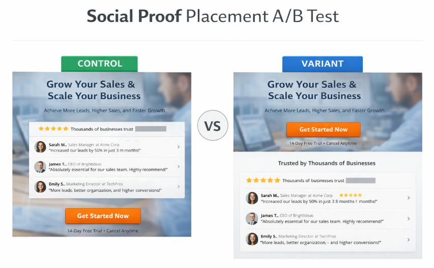
A single in-depth quote performs differently from a cluster of short reactions or an aggregate rating. B2B audiences tend to respond to attributed, role-specific testimonials. Consumer brands often do better with volume signals. Test both independently.
Key elements you should prioritize for A/B testing in landing pages:
CTA button copy: The implied commitment level of your CTA language directly affects conversion. Test specificity, perspective, and the degree of urgency in the phrasing.
Form length: Each additional field introduces friction. Test a stripped-down version of your current form, collecting only what’s necessary.
Hero image vs. video: A short, looping product demonstration can outperform a static visual, particularly for complex or unfamiliar products where showing is more efficient than telling.
Pricing display: The default view, tier order, and above/below-fold placement of pricing all influence perceived value.
3. The value proposition frame
The same offer can be framed around saving time, saving money, or reducing risk, and each frame speaks to a different decision driver. Testing which resonates most with your audience tells you something fundamental about what your customers actually care about.

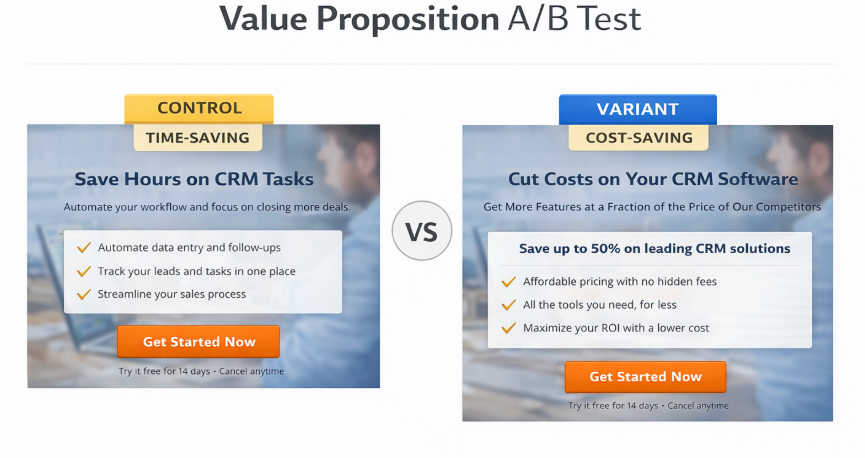
That insight carries across every channel.
Best practices for A/B testing landing pages
Here are a few practical guidelines to help you run effective A/B tests on your landing pages:
- Start with conversion-focused metrics. Measure the outcome closest to the business goal. In case conversions are few and far between, test micro-conversions.
- We talked about CTA copy and headline. Copy is faster to change and often has a bigger impact than design/visual tweaks. Therefore, test all written content first.
- Prioritize high-impact variables. These include messaging angle, page structure, pricing transparency, page load speed, CTA placement, etc.
- Try to be bold with experiments. If a test fails or throws weak results, try a bolder version of the idea. Test radically different messaging. Emphasize different value props.


Above all, try to build a culture of experimentation. Budget a portion of traffic for experiments. And remember that every winning test becomes the new baseline. Then you test again.
A/B testing for email campaigns
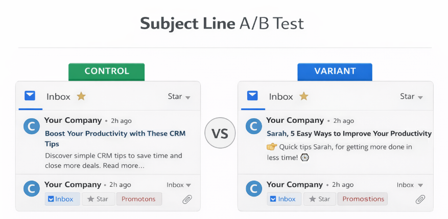
1. Subject line
The subject line is the first thing a subscriber sees. Both the subject line and preview text decide whether your email gets opened or not. Here are the key variables to test:
- Personalization: Name tokens and behavioral references work in most B2C contexts, but can feel intrusive in certain B2B segments.
- Curiosity vs benefit: Curiosity-driven lines work well for engagement-focused sends. But Transparent benefit statements outperform when the purchase intent is already high.
- Length & formatting: Shorter subject lines often perform better on mobile. Emojis can do well in some categories but may come off as unprofessional in others.

2. Sender name
The “From” field is processed before the subject line and has a meaningful effect on both the subscriber and how ISPs analyze the send. Testing a brand name against a personal name, or a hybrid of the two, is one of the simplest experiments to run. Results vary significantly by email type and lifecycle stage, so it’s worth testing across different send categories.
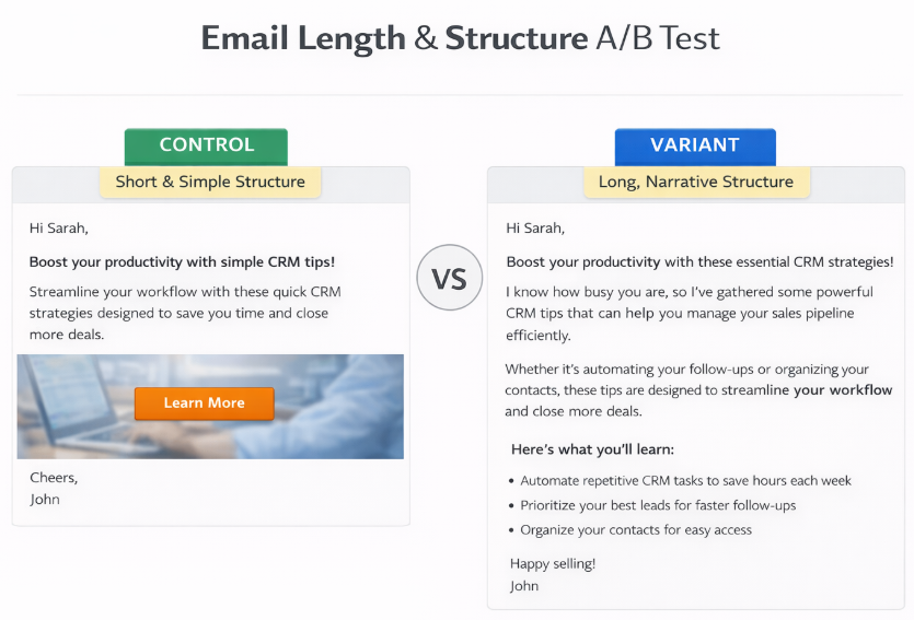
3. Email length & structure
There is no universally correct email length. Shorter emails reduce friction and perform well when the reader’s motivation is already high. Longer, narrative-driven emails can outperform significantly in nurture sequences where trust is still being built. The meaningful test is between your current format and a version that takes a different structural approach entirely.

4. Send time
Industry benchmarks for optimal send times are widely cited and widely followed, which means the most recommended windows are also the most congested.
Your audience’s habits are specific to them, and only your own data can reveal the truth.
Test across different days and times, and measure open rate and click rate separately, as they frequently peak at different points.
5. CTA placement & repetition
A CTA placed early captures readers who are already convinced. A CTA at the end captures those who need to read through before deciding. The most useful test is single placement versus repeated placement, and tracking not just clicks but the downstream conversion that follows.
Check out Email Monday’s laundry list for more email a/b testing ideas.
Best practices for A/B testing email creatives
Kath Pay, one of the most vocal proponents of rock-solid testing, recommends these overarching principles for A/B testing email creatives:
- Set up a testing plan. A good testing plan defines the objective, hypothesis, test variables, sample size or duration, and measurement method.
- Choose the right success metric. The metric you optimize for determines the outcome of your test. Beyond opens and clicks, focus on purchases, revenue per email, sign-ups, qualified leads, and so on. Pick a metric that reflects your core business objective.
- Subject lines and CTA buttons, while important, don’t operate in isolation. Embrace holistic testing, where multiple elements support the same idea.
- Test continuously. Include testing into every email campaign. Use the results to inform all your future campaigns. Importantly, treat each test as a learning step.
- Share the insights across your organization. Email split testing unearths valuable customer behavior insights. In fact, email testing can function as low-cost customer research, often cheaper than surveys or paid acquisition experiments.


How to prioritize what to test first
Score each potential test across three dimensions:
- How much of your traffic or list it exposes to the variant (reach)
- How likely it is to produce a meaningful lift (impact), and
- How quickly you can build and launch it (ease).
Start with whatever scores highest in aggregate. The objective is learning velocity, the speed at which your understanding of your audience compounds.
Document everything, including tests that produce no lift.
A null result tells you where the problem isn’t, which narrows the space considerably. Failed tests are as much a part of the map as winning ones.
Note on statistical significance
In A/B testing, statistical significance helps you figure out if the 10% lift in conversions you just saw is a genuine result of your genius design change or just a lucky streak of data.
But why does that matter? You see, without checking for significance, you’re essentially gambling. Statistical significance gives you the confidence that if you ran the test again under the same conditions, you’d likely see the same results. Let’s break this down:
- In any test, there’s going to be noise. Statistical significance calculates the probability that the difference between your control and variant happened by sheer coincidence.
- Implementing a change across an entire website can be expensive and risky. Significance ensures you aren’t overhauling your asset based on a false assumption.
Statistical significance is highly underrated in A/B testing. ESPs don’t factor it in. But if you want long-term results, you need to approach A/B testing scientifically. As Kath Pay emphasizes once again, “You will get best results when you adopt a scientific approach that incorporates a hypothesis tied to your campaign or program objective. It’s easy to do simple A/B testing on a subject line or call to action, but those results likely will apply only to that campaign. Aim higher, testing over multiple campaigns to gain statistical significance and long-term gains.”
Wrapping up
A/B testing is often treated like an optimization exercise, but it’s really a learning system.
Every test tells you something about how your audience thinks, what they respond to, and what they ignore. Over time, those small insights compound.
The key is consistency. Run tests regularly, document what you learn, and use those insights across channels. Do this long enough and A/B testing becomes a reliable way to improve every campaign, every landing page, and every email you send.