

The product grid is one of the most valuable content blocks in an email template. It’s where you spotlight multiple products or services in a clean, scroll-stopping layout that encourages clicks, and potentially conversions.
At the same time, the way you build these grids isn’t universal.
The drag-and-drop experience, design flexibility, and even content block limitations can vary significantly from one ESP to another.
What’s intuitive in Mailchimp might feel rigid in Klaviyo, or the other way around.
That’s why we created this guide.
Our design team at Email Mavlers walks you through how to create image-based product grids in 4 ESPs. Along the way, you’ll gain insights into email image grid design best practices and what to expect from different tools.
How to Create Clickable Image Grids in Email
As mentioned earlier, the image grid is a core building block of your email template. It helps organize your content visually, draw attention to multiple offerings at once, and guide your readers toward action.
Let’s start by looking at how to create image grids in Klaviyo.
1. Klaviyo
To create image grids in Klaviyo, use the Split Block.
This block lets you place images side by side by adjusting the number of columns. You can then add images or text to each column and customize the layout by tweaking the padding, borders, and other settings:
- Drag a Split block into your email template.
- Select each column and choose whether to add an image or text.
- For image columns, you can upload a new image or pick one from your library.
- Adjust padding, borders, and spacing to fine-tune the layout.
- To add more than two columns, insert another Split block.
- For more complex layouts, consider using tables, although they’re best for mixing text and images.
- Use Klaviyo’s preview tool to check how your grid appears on mobile and other devices.

Need help with custom Klaviyo templates? Get in touch with our Klaviyo team, and let’s get started!
Now let’s find out how to create image grids in Mailchimp.
2. Mailchimp
Mailchimp offers a few easy ways to add image grids to your emails. Here are the steps to do it:
- Drag and drop the Image Group block into your email layout.
- Click “Add Another Image” to include more images.
- Upload images from your computer, pick from the Content Studio, or add via URL.
- Rearrange images to create a clean grid layout.

Source: Mailchimp
Should you need more customization, you can also use the Code content block to insert HTML for a custom image grid, handy if you’re working with third-party tools or want more control over the layout.

3. Brevo
Follow these simple steps to create image grids in Brevo:
- Use the Drag & Drop Editor to add an Image block to your email. You can upload images from your computer or choose from the Content library.
- In the Content library, you can manage your images: replace, rename, delete, or edit them using built-in tools like crop and filters.
- To create an image grid, combine rows and columns and place Image blocks inside the columns to arrange them in a grid layout.
- To display different images dynamically (like in a product announcement), use data feed variables in the Image block settings.
- Brevo’s editor is mobile-responsive, so your image grid will automatically stack on smaller screens.

Incidentally, Brevo lets you create a brand library where you can save your logo, colors, and fonts. You can then apply these settings across all your emails to keep them consistent.
4. ActiveCampaign
In ActiveCampaign, you can create a grid-like look by placing individual “Image” blocks or by using columns to organize the images within your layout. Here are the steps:
- Use the Columns block to organize images side-by-side by placing one image block in each column.
- You can resize and align each image block to make the grid look neat and balanced.
- Always preview your email on mobile to make sure the images stack properly and the layout stays clear on smaller screens.
- It’s better to use the dedicated “Image” blocks rather than placing images inside text blocks for better control.

ActiveCampaign also offers an AI Image Generator to create custom images directly in the email designer.
Need help with custom ActiveCampaign templates? Get in touch with our team, and let’s get started!
Which Email Platforms Come with Image Grid Support?
These are not the only platforms that support image grids in email. Others do offer built-in tools to create image grids, but this feature isn’t supported by all email clients.
Whether a grid displays correctly depends on a few factors:
1. Email Client Support
Different email clients display emails in different ways. Some support modern CSS layouts like grid or flexbox, but others don’t. For reliable image grids, HTML tables are still the safest option since they work consistently across most clients.
2. Email Marketing Platforms
Most ESPs include drag-and-drop editors with “image grid” or “image section” blocks. These tools usually use tables behind the scenes to ensure compatibility with email clients.
3. Coding from Scratch
If you’re building an email manually, be cautious with CSS.
Grid and Flexbox may not render properly everywhere. Tables remain the most dependable way to create grid layouts.
If you’re comparing tools, knowing the best email builder for image grids can save you time and ensure better cross-client rendering. Later in this post, we’ll also touch on email image grid comparison points to consider when choosing between tools.
Designing Product Image Grids in Email
If you want to create image grids from scratch, consider the following tips:
- Stick to HTML tables for reliable rendering across all major email clients.
- Stack grid items vertically on smaller screens using media queries or fluid layouts.
- Compress images to reduce load time and use consistent dimensions for a tidy grid.
- Include product name, price, and a CTA under each image to drive action.
- Use uniform spacing, padding, and styling to keep the grid clean and balanced.
- Use 2 or 3 columns for optimal readability, especially on mobile.
- Make sure to add descriptive alt text for accessibility and to improve engagement if images are blocked.
- Preview your email in tools like Litmus or Email on Acid to catch layout issues.
- Make sure each product image or block is wrapped in a link with a large enough touch target.
- When using platforms rely on built-in product grid blocks for better compatibility.
Designing product image grids in email is all about balancing visual appeal with functionality. By keeping email layouts responsive, images optimized, and content clear and clickable, you can ensure your grids not only look great across devices but drive engagement, and potentially conversions.
If you’re building from scratch or choosing an ESP, it’s worth considering how flexible the platform is when it comes to email image grid design. Whether you’re building with code or a drag-and-drop editor, the ideal image grid email platform comparison should include support for responsive stacking, precise spacing, and mobile previews.
5 Email Image Grid Examples in E-commerce Emails
Image grids are especially relevant in e-commerce emails because they allow brands to showcase multiple products in a compact, visually engaging format. This format mimics the online shopping experience, where users scroll through product thumbnails with prices and quick access to details.
For brands with large inventories or regularly rotating stock, image grids are both a design tool and strategic choice. Let’s explore examples of email templates with image grids.
1. Firoucci
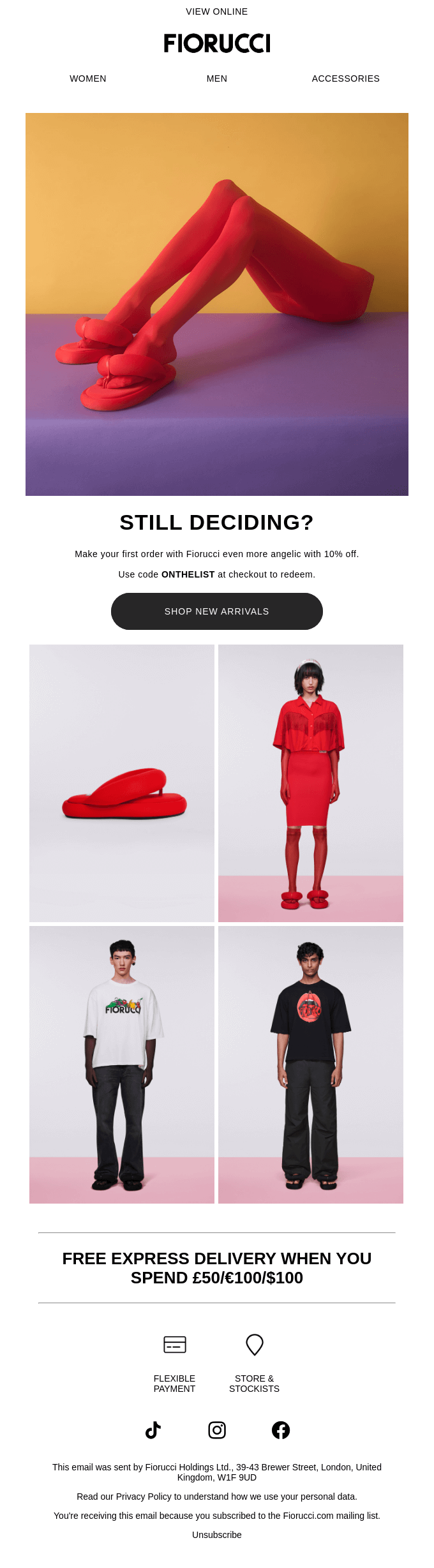
This email showcases Fiorucci’s bold, vibrant aesthetic with a selection that spans from statement red platform shoes and matching monochromatic looks to casual streetwear featuring the brand’s iconic logo tees.
The product grid demonstrates the label’s versatility, offering everything from eye-catching accessories to everyday essentials that maintain Fiorucci’s distinctive contemporary edge.
2. Three Nails
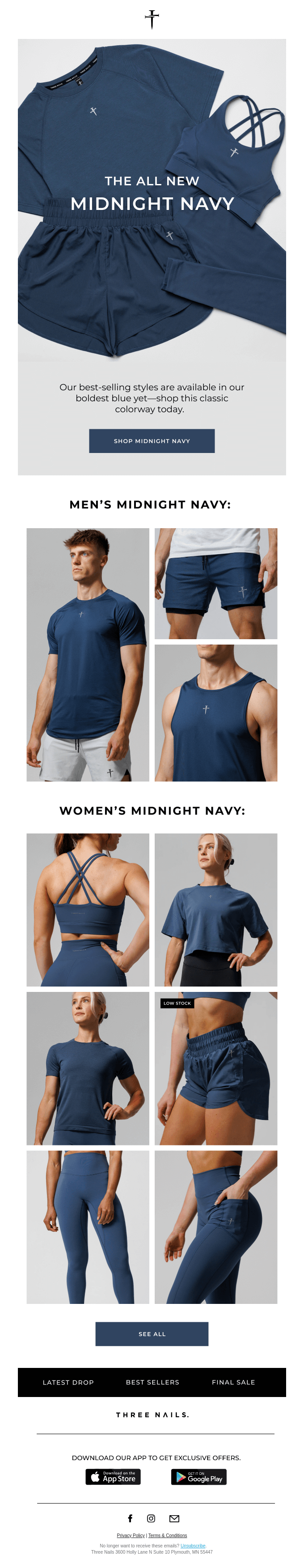
The product grid uses a clean, organized layout that separates men’s and women’s collections with clear section headers.
The men’s section features a compact 2×2 grid format, while the women’s section expands to a more detailed 3×2 grid arrangement, allowing for better showcase of the varied activewear pieces and design details like the intricate sports bra back straps.
3. Adun
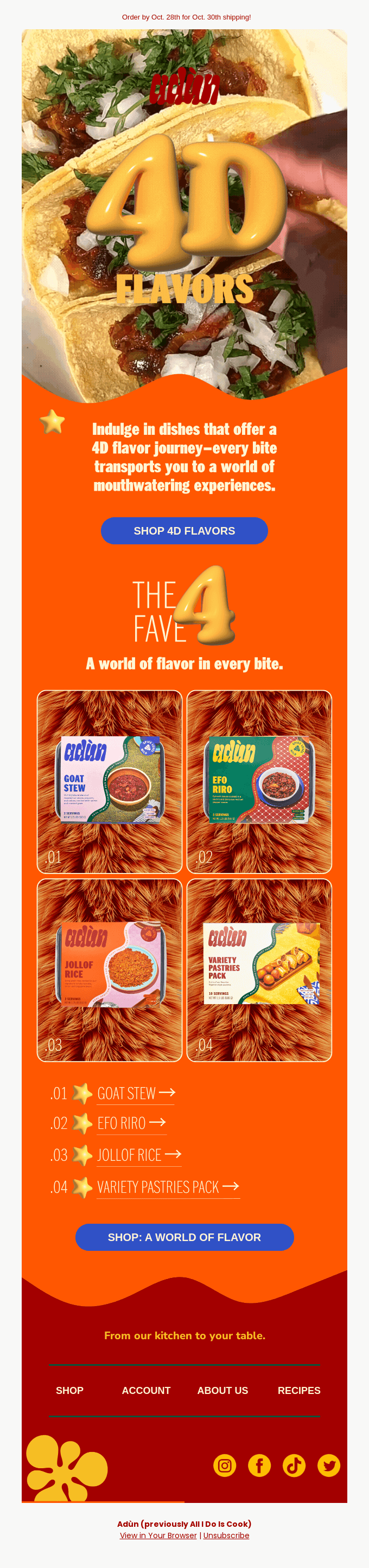
The product grid employs a neat 2×2 format with numbered product cards (01-04) that create an easy-to-navigate layout.
Each card features rounded corners and displays the product packaging against a consistent textured background. The numbered system connects seamlessly to the corresponding product list below with clickable arrows, creating an intuitive shopping experience that guides users from visual discovery to product details.
4. GOAT
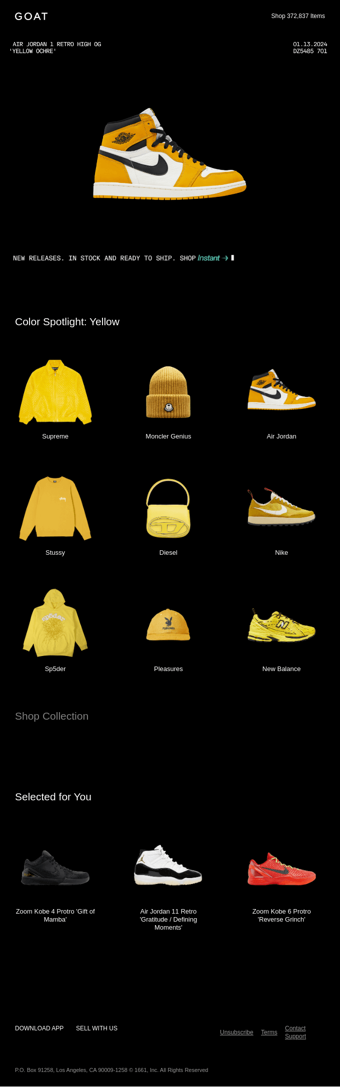
The email features two distinct grid formats: the first section uses a clean 3×3 grid layout that showcases curated yellow items from premium brands like Supreme, Moncler Genius, and Stussy, creating a cohesive color story across different product categories.
Below that, the “Selected for You” section employs a simpler 1×3 horizontal layout focusing on sneakers, with detailed product names and descriptions that emphasize personalized recommendations over thematic curation.
5. Dyson
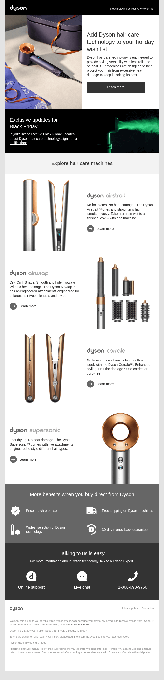
This email uses a single-column grid format that stacks each hair care product in individual sections with consistent left-right layout pairing: product image on the left, descriptive content on the right.
This approach creates a catalog-like browsing experience that allows each product to have dedicated space and detailed explanations without competing for attention, making it easy to scroll through and compare the hair care technologies.
Email Image Grid Comparison
According to Style Campaign, there are 3 types of image grids you can use in your email templates, namely:

- Baseline Grid: This grid is derived from the body copy’s line height. If your body copy is 15px with a 24px line height, your baseline unit is 24px. All other elements’ line heights should be multiples or subdivisions of this unit (e.g., 6px, 12px, 24px).
- Column Grid: This extends the proportional system to the horizontal layout, creating columns and gutters based on typographical units. This is useful for complex, multi-column layouts and modular systems.
- Modular Grid: A modular grid combines both horizontal and vertical divisions, creating a super-structure of modules. This is ideal for managing the varied content in modern email design and can be used to create asymmetrical, collage-like layouts.
As Style Campaign observes, adopting a typographic grid system for email design brings order and consistency to the creative process. Instead of relying on intuition with arbitrary, disconnected values, a grid provides a structured framework based on proportional relationships.
These grid systems are not just for aesthetic order—they are essential for a successful image grid in email campaigns, especially when you’re dealing with content-rich layouts that need to maintain consistency across devices.
In fact, you can also design interactive image grids for email, especially in AMP emails.
Ultimately, understanding the differences between these systems will help you choose the best email builder for image grids that aligns with your design goals.
Wrapping Up
Whether you’re using Klaviyo’s Split Block, Mailchimp’s Image Group, or building tables from scratch, the key is to stay flexible, test thoroughly, and keep your emails mobile-friendly.
By mastering the image grid in email campaigns across various platforms, you’re not just building beautiful emails. Rather, you’re setting the stage for higher engagement and better conversions.
Need help creating custom grids in emails? Get in touch with our team, and let’s get started.
Susmit Panda - Content writer