

Often overlooked in favor of flashy promotions, receipt emails (a form of transactional email) consistently outperform traditional marketing emails.
In fact, according to Grand View Horizon, the global market for email receipt was valued at US$ 483.6 million in 2023 and is projected to expand at a compound annual growth rate (CAGR) of 48.2% between 2023 and 2030. However, while marketers often chase the next promotional send, receipt emails sit quietly in the background—reliably outperforming and driving meaningful engagement and revenue.
Why are they so effective?
Because customers anticipate them, trust them, and often revisit them multiple times. As a result, transactional emails typically see open rates in the 80–85% range, whereas standard marketing emails usually hover around 20–25%.
Having designed custom e-commerce emails and HTML e-receipt templates for many clients, our team at Email Mavlers can reliably attest to their impact on engagement and revenue.
Today, we show you how to craft personalized e-receipt emails that not only fulfill a transaction but build lasting loyalty, turning buyers into (long-term) subscribers. Let’s roll!
How to design e-receipts that drive sales? 7 E-receipt design best practices
Incorporating e-receipt design for conversions can turn a simple email into a revenue-driving tool. Here’s how:
- Make recommendations smarter. Replace generic “customers also bought” suggestions with modules tailored to the purchase itself—think accessories, upgrades, or subscription shifts that naturally complement what was just bought. These recommendations can be embedded in personalized e-receipts to enhance relevance.
- Weave in urgency. Add expiring offers, loyalty perks, or countdown timers right inside the receipt. Segment your incentives—new vs. returning buyers, first-time vs. high-value purchases—so that each reward feels personalized and exclusive.
- Expand the call to action. Don’t limit users to “view order.” Build in micro-CTAs like “reorder,” “refer a friend,” “leave a review,” or “share on social.” Use bold, easy-to-tap buttons and highlight features like one-click reordering to spark repeat sales, especially for consumables.
- Tell your brand’s story. Dedicate space for social proof or narrative like UGC carousels, behind-the-scenes peeks, quick notes from the founder, or a “what’s next” journey. Refresh these blocks seasonally or by lifecycle stage to keep them dynamic.
- Optimize for mobile first. Most receipts are opened on phones, so streamline layouts for thumb navigation. Add interactivity with collapsible sections, tap-to-expand order details, responsive promos, and adaptive image scaling. Test accessibility, contrast, and dark mode to ensure both clarity and engagement. This aligns with responsive e-receipt design best practices.
- Don’t limit testing to standard inputs—check maximum cases like extra-long customer names or detailed product descriptions to confirm the layout holds up. Go beyond typical scenarios and stress-test with unusually long names, codes, or descriptions so the design doesn’t collapse under real-world edge cases.
- Host images and links externally, allowing quick updates by overwriting files or redirecting URLs without touching the email code.
Done right, your receipts evolve from passive notifications into active sales engines, delivering value for customers while quietly lifting your bottom line.
Best coding practices for e-receipt emails
To make e-receipts reliable, responsive, and adaptable, email developers need to follow proven standards in email coding. Here’s what matters most:
- Responsive frameworks first: Build receipts with frameworks like MJML to ensure seamless rendering on desktops, mobiles, and tablets. These tools handle complex grids, preserving hierarchy and preventing layout breaks on smaller screens, supporting responsive e-receipt design.
- Inline styling for compatibility: Since many email clients strip external CSS, keep styles inline and lightweight. Apply them only to essential layout elements to minimize rendering glitches.
- Personalized with templating: Use templating languages to inject live order data, display conditional elements like shipping or discounts, and loop through purchased items. This creates concise but highly contextual messages and allows for personalized e-receipt emails.
- Provide official docs & easy tracking: Attach PDF invoices for compliance, and include clear links to order status pages. Add UTM parameters so marketing teams can measure engagement and refine follow-ups. This also is part of coding e-receipts for e-commerce standards.
- Accessibility and testing built-in: Test thoroughly across major email clients (Gmail, Outlook, Apple Mail) and devices. Prioritize accessibility with semantic HTML, alt text, and readable contrasts, while also fine-tuning dark mode compatibility.
These best practices come together to make branded e-commerce e-receipts that are reliable, personalized, visually consistent, and effective as sales-driving touchpoin
ts at the moment of purchase.
Proper coding e-receipts for e-commerce ensures every email works flawlessly across devices. If you need more specific tips, take a look at Mailjet’s dedicated article on this topic.
Now, let’s look at some well-designed HTML e-receipt templates from top brands.
E-receipt design: 7 examples of e-receipt templates for e-commerce brands
1. Wimp
Wimp’s email demonstrates how a clean, thoughtful design can communicate professionalism while retaining a friendly brand personality. The email balances layout, color, and tone in a way that connects with customers beyond the transactional moment.
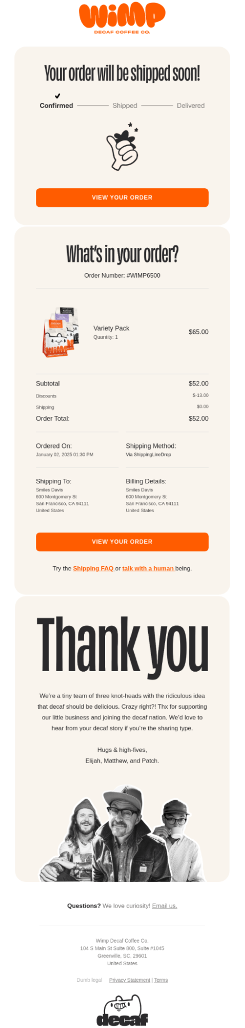
Here’s what Wimp gets right in their e-receipt email design:
- Clean, minimalist layout with plenty of white space that feels modern and uncluttered.
- Consistent orange brand color used strategically for CTAs and accents without overwhelming.
- Playful yet professional typography mixing bold headers with readable body text.
- Clear visual hierarchy guiding the eye from confirmation through order details to thank you.
- Strategic cross-selling opportunity with the “Shipping FAQ” and customer service links
- Clear shipping timeline visualization manages expectations and reduces anxiety.
The design successfully balances professionalism with approachable brand personality, making customers feel good about their purchase while encouraging future engagement.
2. Vuori
Vuori’s approach to e-receipts highlights the importance of aligning design with brand positioning. Their email focuses on clarity, visual appeal, and a seamless customer experience that reinforces the premium, lifestyle-oriented identity of the brand, making it a prime example of e-commerce email receipts done right.
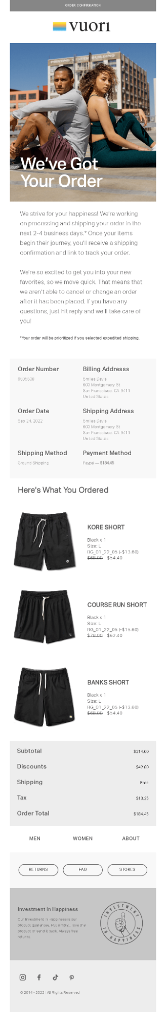
Below are some of the winning elements of Vuori’s e-receipt design:
- The email maintains a consistent typographic hierarchy, using clear section breaks to guide the reader’s eye and make the content easy to scan.
- Product images are crisp and well-lit, showcasing each item in a way that highlights quality and detail, helping customers visualize their purchase.
- A subtle, upscale color palette, dominated by black, white, and gray, creates a cohesive look that reinforces the brand’s premium positioning.
- Strategically placed CTA buttons such as returns, FAQ, and stores give customers quick access to essential service areas, reducing friction.
- Transparent messaging around processing times reassures customers by managing expectations and demonstrating proactive communication.
- Multiple navigation links—including Men, Women, and About—encourage continued browsing and keep shoppers engaged with the brand ecosystem.
The email successfully combines a lifestyle-oriented aesthetic with functional order confirmation.
3. Olipop
Olipop’s e-receipt email shows how creativity can elevate a standard transactional message.
By introducing playful design elements and celebrating the product itself, the email turns a routine notification into a visually engaging and memorable interaction.
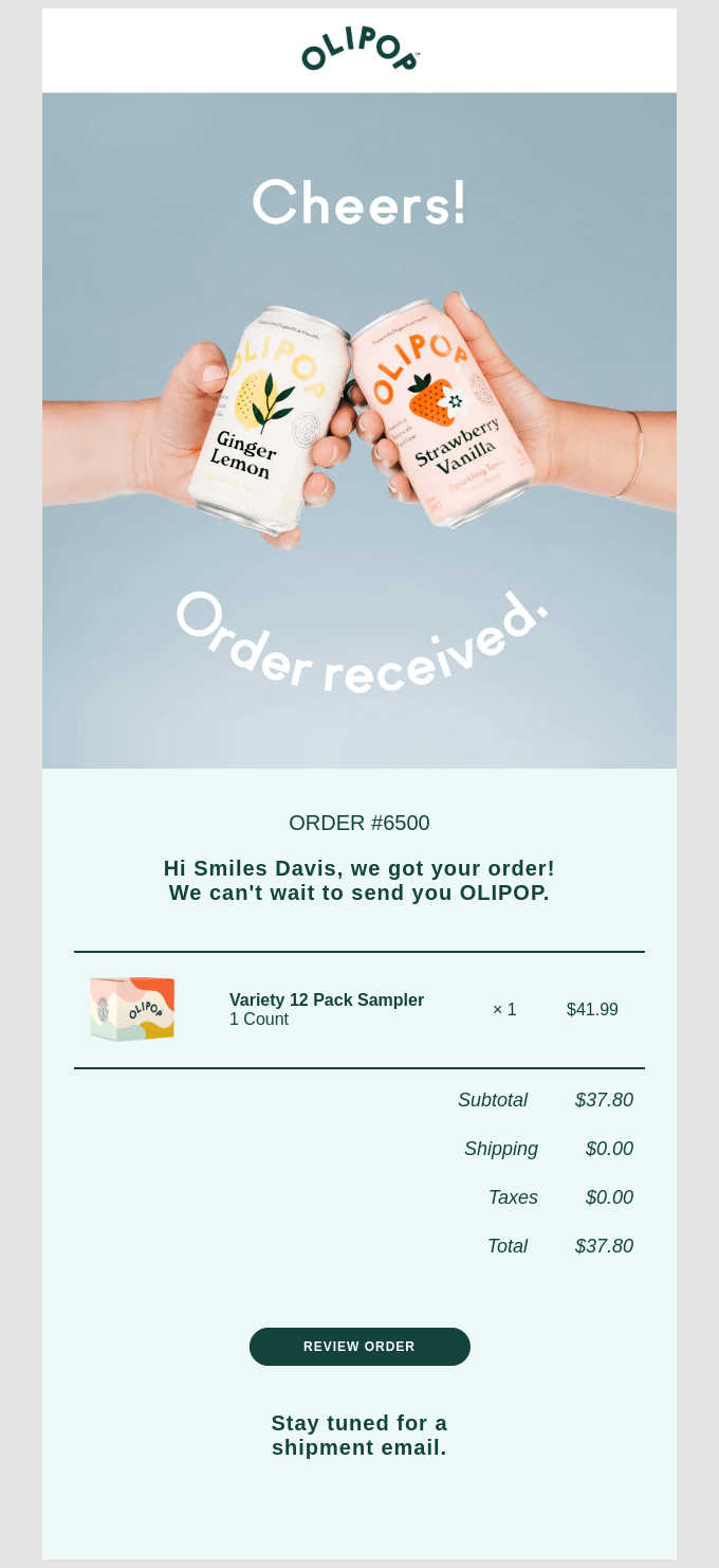
Here’s what makes Olipop’s email e-receipt stands out:
- The playful arc treatment on “Order received” adds a touch of sophistication and sets the design apart from standard email templates.
- Product-as-hero photography highlights the actual flavors, celebrating them directly instead of relying on generic lifestyle imagery.
- A soft blue background creates a dreamy, Instagram-worthy aesthetic that feels fresh and distinctly different from typical receipt emails.
This email uniquely transforms what’s typically administrative into something that feels like a celebratory invitation.
4. DoorDash
DoorDash demonstrates how functionality and brand identity can work together in an e-receipt. Their design prioritizes clarity and ease of use while incorporating visual cues and interactive elements that reinforce the delivery experience.
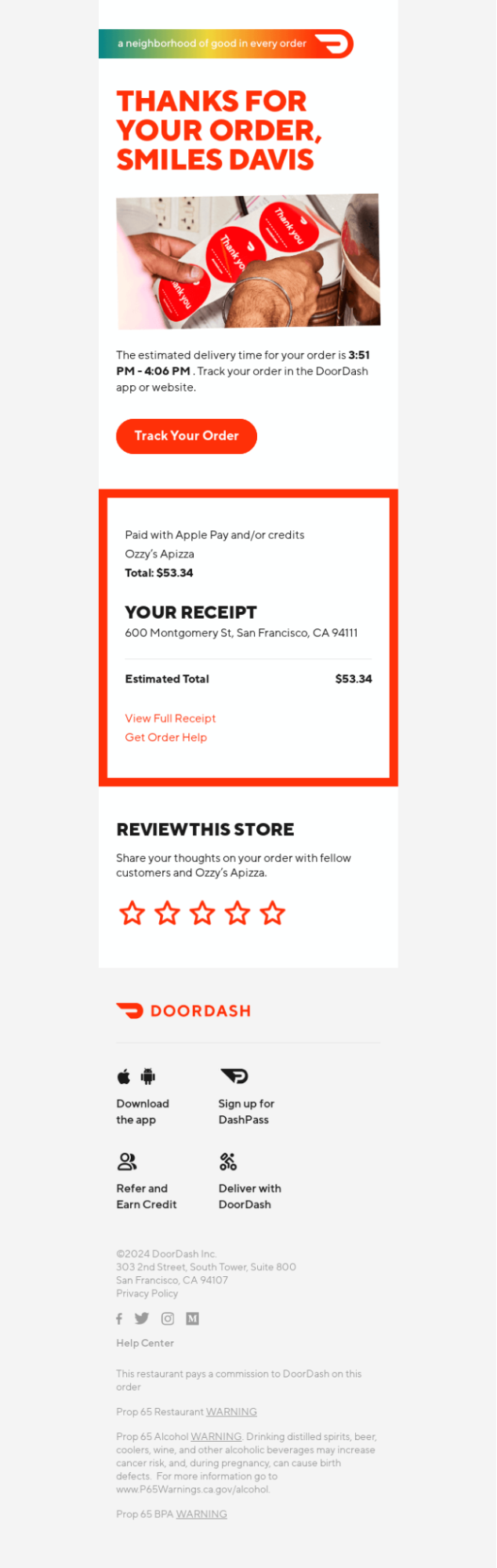
Let’s explore how DoorDash gets this e-receipt design spot on:
- The “Thank You” headline aligns with the thank-you stickers in the hero image which shows the packaging in progress, signaling that the delivery is already underway.
- The signature DoorDash red is applied consistently across CTAs and visual accents, reinforcing brand recall and design cohesion.
- Order details are placed within a bold, high-contrast block, drawing the eye to the most critical transaction information.
- Headings, totals, and CTAs are clearly distinguished through thoughtful typography and spacing, making the email quick to scan.
- The prominent “Track Your Order” button commands attention, creating a strong CTA that drives instant engagement.
- Cross-promotional links—including app downloads, DashPass sign-ups, and referral prompts—provide opportunities for extended customer engagement.
- The single-column, mobile-first layout with large tappable elements ensures smooth readability and effortless navigation on phones.
Together, the design blends functionality with marketing strategy while staying visually clean and on-brand.
5. Art of Play
Art of Play’s e-receipt is an example of how playful design can coexist with organized, readable layouts. The email effectively reflects the brand’s personality while keeping the focus on the order information, making it visually engaging yet user-friendly.
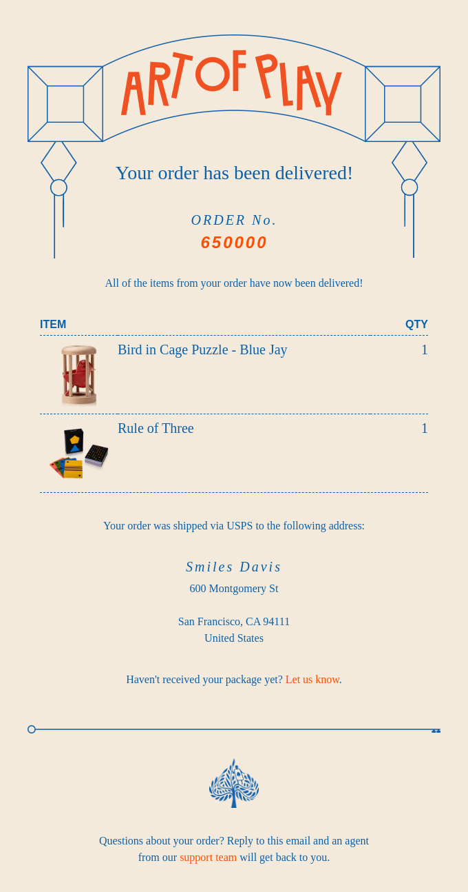
Here’s what makes this e-receipt email from Art of Play strong aesthetically:
- The “ART OF PLAY” arc at the top immediately grabs attention with its curved, dynamic typography, setting a playful tone that matches the brand identity.
- A mix of serif and sans-serif fonts balances readability with personality; the orange order number stands out against the neutral background.
- Soft beige background with blue text and orange accents creates a friendly, approachable look while maintaining readability.
- The symmetry in the header graphics and centered content gives the email a well-composed, polished feel.
- Ample spacing around sections prevents the email from feeling cluttered and guides the eye naturally down the email.
This e-receipt email combines playful design elements with clean, structured layout choices, creating an experience that is both visually engaging and easy to navigate—perfectly reflecting Art of Play’s brand personality while keeping the focus on the order details.
6. Chipotle
Chipotle’s e-receipt illustrates how a brand can combine appetizing visuals, strong hierarchy, and interactive elements to enhance the post-purchase experience. The design clearly communicates essential information while staying on-brand and visually appealing.
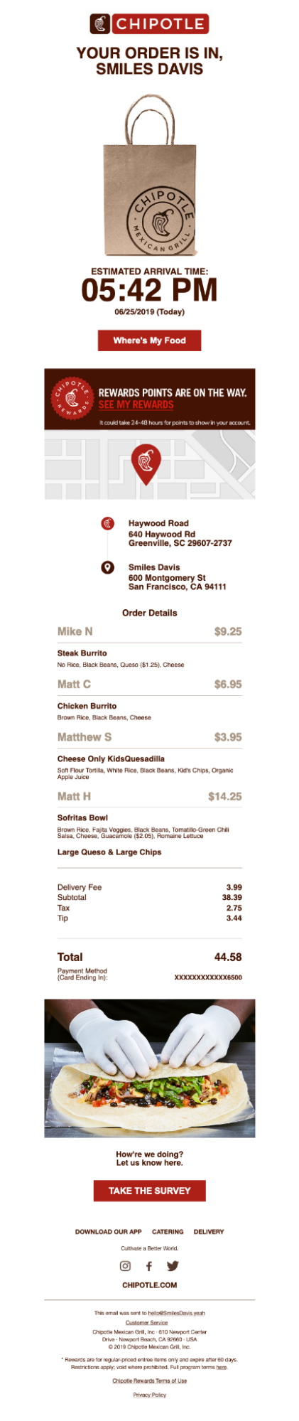
Below are the key design elements that elevate this Chipotle e-receipt email:
- A large, bold font for the estimated arrival time makes key information instantly noticeable.
- The central image of the Chipotle bag and the burrito preparation at the bottom adds a tactile, appetizing feel without cluttering the layout.
- A simplified map and location pins visually communicate the restaurant and delivery addresses, enhancing clarity.
- Buttons like “Where’s My Food” and “TAKE THE SURVEY” are clearly visible with strong color contrast, encouraging interaction. The first CTA is particularly effective.
- Items are grouped with clear typography, prices aligned, and minimalistic dividers, making the receipt easy to scan.
This Chipotle e-receipt email combines strong brand reinforcement, clear visual hierarchy, and thoughtful personalization with appetizing imagery and intuitive layout. The consistent spacing, alignment, and footer clarity tie it all together, resulting in an email that’s not only easy to navigate but reinforces the Chipotle experience from start to finish.
7. Copywrong to Copywriter
This e-receipt shows that even minimal design can be highly effective when paired with a personable, conversational tone.
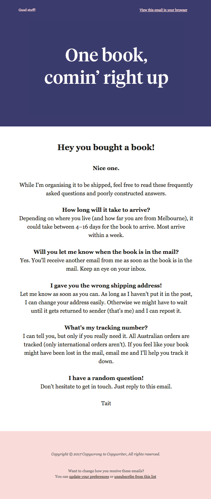
Aesthetically, this email may seem minimal, if not bland. However, keeping the brand in view, this e-receipt is a great example of read-worthy emails as well as branded e-commerce e-receipts:
- The email uses conversational language that makes the experience feel personal and human.
- The email addresses common shipping questions before the user even asks, reducing friction and managing expectations.
- It encourages replies for random questions, creating a sense of approachability and two-way communication.
- Signing off with just “Tait” reinforces the personal, human touch of the email.
- The tone aligns with the quirky, approachable brand identity, making what is essentially a receipt memorable.
This email transforms a transactional message into an engaging, human-centered interaction, reinforcing brand identity while keeping the experience clear, approachable, and memorable.
E-receipt design: Wrapping up
E-commerce email receipts are far more than simple transaction confirmations; they are powerful touchpoints that can reinforce your brand, delight customers, and drive repeat engagement. The examples explored show that with thoughtful design, strategic messaging, and smart coding practices, even routine emails can become memorable experiences that support your revenue goals.
If you’re ready to turn your e-receipts into a strategic asset that boosts customer loyalty and drives sales, let’s craft emails that not only confirm purchases but tell your brand story. Reach out today and see how we can elevate your transactional emails. Let’s get started.