

Halloween is one of those days on the marketing calendar when brands can let loose, experiment with bold creativity, and connect with audiences in ways that feel both playful and memorable. For marketers, it’s not just about adding a pumpkin emoji or a splash of orange; it’s about crafting campaigns that feel on-theme while staying true to the brand’s voice and goals.
In today’s expert curation, we bring together an assortment of Halloween email design ideas from across industries, such as e-commerce, retail, tech, hospitality, and more.
Each example highlights how different brands weave the Halloween spirit into their email design, copy, and strategy in unique ways. Whether you’re aiming to cast a spell with spooky subject lines, create design-driven atmospheres, or simply give your subscribers a treat, these templates serve as inspiration to elevate your next seasonal campaign. Let’s crawl away!

Halloween email subject lines examples
Subject lines are the first hook in any Halloween campaign. Here’s a collection of ideas that show how brands add seasonal flair to their inbox presence:
- 🎃 Don’t Ghost This Deal—It Vanishes at Midnight!
- Spook-tacular Savings Await You 👻
- Trick or Treat? 🎁 Open for a Surprise…
- Creepin’ It Real: Your Halloween Special Inside
- Limited-Time Scare: Frightfully Good Offers
- 🕷️ Web of Deals You Can’t Escape
- Ghouls Just Wanna Have Fun—And Discounts!
- Sink Your Fangs Into These Halloween Treats 🧛
- Ready to Be Spooked? Your Halloween Gift Awaits
- Step Inside If You Dare… 👀 (perfect for a Halloween email campaign for restaurants!)
- Monsters, Magic & Markdowns—This Way ➡️
- BOO! You’ve Unlocked a Scary-Good Deal
- Creep It Real: Spooky Styles for Less
- Ghostly Goodies Inside—Before They Disappear!
- A Bewitching Offer Just for You ✨
Now, let’s take a look at some of the best Halloween email designs from our curation.
Halloween newsletter templates
Newsletters allow brands to engage subscribers with storytelling and multi-layered content. The following examples show how diverse approaches can create memorable experiences.
Mailmodo
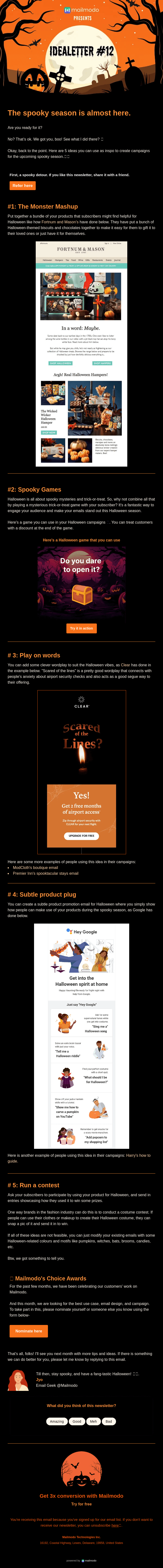
This newsletter demonstrates how varied content formats—from events to games—can keep readers engaged throughout a Halloween campaign:
- Moving between Monster Meetup events, spooky games, costume contests, and Choice Awards keeps attention through topic diversity.
- Placing the sweepstakes entry deep in the email rewards engaged readers who actually consume the content rather than just skimmers.
- Showing actual email previews and web pages within the newsletter adds meta-layering that demonstrates the breadth of their Halloween activation while providing visual proof of ongoing engagement
Disruptive Advertising
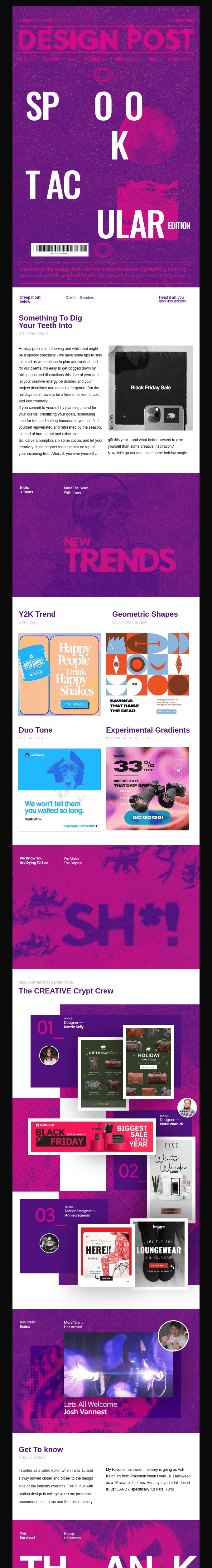
Here, a design-focused newsletter experiments with layout, color, and typography to create a Halloween atmosphere that feels sophisticated:
- Breaking the hero text across multiple lines with irregular spacing creates visual disruption that mirrors the unsettling nature of Halloween.
- Displaying phone screens and design mockups within the email layout adds dimensional depth and demonstrates practical application, helping recipients visualize.
- Committing to deep purple instead of expected orange creates a sophisticated, moody atmosphere that feels more editorial and less commercially Halloween.
- Highlighting individual designers with their Halloween-themed work humanizes the brand and creates aspirational identification.
National Geographic
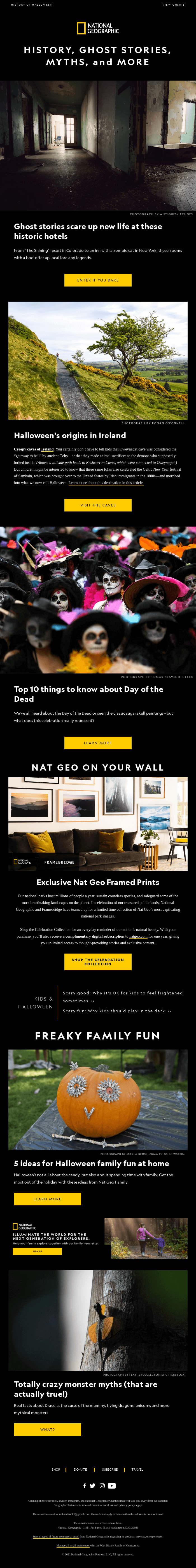
A globally recognized brand uses immersive imagery, careful pacing, and consistent mood to deliver a visually rich Halloween experience through its newsletter:
- Each section uses edge-to-edge atmospheric images that create immersive visual moments rather than constrained product boxes.
- The bright golden buttons pop uniformly against every dark background throughout the scroll, creating reliable wayfinding that guides the eye.
- Placing text over darkened photo regions ensures readability while preserving image drama.
- Alternating between full-width hero images and content blocks creates visual pacing that prevents monotony, with generous negative space between sections.
- Maintaining dark backgrounds throughout creates a cohesive nocturnal mood appropriate to both Halloween and National Geographic’s exploration aesthetic.
Moving on from Halloween newsletter ideas for businesses, let’s explore a bunch of examples for the e-commerce folks.
Halloween email templates for e-commerce
E-commerce brands use Halloween to showcase products in new, thematic ways. The following templates highlight how different companies adapt the holiday to their offerings.
Polaroid
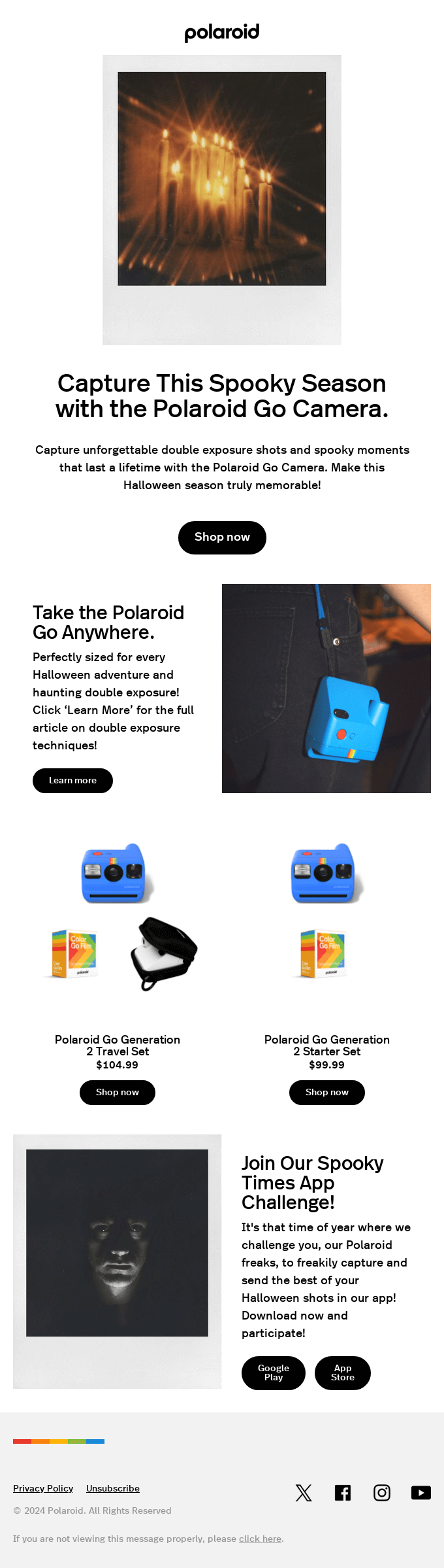
This example comes from a photography brand that balances seasonal atmosphere with product storytelling. Here are the key strengths of this Halloween email design:
- The blurred, double-exposed candle shot at the top demonstrates the camera’s unique aesthetic capabilities rather than just describing them, making the product benefit tangible and intriguing.
- The warm oranges and blacks throughout maintain the Halloween atmosphere while staying true to Polaroid’s brand identity, with the bright blue camera providing eye-catching contrast.
- The single-column design with clear sections and prominent buttons works perfectly for smartphone viewing, where most marketing emails are opened.
- The “Learn more” CTA for double exposure techniques adds value beyond just selling, positioning Polaroid as helpful and building trust with photography enthusiasts.
We’d say the hero image alone makes it one of the best Halloween promotional email templates.
Blu Dot
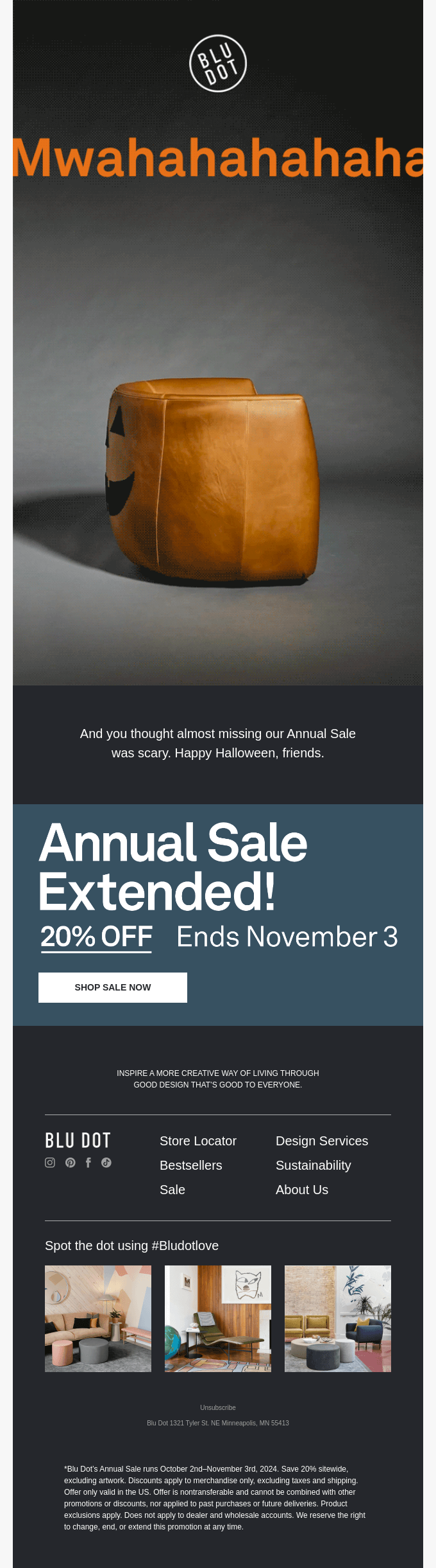
Blu Dot puts a playful twist on Halloween while staying aligned with its design-forward identity:
- The orange pumpkin-shaped ottoman creates a visual pun that takes a moment to register, rewarding attentive readers with a “gotcha” moment that reinforces the playful tone.
- The repeating “hahahaha” in orange creates both texture and reinforces the evil laugh concept without needing additional graphics or imagery.
- The dark, gradient background and single product shot feel refined and design-forward rather than cluttered with Halloween clichés.
Shakti
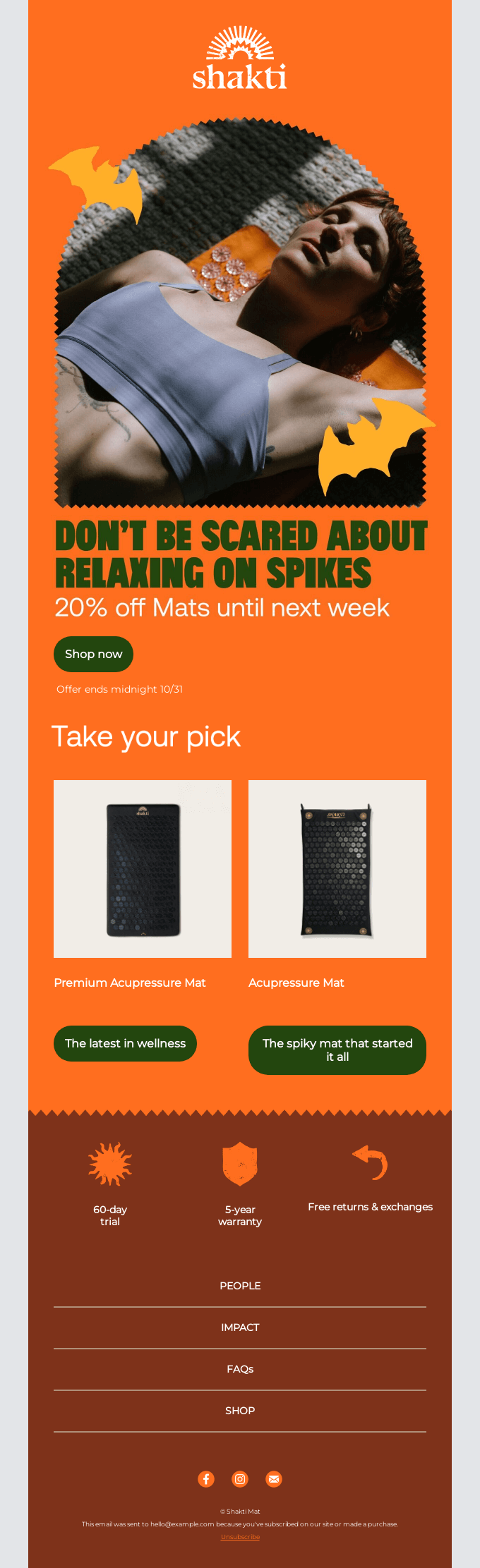
This wellness brand uses Halloween to creatively address a customer hesitation while leaning into thematic visuals:
- The cutout bats floating around the image feel quite organic and whimsical rather than clipart-cheap, maintaining design sophistication while nodding to the season.
- Using “DON’T BE SCARED” to address the intimidating nature of acupressure mats turns a potential purchase barrier into the Halloween hook, solving a real objection while staying on-theme.
- The dramatic upward shot of the model creates unease and disorientation that mirrors both the Halloween vibe and the initial apprehension customers might feel about lying on spikes.
- The spiky edge between sections visually echoes the mat’s texture while creating clear content separation, turning a functional design element into thematic reinforcement.
- The shift from energetic orange to grounding earth tones mirrors the journey from Halloween excitement to the calming wellness benefits, creating a subtle psychological alignment.
SAYSO
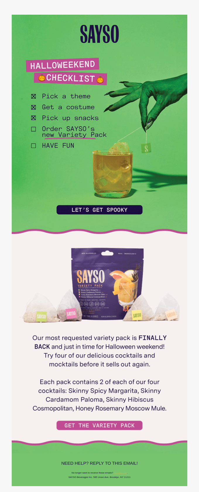
SAYSO takes an unexpected approach, adapting Halloween aesthetics to fit its modern, stylish positioning. Here are the highlights of this Halloween promotional email template:
- Using vibrant green instead of expected orange and black makes the email stand out in crowded Halloween inboxes while aligning with the brand’s fresh, modern cocktail positioning.
- The green-painted hand reaching for the drink is just spooky enough to be Halloween-appropriate without being cartoonish, maintaining brand sophistication for an adult beverage audience.
- Individual cocktail pouches displayed around the main package provide visual variety and help customers understand exactly what they’re getting.
- Both CTA buttons use the same magenta accent color that appears in the header highlights, creating visual cohesion while the contrasting button placements (dark vs light backgrounds) ensure visibility in both contexts.
Halloween email designs for fashion brands & retail
Fashion and retail marketers often experiment with cultural references and bold visuals around Halloween. These campaigns illustrate varied creative approaches. Here is a list of our favorite Halloween email templates for retail and fashion.
Cotton Bureau
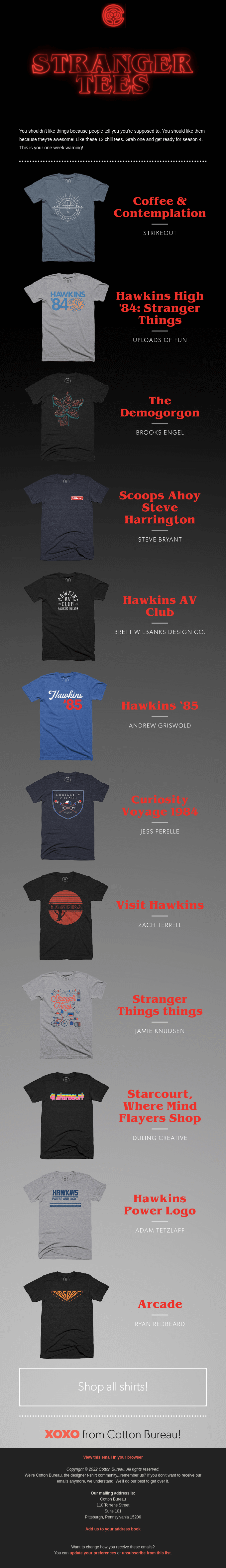
Cotton Bureau connects its Halloween campaign with pop culture, creating resonance for fans of a cult series. Here’s what stood out to us from their Halloween email campaign template:
- The single-column layout creates a browsing experience similar to social media feeds, making it feel less like a traditional email blast and more like curated content discovery.
- The glowing red Stranger Things logo and retro font styling tap into the show’s core appeal while naturally aligning with Halloween’s vintage horror aesthetics.
- The black backdrop with red accents directly references Stranger Things’ visual identity and the Upside Down atmosphere, making the email feel like an extension of the show rather than generic merch spam.
- Putting the comprehensive CTA at the bottom after showcasing highlights respects the browsing experience while capturing anyone who scrolled through without committing to a specific design.
Wool & Oak
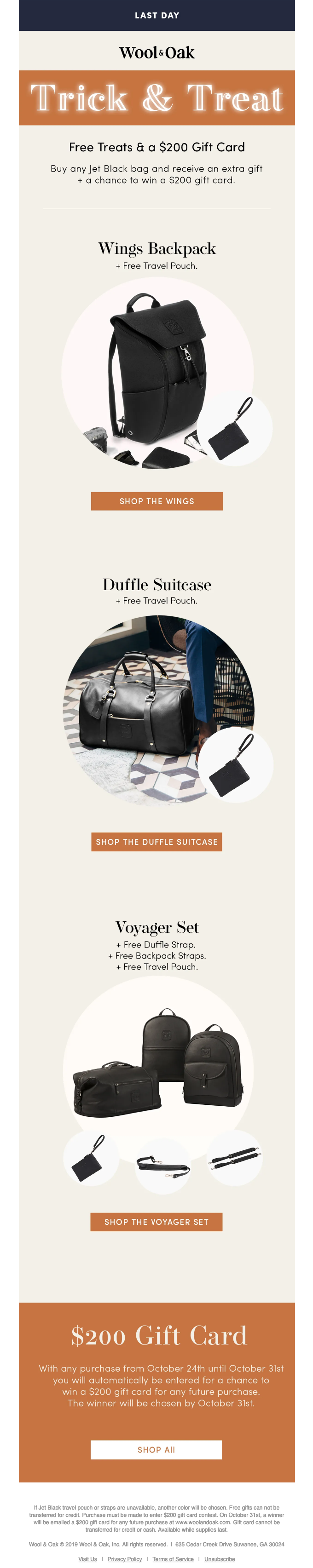
Wool & Oak uses Halloween subtly to present its products with sophistication:
- Starting with the backpack, moving to the suitcase, then ending with the complete set creates an ascending value proposition that guides viewers from entry point to maximum purchase.
- Showing the free travel pouches and straps separately next to each product helps customers tangibly understand the bonus value.
- Instead of orange, purple, or themed graphics, the all-black luxury bags suggest “elevated Halloween” for adult travelers who want sophistication over kitsch.
- The warm orange-brown buttons provide Halloween color without being garish, while maintaining enough contrast against the cream background for strong conversion focus.
Starbucks
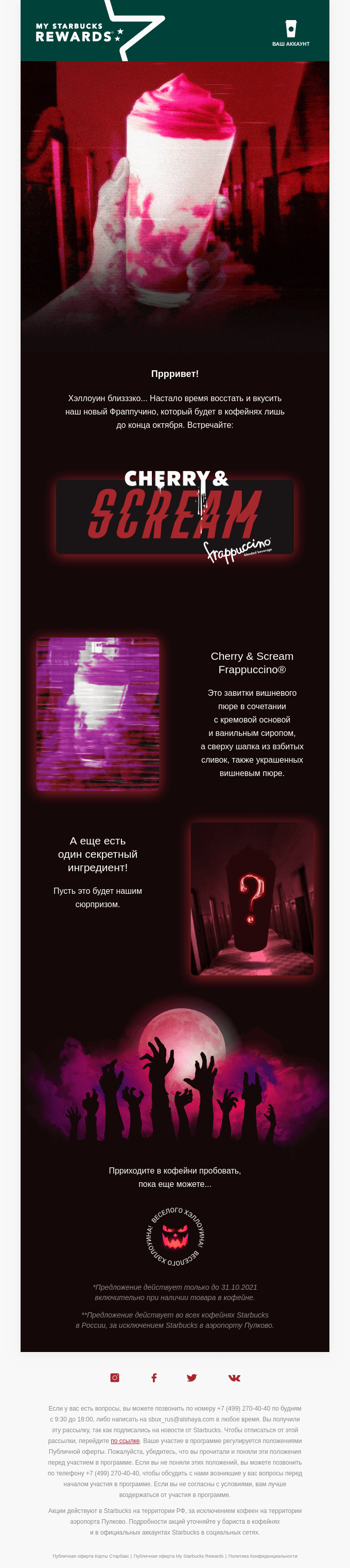
The popular coffee chain embraces a more cinematic, atmospheric approach in their Halloween email campaign template:
- The glitchy, distorted imagery and cinematic red lighting creates genuine unsettling atmosphere rather than cute Halloween clichés, positioning the drink as an experience rather than just a seasonal flavor.
- The slashed, horror-font rendering of “SCREAM” mixed with Cyrillic text creates cultural localization while maintaining universal horror movie visual language that transcends language barriers.
- The reaching hands against the pink moon creates an apocalyptic scene that’s both threatening and playful, suggesting the drink inspires cult-like devotion.
- The glitched product shot mimics analog horror footage aesthetics popular in modern horror, connecting to younger audiences’ nostalgic fascination with retro media formats.
- The Starbucks siren logo transformed into a carved pumpkin maintains brand identity while fully committing to the Halloween theme without feeling forced.
Halloween email templates for SaaS & tech
SaaS and tech brands tend to approach Halloween differently, mixing functional storytelling with seasonal creativity. These examples show how that plays out across the industry.
Motif
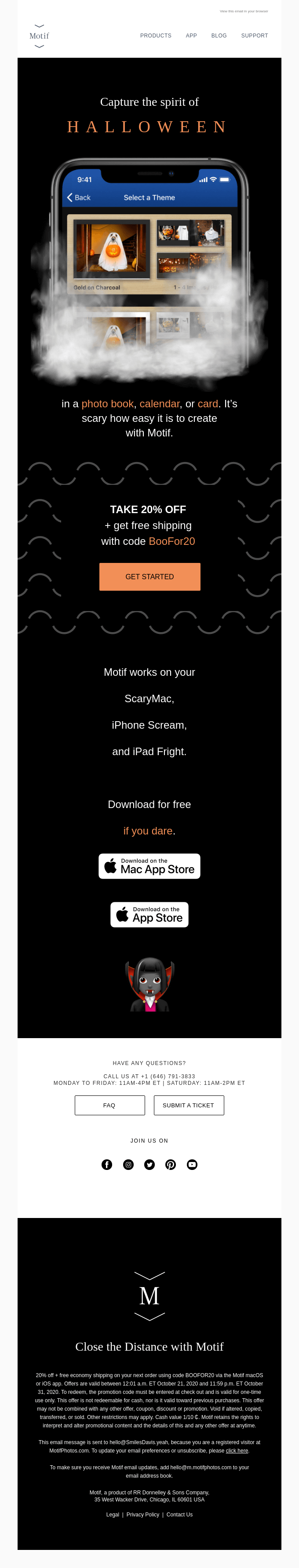
This design platform incorporates Halloween directly into its product showcase while keeping a playful edge:
- Showcasing the actual product UI with Halloween themes selected demonstrates functionality rather than just describing it, helping users visualize exactly how they’ll create their own Halloween content.
- The wispy smoke rising from the device creates a supernatural, haunted quality that makes the digital product feel tangibly spooky and alive.
- The small cartoon devil at the bottom provides a welcoming, non-threatening counterpoint to the darker imagery above, ensuring the email feels fun rather than frightening.
- The subtle undulating lines throughout create subliminal unease and movement, like watching something ripple in darkness, without overwhelming the content.
WeTransfer

WeTransfer uses Halloween as a cultural moment to highlight creative voices instead of products:
- The email features emerging artists and their work, positioning the brand as a cultural curator that supports creative voices, which builds deeper audience connection than transactional messaging.
- Each creator gets dedicated real estate with their artwork and bio, creating a gallery-like browsing experience while allowing readers to discover new favorites at their own pace.
- Moving beyond commercial Halloween imagery to showcase abstract, conceptual, and fine art pieces elevates the holiday beyond consumerism and appeals to sophisticated art collectors.
- From Maja Daniels’ dramatic florals to Kenichi Hoshine’s geometric abstraction, the varied visual approaches demonstrate that Halloween inspiration transcends a single aesthetic, expanding creative possibility.
- The mystical scene with candles, moon, and trees creates an enchanted, contemplative atmosphere that signals this is art-focused content.
Double
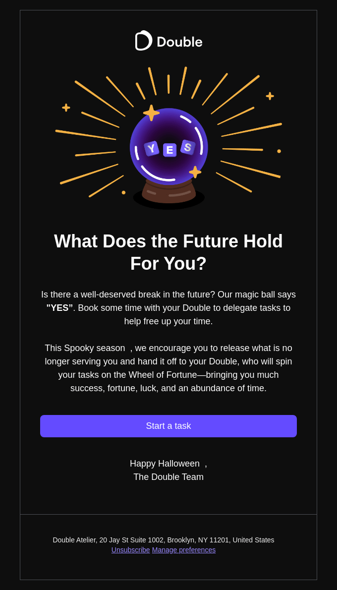
Double reimagines Halloween motifs in a minimal, symbolic way:
- Transforming task delegation into a mystical prediction cleverly reframes mundane work management.
- The stark darkness with golden radiating lines creates a theatrical spotlight effect, making the single central image command full attention like a carnival attraction in the night.
- The “Start a task” button stands alone with no competing elements, navigation, or visual noise, creating a clear singular path forward that respects decision fatigue.
Halloween email templates for real-estate
For lifestyle-driven sectors like hospitality and real estate, Halloween provides an opportunity to blend ambiance with customer engagement.
Zillow
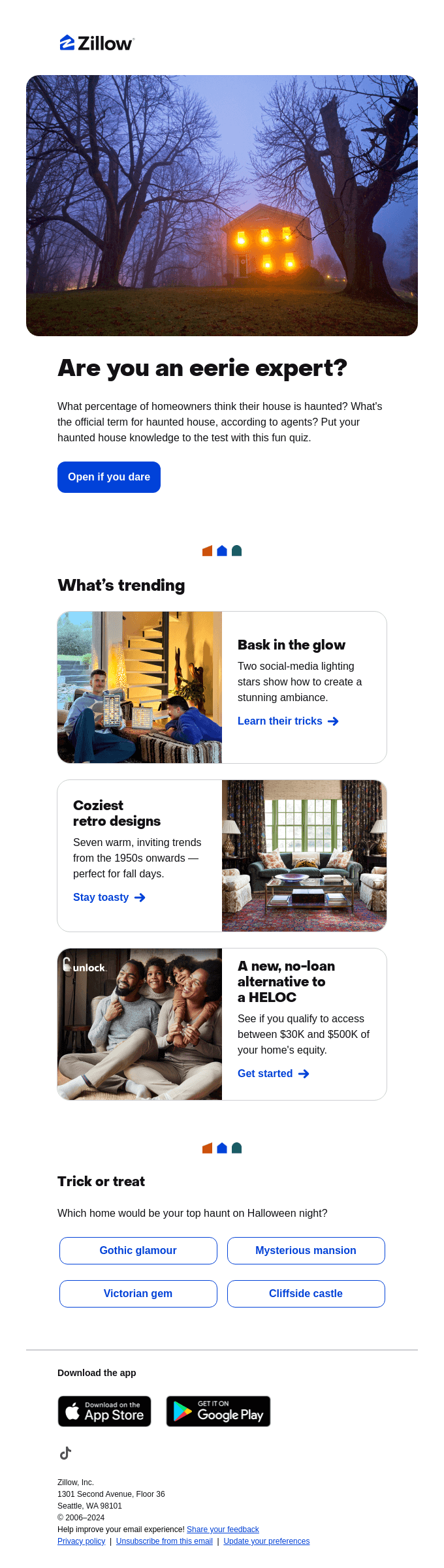
The acclaimed real-estate company uses Halloween themes to connect with audiences while keeping its content practical:
- The foggy, backlit house with glowing windows creates an unsettling ambiance through real photography.
- The skeletal branches on either side create natural compositional borders that draw eyes toward the central house while reinforcing autumnal decay without needing additional decorative elements.
- Mixing the Halloween quiz with unrelated trending home design content ensures the email serves ongoing value even for subscribers who aren’t Halloween-focused.
Society6
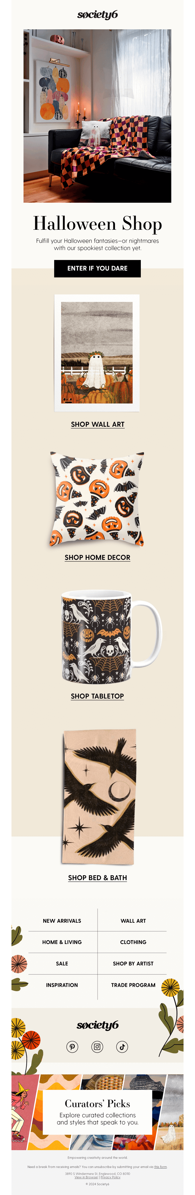
We love how Society6 integrates Halloween into everyday living spaces with a refined seasonal style:
- The hero image shows Halloween products integrated into an actual living room rather than floating on white backgrounds, helping customers visualize how pieces work within their existing spaces instead of as novelty items.
- The stacked format with individual category images creates a department store browsing experience that showcases range, letting each category breathe visually.
- Using primarily black, white, and orange with minimal imagery keeps the aesthetic sophisticated, signaling that these are design pieces for year-round display, not disposable party decorations.
- The autumn flowers framing the footer navigation add organic warmth that softens the commercial structure while maintaining seasonal relevance beyond Halloween, extending the email’s useful lifespan into general fall.
These choices show how Society6 uses Halloween as a gateway rather than a gimmick—offering seasonal relevance while positioning its products as timeless additions to the home. It’s a reminder that holiday campaigns can drive excitement without sacrificing brand sophistication.
Still sitting on Halloween email design ideas?
As inboxes grow noisier around seasonal moments, the brands that stand out are those that balance theme with authenticity—adding just enough Halloween flair to spark excitement without losing sight of what makes their message valuable. That balance is what turns a seasonal email into a campaign that lingers in memory long after the pumpkins are gone.
If you’re sitting on a pumpkin pyramid of Halloween email design ideas, our email developers can turn those into inbox-ready emails. Let’s get started for Halloween!