

Limited-time offers create urgency, trigger FOMO, and nudge customers to act fast.
Nonetheless, the effectiveness of your offer depends just as much on how you present it as what you’re offering.
Even a great limited-time deal can easily get lost in crowded inboxes if the email lacks clarity, punch, or direction. That’s why crafting the right message, from subject line to CTA, is key to making the most of your window of opportunity.
Hence this curation of limited time offer email templates.
In this guide, we’ll walk you through actionable tips to sharpen your messaging, add urgency without sounding pushy, and of course, design emails that convert under pressure.
You’ll also get access to easy-to-adapt limited time promotion emails tailored for flash sales and seasonal promos.
Curious to explore what the design team at Email Mavlers has curated for you? Let’s jump right in.
How Top Brands are Crushing It with Flash Sale Email Templates
When it comes to flash sale emails, some brands know exactly how to grab attention, spark urgency, and drive clicks.
We spotlight 7 top brands that are setting the standard with their sharp design, compelling copy, and use of time-sensitive tactics. Let’s take a closer look at what makes their limited time offer email templates stand out. First up, Fabletics.
1. Fabletics
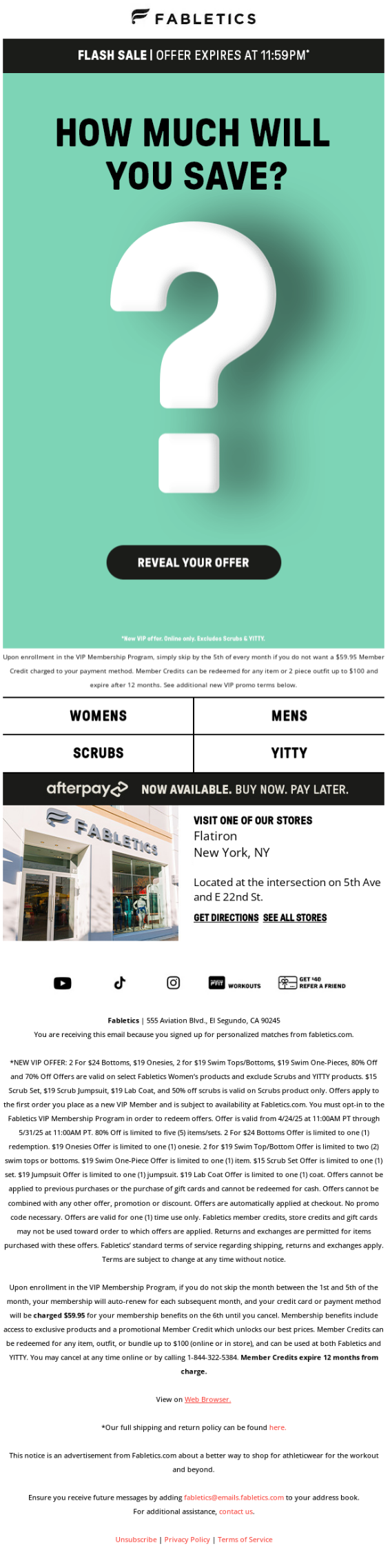
Fabletics’s email sets the tone for the rest of our limited time offer email examples. Here’s why:
- The offer expiration time is the first thing mentioned in the subject line. It’s also the first thing you see in the hero space, right below the brand name and logo.
- By making the button interactive, Fabletics have effectively made their promotional message more memorable.
- The hero image is clean, minimal, and doesn’t distract from the action it prompts the subscriber to take.
- All important details related to the offer are in live text, so that the fine print is accessible to all.
The best part of the email is the interactive CTA. We like how it has been personalized, which is why it’s memorable.
2. Top of the Mornin’ Coffee
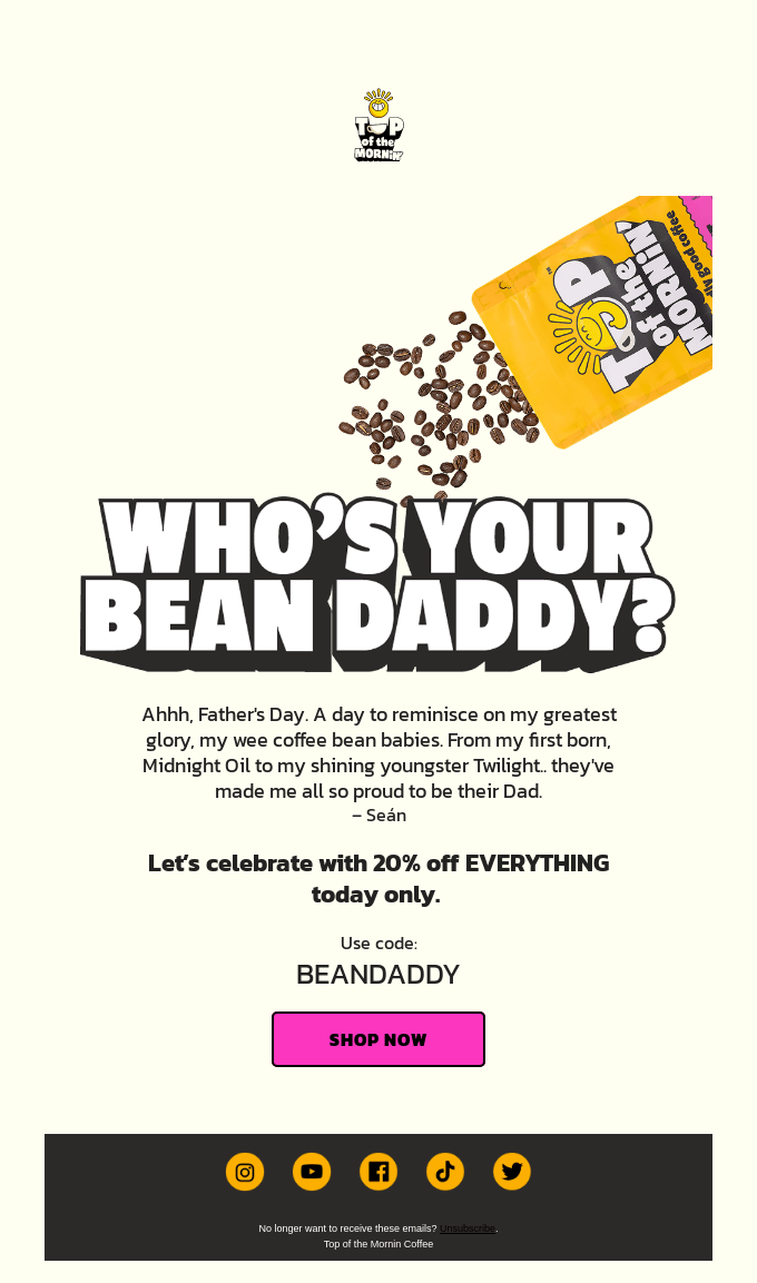
This Father’s Day email from Top of the Mornin’ Coffee reflects the blink-and-miss nature of the sale. Here’s how:
- The message is short and quick. The Word Art-style headline stands out against the minimalist forefront.
- The text is nicely broken up into multiple fonts so the reader doesn’t miss any part of the message.
- The deep-pink CTA button is unmissable; in fact, it’s the first thing that catches the eye. Yes, it’s their brand color—but using it in a flash sale email without layering on extras shows smart, efficient use of design resources.
The brevity of the email, combined with the uncharacteristic subject line, completes the appeal of the message.
3. Adore Me
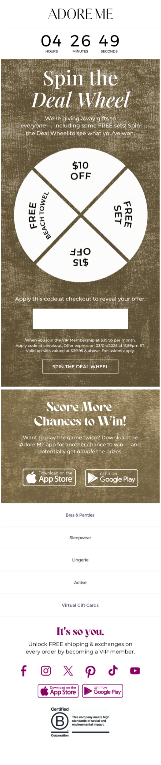
Adore Me leverages the countdown timer to great effect. But that’s not the only cool thing about their application of limited time email marketing because there’s more:
- The brown/tan textured background creates a premium, cozy feeling that aligns with intimate apparel branding while providing excellent contrast for white text and elements.
- The CTA button uses a subtle outline style rather than a solid fill, which creates an elegant, non-aggressive appearance that feels more inviting than pushy.
- The clean, uncluttered design focuses attention on the key elements without any visual distractions.
- The design flows logically from the countdown at top, to the wheel in the middle, to the action button below, guiding the users through the intended journey.
We also love how the spin-wheel mixes things up, alternating between discounts and freebies.
4. Finn
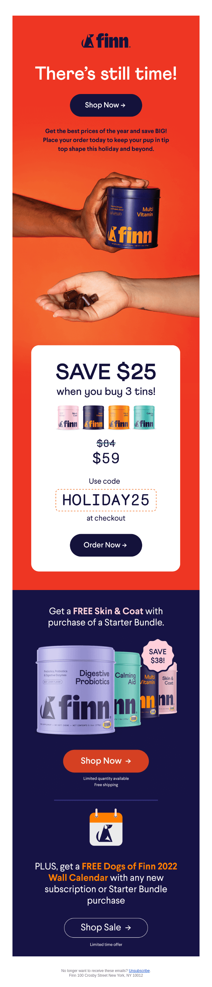
Finn’s promotional Christmas email template stands out for a number of compelling reasons:
- The red-orange background triggers urgency and excitement, psychologically associated with alerts and immediate action, while creating high energy around the promotional content.
- The design unfolds multiple offers as users scroll, maintaining engagement while building momentum toward the CTA.
- The design uses distinct color blocks to create clear visual sections – the vibrant red-orange top section for urgency messaging, the clean white middle section for the main offer, and the deep navy bottom section for additional promotions. This segmentation helps organize information hierarchically.
- Each block corresponds to different types of information, making it easy for recipients to quickly scan and process the multiple offers.
From its clean design to the well-balanced copy and clear CTA, every element feels intentional. It not only captures the holiday spirit but maintains brand consistency as well.
5. Boohoo
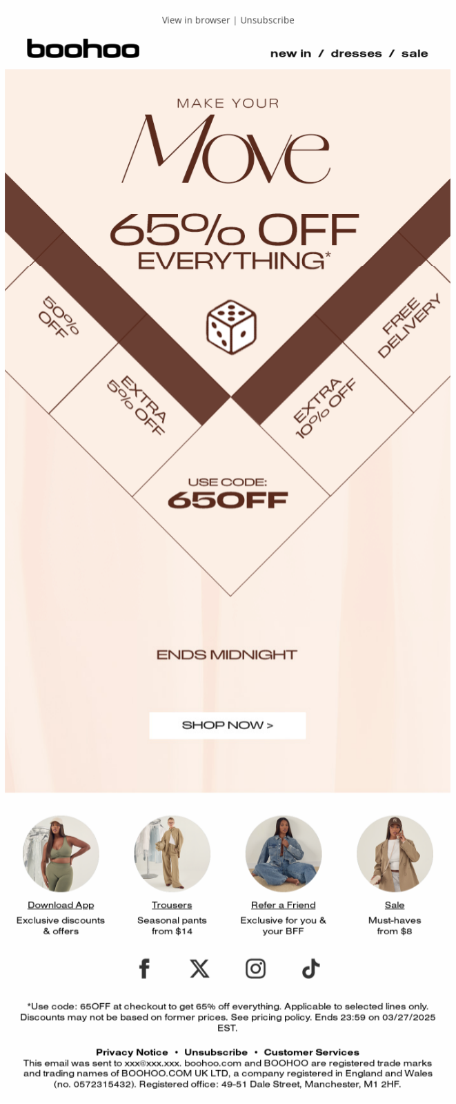
Here is a uniquely-designed email from Boohoo. Here’s why it caught the attention of our design team:
- Instead of traditional rectangular hero images, this template uses an innovative diamond/chevron geometric pattern that creates natural directional flow. The angular shapes act like visual arrows pointing downward, guiding the eye toward the bottom of the email where the CTA lives.
- The animated GIF where the dice rolls down to the pit is very compelling, and captures the email’s theme so well.
- Different brown shades create visual depth and information hierarchy – darker browns for the geometric shapes and key messaging, lighter browns for secondary text, ensuring the most important elements stand out clearly.
- Live text scales properly across devices and remains readable at any screen size, ensuring the legal disclosures don’t become illegible barriers to conversion on mobile devices.
Also, the single-column layout ensures mobile responsiveness, recognizing that most recipients will view this time-sensitive promotion on their phones where they can act immediately on the offer.
6. Eline Rosina
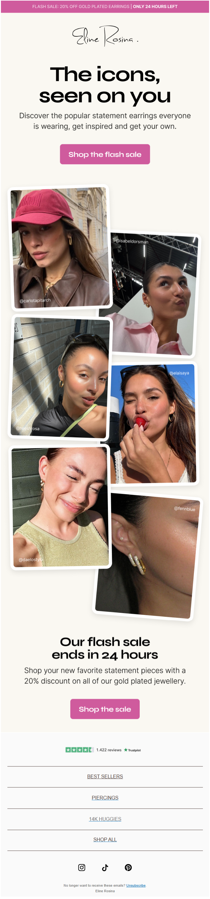
This email from Eline Rosina applies flash sale strategy through powerful social proof and urgency tactics:
- The collage of customer photos wearing the earrings offers genuine social proof that these pieces are popular and desirable. Seeing actual people styling the jewelry makes the products feel more attainable and trendy.
- The variety of different people wearing the earrings shows broad appeal and helps recipients visualize themselves wearing the pieces, making the purchase feel more personal.
- The template repeats the time-sensitive messaging both at the top and bottom, ensuring the flash sale deadline remains top-of-mind throughout the entire email experience.
- The email uses minimal, scannable text that empowers faster decision-making during time-sensitive moments.
Overall, the email masterfully combines authentic social proof imagery with urgent time pressure and crisp messaging.
This is exactly how you design announcements for limited time email marketing.
7. Little Beast
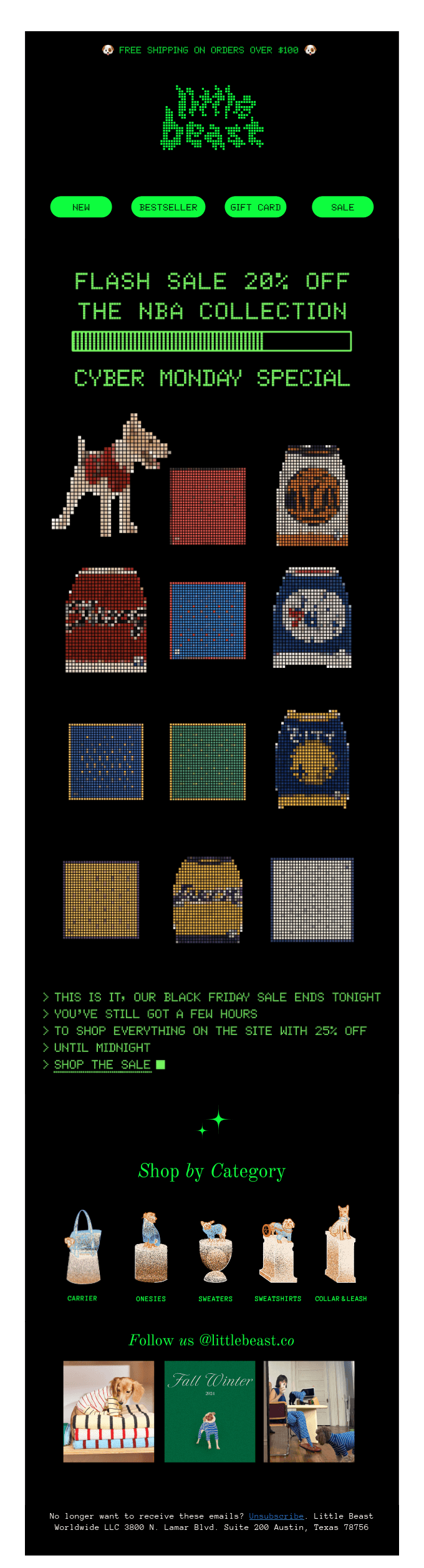
This email brilliantly uses retro gaming aesthetics to create an engaging limited-time offer experience:
- The pixelated 8-bit art style immediately captures attention and creates emotional connection with recipients who associate retro gaming with fun, collectibility, and exclusive experiences.
- The loading bar reinforces time sensitivity by suggesting the sale is actively counting down, creating anxiety about missing out as the “system” processes the limited-time opportunity.
- The “SHOP THE SALE” button uses the same pixelated green terminal font as the rest of the email. It blends seamlessly into the retro gaming interface, treating the entire email like an interactive game screen.
While conventional email marketing would demand a more prominent CTA, this approach prioritizes brand experience and customer connection over immediate visual conversion tactics, betting that authentic engagement will drive better long-term results.
How to Write Limited Time Offer Emails
Here are some key tips on how to write effective limited time offer emails, each with a brief description:
1. Ace the subject line
Use words like “Ends Tonight,” “Last Chance,” or “24-Hour Deal” to grab attention and convey scarcity right away. As far as copy goes, most of these urgency email campaign templates pitched the offer right in the subject line.
2. Highlight the time limit early
Don’t bury the deadline. Mention it prominently in the header or opening line to create urgency from the start.
3. Use action verbs
Phrases like “Grab Yours Now” or “Shop Before It’s Gone” spur quick decision-making and tap into FOMO.
4. Reinforce the deadline visually
Add countdown timers, bold deadline banners, or icons (like clocks) to emphasize the ticking clock.
5. Optimize for mobile
Most flash sale opens typically happen on phones. Use short text, big buttons, and single-column layouts.
Learning How to Create Urgency in Email Marketing
Urgency is one of the most powerful tools in email marketing, but it only works when it feels authentic. Instead of relying on gimmicks, focus on creating real reasons for subscribers to act now. Limited-time offers, low-stock alerts, and seasonal offer email templates are effective because they introduce a sense of scarcity and immediacy.
To make urgency work, be specific. Say exactly when the offer ends, what’s at stake, and why the subscriber shouldn’t wait. Phrases like “Only a few left” or “Offer expires at midnight” perform better than vague prompts. Pair that with a strong CTA and clean design, and your email becomes a trigger, not just a reminder.
Urgency doesn’t mean shouting, it means showing why acting today matters more than waiting until tomorrow.
Wrapping Up!
The brands we featured didn’t just build beautiful emails. They built momentum. They made urgency feel real, value feel personal, and the CTA feel irresistible. With these limited time offer examples now shared, you’re equipped to do the same.
So the next time you launch a flash sale or a 24-hour promo, remember: urgency doesn’t come from the clock alone.
It comes from the story you tell, the emotions you spark, and the clarity of your call to action.
Need help creating stunning promotional emails? Get in touch with our team, and let’s get started.