Every email has a lifecycle. A person discovers your brand, signs up, reads a few emails, engages for a while —or maybe fades away over time.
That’s the reality every email marketer works with.
What we can control is the experience that happens in the middle—the part where email design, interaction, and usability determine whether someone keeps scrolling or checks out.
In 2026, that experience is shaped primarily by mobile. The image of someone checking email on a desktop monitor, coffee mug in hand, is now a museum exhibit.
Most users check email on their phones. Often quickly, in motion, or between other tasks.
In a Mailjet survey, 71.5% of consumers said they check email most often on mobile. That changes everything about how we design for attention and clarity.
This is where mobile-first micro-animations start to matter. Not as decorative effects, but as functional design elements. Small yet noticeable. They offer instant feedback, reduce hesitation, and make navigation feel intuitive.
These are the same micro-interactions we’re used to in apps: a swipe to confirm deletion, a quiet pulse on a discount badge to signal relevance, a smooth loading shimmer to indicate new content is available.
In email, these lightweight email animations guide momentum. They help people move from open → scroll → click with less friction, especially on mobile-first email design where gestures drive behavior. They support focus, encourage action, and add clarity without slowing anything down.
Today, we’ll look at how mobile-first micro-animations are shaping modern email design in 2026, why they’re becoming standard rather than experimental, and where they make the biggest difference in the mobile inbox environment.
What Are Mobile-First Micro-Animations in Email Design?
Mobile-first micro-animations are small motion cues inside an email that help users understand what’s happening as they interact with it, receive feedback, and engage with the content more smoothly.
Especially important on mobile devices, where every touch interaction needs to feel natural, even if users aren’t perfectly precise.
You’ve experienced them a thousand times in interactive email design —most of us barely register them anymore –
- A progress bar that fills as a user scrolls.
- A CTA button that subtly shifts or highlights when tapped.
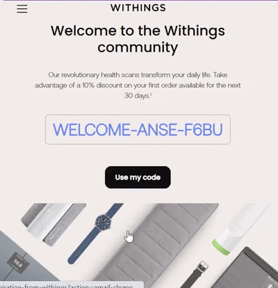
- A discount badge that activates once a code is applied.
- Icons that confirm an action has been completed.

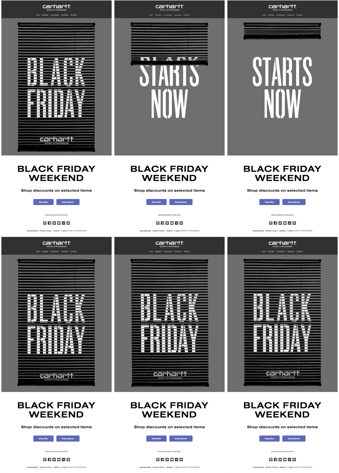
Image Source: Email Love
These are the kinds of moments that help users understand what to do without having to think about it. When they’re done well, they disappear into the flow and just make things feel smoother.
What makes these email micro-animations valuable is not their visual flair, but their function. They:
- Provide instant feedback.
- Guide focus toward key actions.
- Reinforce clarity without adding complexity.
- Help retain attention in fast, mobile-first viewing environments.
They’re subtle enough that most users won’t consciously notice them, yet they noticeably improve the flow of interaction within the email.
Individually, these touches are barely noticeable. But take them away, and your mobile-first email design turns out rigid and uncertain.
Incorporating Micro-animations in Email Templates
Using mobile-optimized email animations in your email templates open up many creative spaces to engage recipients and make interactions feel intuitive and responsive. Some actionable ways to pull it off:
1. Animated CTAs
Apply them to your call-to-action buttons. A subtle pulse or a slight color shift when the user scrolls to or taps the button catches attention without hijacking the flow. It communicates clearly: this is the next step, and it’s ready for interaction.
2. Loading or processing indicators
Emails with interactive elements —like video previews, forms, or AMP-based modules—go really well with quick-loading indicators. Even a brief animation that shows content is loading reassures the user, especially on slower connections. Without it, users can hesitate or abandon the email entirely.
3. Animated icons
Email micro-animations also work well on individual product elements. Small, reactive icons—like a heart that pops when saving a product or a cart that wobbles when an item is added—give immediate feedback. These motions confirm actions and subtly reinforce behavior, with no cognitive load.
4. Countdown timers + progress bars
Limited-time offers or promotions gain impact through motion designs in email as well. Animated countdown timers or progress bars signal urgency in a way static text cannot. Users can see the time left or the progress toward an offer at a glance, which increases engagement and drives conversions naturally.
5. Hover effects
Even hover states can benefit from light-weight email animations. A tiny expansion, shadow shift, or ripple effect when hovering over a button gives users confidence that the element is interactive. These cues are especially valuable for emails opened on devices that support touch feedback and hover-like behavior, maintaining clarity in the interface.
6. Celebratory animations
Finally, animated email design can create small celebratory moments for completed actions. When someone completes a purchase, redeems an offer, or unlocks a feature, a short, subtle animation—like a confetti burst or glow behind a coupon code—can make the experience more satisfying.
Best Practices for Implementing Micro-Animations in Mobile-First Emails
When adding micro-animations to emails in 2026, remember to follow some rules that reduce frustration and errors:
1. Mobile users don’t have patience for sluggishness. Mobile devices, especially lower-end models, don’t handle heavy animations or oversized GIFs well. Every micro-animation should be light on its feet. Lean toward CSS-based motion where possible. It loads faster and doesn’t interrupt the flow of the email.
2. Treat micro-animations in email design as a spotlight. Let it shine on calls to action, clarify where to tap next, or cheer on a completed task. Anything that blinks, bounces, or spins without purpose can feel like annoying background chatter in an otherwise smooth conversation.
3. Like every other aspect, email clients aren’t all created equal in the animation game, too. iOS, Gmail, Outlook, and other clients all handle animations differently. Some support CSS transitions fully; others fall back to static images.
So test like it’s your job and prepare polite fallbacks for the less lively email clients. Your micro-animations should degrade gracefully so that the core message and interactivity remain intact even when motion isn’t available.
4. Email micro-animations need to respond to swipes, taps, and holds naturally. Feedback should feel immediate and intuitive. A subtle button shift, a gentle icon bounce, or a soft highlight can communicate action without requiring users to aim precisely or wonder what just happened.
5. Speed, easing, and visual style should align across the email. This creates a sense of cohesion and makes interactions predictable—users instinctively understand how to engage with your content.
6. Finally, keep accessibility in the center. Motion design in emails should complement the experience, not exclude anyone. Provide alternative ways to communicate key actions, whether through alt text, color changes, or other cues.
And never rely on motion alone to convey critical information—every animation should have a first frame that communicates the message clearly, even if the motion doesn’t render.
Interactive email accessibility. We’ve been in those conversations with clients more times than we can count. In this blog, our developer tackles the hottest questions around whether both can exist—and how to do it right.
Interactive Email Accessibility: Is It Possible & How to Achieve It?
The road ahead
Micro-animations are becoming a baseline expectation for mobile-first email design. When done right, they guide users, provide feedback, and make interactions feel effortless—without adding noise or slowing down the experience.
The next time you design an email, don’t just add motion for decoration. Make it purposeful, subtle, and mobile-ready.
Want help adding the right micro-animations to your emails? Get in touch, and let’s make your email experiences smarter and more engaging.


