

An inbox full of pastel clichés is noise. One thoughtful message that lands earns attention.
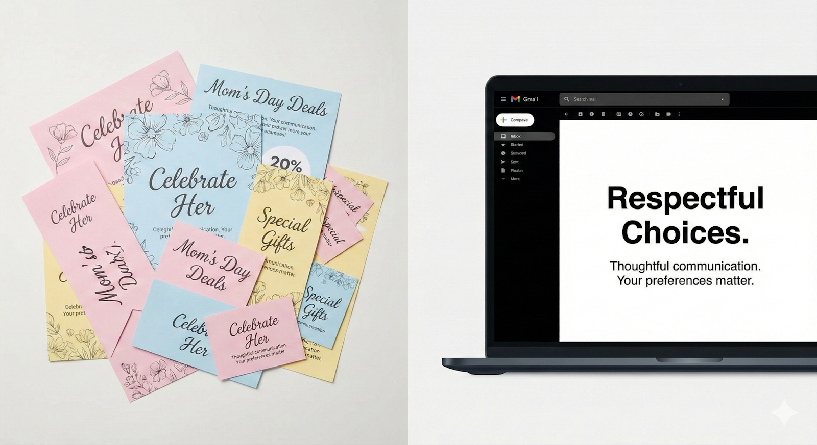
If you try to follow the masses, then you will learn that you’re doing the exact same thing they are doing. That’s a trap. In order to stand out from the crowd, you must do something different. Offers, coupons, and price slashes are too vague. They will still sound transactional. It’s just a marketing tactic, disguised as solidarity.
This guide shows a different way. It shows why Women’s Day emails deserve more than slogans.
Build a Women’s Day email campaign that converts by respecting shoppers’ identities with identity-aware personalization, meaningful interactions, and an accessible, confident design. Not performative gestures. Real signals. Real choices. Real relevance.
Let’s cut to the chase and learn how an inclusive email design for Women’s Day can muster the real respect women shoppers deserve.
Principles of respectful Women’s Day email design
First things first. Let’s discuss the five key principles that will help you design a respectful Women’s Day email design.
- Center agency, not assumptions. Lead with customer choice. Ask. Don’t project tastes.
- Honor intersectionality. Gender intersects with age, faith, ability, culture, and class. Build systems that respect that complexity.
- Avoid tokenism and infantilization. No default-to-pink. No saccharine copy. Use agency-affirming language.
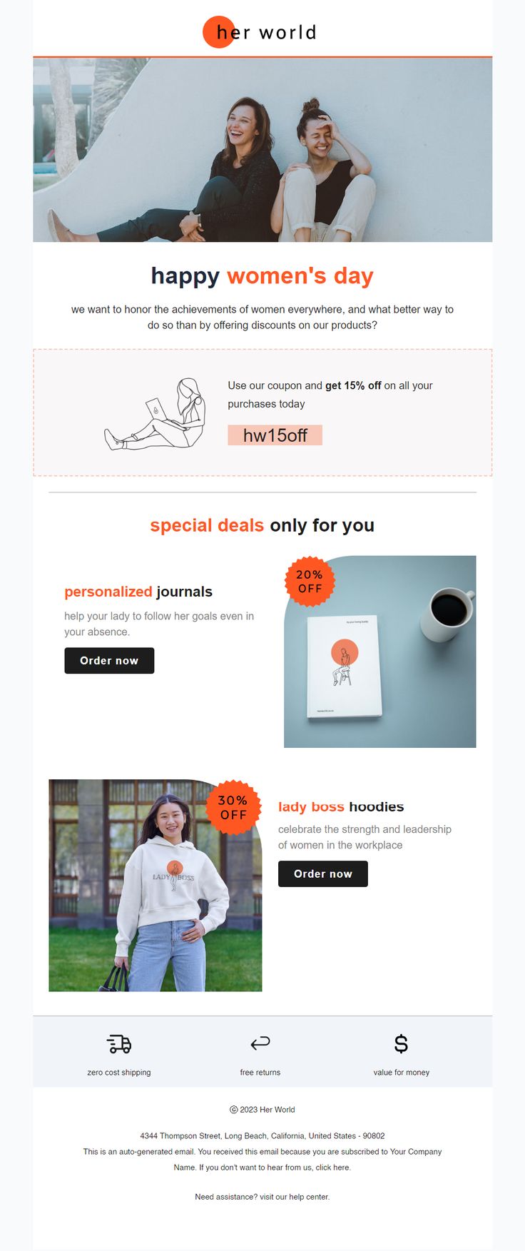
- Offer value, not noise. Celebrate with stories, access, education, or tangible value, only discount if it’s meaningful and not exploitative.
- Design for accessibility and control. Clear opt-outs, alt text, readable type, high contrast, and explicit preference centers.
Once your principles are clear, the next question becomes practical: Who exactly are you designing this Women’s Day email campaign for?
Audience segmentation: Who you’re really speaking to
Segment by intent and behavior, not assumed identity:
- Advocates / Repeat buyers – loyal, values-aligned.
- New shoppers – curious, testing the brand.
- Gift buyers – shopping for someone else.
- Price-sensitive shoppers – responsive to offers.
- Community-oriented – engage with causes, stories, and UGC.
With the right audience segments defined, email personalization becomes powerful, but only when handled with care.
Personalization that feels human, not intrusive
Done well, email personalization feels like consideration; done poorly, it feels like surveillance.

Here are five key personalization strategies that feel human.
- Progressive email personalization. Start light, first name, broad interest, then deepen with user choices: “Would you like curated picks from women-owned brands?” Save and respect that selection.
- Declared preferences over inferred identity. Ask gently and store the answers.
- Contextual content. Show products or stories tied to behavior. If someone just bought a self-care kit, surface complementary experiences rather than generic “for her” bundles.
- Moment-aware email personalization. If a user recently browsed careers content, offer mentorship pieces or event invites; if they browsed gift-wrap, surface curated gift lists.
- Respect privacy. Never expose sensitive details. Honor consent and opt-ins.
Respect isn’t a monologue. It’s participation.
Interaction: Make Women’s Day emails two-way
When shoppers are invited to respond, contribute, or choose, engagement becomes meaningful rather than passive.
Here are five easy steps to make your Women’s Day emails conversational.
- Light interactive elements. One-click polls (“Who inspires you right now?”), save-for-later buttons, or quick preference toggles.
- In-email micro-surveys. One or two questions to refine email personalization, and store those answers.
- Shoppable carousels. Allow fast choices without forcing a full site journey.
- Social & community hooks. Invite UGC (stories/photos) with explicit consent and moderation rules; reward contributors with recognition or small incentives.
- Accessibility-first interactions. Ensure fallbacks: if an interactive widget fails in an inbox, provide a clear CTA that does the same job.
Even the strongest strategy can falter if the design contradicts the message.

Design that respects attention and bodies
Accessible, intentional design signals that respect isn’t just written into the copy, it’s built into the experience.
Here are five design principles to help your emails stand out.
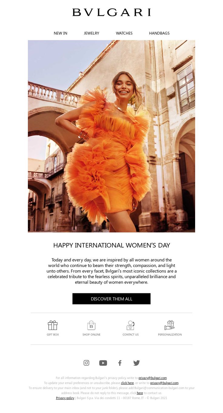
- Color and imagery. Use a refined palette that aligns with brand equity. If pink is on-brand, use it intentionally, not because it’s the default. Choose imagery reflecting diversity in age, ethnicity, ability, and body type. Avoid token stock shots.
- Typography & spacing. Legible font sizes, clear hierarchy, generous tap targets on mobile.
- Contrast & accessibility. Meet WCAG AA for text and buttons. Provide descriptive alt text for all images.
- Layout variations. Build modular templates so sections can show or hide by segment, one template, many respectful variants.
- Inclusive microcopy. Center empowerment and choice (“Share a story” / “Explore curated picks”), not assumptions (“for her”).
Celebration often includes an offer, but intention determines impact.
Offers and incentives: Generous, not exploitative
When incentives are transparent and thoughtful, they enhance trust instead of eroding it.
Here are four strategies that will position you as generous and not exploitative.
- Value-first offers. Experiences, charity matches, educational content, or access to events and women-owned makers.
- Discounts with context. If offering reductions, explain the reason. Keep expiration transparent and reasonable.
- Cause partnerships. Be explicit: how much, to whom, and when is the donation delivered? Offer opt-in at checkout rather than pre-checking donation boxes.
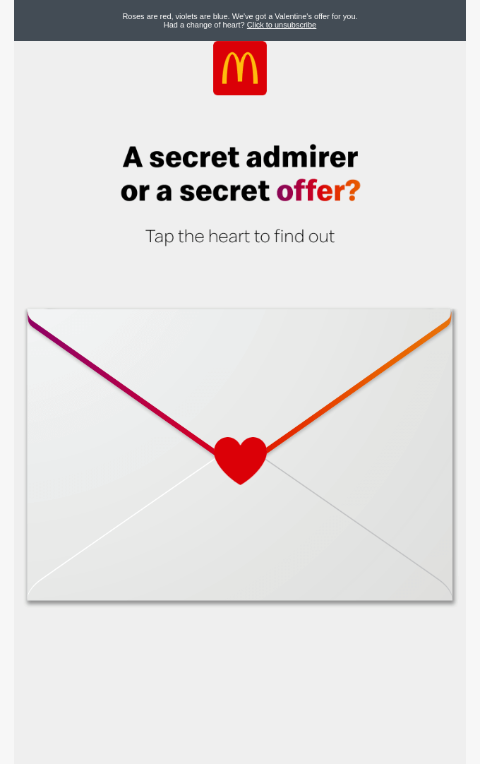
- Avoid manipulative urgency. Don’t weaponize sentiment by tying scarcity to identity.
With the strategy defined, let’s translate it into practical language and structure.
Content examples, subject lines, preheaders, CTAs
Clear, grounded messaging ensures your email feels deliberate rather than decorative.
Subject lines
- “A short note and a small gift”
- “[Name], curated finds from women-owned brands.”
- “Stories from women who made it happen”
Preheaders
- “Shop mindful gifts, support causes, or simply read.”
CTAs
- “Explore curated picks.”
- “Share a story.”
- “Support women makers.”
Tone: warm, concise, specific. Avoid hyperbole and empty praise.
Behind every respectful experience is an infrastructure that supports it.
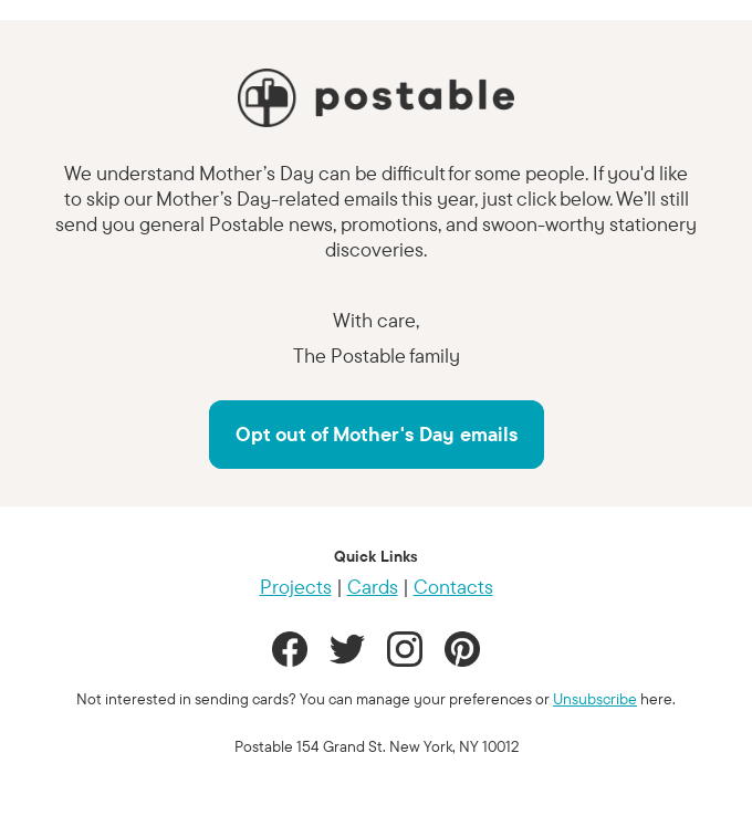
For example, you can even ask your subscribers if they are okay with receiving Mother’s Day emails and if they want to opt out. There may be people who lost their mothers and are going through trauma. This empathy will go a long way in building a deep bond with your audience.
Technical implementation: Templates, dynamic content, fallbacks
Strong technical foundations ensure your message remains inclusive across devices, clients, and data scenarios. Here are five technical considerations you must pay attention to.
- Data-first templates. Central content DEs to drive hero, headline, image, and CTA. Always include fallbacks.
- Conditional blocks. Show/hide modules per segment, country, or declared preference.
- Accessibility coding. Semantic HTML, role attributes, keyboard-navigable buttons.
- Tracking & privacy. Respect consent flags; use privacy-safe analytics and explicit opt-ins for UGC.
- Progressive enhancement. Add AMP or interactive widgets only where supported; always provide usable fallbacks.
Before pressing send, pause. Respect requires review.
Testing, QA, and ethical review
Rigorous testing and ethical oversight protect both your audience and your brand integrity. Here are four quick and effective ways to do that right.
- Testing matrix. Segments × devices × clients × empty-data scenarios × accessibility checks.
- Cultural/editorial review. Run copy and imagery through a diversity lens. Use a small advisory panel when possible.
- Compliance checks. Verify charity claims, endorsements, and data collection legality.
- Pre-send checklist. Links, alt text, preheader combos, dynamic fallbacks, and clear unsubscribe flow.
Once the campaign is live, measurement determines whether your intention translated into impact.
Measurement: KPIs that matter beyond opens
Looking beyond vanity metrics helps you understand whether trust, not just traffic, was built.
- Primary KPIs. Conversion rate by segment, revenue per recipient, gift purchases, donation opt-ins, and UGC submissions.
- Engagement health. Opt-outs, complaint rate, time-to-repeat, and downstream retention lift.
- Experimentation. A/B test email personalization depth, interactive widgets, and offer types. Measure incremental lift, don’t celebrate mere relative conversion.
- Qualitative signals. Social shares, replies, and sentiment.
Even well-meaning campaigns can undermine themselves without careful reflection.
Pitfalls to avoid while implementing a respectful Women’s Day email design
Awareness of these pitfalls helps ensure your message strengthens relationships rather than weakening them.
- One-size creative across diverse audiences.
- Inferring gender or pronouns without permission.
- Exploitative urgency tied to identity.
- Low-contrast, inaccessible designs.
- Treating Women’s Day solely as a sales event misses the opportunity to build a relationship.
Wrapping up
That brings us to the business end of this article, where it’s fair to say that you should treat celebration as consideration, not commercialization.
And with these examples of Women’s Day email templates, you can do so with ease.
Women’s Day emails should always be respectful to shoppers, given the significance of the day. This day is meant to highlight the sacrifices and struggles women face every day.
So, these kinds of emails should have choice, clarity, and craft.
What you can do is: Run an A/B test. One should be focused on stories and access to your product. And the other should be a product-led curation. Then, measure which email builds more long-term trust.
The ball is in your yard now. Make every effort count.