The human eye can perceive roughly 10 million colors, and research shows we form emotional associations with colors in milliseconds. These associations aren’t random—they’re rooted in psychology, culture, and personal experience. When designing email templates, you’re not simply choosing aesthetically pleasing hues. You’re triggering neurological responses that guide how your subscribers react to your emails. The key is deploying these colors strategically to align with your campaign objectives and audience psychology.
This is where email template color psychology becomes a powerful differentiator.
As email marketers and strategists who specialize in behavioral design, we’ve studied how color influences decision-making, emotion, and user action. Through color theory for email templates, you better understand how hues shape perception and drive visual hierarchy.
Today, we’ll show you how to leverage color psychology so that every button, header, and visual element doesn’t just look good but performs, persuades, and converts.
Why Color Psychology in Email Matters
Colors aren’t just visual elements — they communicate with the brain. Some instantly command attention, while others inspire calm, trust, or excitement.
In emails, using the right colors can help you determine the best colors for email templates that align with user intent and engagement goals:
- Spotlight key elements like headlines or CTA buttons
- Naturally guide the reader’s eye through the layout
- Reinforce your brand identity with consistent hues
- Motivate action — clicks, engagement, and conversions
Understanding the Psychology of Colors
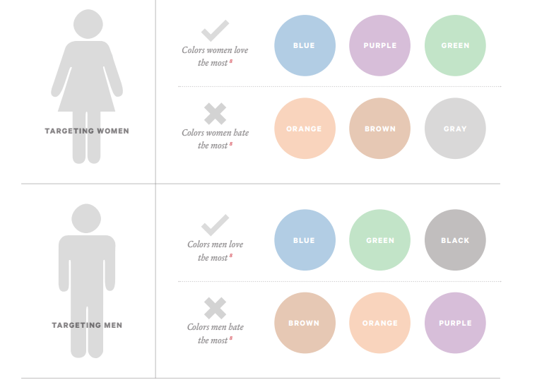
Different colors trigger different emotional responses. So here’s a quick cheat-sheet, if you will, to help designers with color selection for email templates:

Source: Nethunt
- Red: Excitement, urgency, action; great for flash sales and limited-time offers
- Blue: Trust, calm, reliability; ideal for corporate and financial emails
- Green: Growth, wellness, balance; perfect for eco-friendly and health-focused brands
- Orange: Energetic, friendly, motivating; encourages clicks without being pushy
- Yellow: Optimism, alertness, attention; best used sparingly to highlight key elements
- Purple: Luxury, creativity, sophistication; suited for premium and artistic products
- Black/Grey: Elegance, neutrality, timelessness; ideal for minimalist and high-end visuals
Color Psychology is Nuanced
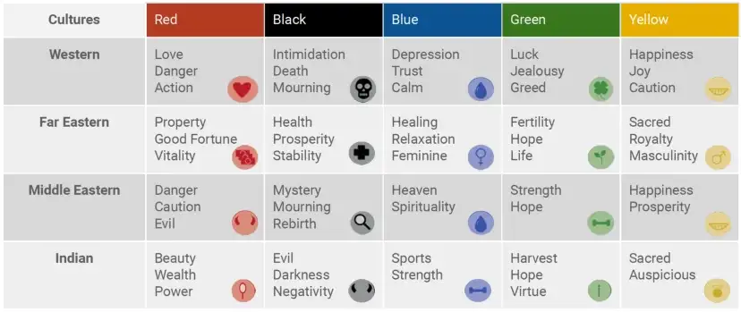
Color psychology is not universally true for all colors. While certain colors can evoke consistent physiological and emotional responses, the specific psychological or symbolic meaning of a color is highly variable and depends on several factors:
- Cultural differences: A color that symbolizes one thing in one culture may symbolize the exact opposite in another. Consider yellow. While often associated with happiness and optimism in the US, it symbolizes envy or jealousy in Germany, and is linked to death or mourning in parts of Latin America.
- Context and individual experiences: An individual’s unique memories and associations can override general psychological trends. If you had a very positive childhood experience involving the color brown, you may associate it with warmth and comfort, regardless of what a general survey might suggest.
- Shades, tints, and tones: A bright, highly saturated color will have a different effect than a muted, pastel version. Light blue can be calming, while a very dark or intense blue may feel more serious or formal.
- Physiological factors: Factors like age and even mood can influence how colors in your emails are perceived and preferred.

Source: Granth
Since color psychology is not universally true, a “highly personalized” strategy in email marketing goes beyond just choosing a nice color. It involves considering your audience’s context, culture, and what you’re trying to make them do. There isn’t a single color palette for email templates.
And the first step in personalization is making your emails instantly recognizable and trustworthy. Accordingly, never compromise your core brand colors. By consistently using your primary colors (e.g., your logo colors), you reinforce brand recognition and trust. The color becomes personally associated with your promises and reputation in the subscriber’s mind
How to Apply Color Psychology in Email Templates
Below are a few general tips for applying color psychology when aiming for colors that boost engagement in email templates:
- Make CTAs Stand Out: Use contrasting colors for your CTA buttons so they instantly draw attention.
- Maintain Brand Consistency: Stick to your brand colors for trust and recognition, while using complementary shades to highlight key sections.
- Match Colors to Your Audience: Tailor color choices based on who you’re targeting, vibrant for younger audiences, muted and refined for professionals.
- Test for Performance: Run A/B tests on CTA and header colors, as even small tweaks can lead to significant improvements in clicks and conversions.
Now, those are standard practices. But, based on our discussion on the relative nature of color psychology, it is important to keep a few more things in mind.
Advanced Tips for Email Color Strategy
Once you’ve mastered the basics of color psychology, it’s time to elevate your email visuals with strategic color decisions that influence behavior, enhance clarity, and boost conversions:
- Maintain Core Brand Colors: Use your primary brand colors consistently in headers and footers to instantly build trust and recognition.
- Adapt Accents for Culture: Localize accent colors for global segments (e.g., using Red for promotions in China to symbolize luck, versus a cooler tone elsewhere).
- Avoid Over-Saturation: Use bright, highly saturated colors strategically, and rely on more muted, accessible tones for large backgrounds to reduce visual fatigue.
- Utilize the Isolation Effect (Von Restorff): Ensure your primary CTA color is the single most dominant hue in the email, chosen specifically because it contrasts maximally with the surrounding background and text colors.
- Establish a Hierarchy with Hue Intensity: Use bright, highly saturated colors only for the most important elements (CTAs, key offers) and reserve less saturated, lighter colors for secondary elements (borders, dividers) to guide the reader’s eye.
- Test Color on Negative Text/Error States: For transactional emails or forms, use a specific, non-brand Red only to highlight errors, warnings, or time-sensitive countdowns, ensuring this red is never used for general CTAs to preserve its psychological signal of danger/urgency.
Don’t forget accessibility!
To make your emails inclusive and effective for all viewers, color usage must account for visual clarity, usability, and real-world viewing conditions while considering the emotional impact of colors in templates:
- Ensure High Color Contrast: Follow WCAG standards, minimum 4.5:1 contrast for normal text, 3:1 for large text. AAA (7:1) is ideal for maximum readability. Always verify using a Color Contrast Checker before sending.
- Don’t Rely on Color Alone: Support color cues with icons, labels, text, or underlines, especially for links, error or success messages, and visual data to accommodate users with color blindness.
- Psychology Meets Accessibility: A CTA that passes the 4.5:1 contrast rule not only improves readability but leverages the Isolation Effect to visually stand out and increase clicks.
- Design for Dark Mode: Choose colors that maintain contrast when inverted or define Dark Mode-specific styles to ensure CTAs, text, and accents remain accessible and clickable.
- Check Contrast in Non-Text Elements: Icons, dividers, and button borders must have at least 3:1 contrast against their background to remain visible and functional for all users.
Color As Strategy, Not Decoration
In email marketing, color isn’t merely there to make things look good; it’s there to make things work better. Every shade you choose has a job: to direct attention, build emotional connection, clarify information, and ultimately influence action. But when backed by brand consistency, cultural awareness, accessibility, and behavioral psychology, color stops being just a design decision and becomes a strategic advantage.
The best-performing emails don’t just use color; they engineer it. If you’re ready to turn your email templates into psychologically smart, conversion-driven experiences, not just visually appealing pixels, we can help you create something impactful. Get a quote here!


