

Valentine’s Day is so closely associated with romance and intimacy that many marketers struggle to see how it fits into their strategy. Faced with a high-ROI seasonal moment, brands often turn inward and question whether their identity aligns with the “Valentine’s vibe.” When it doesn’t, they opt out, leaving one of the most profitable marketing moments of the year to candy-sellers.
But that assumption couldn’t be more off the mark.
Valentine’s Day is far broader than it’s typically given credit for. It is not a category-based holiday, but a moment-based one. As a result, you don’t need “romantic products” as such.
What you need is a clear benefit, framed around appreciation and self-expression. In fact, 24% of shoppers buy Valentine’s Day gifts for their mothers, while 13% buy themselves flowers!
In today’s post, our team curates Valentine’s Day email templates from a variety of brands. Think your brand doesn’t match the Valentine’s Day vibe? These emails say otherwise.
12 Highly Inspiring Valentine’s Day Email Templates from Popular & Not-So-Popular Brands
1. M&M’s
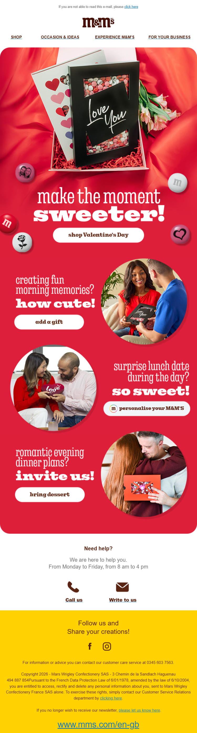
Valentine’s Day subject line: ❤️ Looking for Valentine’s Day Ideas?
This Valentine’s Day email stands out because it uses strong visual hierarchy and storytelling to guide the reader through different gifting moments, not just a single product.
Source: Inbox
The layout balances emotion and clarity by combining bold color blocks, consistent shapes, and human imagery, making the email feel festive, intentional, and easy to scan on mobile. Besides:
- The red background acts as a full-bleed canvas, eliminating visual noise and anchoring attention on the content.
- Repeated rounded containers create visual consistency and soften the overall look.
- Alternating image and text alignment keeps long-scroll fatigue low on mobile devices. The CTAs are visually distinct but not dominant.
- The footer shifts to the brand color, clearly signaling the end of the promotional narrative.
Expert tip: If your email is heavy on images, utilize live text for the most important part of your communication so that it gets across for subscribers with their images turned off.
2. Licorice
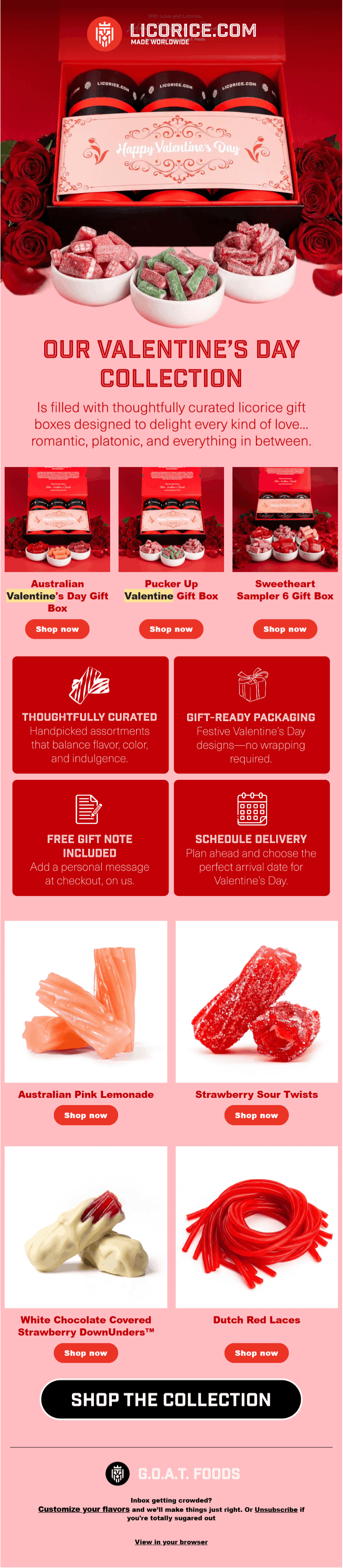
Valentine’s Day subject line: Valentine’s Gifting, Handled 💘
This Valentine’s Day email from Licorice leans heavily into structure and product clarity while still feeling festive and indulgent. The design uses strong symmetry, bold color blocking, and modular sections to turn a large product range into something easy to browse.
Source: Inbox
In addition, here’s what makes this seasonal email template stand out to us:
- A centered, boxed hero layout immediately frames the collection as premium and highly gift-worthy. The deep and soft pink backgrounds create a sensual appeal.
- The white product cutouts emphasize texture and color contrast, critical for candy-based products. The pink background acts as negative space, softening the density of red-heavy sections and preventing visual fatigue.
- Value-prop tiles are visually boxed to interrupt scroll momentum at a strategic midpoint.
- The CTA hierarchy is intentionally flat until the final section, delaying urgency. The ultimate CTA is oversized and isolated, clearly marking the moment of conversion.
Expert tip: Contrary to traditional structures, there’s no need to push sales or campaign details to the end. If the opening section does the heavy lifting, adding more design doesn’t help.
3. Playboy
Valentine’s Day subject line: This Valentine’s, unwrap yourself.
This Valentine’s Day email from Playboy positions the occasion around self-identity, with a design that emphasizes confidence and ownership.
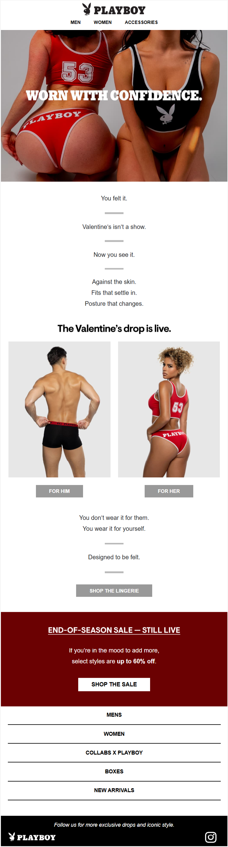
To elaborate, here’s why Playboy’s minimally-designed V-day email caught our attention:
- Interestingly, the design avoids overt seasonal iconography. It acts as a visual relief for the overwhelmed subscriber on V-day, and reflects brand confidence as well.
- The hero image intentionally eliminates faces and environmental context, shifting attention toward physical form, fit, and how the product sits on the body.
- Short, declarative text blocks are used—an evergreen tactic in copywriting.
- The sale section is visually isolated from the main narrative to prevent discount messaging from weakening the brand’s premium positioning.
Expert tip: For brands in the intimacy space, privacy is a conversion factor. Try to come up with a discreet subject line that protects users who might have lock-screen notifications.
4. Little Beast
Valentine’s Day subject line: Introducing the New Love Drop
Little Beast’s Valentine’s Day email template uses vertical storytelling and emotional sequencing instead of traditional product blocks. Let’s unpack it:
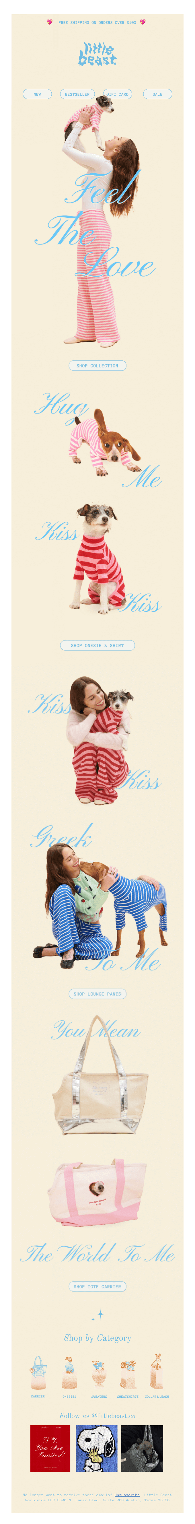
- The extreme vertical layout turns scrolling into a narrative experience, which encourages emotional engagement on the special day.
- Handwritten-style typography functions as an emotional cue. Importantly, product usage is demonstrated through human–pet interaction. The design alternates between movement (standing, lifting, walking) and stillness to maintain the visual rhythm.
- The CTAs are delayed and understated, appearing only after emotional framing has been established. Likewise with the accessory products.
- By using a muted, cream-toned background, the design minimizes visual tension and lets pastel accents and soft imagery establish a sense of calm and intimacy.
Expert tip: Since about 90% of the population is right-handed, their thumb often obscures the right side of the screen. Place your emotional cues on the left side of the layout to ensure they are read while the user is physically interacting with the scroll.
5. Fable
Valentine’s Day subject line: The Perfect V-Day Gift 💐
Fable’s Valentine’s Day email captures your attention from the get-go, doesn’t it? The “To-From” framework is one of the most recognizable elements around V-Day.
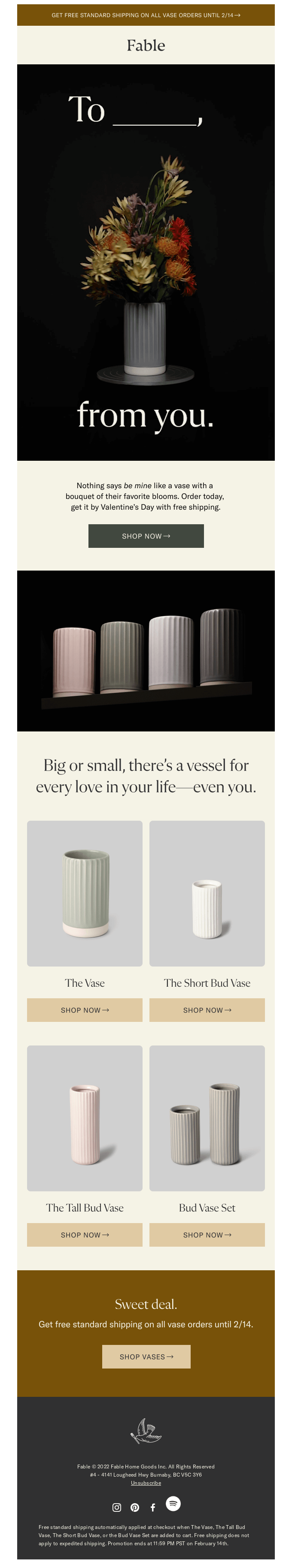
But there’s more. Here are a few additional aspects that forced us to include Fable in our V-day collection of email design:
- High-contrast typography (white on black) is used only once, ensuring that the opening message lands with maximum impact instead of competing with later sections.
- Product photography is lit softly with shallow shadows, which preserves depth while also avoiding harsh edges that would break the calm, premium tone.
- The consistent product framing across variants reduces cognitive load, allowing viewers to compare size and form without re-orienting visually each time.
- The email avoids repeating Valentine’s language in later sections, letting the initial framing do the emotional work while the rest of the layout stays evergreen.
- The CTA buttons are intentionally muted and low-contrast relative to the hero.
Expert tip: The way Fable designs the to–from framework almost begs the “To” field to become an animated GIF looping through different names. That said, it’s a good reminder that GIFs don’t always need to lead the creative process. Often, letting the design fully take shape first reveals more natural, restrained opportunities to add motion without overwhelming the viewer.
6. Hugo & Marie
Valentine’s Day subject line: There’s This Thing Called Love, and It’s Everywhere
Hugo & Marie’s V-Day email secures its place on our list by leading with a strikingly sensual hero image that channels passion through visual restraint.
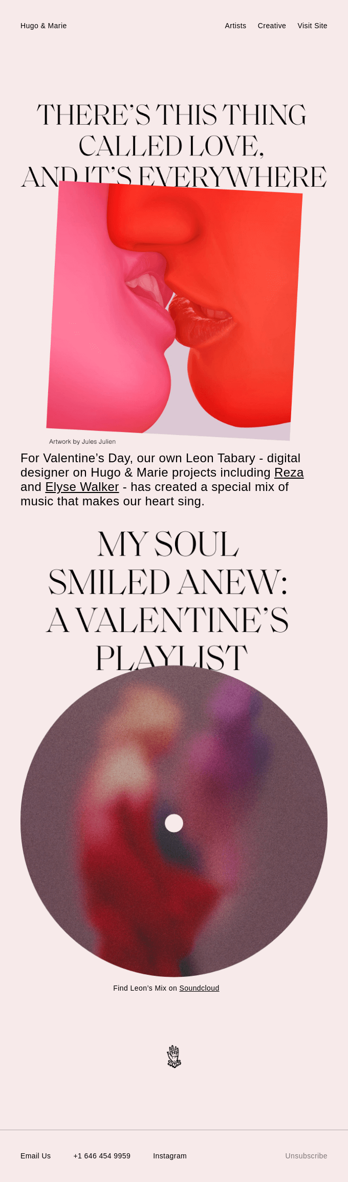
This email is operating more like an editorial art drop than a commercial send, and the design choices reinforce that at every level:
- The layout borrows heavily from art magazine hierarchy, using oversized serif headlines with generous line spacing to encourage a moment of contemplation.
- The pale blush background acts as a neutral emotional canvas. The hero image artwork is intentionally cropped and off-axis, rejecting symmetry to create tension and intimacy.
- Typography is treated as a visual object, not just text. Large letterforms overlap imagery and whitespace, reinforcing the artistic vibes.
- We love the vinyl-record motif anchoring the center of the email. The circle contrasts with the square hero image, while the soft blur offsets the crisp, zero-blur treatment of the hero. Together, these elements lend a nice visual rhythm to the email.
7. Fulton
Valentine’s Day subject line: A gift that says “I love you from head to toe”
Fulton’s Valentine’s Day email reframes love as an act of mutual support. It opens with a striking hero block that establishes the emotional and conceptual tone for the entire message.
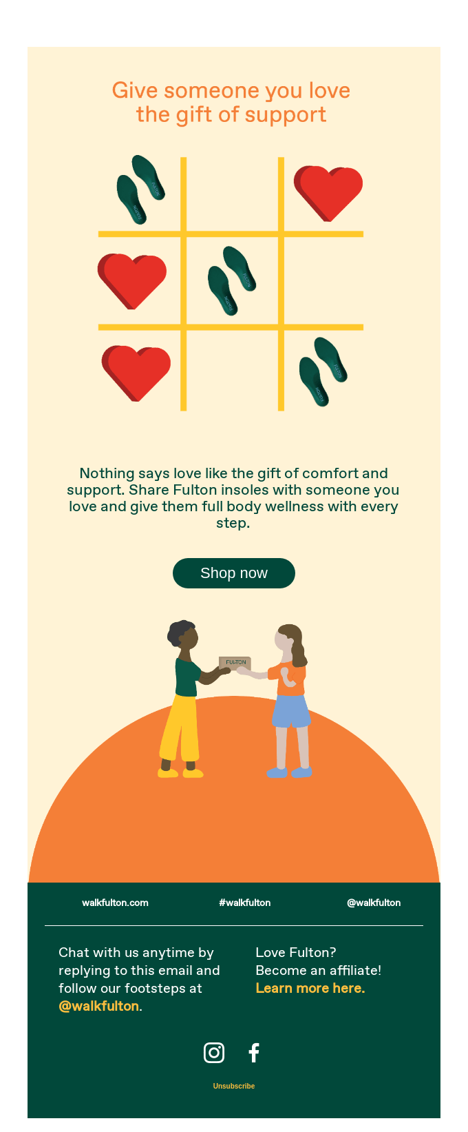
Here’s what we found cool about Fulton’s email:
- The tic-tac-toe–style grid at the top is winning. Replacing traditional Xs and Os with hearts and insoles subtly reframes the product as an expression of care.
- The rounded, dark green CTA button visually echoes the insoles’ color, creating a direct visual association between the action and the product.
- The illustrated human figures at the bottom introduce warmth and inclusivity.
- The layout uses a dual-pyramid structure—one inverted and one upright—so both visual flows converge at the CTA, naturally pulling attention toward the button.
Expert tip: Don’t overthink color. You don’t need a sprawling palette. Instead, commit to two or three colors to keep the visual language focused and cohesive.
8. MacPaw
Valentine’s Day subject line: What is LOVE?💘
MacPaw’s Valentine’s Day email template kicks off with a truly winning piece of copy that reworks Stevie Wonder’s classic into a product-driven headline.
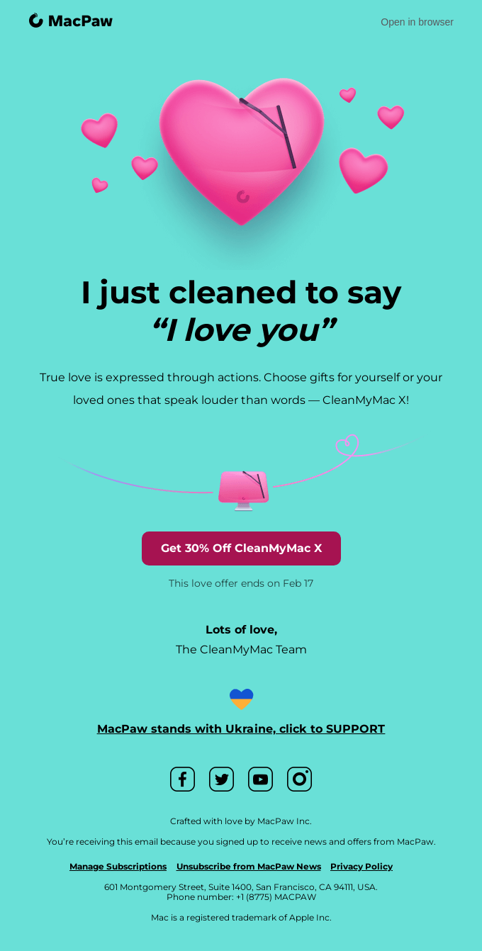
But not just copy. Here are a few ways MacPaw stands out through the design:
- The flat teal background acts as a neutral emotional field that allows the pink elements to pop without relying on gradients or shadows. This keeps the email lightweight.
- The deep magenta CTA does not appear anywhere else, giving it instant visual priority.
- Rounded forms, soft colors, and emojis create warmth, while precise alignment, restrained typography, and ample whitespace maintain software-grade professionalism. This balance prevents the email from feeling gimmicky despite its Valentine’s theme.
Expert tip: If your product doesn’t naturally scream Valentine’s Day, lean on a standard template, and let great copy do the heavy lifting. A skilled copywriter can reframe even the most unexpected offerings into something emotionally resonant. Just look at MacPaw’s email above to see how powerful words can turn a standard layout into V-Day gold.
9. Tula House
Valentine’s Day subject line: 💐 Valentine’s Day Flower Bar at Tula House 🌹
Tula House gets their Valentine’s Day email just right, opening with a charming hero image and flowing into a clean, scrollable layout built around vibrant, image-led blocks.
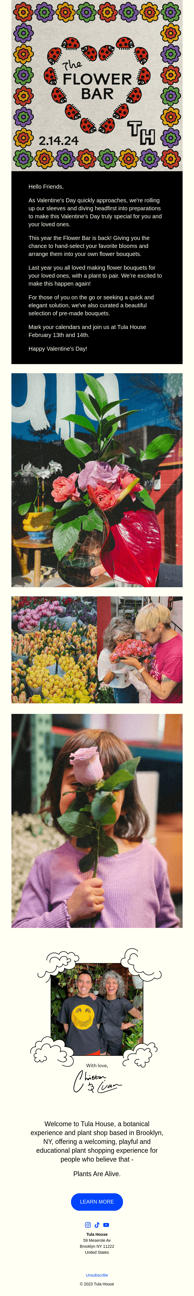
Seasonal email templates shine when design does the heavy lifting. Tula House’s V-Day email campaign is a great example of how to let visuals tell the story:
- The illustrated floral border, ladybugs, and handwritten typography instantly convey warmth, creativity, and a local/artisanal brand personality. V-Day is anchored visually and contextually right at the top, setting expectations before any copy is read.
- A bold, graphic hero section is followed by rich photography, guiding the viewer’s eye from the announcement to inspiration to human connection.
- Images are sequenced to tell a story—flowers, people selecting them, and then the joy of receiving them—rather than acting as standalone visuals.
- Cream-colored sections and spacing prevent visual overload and let both imagery and copy breathe.
- Most importantly, despite being highly visual, the email remains accessibility-friendly by using live text in the message section instead of baking copy into images.
Expert tip: Ideally, keep all copy as live text rather than embedding it in images, so the message is clear and readable for everyone. Always add descriptive alt text to images to ensure screen readers can relay the content accurately.
10. Bored Cow
Valentine’s Day subject line: Our February Moosletter is here!
Bored Cow’s newsletter has long been a favorite of ours, and their Valentine’s Day newsletter stays true to that standard. Embracing the idea that V-Day can be inclusive and wide-ranging, it delivers love and fun in a playful, feel-good way.
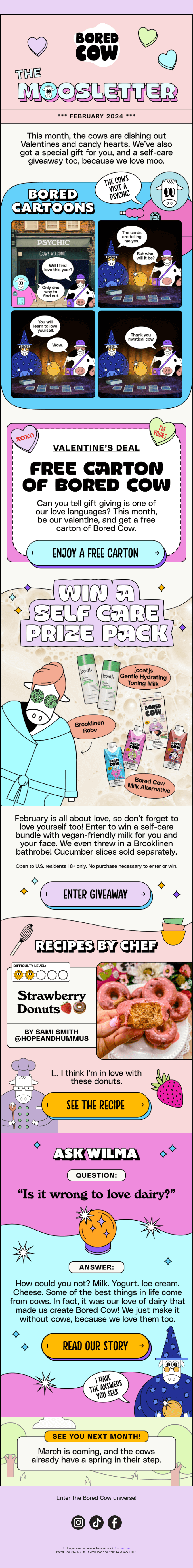
This Valentine’s Day newsletter doubles down on playful branding and modular storytelling:
- From the color palette to illustration style, every section feels unmistakably “Bored Cow,” reinforcing brand recall through consistency and repetition.
- Pastels paired with thick outlines and bold typography help each section stand apart.
- The sheer variety of content is winning. Deals, recipes, and brand philosophy coexist smoothly thanks to the tight layout. Characters recur across sections, creating continuity and a narrative thread throughout the scroll.
- Instead of one primary CTA, each block has its own, encouraging micro-engagements. There’s also just one idea per panel, which reduces the cognitive load.
11. World Wide Fund for Nature (WWF)
Valentine’s Day subject line: Roses are red, oceans are blue…
WWF’s Valentine’s Day email campaign is mostly text-based, but here’s another example of how any brand or organization can leverage seasonal email templates.
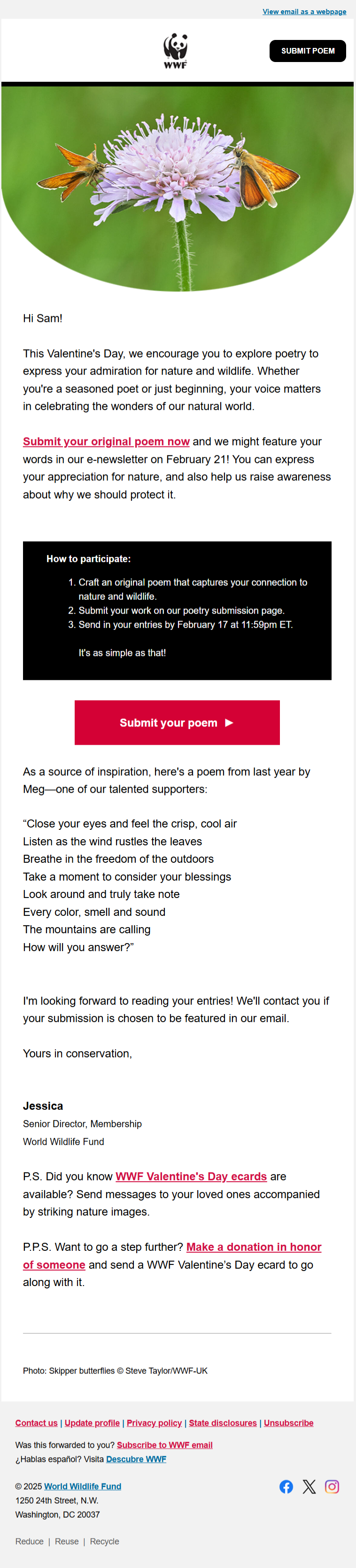
Source: Inbox
The email is designed around a single, clearly defined objective: encouraging recipients to submit a poem. There are no competing messages or parallel campaigns distracting from this goal.
But the email also has a number of design-specific elements worth borrowing from:
- The hero image works as an emotional introduction, establishing a calm, nature-focused mood that aligns immediately with WWF’s mission.
- V-Day is referenced in a subtle, values-led way, framing love as admiration for nature. A minimal layout with ample white space reduces cognitive load.
- The primary CTA button stands out through color contrast, made more effective by the overall restraint of the surrounding design.
- The use of live text throughout ensures the email remains accessible.
- Secondary actions, such as related Valentine’s Day cards and donations, are intentionally placed in postscript sections so they do not compete with the main objective.
12. Olipop
Valentine’s Day subject line: This soda has a crush on you 🤭💕
Olipop nails their Valentine’s Day email with playful copy, opening with a hero image that instantly sets the tone and leaves you smiling.
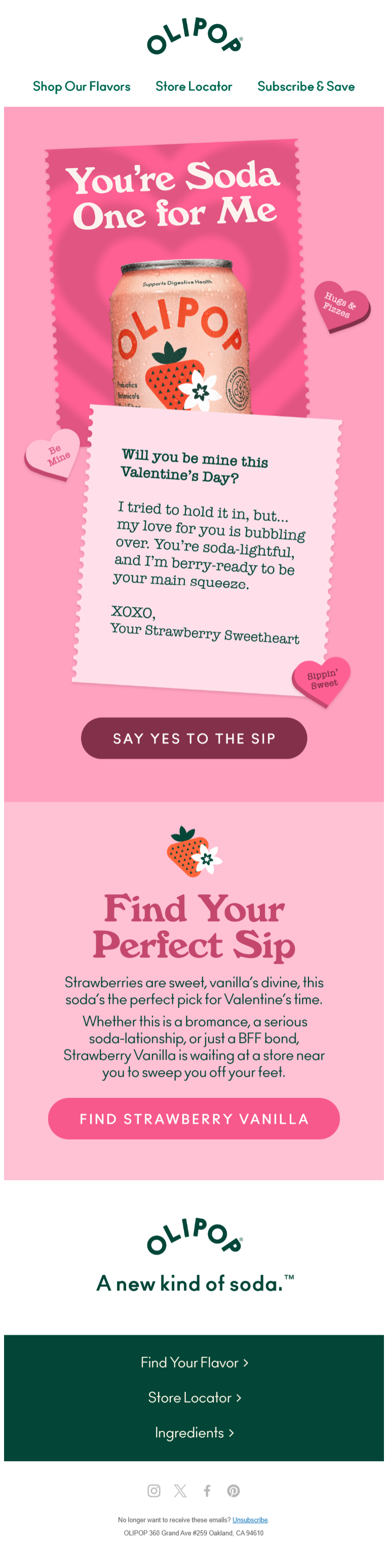
The email is built around a single product and flavor, keeping the message tightly focused and easy to understand at a glance. But there’s more:
- The product is placed front and center, ensuring brand recognition and product recall without relying on secondary imagery. The pink color reinforces the seasonal context while remaining consistent with the brand’s established visual identity.
- Decorative elements (hearts, stickers, notes) are used sparingly to support the narrative without cluttering the layout.
- The primary call to action is clearly defined and positioned immediately after the main emotional pitch, capturing intent at its peak. A secondary content block (“Find Your Perfect Sip”) extends the story while still supporting the same product focus.
Expert tip: Unlike Olipop’s approach, it’s best not to stretch copy cleverness too far. Simplicity almost always outperforms wit. So keep playful wordplay contained to the headline, and let clarity do the selling everywhere else.
Locked A Valentine’s Day Email Idea? Get It Designed by Email Mavlers’ Team!
To sum up, here’s what you need to remember this Valentine’s Day:
- Valentine’s Day is a moment-based opportunity. Any brand can participate by framing its value around appreciation, care, or self-expression, not romance alone.
- Simplicity wins. Focused layouts, restrained copy, and limited color palettes consistently outperform overdesigned, clever executions.
- A strong emotional hook at the top can carry the entire email. Once the framing lands, the rest of the design can stay evergreen.
- Design for mobile-first viewing. Clear visual hierarchy, scroll-friendly layouts, and reduced cognitive load are essential.
- Accessibility matters the most. Use live text, add alt text, and test that your email still lands even when images don’t.
Have a Valentine’s Day campaign idea in mind? Our team can turn it into a fully designed and developed email in as little as 8 hours. Let’s get started.